How To Create the Best Dashboards in 6 Easy Steps
8 min read | Published

Summary
Great dashboards do more than display data; they help people make faster and better decisions. But getting there requires more than just choosing the right visuals.
It begins with understanding what users actually need and how those needs connect to business goals. From there, it is about designing with clarity, building on consistent metrics, and ensuring the dashboard fits naturally into everyday workflows.
This article walks through a practical, repeatable process for creating dashboards that are both intuitive and impactful. The result is dashboards that empower users, reduce bottlenecks, and support a data culture.
Creating the Best Dashboards
At some point in our lives, most of us have experienced a teacher pointing to some basic statistics on a big screen full of graphs and charts. While these simple static dashboards remain relevant for certain use cases, the modern trend is for customizable, dynamic, interactive dashboards that allow for increased engagement. This is because today’s users expect more from their dashboards and want to be able to slice and dice the data.
Although modern dashboards are becoming increasingly sophisticated, they needn't be complicated to create. With the right preparation and tools, it can be relatively straightforward to organize your data and create highly effective, customizable dashboards that end users love.

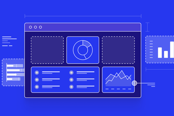
A good example of a modern dashboard
To build the best dashboards you’ll need a modern analytical tool or solution that easily integrates and plays well with other tools in your technology stack. These tools provide a “smart analytics" approach, making use of advancements in big data, machine learning, mobile technologies, and graphic interface design to assist users in making decisions with improved precision, efficiency, and speed.
Smart analytics tools can be seamlessly integrated into business processes and applications. The best ones allow you to create interactive dashboards via user-friendly no-code UI, so you can easily make the shift from static dashboards toward intelligent insights.
In this article, you’ll learn how to use these tools to create modern, easy-to-use dashboards that even non-technical users will love.
Step 1: Define the Purpose of Your Dashboard
Before you jump into building your dashboard it is necessary to do some groundwork. A good analytics platform can help you organize your data into insights and present it, but if you, the creator, do not have a clear vision for your dashboard, then users will be unable to glean anything from it. To gain inspiration and a better understanding of what makes a dashboard fit for purpose, check out these examples of healthcare dashboards.
The overarching goal of any dashboard is to support users to make informed decisions, by providing them with access to data insights presented to them in a logical and accessible way. So, before doing anything else, you need to understand the problem you want to solve, and how your dashboard will provide the solution.
The best way to clarify the purpose of your dashboard is to research your users and their needs. It can be helpful to put yourselves in the user’s shoes by answering these kinds of questions:
- How do they currently accomplish their objectives?
- What are some of the issues and problems they face?
- What information is crucial for them to act on the insights?
- How will they use the dashboard on a day-to-day basis?
- How will they be interacting with the dashboard to create new insights?
Ideally, you’ll talk to future users of your dashboard before you create it. This will provide further clarity on what your users need in order to be able to act on your dashboard insights. For more on defining the purpose of your dashboard and user research, check out these tips for building dashboards users love.
Step 2: Connect and Prepare Your Data
A high-quality analytics platform will be able to connect to a variety of data sources. Common data stores or databases include Snowflake, AmazonRedshift, and Google BigQuery. Some platforms also allow you to connect to data source managers (e.g., Dremio or Apache Drill), enabling you to connect to even more existing databases.
Moreover, depending on the analytics platform you choose, ideally, you should be looking to prepare and connect your data once and subsequently build many dashboards on top of it, rather than needing to connect data for each dashboard you build.
Once you have connected your data, you will need a data model. Put simply, this is a visual representation of your data elements and the connections between them. By defining how different data are related, the data model ensures the data on your finished dashboard will be accurate and consistent. So, regardless of how your users interact with your data, they always get it from a single source of truth.
This is where the logical data model (LDM) comes in. The purpose of the LDM (sometimes referred to as a semantic data model) is to turn your data into something more business-friendly. It combines data from different sources in a logical manner, acting as a blueprint that represents the definitions and characteristics of your data elements.

An example of an LDM
When it comes to building the LDM, the most common methods are:
- Drag-and-drop: With some platforms, you can use drag-and-drop to create tables (and the relationships between them), add attributes, and set primary keys.
- Application Programming Interface (API): An API can be used to programmatically create, modify, or query the data model.
- Python SDK: Use this method to access libraries and functions to create tables, define attributes, set primary keys, and establish relationships.
An optimal analytics platform will allow you to build your LDM with any of the above-mentioned methods. If you connect to a specific data source, some can even identify the data model components and automatically generate the LDM for you. That way, you’ll only need to select and add the tables you need.
Step 3: Plan Your Dashboard Layout
Now you know the purpose of your dashboard and have prepared the data, it is time to sketch out what your dashboard might look like. You can start with paper and a sharpie, before progressing to a simple tool like Balsamiq or Whimsical to create a wireframe.
During this stage, it is important to keep the information about your future users from the previous steps at the forefront of your mind. Your dashboard information architecture should be clear and intuitive so that users can easily find what they want. Aspects to consider when planning the information architecture include:
Navigation: How will users move between different areas of your dashboard, or between different dashboards (if multiple dashboards are required to meet your main purpose)? Consider whether elements such as tooltips, drills, and links are necessary, and if so, where and how they can be used.
Grouping: As a general rule of thumb, similar information should be grouped together. Typical examples of grouping include putting the same metrics together in one place (e.g., all expense metrics, all losses metrics, etc.), or grouping by category (first-time customers, returning customers, etc).
Labeling: What labels do you need to include to help users understand what they are looking at? Labels should be clear and concise, allowing users to easily absorb the information your dashboard is designed to convey.

Labeling examples on a column chart
Filtering: What aspects do your users need to filter for? Check your user research to remind yourself of the kind of information they will be searching for and how they need to narrow down the scope of the data displayed.
At this stage, you’ll also want to make sure you’re choosing the most effective visualization type for the information you’re trying to convey. For example, to show comparisons between categories it’s best to opt for a bar chart or column chart. Whereas if you want to compare parts to the whole, a pie chart, donut chart, or tree map is the better choice. When building your dashboard, creating different types of visualizations can be achieved with the click of a button, but knowing when and why to choose a particular visualization is a delicate art. Check out our introductory post on visualizations to learn more about this.
Want to see what GoodData can do for you?
Get a guided tour and ask us about GoodData’s features, implementation, and pricing.
Request a demoStep 4: Build Your Dashboard
You’re now ready to use the information in your wireframe to build your dashboard. The best analytics platforms make building and editing dashboards easy. The data model ensures that all the metrics, facts, and attributes are available within the user interface (UI) to create the insights you need. Simply drop the insights you want to include directly into the dashboard and modify your visualizations from there. The drag-and-drop functionality can be compared to building with Lego bricks; it can be highly satisfying to see your dashboard quickly take shape.

Creating a dashboard is easy with drag-and-drop
To improve user engagement and make the dashboard more interactive, you’ll need to add filters to allow users to narrow down on relevant information. The main filters are attribute filters and date filters, both of which should be implementable with a few mouse clicks.

Setting up an attribute filter for your dashboard
Drilling is another way for users to better explore your dashboard’s data. This involves linking elements in your visualizations to other visualizations (or other dashboards), allowing users to delve deeper into the data and get the insights they need. Your analytics platform should make this easy to set up, you simply need to define and set the drill.
In the dashboard below, a drill into visualization has been defined. When users click a point on the graph it takes them to another visualization, which shows them more detailed information and breakdowns.
The above are just some of the features you might use when building your dashboards, and the best platforms make several additional features available. One way to discover some of these first-hand is to request a demo of our platform.
Step 5: Customize the Appearance of Your Dashboard
Once you’ve built your dashboard, you’ll want to align its appearance with the product, app, or web portal you plan to embed it into. Even if you don’t plan to embed, you’ll still want it to match your branding so that it’s similar to what people are used to and it looks like it has been specifically designed for your company or business.
As well as removing and replacing the analytics platform’s branded elements with your own (white-labeling), other aspects to consider customizing include:
- The overall theme of your dashboard.
- Color schemes of visualizations and insights.
- The display language to reflect localization.
- Time zones, and date formats: a must if you have offices or companies spread across the globe.
Step 6: Embed Your Dashboard
Embedding is a popular method by which to share, or rather, distribute dashboards to users as it allows for even more customization. Put simply, embedding is the process of integrating dashboards from an analytics platform into an application or web portal. By combining the two pieces of software, the end product appears as one cohesive whole, rather than two separate products.
Embedding is one of the best ways to integrate dashboards (and your analytics) into a SaaS application.
Examples of embedding methods include:
- Basic embedding via iFrame
- Web Components
- Embedding prebuilt dashboards and visuals with SDKs
- Programmatic Embedding with SDKs
The embedding method you choose will depend on your use case. You can find more information about how to match your use case to the right embedding type here.
Another option is to export the entire dashboard as a PDF, or export individual insights as XLSX or CSV files. Exporting a dashboard to a PDF file can be the most straightforward option if you do not need to further process the data and you want to show all insights and KPIs in a single file.
Finally, if you want end users to be able to reuse your dashboards, it is best to choose an analytics platform with multi-tenant capability. Your users can then access data, configuration, and other specific functionalities, depending on the permissions you provide.
Your users (aka tenants) might be:
- Users within your company (e.g., departments, or single users with specific needs).
- External users related to your business (e.g., resellers, agents, etc.)
- Customers (e.g., client companies)
To provide users with the benefits of multitenancy, you create your dashboard in a parent workspace, which contains your data model, metrics, and dashboards — as described in the previous steps.
You then assign child workspaces to your tenants, which contain the same elements as the parent workspace, but only a subset of the data. This workspace contains the data model, core metrics, and dashboards inherited from the master workspace, but each child workspace contains the data relevant to the tenant. From here, you can give your end users further permissions, such as creating additional metrics and dashboards, without affecting your master workspace.
Ready To Create the Best Dashboards?
Now you know some of the best practices for planning, building, and sharing great dashboards, the next step is to start building your own. Our platform is a great place to start. Get a free trial to experience how easy it is to connect data, create an LDM, and build interactive dashboards.
You’ll also want to check out our dashboard plugins, which enable you to customize dashboards according to your individual needs. For example, you can cluster relevant insights, add textual descriptions, or create specialized visualizations such as gauge charts, radial bar charts, and polar area charts.
Discover More About Dashboards
Interested in learning more? Check out these resources to continue your journey in dashboard creation:
https://www.gooddata.com/resources/dashboard-examples-for-a-data-driven-organization/
https://www.gooddata.com/blog/updates-report-dashboard-sharing-via-email/
Want to see what GoodData can do for you?
Get a guided tour and ask us about GoodData’s features, implementation, and pricing.
Request a demoFAQS About Creating Dashboards
Define user goals, model your data with a semantic layer, wireframe your layout, build visualizations, add interactivity, and embed the dashboard into existing apps or tools.
A semantic data model ensures consistent and accurate metrics across reports. It simplifies data relationships and enables reusable, business-friendly logic.
Dashboards give users access to real-time insights in a visual, interactive format. This allows faster, more informed decisions without relying on manual reports or analysts.
Clear labeling, intuitive navigation, consistent filters, and responsive visuals all contribute to a user-friendly experience. Good dashboards reduce cognitive load and focus on actionable insights.
Embedding dashboards into existing platforms or applications allows users to access insights in their normal workflows. It streamlines access to analytics and improves user engagement.
Drag-and-drop tools lower the barrier for non-technical users to create dashboards. They speed up development and make it easier to iterate based on user feedback.
These features allow users to explore data by category, time, or metric level. Interactivity helps users uncover deeper trends without requiring new dashboards.