How To Choose the Best Chart Type To Visualize Your Data
10 min read | Published

Summary
The article guides readers through choosing the most effective chart type by starting with the question they want to answer. It explains how different visualization goals — such as showing a single key value, comparing categories, illustrating composition, highlighting trends, revealing relationships, mapping data, or displaying detailed information — align with specific chart types. By focusing on the purpose behind each chart, the article shows how to avoid cluttered visuals, present information clearly, and help audiences interpret data accurately for better decisions.
Why is it so important to pick the right chart type?
Charts, visualizations, or insights are the building blocks of all dashboards, so choosing the right chart type is one of the crucial skills when building a dashboard. Pick the wrong one, and you can cause confusion, misinterpretation of the data, or even a wrong business decision with a lasting impact.
Today, I would like to share my experience in designing real-life business dashboards and other data-heavy applications, focusing on chart types.
In the previous post about building dashboards users actually love to use, I talked about the general principles of building a dashboard. In this one, I’ll focus on the details of the dashboard’s building blocks, the charts. And you better know your charts well before building the dashboard. So let’s get started.
Start with the use case — ask the most important question first
I could just list all available chart types here like in every other article on the internet, but I think this approach leads to thinking chart-first and creating already mentioned exhibitions of charts. And you don’t want to build an exhibition. You want to deliver a message with your charts and dashboards — to have an impact on your users. Keep that in mind whenever you feel the urge to use the random but nice-looking chart you just saw in some infographics!
When deciding which chart to use, you should always start with the most important question:
What do I want to show to my users?
- Show one big number
- Compare values within and between groups
- Show the relative composition of data
- Display change over time
- Explain the relationship between metrics
- Plot geographical data
- Show the details of many items
These seven use cases will cover 99% of your data visualization needs. If you answer the question with a use-case, meaning with what you want to deliver as a message, and not directly with the chart type, you’re on the right path. Let’s now dive deeper into the details.

What do I want to show to my users? The answer to this question dictates the chart type.
Show one big number with a KPI
Just because you have numbers, there is not necessarily a reason to create a chart. Showing a KPI (key performance indicator) is a great way to convey headline figure information, whether you build a marketing, project management, or supply chain dashboard. Good examples of KPI-worthy numbers are the following metrics:
- Number of sold items
- Gross revenue, net revenue
- Number of visitors to a website
There are two very important pieces of information that must come along with a KPI.
First is the related date range or time frame — meaning the time span represented by the KPI. Typically in the form of a date filter on the dashboard or indicated in the title of the KPI.
The second is context. Showing the number alone is not enough. You need to give it context. For example, to show the difference from the previous period or compare it with another metric. Without context, the user cannot tell if the number should make them smile or frown.

KPIs are best when showing the metrics as one big number.
Want to see what GoodData can do for you?
Get a guided tour and ask us about GoodData’s features, implementation, and pricing.
Request a demoCompare values within and between groups using a bar chart, column chart, or bullet chart
- What is the population in European countries?
- What are my sales numbers in those countries?
- Who are the top salespersons in my company?
All these questions can be answered by the most well-known and used types of charts — bar charts and column charts. These names are sometimes used interchangeably, but typically the columns are vertical, and the bars are horizontal (to remember the direction — picture all those ancient roman buildings with columns). The meaning stays the same — the length of the bar (or column) represents the value. Don’t shy away from using bar and column charts. They might be omnipresent and well-known by users but that is their biggest strength — they convey the message in the most understandable way.

Bar chart and column chart works well for comparing values within categories.
Both bars and columns in your charts can be grouped (sometimes called clustered). For example, if you want to show the comparison not just between the countries but also within countries, the grouped bar chart is a good option to show, e.g., the average age in countries (group) but also between men and women.
Another option is to stack (or segment) bars in your chart. This step subdivides the data in each category, meaning the chart can answer questions like what the sales are in different regions and across multiple product categories. The bars in the stacked bar chart can be a simple sum of values to show the total, or all bars can be stacked to 100% to show the percentage of each category.

Grouped column chart, stacked bar chart, and 100% stacked column chart.
You might need to go one step further beyond simple comparison. For example:
- Who are the top salespersons in my company, and what are their goals?
- How is this person doing in comparison to a company benchmark?
A bullet chart is a great way to display answers to such questions. The main bar displays the current value, the secondary bar can show, for example, a previous period value, and the symbol marker typically indicates a goal or benchmark value.

Bullet chart packs a lot of information into an easy-to-understand form.
Show the relative composition of data utilizing a pie chart, donut chart, or treemap
Anytime you need to show a simple composition or part-to-whole (how the share relates to the total amount), this class of charts comes in handy. For example:
- Allocation of women and men among your customers
- Approved and denied applications for a school
- Share of 1 region’s sales on the whole company sales
These kinds of questions could be very well answered by a pie chart or donut chart. On the other hand, pie and donut charts should come covered in black and yellow warning signs saying do not use for more than two or three categories! Humans are simply awful at comparing angular distances — the sizes of slices — if there are too many of them. So for information about more complicated compositions, read on.

Pie chart and donut chart works well with two or three categories.
Imagine you want to display a composition of a two-level hierarchy. For example:
- Number of humans per continent and country
- Budget of different marketing campaign categories and specific campaigns
This composition can be very well shown by a treemap, which is basically a rectangular pie chart. But since it’s rectangular, the area is easier to perceive by the human brain.

Treemap is great for displaying two levels of more complicated compositions.
Display change over time with a line chart, area chart, or column chart
Showing the evolution of any metric over time is one of the most common use cases while designing a dashboard. A few examples might be:
- Sales trend over the past year
- Number of webpage visitors trend
- Amount of support tickets coming to your help desk day by day
All those use cases have in common that they show the progress of a metric in time. The change from one period to another is the key message communicated by these charts.
A line chart, area chart, and column chart are the most common chart types used to visualize change over time. In most cases, they can be used interchangeably, but there are subtle differences between them. Line charts and area charts are the best tools to visualize data that goes up and down from day to day. For example, the number of tickets in your backlog, the amount of money in a bank account, or the temperature. On the other hand, column charts are the best choice for data that starts at zero every period. Like the daily number of support tickets, monthly sales numbers, or webpage visitors.

Line chart, area chart and column chart are the default option to show progress over time.
Now imagine you want to display a sales trend of your four different product categories. What is the key message here? Do you want to compare them against each other or show their share of the overall sales performance? The former is best done with a line chart with multiple lines, the latter with a stacked area chart.

Multi-line chart and stacked area chart can show the more complicated change over time.
One last example of displaying time, although on a cyclical basis, is the most popular hours, days, or months. For example, what are the busiest hours on your hotline during the week? Heatmap is a fantastic type of visualization for exactly this use case.

Heatmap showing the most popular days and times.
Explain the relationship between metrics with a scatter plot, bubble chart, or combo chart
Explaining a relationship or correlation between two metrics can be very beneficial since it’s one step further towards getting valuable insights from the data. If you ever need to answer a question like the following examples, the scatter plot is the best choice:
- How does the campaign spend relate to its revenue across many different campaigns?
- What is the relationship between the number of orders and total revenue by the product category?
- How many courses each student started and finished?
Each campaign, product category, or student is represented by the dot on the chart, and each metric is then encoded on one of the X and Y axes.

Scatter plot showing the relationship between two metrics.
Adding a third metric to the mix brings an extra level of insight but also an extra level of complexity. This additional metric is typically represented by the size or the color of the dot, which then becomes a bubble, therefore a bubble chart. A few example questions that can be answered with bubble charts are:
- How many courses did each student start and finish (X and Y axis) and what university did they study at (bubble color)?
- What is the relationship of the company’s total revenue in each country (bubble size) to the number of stores in that country (Y-axis) and to the number of employees in that country (X-axis)?
- Or one of the most famous bubble charts by Hans Rosling — how do the country’s GDP per capita (X-axis) and population (bubble size) relate to life expectancy (Y-axis)?

Bubble chart can show even more complicated relationships well.
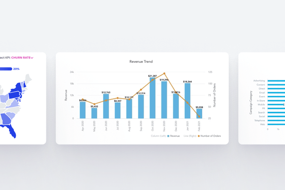
A relationship or correlation between two metrics can also be shown over time. For example, the number of visitors and the revenue of the e-commerce website. In that case, a combo chart consisting of a column chart and the line chart comes into play. With two independent Y axes, it is possible to show the relationship even between metrics with vastly different scales.

Combo chart is the best option when the two comparable metrics have very different scales.
Plot geographical data on the map
Whenever you need to display geographical data, it’s kind of obvious to put them on a map. For example:
- Distribution of customers across states
- Number of people living in the cities
- Revenue per region
The location is a generally understood concept, and a map provides a direct connection to the data. On the other hand, having geographical data does not mean the map is the best option. For example, if you need to display a relationship between two different metrics for a single geographic location, e.g. the number of stores in a state and the average sales for that state, it’s better to go back to scatter of bubble charts than try to cram too much information on the map.
There are two main ways to display data on a map. To fill the area (e.g. a state) or to use a pushpin or other shape over the target area. In most cases, I would suggest using the pushpin on the map over the filled areas (a filled map is sometimes called a choropleth). Why? Because the size is psychologically perceived as a much stronger indicator than the color shade. Therefore the poorly performing large states (let’s say Alaska) will overshadow many better-performing small states (for example, Massachusetts). In other words, geographic significance does not translate to data value significance.
Also be sure to use the map only as a background, the star of the show are the data points.

Map is the generally understood tool to show the location.
Show the details of many items as a good old table
Yes, although they might not be the most striking kind of visualization, tables have their place on the dashboards in some cases. The fact that you have data to show does not mean they need to be shown as a chart. Sometimes the best shape for the data is still the humble table.
The table needs to make sense in the context of the whole dashboard, though. For example, a dashboard focused on orders from the e-commerce store, showing various overviews and summary charts, and in the end, it can show all the separate orders in a table. So you can see the order details or even drill from the dashboard directly into your system to see all the details of that particular order. Other examples could be:
- Products details — product category, items sold, average price, % of revenue
- Customers details — name, email, # of orders, total revenue
- Support agents — name, position, # of assigned tickets, # of resolved tickets, CSAT
In general, if you need to list details of a group of items, the table is usually a good choice. Especially if it’s part of the dashboard, it is interactive and allows users to sort columns, drill into other dashboards, etc.
Lastly, having at least one table on the dashboards could also serve as a negotiation trick for the more stubborn stakeholders who are not willing to leave their safe and familiar space of Excel.

Table can show the more complicated data with a lot of details.
Stay boring, avoid exotic chart types
So the other day, you went on the internet and found some exciting visualization to spice things up a little on your dashboard. Something like you can find in the Xenographics zoo of data visualizations. Well, forget about it. Some of those charts might look cool on some fancy infographics but not on your typical dashboard. Again, the dashboard is about understandability. Be a little boring with the chart types on purpose. The users of your dashboards will thank you.
Summary of the key principles
We’ve explored the 99% of the most common use cases of data visualization you can come across and also the most useful chart types. The visual part of the data presentation is really important but always keep in mind that the focus should lay on following the use case and delivering the message to your audience. Adhere to the mentioned principles, and you can’t go too wrong.
- Start with the use case
- Show one big number with a KPI
- Compare values within and between groups using a bar chart, column chart, or bullet chart
- Show the composition of data utilizing a pie chart, donut chart, or treemap
- Display change over time with a line chart, area chart, or column chart
- Explain the relationship between metrics with a scatter plot, bubble chart, or combo chart
- Plot geographical data on the map
- Show the details of many items as a good old table
- Stay boring, avoid exotic chart types
Do not build exhibitions of charts. Build usable and understandable dashboards instead!
If you want to try any of the mentioned charts, you can register for the GoodData trial and play with them on your own. Or, alternatively, request a demo and we'll walk you through them.
Want to see what GoodData can do for you?
Get a guided tour and ask us about GoodData’s features, implementation, and pricing.
Request a demoFAQs about choosing the best chart type
An effective chart makes the main insight immediately clear to your audience. If viewers have to work to understand the message, it may be time to reconsider the chart type.
Complex charts can confuse viewers, slow down interpretation, and even lead to misinterpretation. Simpler designs often make insights more accessible.
The right chart highlights the most relevant patterns or relationships in the data, making it easier for decision-makers to act confidently based on accurate insights.
Consistency can improve readability, but variety can be useful when different metrics require different visual treatments. The key is to maintain clarity across all charts.
Maps are most useful when location or geography is central to the insight. If location is not critical, a different chart may present the data more effectively.
Limit unnecessary elements, use clear labels, and keep the focus on the main message. Removing non-essential data points or visual effects often improves clarity.