Interactive Data Visualization: The Only Guide You Need
5 min read | Published


Summary
From ancient maps to today’s dynamic charts, data visualization has always helped people make sense of information. Technology has turned it into an interactive experience, where a click or a swipe can reveal new layers, spark questions, and surface insights instantly. This article explores the power of interactive data visualization, showing why it matters and how it can transform the way anyone — from curious beginners to seasoned analysts — works with data.
What Is the Meaning of Interactive Data Visualization?
The main thing to remember is that, unlike static visualizations, interactive visualizations invite user participation. Whether clicking a button or adjusting a slider, users play an active role in shaping their data experience. It's all about action and reaction: your input triggers instant visual responses, empowering you to further explore and analyze the data.
Below is an example of interactive data visualization: users can filter and sort the data to meet their needs.
Interactive Data Visualizations: Key Features To Know About
Interactive visualizations typically offer a range of features designed to help users explore the data. One of the best ways to understand these features is by comparing interactive visualizations with non-interactive visualizations.
Non-interactive data visualizations include static graphs, heat maps, and various chart types, such as pie, bar, or line charts. Picture a basic chart whipped up in Excel — it's quick and easy for basic data inquiries. These visuals are best suited for simpler data stories — and are easy to share via email or print since the information is static and easy to view.
Interactive data visualizations are often used in dashboards and business intelligence (BI) reports. They are perfect for large amounts of data when you have more questions and a trend to investigate. Interactive visualizations offer a user-friendly way to dig into the data, saving you time and energy compared to sifting through endless rows of numbers in static reports.
Below we take a closer look at the features of interactive data visualizations and how these compare to non-interactive visualizations. The insights are based on Lenstore’s Healthy Lifestyle Cities Report, which contains details about inhabitants across world cities, such as level of happiness, life expectancy, hours of sunshine, and average annual working hours.
We will focus on the level of happiness and try to answer the following question: what is the level of happiness in Helsinki and how does this compare to other cities?
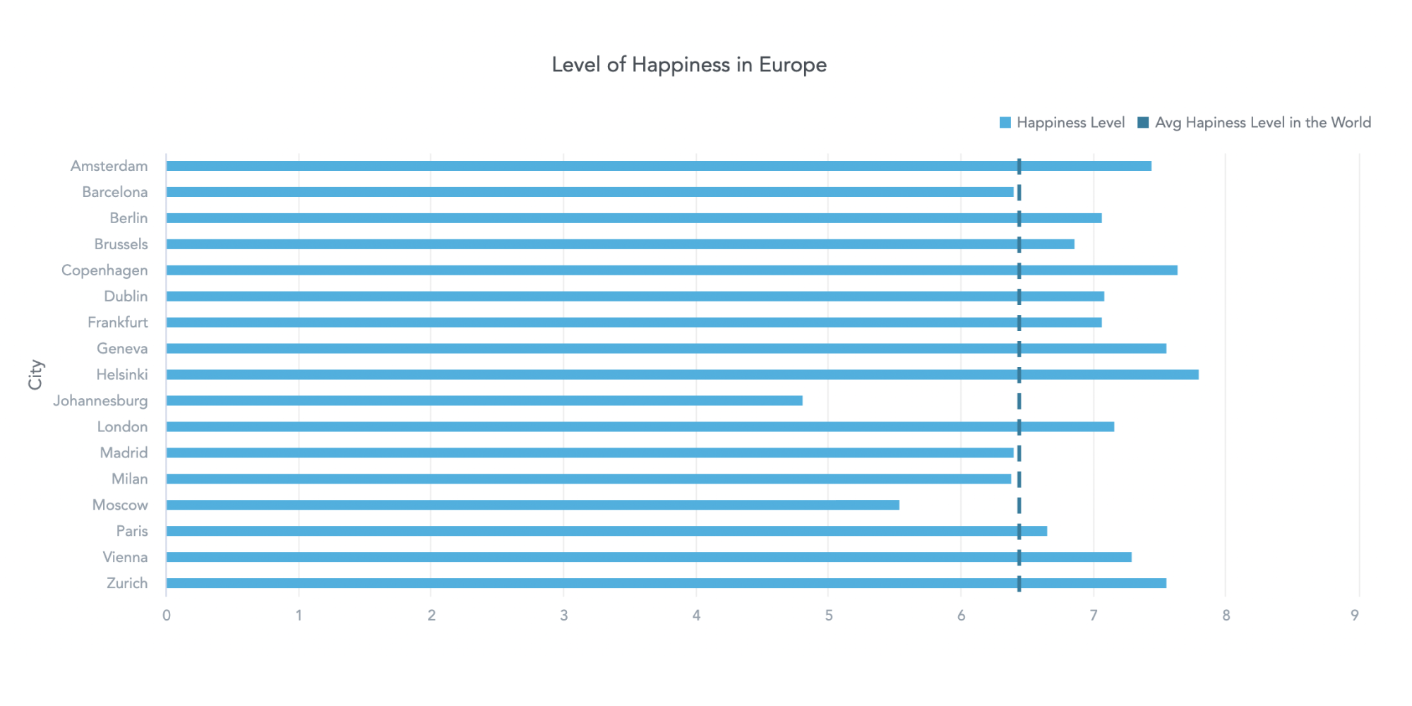
First, let’s see how the information might be presented in a non-interactive data visualization.
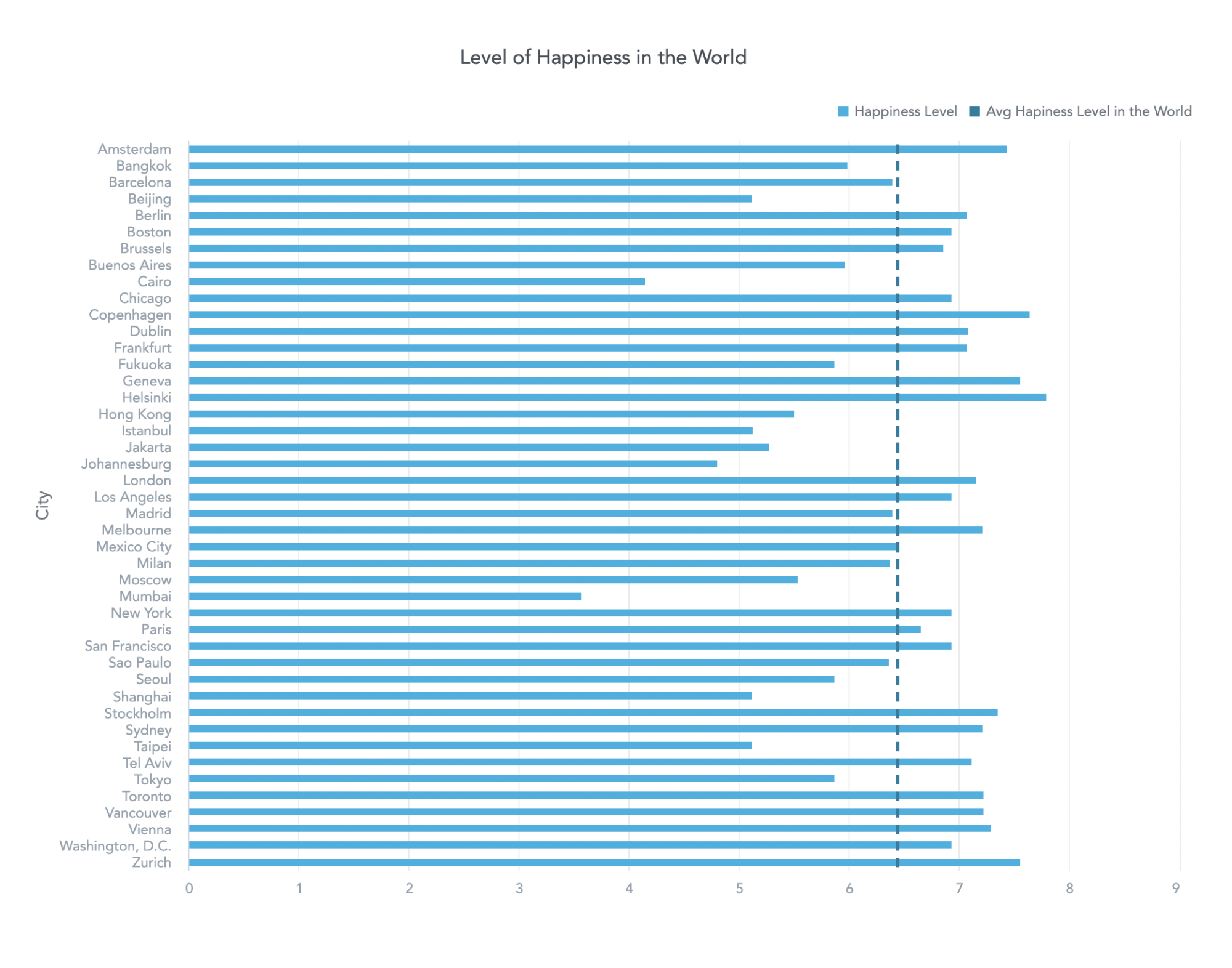
The chart shows that Helsinki's happiness levels are higher than the world average. But what causes the population to be happier than in other cities? Is there a connection between happiness level and annual average working hours? This static visualization fails to provide the necessary data, but the answer can be found in the interactive data visualization below.
Firstly, you can zoom in to see the data about Helsinki up close.
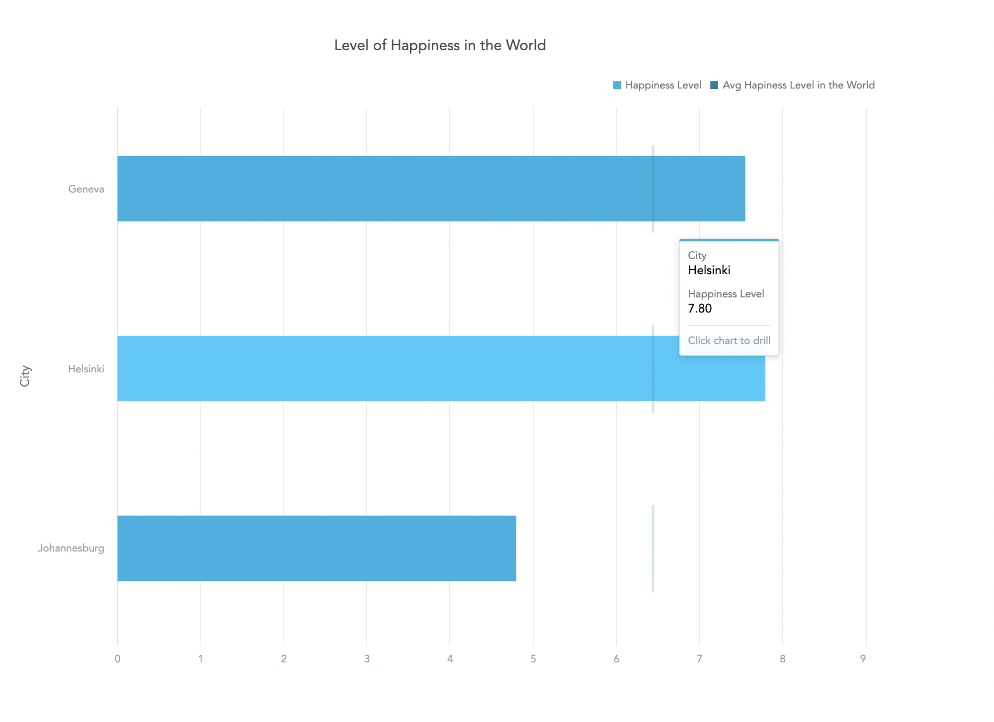
Then, you can drill into the visualization to check the annual average working hours in Helsinki — and compare these with the world average.

Drill in for additional information.
↓

View the data you drilled into.
This is just one of the ways you can slice and dice the data. Interactive visualizations offer several options to explore the data, such as filtering to compare Helsinki with other European cities only.
What Is the Advantage of Building Interactivity in Visualizations?
The many benefits of interactive visualization include:
Simplifying complex data
Humans naturally find it simpler to interpret visual data compared to numbers alone. Interactive dashboards take this a step further by helping users manage large datasets and making the data more comprehensible. Users can, for example, easily uncover cause-and-effect relationships that might have been overlooked. This enables businesses to gain valuable insights, evaluate key performance indicators (KPIs), make informed decisions, and ultimately build a data culture.
Boosting engagement and productivity
Interactive data visualizations offer concrete benefits in boosting engagement and productivity across various industries. In the realm of marketing, for instance, interactive dashboards allow teams to analyze customer behavior patterns in real time. By toggling between different metrics and segments, marketers can quickly identify trends and opportunities, leading to more targeted campaigns and higher conversion rates.
In the field of finance, interactive visualizations enable financial analysts to perform complex data analysis tasks with greater efficiency. With features like drill-down capabilities, analysts can easily navigate through vast datasets to uncover insights and anomalies. This not only saves time but also enhances accuracy in forecasting and decision-making, ultimately improving the bottom line for businesses.
Increasing Flexibility
Another benefit of interactive visualizations is that they allow users to customize their analytical processes to suit their needs. Whether it's choosing different visualization types or adjusting settings, users have the freedom to tailor their analysis workflows according to their objectives.
This level of customization enhances user satisfaction, streamlines the analysis process, and translates into tangible benefits. For instance, in supply chain management, interactive visualizations allow logistics managers to track and optimize inventory levels, adjusting parameters such as reorder points or lead times as needed. Similarly, in healthcare, interactive visualizations enable medical researchers to explore large datasets of patient records, identifying trends and patterns that could inform clinical decision-making and improve patient outcomes.
How To Create Interactive Visualizations
Creating interactive visualizations begins with selecting the right tools and techniques to effectively convey data insights. Choosing the appropriate interactive visualization solution is crucial; the best analytics software will offer a range of features for creating interactive visuals. Understanding the specific requirements of your data and audience will help in selecting the most suitable tool.
Next, you’ll need to structure and prepare the data for visualization. This involves cleaning and organizing the data to ensure accuracy and consistency. One such method is defining the data via a semantic layer, which allows end users to take advantage of predefined business-friendly metrics and easily build visualizations within a drag-and-drop interface.
Once the data is prepared, the next step is to design your interactive visualizations. Use visualization best practices to select the chart type that best represents the data and arrange it in an intuitive manner. Adding interactive elements such as filters, tooltips, and drill-down capabilities enhances user engagement and allows for deeper exploration.
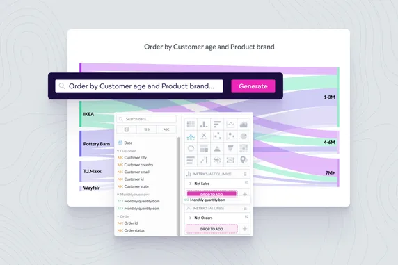
Today, the best analytics software also allows you to use AI for visualizations and dashboards. For instance, with Natural Language Querying (NLQ) you can search for information in conversational language. The NLQ server communicates directly with the semantic layer to create an insight based on your request. To demonstrate this capability, let's revisit our world happiness levels from earlier. To focus on the number of sunshine hours in the city per year, we can use NLQ to request a chart that displays the desired information.

Pull data using conversational language with NLQ.
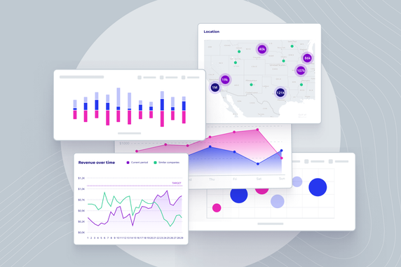
Interactive Data Visualization Examples
Whether you're tracking your fitness progress with a mobile app or checking the weather forecast, interactive visualizations have become integral to modern life. Now that you understand the meaning of interactive visualization, you'll likely begin to notice its presence all around you as well as the various features available.
The dashboard below, for example, showcases a drill-down feature, which enables users to explore intricate layers of data detail within a single visualization. This feature facilitates a deeper understanding of trends and the discovery of actionable insights.
The second example illustrates drill-into-dashboard and drill-into-visualization functionalities. The drill-into-visualization feature allows users to transition between different visualization contexts within the same dashboard, enhancing the flexibility of data exploration. Drilling into a dashboard empowers users to navigate from one dashboard to another, typically leading to more detailed analyses and comprehensive insights.
Creating the Best Interactive Visualizations
It’s no secret that creating the best interactive visualizations and dashboards requires the best tools. For this purpose, the GoodData platform is trusted by over 3.2 million users across the globe. Its combination of a robust semantic layer and intuitive drag-and-drop interface makes it the smart choice for your visualization-building needs.
For more information, check out our article on building interactive dashboards with GoodData, or request a demo to get started today.
Interactive Data Visualization FAQs
Because these tools let users explore data on their own, they help teams spot patterns, make connections, and act faster. Businesses that use them often find insights more quickly and boost engagement compared to static dashboards.
Both. Analysts gain deeper exploration tools, while non‑technical users benefit from intuitive interactions like filters and hover details that make data more accessible and meaningful.
Look for filters, drill‑down capabilities, real‑time updates, and responsive design. These features drive engagement and support quicker, more flexible decision‑making.
By turning users from passive viewers into active participants, interactive visuals help guide deeper engagement with the story behind the data. This often leads to clearer insights and better collaboration.
Yes. Studies show that interactive data tools can increase engagement, speed up discovering insights, and reduce reliance on IT—making analytics more agile and user‑driven.