Good Data Visualization Examples That Drive Engagement
3 min read | Published


Summary
This article presents eight data visualization examples that demonstrate how design choices can make insights easier to understand and more engaging. Each example focuses on a practical way to improve comprehension, such as structuring information for quick scanning, separating historical analysis from forecasts, and using space and color with intention. Together, these approaches show how visualizations can guide viewers to the key message quickly and inspire action.
Example 1: A Creative Visualization That Matches the Content
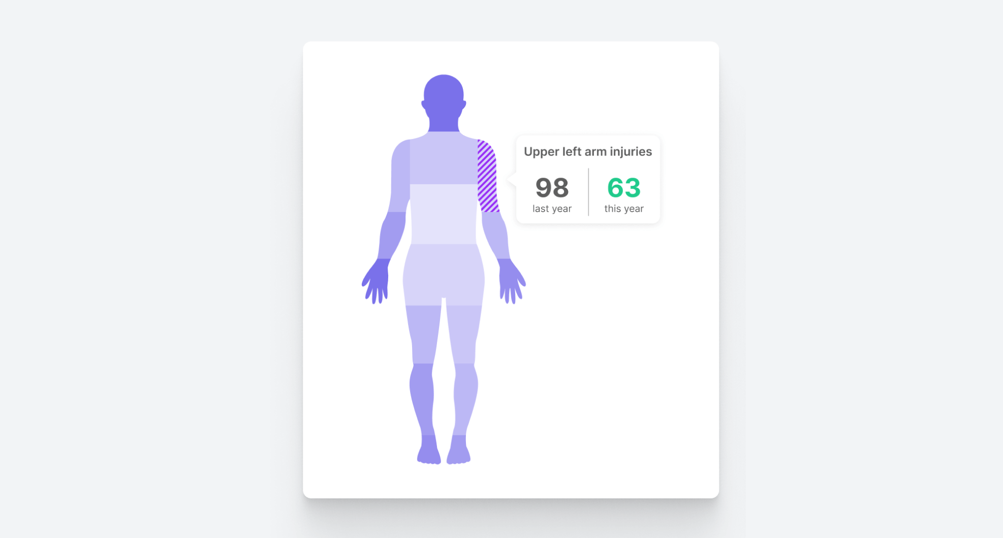
When visualizing data you needn’t be confined to traditional formats like pie charts, bar charts, or scatter plots. This cool data visualization demonstrates how thinking outside the box can result in real visual impact. By using the human body as the framework, the information becomes more engaging and memorable. One of the drawbacks of standard analytics software is its restrictive range of visualization options, which can limit your ability to present data in interesting ways. To create innovative visualizations, seek out a tool with excellent customization capabilities.
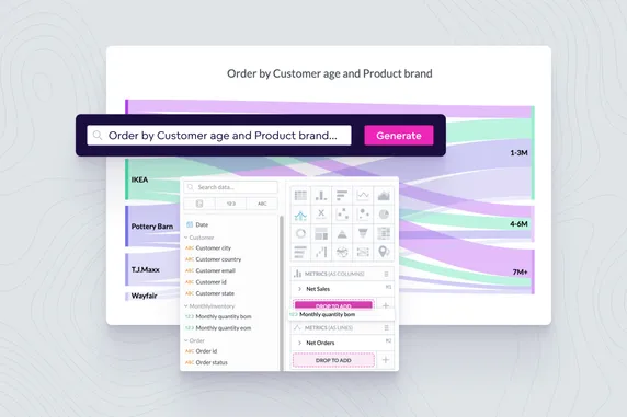
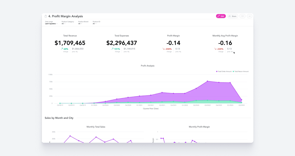
Example 2: A Visualization That Naturally Builds Understanding
Great data visualizations usually share one thing in common: a well-structured data hierarchy. In the example above, high-level overviews are positioned at the top, and more detailed, granular insights are below. This arrangement aligns with the viewer’s natural scanning pattern: they start by absorbing the broad, contextual information, and then delve into the specifics as they move downward. By following this logical sequence, users can easily navigate the narrative, progressively uncovering deeper layers of data and enhancing their overall understanding. For further tips on how to design visualizations for the viewer's eye, check out our article about data visualization best practices.
Example 3: A Visualization With Interactive Features
This example might seem simple, but visualizations needn’t be flashy to be effective. In fact, some of the best data visualization examples are elegantly straightforward, providing a clean design that invites user interaction. The visualization in the video allows users to click on specific sections of the bar chart to uncover additional information, blending simplicity with interactivity to enhance the overall experience.
Example 4: Great Use of Annotations and Callouts
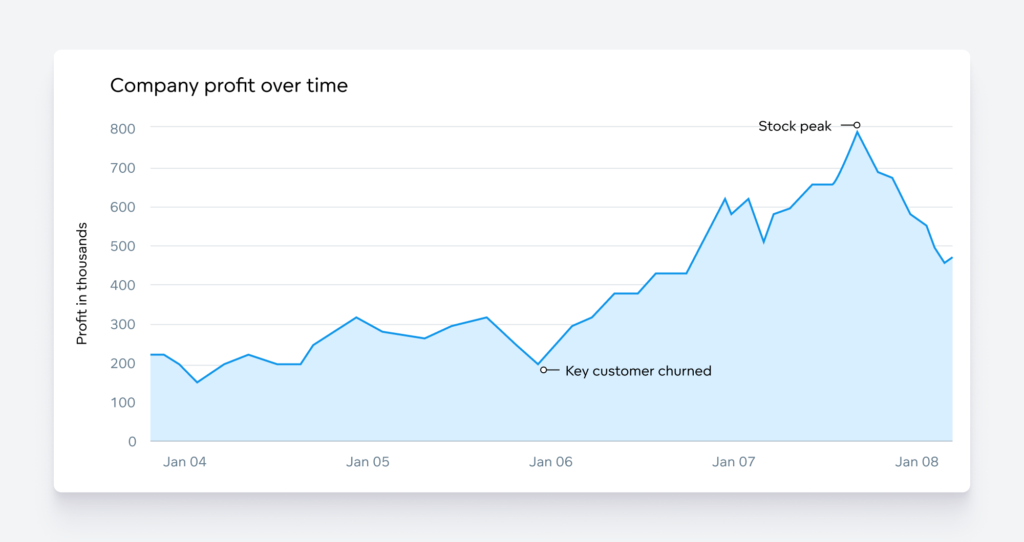
Some of the best data visualizations go beyond just presenting data – they tell a compelling story by combining visuals with thoughtfully placed annotations. In the data visualization example above, key moments are highlighted to provide crucial context that helps users interpret the data. The annotations act as guideposts, directing attention to significant trends or shifts, and explaining the underlying causes or implications.
Example 5: An Extremely Actionable Visualization
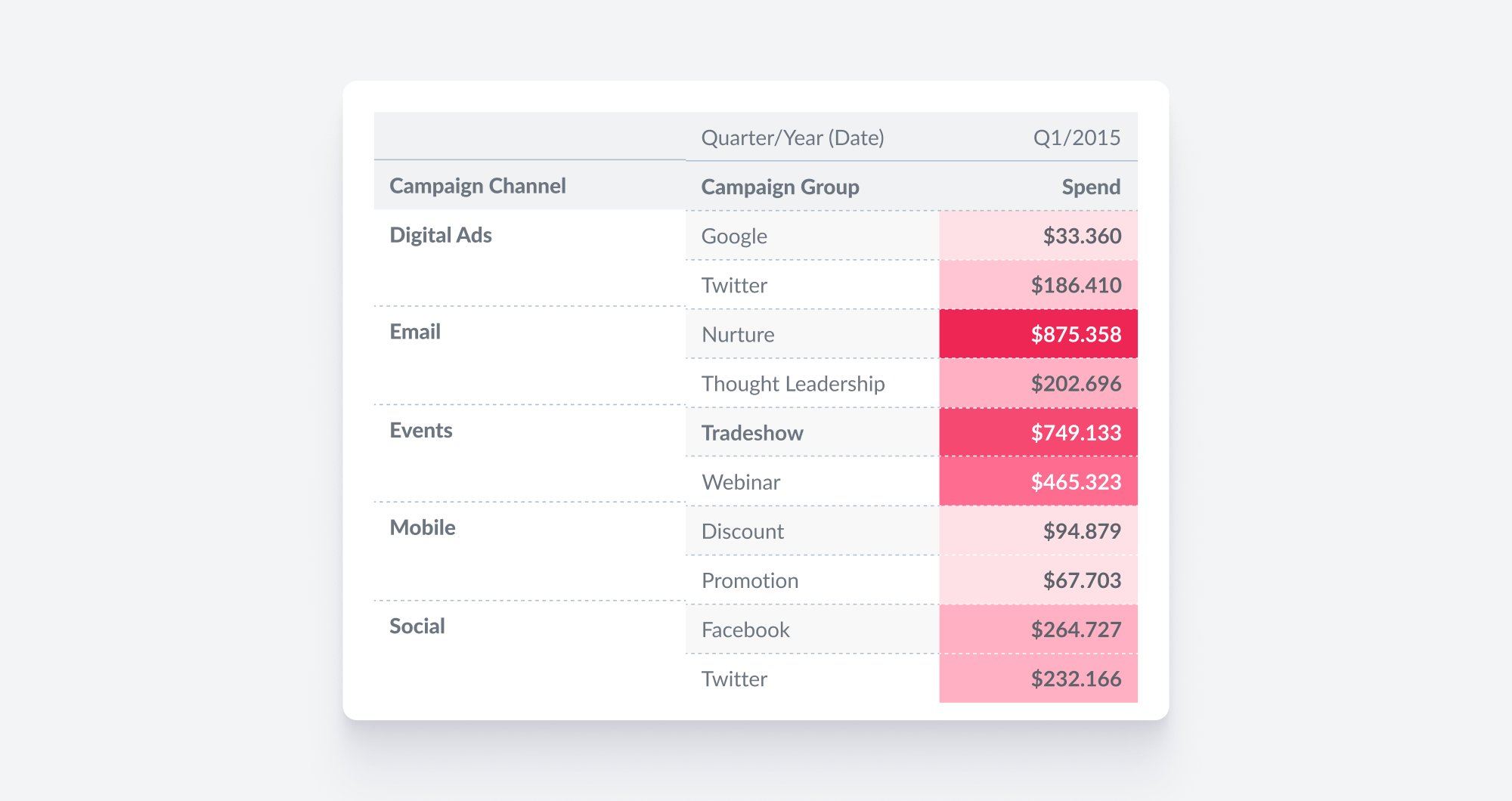
This is an interesting data visualization as the action that needs to be taken is clear at first glance: spending must be reduced on email nurturing and tradeshow events. The clarity is achieved through the use of color and simple graphic choices. Good examples of data visualization tend to guide the audience with visual cues; after all, the easier it is to understand the call to action, the more likely people are to engage with the insights and implement recommendations.
Example 6: Effective Use of Color
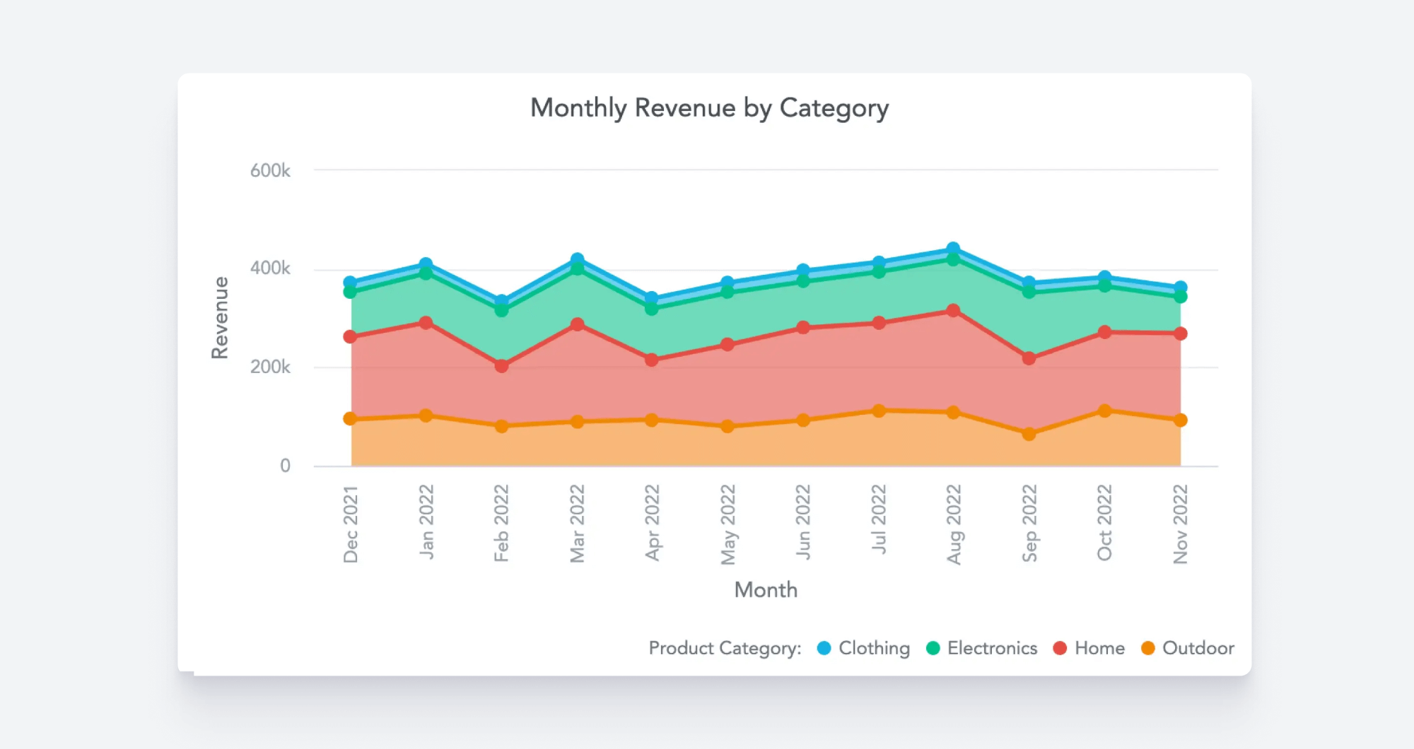
In this stacked area chart, the colors aid in the quick interpretation of the information, making it easy to differentiate between product categories and spot trends. Good analytics software will allow you to create custom palettes so that you can match the appearance of your visualizations to your brand. This palette can then be rolled out across your organization to ensure that everyone is on the same page when it comes to which colors to use. This is not merely an aesthetic choice; it ensures users don’t get distracted by odd color choices that may lead them to misinterpret the data. For more advice on how to create beautiful and impactful visuals like this one, check out 7 Tips for Good Data Visualizations.
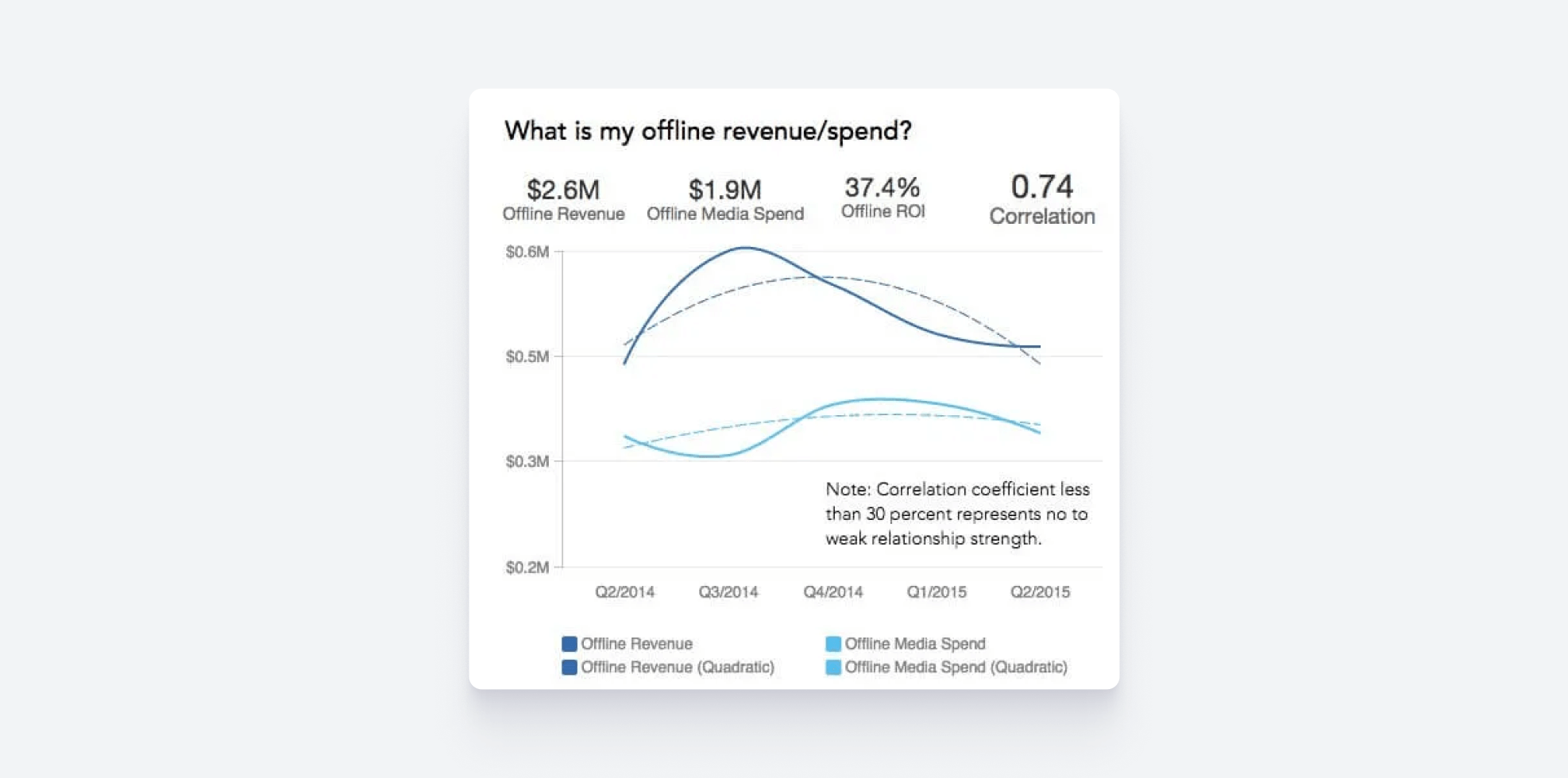
Example 7: A Clear Line Between Analysis and Prediction
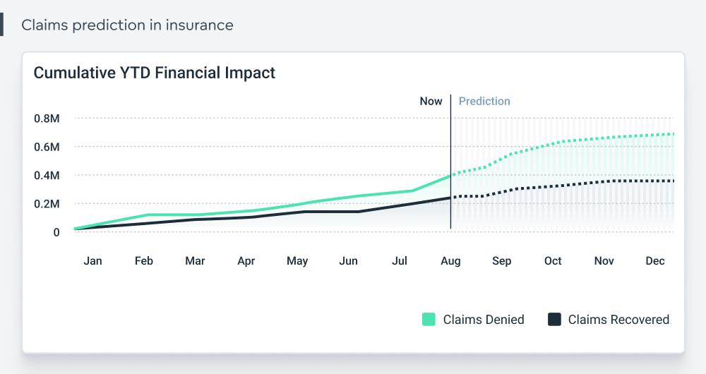
Today, some of the best data visualizations are created with the help of AI, providing advanced features such as forecasting future trends. When displaying predictive analysis, it is essential to clearly delineate where the analysis ends and prediction begins. The above data visualization example excels in this regard: the clear demarcation helps users interpret the insights and forecasts presented without unnecessary confusion.
Example 8: Using Space Wisely
By strategically incorporating minimalist design principles, this beautiful data visualization ensures that each element has room to breathe. The deliberate use of white space helps to direct the viewer's attention to the most important aspects of the data without distraction. This not only enhances readability but makes the overall experience more engaging and user-friendly. Also, notice that the chart type is perfect for the scenario presented. For more on selecting chart types, read How to Choose the Best Chart Type to Visualize Your Data.
Create the Best Data Visualizations with GoodData
Keen to create insightful, interactive, and beautiful visualizations that drive engagement and support data-driven decision-making? Request a personalized demo to discover how GoodData’s AI-fueled features and advanced customization options can help you implement an analytics infrastructure and take your visualizations to the next level.
FAQS About Creating Good Visualizations
Run a short hallway usability test. Ask a few target users to explain the main takeaway in their own words after a brief look and note where they hesitate or misinterpret the chart.
Track engagement metrics such as time on view, interactions like filter use, and downstream actions like clicks to related content or decisions made in meetings. Pair these signals with periodic user feedback.
Start with the message and choose a layout that makes that message unmistakable. Add creative elements only if they reinforce the story and never at the expense of readability.
Use color palettes that are friendly to common forms of color vision deficiency, ensure sufficient contrast, provide text labels or patterns for key values, and include concise alt text for screen readers.
Add it when users need to explore details or compare segments on demand. Avoid it when the goal is a single clear takeaway that should be visible at a glance.
Use short, targeted callouts that explain inflection points, outliers, or thresholds. Keep them close to the relevant data and limit them to the few that truly aid interpretation.