7 Crucial Tips for Building Dashboards Users Actually Love to Use
3 min read | Published

Your end users need dashboards that enable fluid decision-making. They need visualizations that draw their eye to the root of the problem, contextualize their data, and allow them to dig deeper for more answers. How can you provide efficient dashboards? We’ve collected seven key tips that will help you build dashboards users love to use.
Tip 1: Define the problem
To get to the root of the problem you’re solving for your users, start by asking your client questions — lots of them. Here are some examples to help guide your interview:
- Who are the users of the dashboards going to be?
- How do the users currently achieve their goals?
- What are the typical problems these users face?
- What are their most critical and actionable pieces of information?
- How does the product fit into their typical day?
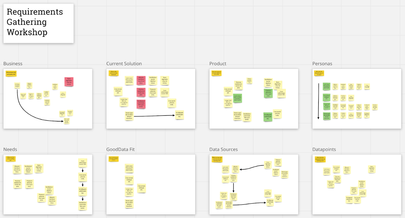
These questions will help you clearly define the problem and outline the scope of your project. Consider hosting a requirements gathering workshop to get all business and technical stakeholders (from both your side and your client’s) together and ensure that everyone’s primary needs will be met.
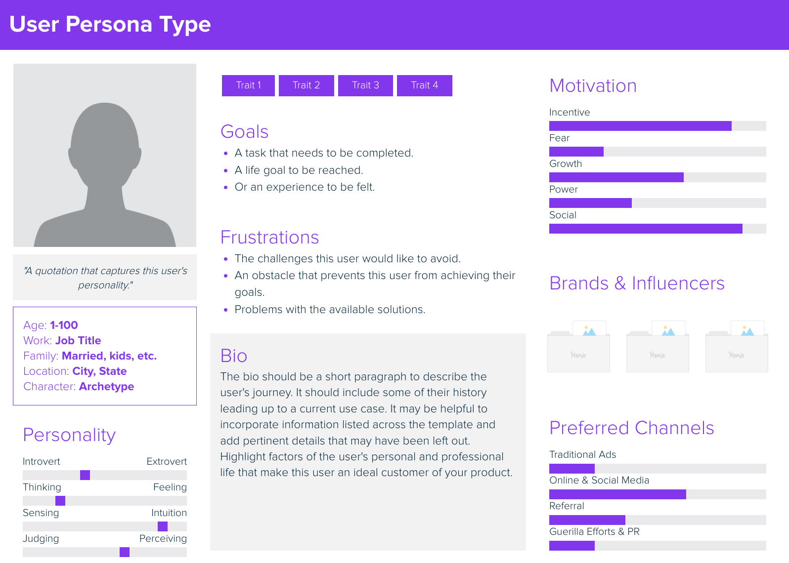
Tip 2: Know your audience
Now that you’ve consulted your stakeholders, it’s time to talk to the people who will actually be using your dashboard. Select about five participants for a research session and prepare another list of interview questions. The goal is to understand their needs and challenges, not their daily tasks. For example, your user doesn’t simply need to create a spreadsheet; they need to know their company’s sales performance. Taking this a step further, we could say that they don’t just need to know the sales performance — they need to act on those findings.
Tip 3: Define the dashboard
You’ve gathered all your notes from client and user research, and you’re starting to get an idea of what you want your dashboard to look like. It’s time to visually outline your dashboard, but how can you do this without spending valuable time on actual development?
In this stage, wireframes will be your best friend. They’re quick, cheap, and easy to make, simple to modify, and easy for everyone to understand. They allow you to visualize the future shape of your dashboard, share the draft with all involved parties, and easily respond to their feedback.
Best of all, your wireframe can be as simple or detailed as you’d like. Draw it by hand or use a tool like Figma, with its vast library of charts and UI elements.
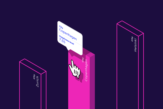
Tip 4: Focus the user’s attention
Whether you plan on building a simple or elaborate dashboard, the layout of your visualizations should focus the user’s attention on the most critical data points. Placing all data points on the same level of importance leads to confusion and de-prioritizes crucial information.
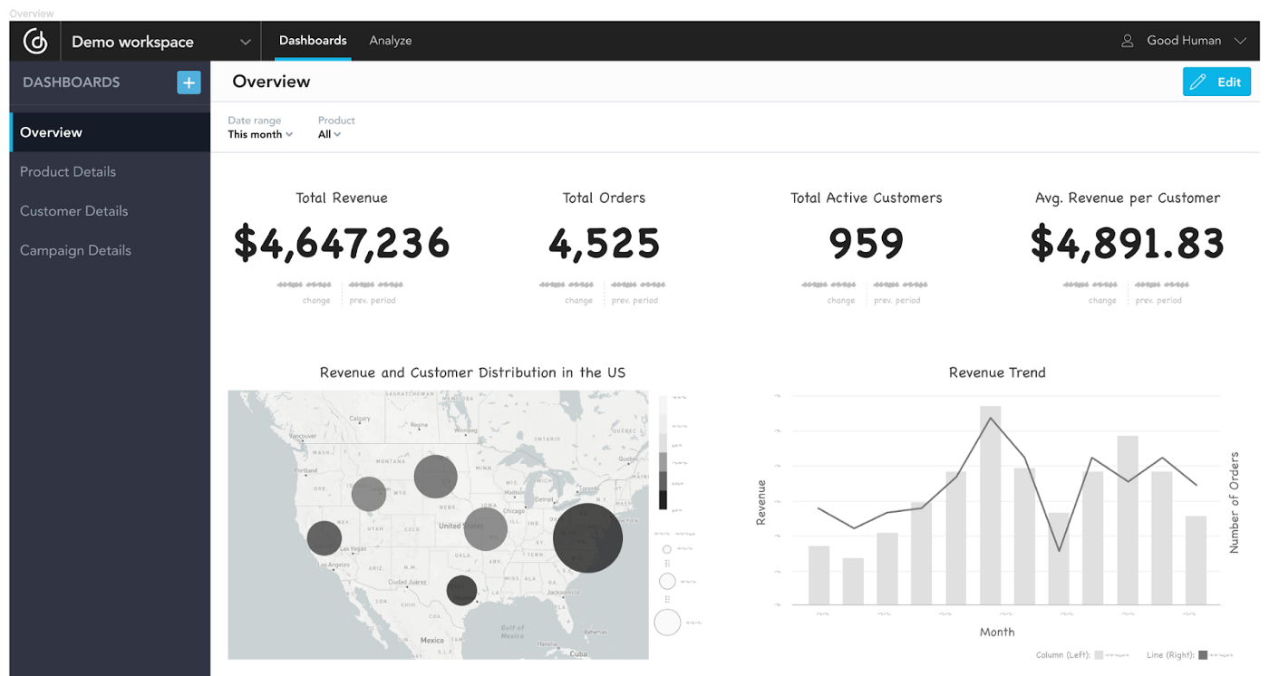
In general, aim to build an overview that starts at a high level and leads the user into more detail. A handful of critical KPIs can communicate the business performance at a glance. Place those KPIs front and center to help users understand which areas need attention, then lead them through the dashboards with drills to discover the root cause behind a specific KPI’s performance.
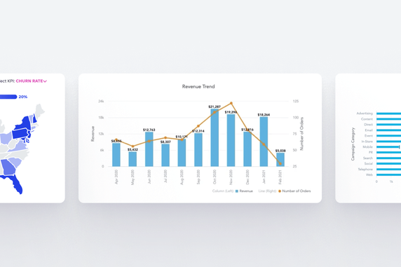
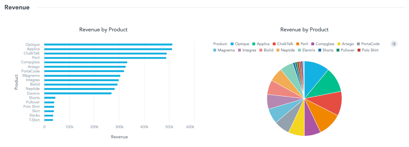
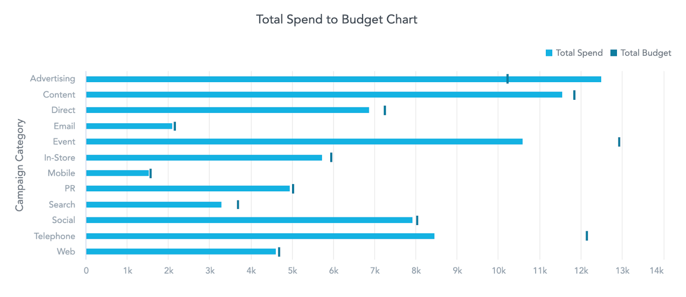
Tip 5: Choose the right visualizations
The ideal visualizations you choose for your dashboard all depends on the nature of the data and the end users’ needs. The best visualization is the one that most clearly and efficiently communicates your data. It should take the user as little time as possible to understand the meaning of the table or chart.
In that spirit, don’t avoid simple visualizations like bar or line charts just because they may not have the same “wow” factor as more unique visualizations. These simple charts are typically the easiest to understand, which is the end goal. Remove any visual clutter that doesn’t convey information (e.g., gifs or lines) and let the charts shine.
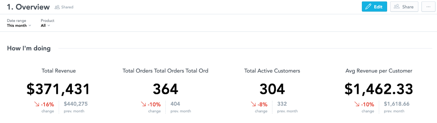
Tip 6: Put your numbers in context
Aside from choosing the right visualizations, it’s important to contextualize your data. Clearly displaying the sales volume is nice, but what is its significance? To give your end user more insight on their business performance, display another number for comparison — the sales volume of the previous period, an industry benchmark, or the quarterly goal.
Now your users not only know the exact data they’re viewing, they also understand what the data communicates — whether they’re exceeding, on track, or falling behind on expectations.
Tip 7: Integrate
Building a dashboard without integrating it into your users’ existing system is an easy way to create a product that users won’t use. Without integration, it just becomes another system outside of their workspace that they have to remember and log into. To encourage your users to utilize your dashboard and get the most out of their analytics, embed the dashboard into their current system and integrate it with a single sign-on so it’s easily accessible with a single click.
Ready to get started?
Building the right dashboard for your users is all about taking the time to understand their needs and displaying their data in the most helpful way possible.
For more information on these seven steps, check out Vaclav Kocian’s original article on Medium.
Want to see what GoodData can do for you?
Get a guided tour and ask us about GoodData’s features, implementation, and pricing.
Request a demo