A Technical Overview of Using Geo Charts in GoodData
2 min read | Published

Overview:
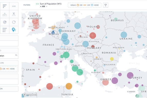
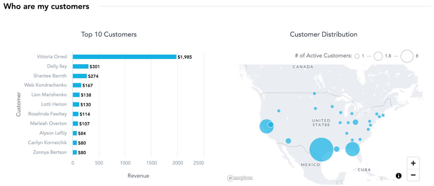
Geo Charts are one of the many useful Insights offered in the GoodData Analytical Designer. Through the use of latitude/longitude Geo Pushpins, users are able to aggregate numeric fields around different geographic locations. Following up on our previous Geo Charts blog post, this article brings you a technical walk-through of how to set up a Geo Chart visualization on the GoodData platform.
Data Pipeline (LDM/ETL) Steps:
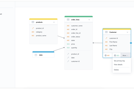
1. Set up your Logical Data Model (LDM)
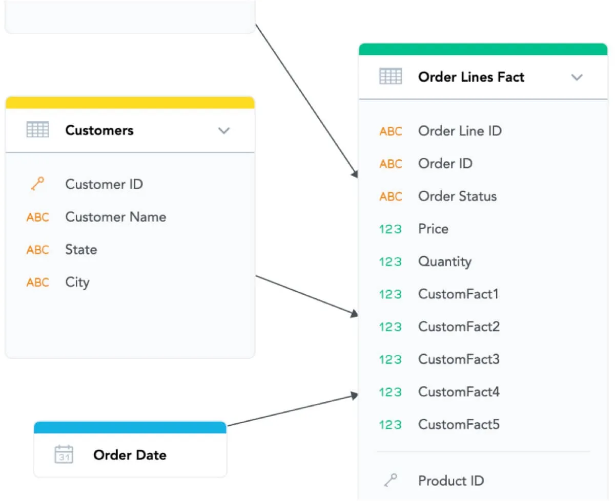
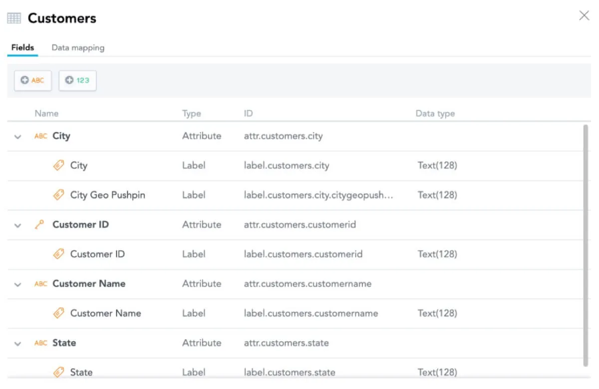
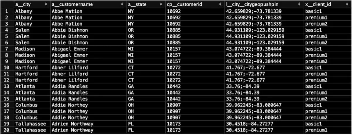
To create your Geo Chart, you will need both a geographic attribute field (for ex: City, Region, or Country) and a corresponding latitude/longitude Geo Pushpin label field. These fields could be located in an Attribute table or a Fact table in your LDM. In this example, the Geo Chart fields are located in an Attribute table called Customers. The geographic attribute field is a__city and the Geo Pushpin label field is called l__city__citygeopushpin.
2. Format data correctly in your data warehouse
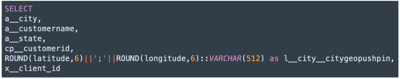
Next, format the data in the output stage of your data warehouse to match the structure of your GoodData LDM. The Select statement below matches the Customers table in this example LDM. The latitude/longitude Geo Pushpin should have a Varchar data type, and should be a concatenation of the latitude and longitude fields rounded to 6 decimal places and separated by a semicolon.
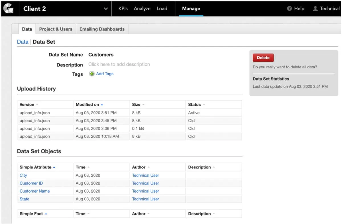
3. Load data into your workspace
Load data into your GoodData workspace using the Automated Data Distribution (ADD) tool. In your workspace, click on the Manage tab, and then click on Data Integration Console on the left side of the screen. From there, you can deploy an ADD process to load data into the workspace.
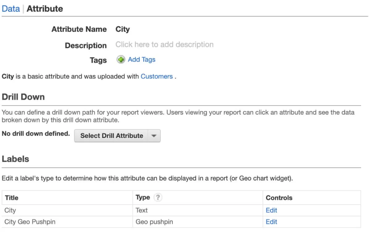
4. Change the label type of the Geo Pushpin field
In order for your Geo Chart to display correctly, you must first change the label type of the Geo Pushpin field. In your workspace, click on the Manage tab, and then click on the dataset that contains your Geo fields. In this example, the dataset containing the Geo fields is Customers. Next, click on the geographic attribute field you selected. In this example, the geographic attribute field is City. From there, you can change the label type of the City Geo Pushpin label from Text to Geo Pushpin.
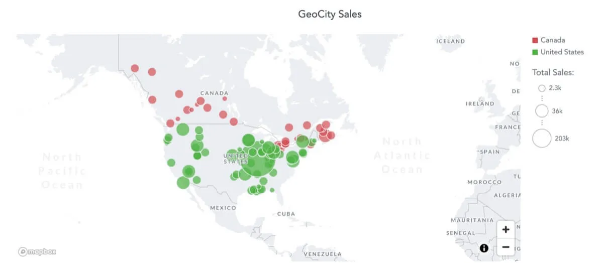
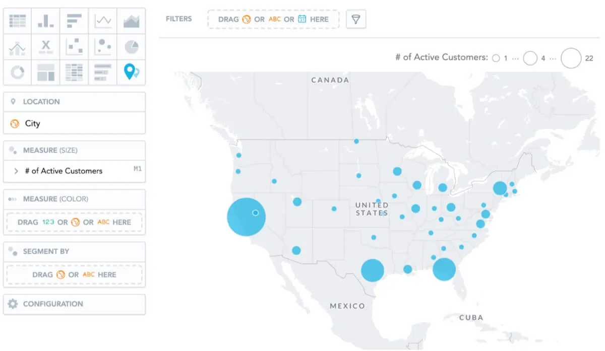
5. Create your Geo Chart visualization
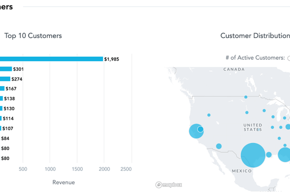
Now, it’s time to create your Geo Chart visualization. Go to the Analyze tab and select Geo Chart (pushpins) as your Insight type. Drag your geographic attribute (in this example, it is City) into the Location section. Then, you can drag 1-2 Measures into the Measures sections to complete your visualization. Save your Insight so that it can be placed on a KPI Dashboard with other visualizations. You are now done creating your Geo Chart!
Helpful Tips
- The GoodData platform has the ability to assign 2 different labels to a single attribute: primary and secondary labels. In this example, you could instead assign a different field like Customer Name as the primary label for the City attribute, and make the Geo Pushpin the secondary label. The resulting Insight will correctly display the City location on the map, but will also include hover-over tooltips for Customer Name.
Do you want to try it on your own? Register for our free trial and start building insights for your teams or your customers today!
Want to see what GoodData can do for you?
Get a guided tour and ask us about GoodData’s features, implementation, and pricing.
Request a demo