Using Geo Charts To Gain Geographical Data Insights
2 min read | Published

Getting the most out of data analytics means driving the whole workforce to adopt and use it in the most effective way. This means providing the most useful insights to the users that need them, in a straightforward way.
With this in mind, our engineers have been hard at work creating new and improved visualization options within the GoodData Analytical Designer, to give you even more data insights. One such visualization tool is that of Geo charts, or pushpins, giving users another tool with which to view the relevant data specific to their needs.
What does it do and why do I need it?
Geo charts, or pushpins, are one of several insight types within the Analytical Designer. They give you the ability to see your data based on geographic location, letting you filter via specific parameters like, for example, population size.
This new visualization option is especially useful for organizations with multiple locations, particularly for those looking to expand into new territories.
Let’s imagine a US e-commerce platform looking to expand overseas into a new continent, for example, Europe. A key part of their expansion would include searching for an optimal location to establish their major continental distribution hub. This task would likely fall into the hands of a Logistics Manager.
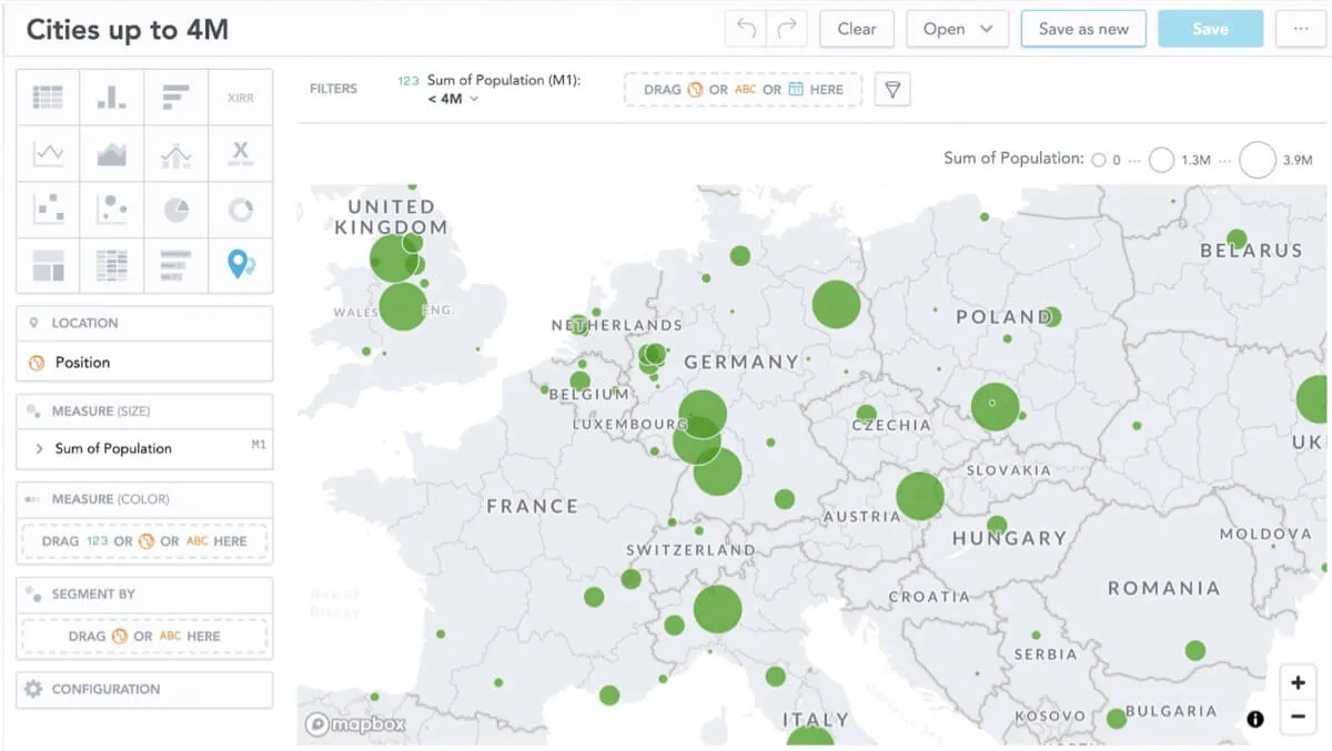
By using the Geo chart visualization tool the Logistics Manager is able to first narrow down their search to the organization's target geographical market, i.e. Europe. This can then be established as the default viewport when returning to this insight.
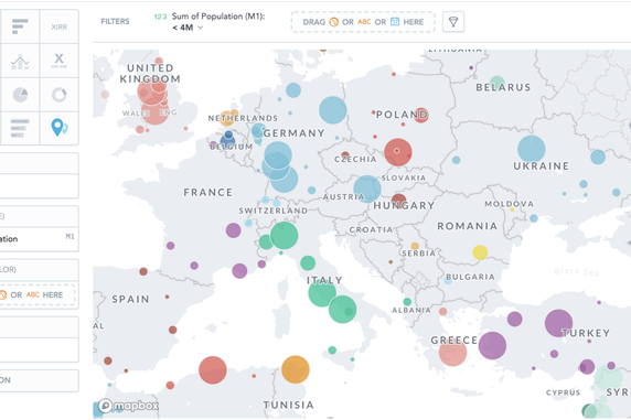
They may then decide to focus on more centrally located European countries, with cities of more than 1 Million inhabitants. The visualization tool gives them the ability to view by dot size, thus giving them a quick way to determine the largest cities in their region of interest.
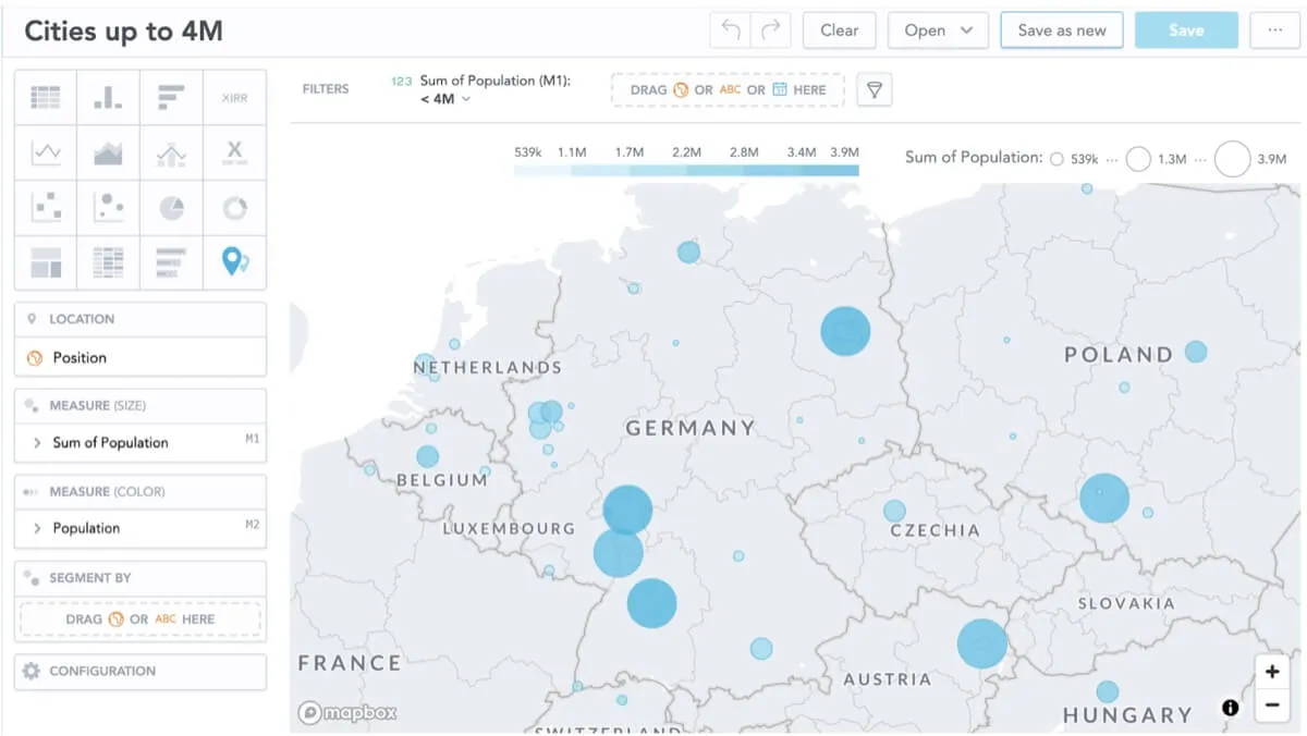
A further means of displaying cities of differing population sizes is via color — darker shades representing more highly populated locations.
Finally, in order to quickly differentiate between different neighboring countries and their most populous cities, the Geo chart visualization tool lets you segment by color.
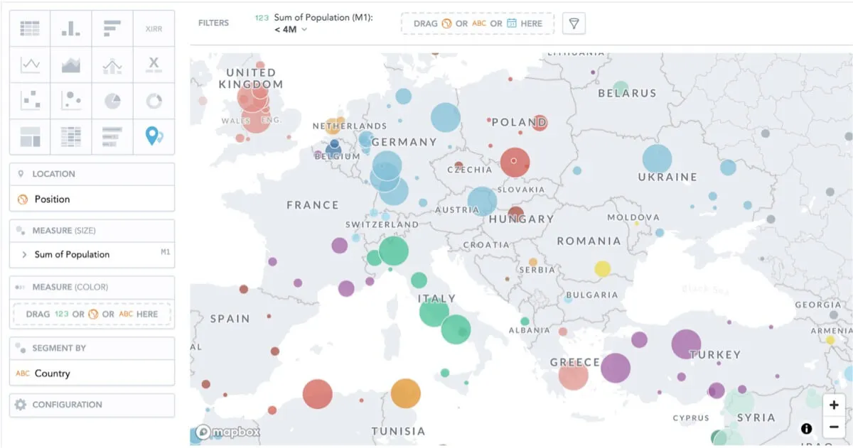
While the organization will likely have more criteria to base their final choice of distribution hub location, as you can see, the geo charts allow them to quickly and effectively shortlist a handful of locations before carrying out more in-depth data lead research.
Experience GoodData in Action
Discover how our platform brings data, analytics, and AI together — through interactive product walkthroughs.
Explore product tours