Elevate Your Data Story I: Rich Text in Dashboard
6 min read | Published

Why Does Your Dashboard Deserve a Makeover?
In the realm of data visualization, there's a well-known saying that a picture is worth a thousand words, and so is data. But what if those thousand words could be distilled into a few carefully chosen ones to amplify the story your data is aiming to tell?
In the world of dashboards, where every pixel is precious real estate, the quest to condense the essence of vast datasets into a single screen often leaves us with dense layouts full of nothing but charts and numbers. It's easy to forget that sometimes, inserting a splash of rich context can transform this complex mosaic into a compelling narrative, enhancing not just the readability but the very understanding of the dashboard for its users.
The Basics of Markdown: A Quick and Fun Primer
Enter the unassuming hero of our story: markdown. With its simple syntax and powerful capabilities, markdown is about to turn your dashboard from a mere collection of graphs into an engaging, informative storybook. Let's embark on a journey to explore how having fun with markdown on your dashboard can elevate your data storytelling to new heights.
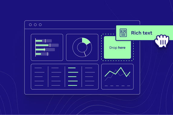
All this is available as a Rich Text widget, which gives you control over where in your dashboard the content should be displayed.

What can you do with this new feature?
GoodData currently supports the basic markdown syntax, also known as CommonMark. In the future, we will expand the supported syntax to give our dashboard builders even more control, but even with this core functionality, you can introduce a few significant improvements to your dashboards.
You can add more text to your dashboards with paragraphs and headings (multiple levels). This was already available in GoodData before the introduction of the Rich Text widget, but placing your text into a widget can give you more flexibility in its placement.
You can also format parts of text using bold, italic, or underscore. This is an intuitive way to highlight information that helps users quickly find the details they need. You can even format entire paragraphs using block quotes or code blocks. Code blocks can describe any MAQL query that calculates an important metric that you want to communicate back to dashboard users.
Another useful feature is to use the horizontal line as a divider. This can be especially useful when you have a longer dashboard or a dashboard that uses a more complex layout.
Last but not least, you can use markdown syntax to embed images, turn text into hyperlinks, or include lists or bullet points, giving you a lot of options to structure your information in a way that is useful to your overall storytelling approach.
You can read the details about each of the syntax options in the public documentation.
Transforming Data into Stories: The Power of Rich Text
Now, let's look at a practical example.
I will attempt to improve the readability of the following dashboard. Using this dataset, we've built some insights looking into what books are usually rated among the top 100 books over the past 40 years. Already at first glance, you will notice that it's impossible to derive some key findings without really zooming into the details.

So let's see what we can do to improve it.
Step 1: Start with context
It's good practice to provide visual clues to help users understand the data immediately. We can add the Goodreads logo together with a short description all the way to the top. Without losing too much space, we can provide quick context for the rest of the dashboard.
Since basic markdown language doesn't allow many formatting options, I have entered two text widgets next to each other: one with the logo and one with a short description and a link to the Goodreads site.

Step 2: Highlight key findings
There are many ways to approach this. We could add a textual widget and describe key findings in bullet points. In my example, I opted for a different strategy. There are a lot of charts on the dashboard, so I wanted to break the flow by carefully placing a visualization representing the key findings. With this approach, I do not have to force the users to study the chart to see the top item quickly.

I used a similar approach for the "Genres" section, but this time, I also included a second widget to describe the findings. I chose this approach because the different charts provided different results, and I wanted to make sure the illustration helped not just visually but also with understanding.
In the case of specific books, the image of the book is quite self-explanatory. Here, I felt like more context is required. Especially since comic books and fantasy have a similar visualization, I felt a brief description could help clarify the context.

Admittedly, this approach has some limits with the current implementation. The rich text widget, in its current form, doesn't allow you to use dynamic values. This is not needed for this dashboard, which isn't likely to receive new data very often. In other real-world use cases, however, this may not be the case.
With image URLs stored in the database, replacing the values dynamically based on the current execution results would further reduce the need to maintain the rich content while still being able to show relevant information. We will surely add this option in future releases.
Step 3: Summary or useful information
It's possible that you want to add some information about your dashboard. I believe it's best to do that at the end. In my example, I wanted to add information about the dataset, an overview of rich text features I used for this particular dashboard, and lastly, an explanation for the metric I used for selecting the top-scoring genres, as it includes a condition that is not communicated anywhere else.
A Rich Text widget is also helpful here so that I can structure all this information in a very concise way.

Tips and Tricks: Markdown Mastery for Dashboard Wizards
In this section, I would like to mention a few tips to ensure your rich content is integrated well into your dashboard.
Tip 1: Maintain simplicity and consistency
Adding rich text can introduce more colors and design elements (fonts, images, or iconography). You should always strive to align these visual elements with the rest of the dashboard and keep them to a reasonable minimum. You should also use images sparingly and make sure they do not overpower the valuable information that is included in the data visualizations. Don't forget that the goal of rich content is to enrich the user experience, not to overpower it.
If your dashboard is embedded in a parent application, this is another design context you should keep in mind when adding rich content to your dashboards.
Tip 2: Optimize image sizes and formats
Dashboard performance is another carefully maintained outcome. When inserting rich content and visuals, it's important to keep this aspect in mind, especially if your dashboard is intended for smart devices or distributed to regions with generally poorer network connections.
Tip 3: Less is more
If what's written above is not clear, you should use images and rich text formatting only when they deliver the desired value to the reader. It's very easy to go overboard, and the result is the exact opposite of the intended state—a more chaotic dashboard that makes it more difficult to explore.
Conclusion: Your Dashboard, Your Story
All in all, the rich text widget is a great addition to your data storytelling toolbox. Together with theming/styling and responsive design, you can build and structure powerful dashboards that are easy to read and quick to scan through to get valuable insights as quickly as possible.
Below, you can compare the before-and-after states of the sample dashboard. While I had to compromise a bit on the real estate, the improved readability and extra context for the dashboard readers more than make up for it.

Markdown, being an easily approachable syntax, offers an easy learning curve while providing lots of opportunities for what you can achieve with a single widget.
Please also note that this article should be the first in a short series describing some new storytelling features we are introducing to the GoodData Cloud platform to give dashboard builders more flexibility. If you are interested in learning more, make sure to follow our blog or the GoodData Developer medium channel.
Last but not least, we would be very happy to learn about your experience with this feature. Please share your improved dashboard or your lessons learned with the rest of the community in our Slack channel.