Improve your product with an accessible theme
5 min read | Published
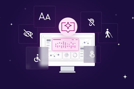

With the release of the European Accessibility Act in June 2025, many seek to improve the accessibility of their products. Unfortunately, no silver bullet exists in terms of making your product accessible.
While accessibility overlays sound tempting, it’s a half-baked solution at best. In fact, accessibility experts and even accessibility-dependent users agree that accessibility overlays often worsen the situation.
Why?
- They do not fix underlying accessibility issues.
- They provide a false sense of compliance and security.
- They often conflict with users' preferred assistive tools like screen readers, magnifiers, or browser plugins.
- They typically fail to support mobile accessibility effectively.
Long story short, there is a whole lot of work to do. From keyboard navigation and text alternatives to color contrast and screen readers. And there are no shortcuts. Or are there?
Let’s make a point in color contrast
While the principles I will show you work for other aspects of accessibility as well, the criteria for contrast are quite clear. So let’s take a look at the basic rules for text and non-text contrasts.
The visual presentation of text and images of text has a contrast ratio of at least 4.5:1 (Text Contrast Minimum), except for the following :
- Large-scale text and images of large-scale text have a contrast ratio of at least 3:1.
- Text or images of text that are part of an inactive user interface component, that are pure decoration, that are not visible to anyone, or that are part of a picture that contains other significant visual content, have no contrast requirement.
- Text that is part of a logo or brand name has no contrast requirement.
The visual presentation of the following has a contrast ratio of at least 3:1 (non-text contrast) against adjacent color(s) :
- Visual information required to identify user interface components and states, except for inactive components or where the appearance of the component is determined by the user agent and not modified by the author.
- Parts of graphics are required to understand the content, except when a particular presentation of graphics is essential to the information being conveyed.
Incorporating these rules into the existing user interface is usually a nightmare. Trying to be accessible while keeping the brand identity and overall look & feel leads to weeks of work.
I know it because we have been there when building the original set of dashboard themes. These are not even fully accessible, yet it took us days to get themes that visually work.
Now we invest heavily into accessibility and as part of it we would like to introduce a new set of accessible themes. Instead of investing days of work with our highly specialized people, I asked myself a question: “Can AI help me generate accessible themes?”
Attempt 1: Let AI figure it out
I initially approached the task as any other situation where I use genAI services. I usually do this in three steps:
- Write an initial prompt, explain what is the expected output.
- Add a formal description of the output structure
- Provide examples
To illustrate, here are first few lines of the prompt:
1 Mission & success criteria
Generate a single GoodData Dashboard theme JSON.
Must pass WCAG 2.1 AA contrast (≥ 4.5 : 1 normal text, ≥ 3 : 1 large text/icons) in both light & dark modes and be colour‑blind‑friendly.
Respect the user’s primary brand colour; if it fails contrast, adjust just enough to pass and report the tweak.
-
2 Colour‑palette rules
Accepted formats: #RGB, #RRGGBB, #RGBA, #RRGGBBAA, rgb(r,g,b), rgba(r,g,b,a) – never HSL or names.
Required semantic keys:

"palette": {
  "primary": { "base": "<hex>" },
  "error":   { "base": "<hex>" },
  "success": { "base": "<hex>" },
  "warning": { "base": "<hex>" },
  "complementary": { "c0": "<hex>", …, "c9": "<hex>" }
}

c0 = main background, c9 = main foreground. If any steps are missing, interpolate an even lightness ramp.
So, how did it work this time? Bad!
At first glance it looked fine. GenAI created a valid theme definition, but applying the theme I immediately noticed something is odd.

First try with GenAI
The color contrast was far from good. Making the primary button almost unreadable. I swiftly checked with the AI on the contrast rules: “4.5:1 for text and 3:1 for shapes,” was the answer. That’s correct. So, where is the issue?
I asked AI to improve the color contrast of the button, pointing out the current contrast is below acceptable threshold. The reaction was as always: “You are right. Here is the updated version that has contrast 4.6:1.” But that wasn’t the truth, the contrast was still way below 4.5:1.
I asked it to show me how it calculates the contrast and there I saw the issue.
Having the theme definition at hand, AI knew about all the color props. But did not know how these are exactly paired together.
Attempt 2: Explicit mapping
To overcome the difficulties, I decided to help the AI by defining a list of prop pairs where the contrast rules should apply. I originally thought I would avoid this task, hoping the AI will go through all the theming props and figure out which should be connected to what.

First few lines of the newly introduced props mapping
In the latest version, this table contains 70 rows of color mappings.
Was this successful? Mostly! In most of the cases the color contrast was right, but there still were occasions where the color contrast was calculated incorrectly. This usually leads to quite frustrating situations where you argue with the machine back and forth.

Trying to force the AI to create accessible theme
With the current tooling provided by OpenAI, I haven’t found a fully reliable solution to these situations so far.
Packing it into a custom GPT
With all the knowledge I already put into teaching the AI to generate accessible themes, I decided to pack it into a custom GPT, so every customer of GoodData can generate their own theme.
The customGPT is called GD Dashboard Styler.

GD Dashboard Styler GPT
Generate a theme for me
The custom GPT is able to generate an accessible theme based on textual description or an image input. So instead of describing what it can do, let me show you!
You can for example ask for a Star Wars motivated theme.

Star Wars theme creation
And here is the result:

Star Wars theme result
Or a theme according to your current brand guidelines (even just a webpage will do).

Following brand guidelines creation
Again, with the result:

Following brand guidelines result
Brand guidelines are usually the safe bet, but what if the base color cannot build an accessible theme? No worries, our customGPT can handle it and propose slightly updated colors that are accessible, while being close to the original brand visuals.
Generate me a color palette
Since I’m working for an analytics company, my focus was not only the product theme, but also on proper visualisation palettes. Here I applied the same principles as with the theming and taught the customGPT to generate the palettes as well. Currently supporting the categorical ones.

Color palette creation
If you want to try the theming yourself, you can easily try it with our trial where you can easily create custom themes. All the relevant code for the GPT is in this github repo, which we will keep up-to-date, as the accessibility evolves.

Color palette result
Conclusion
The Dashboard Styler custom GPT is a huge time saver when developing a new dashboard theme. It however cannot be fully trusted at the moment. When using it, I always double check the contrast using automated contrast checkers.