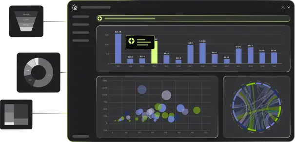


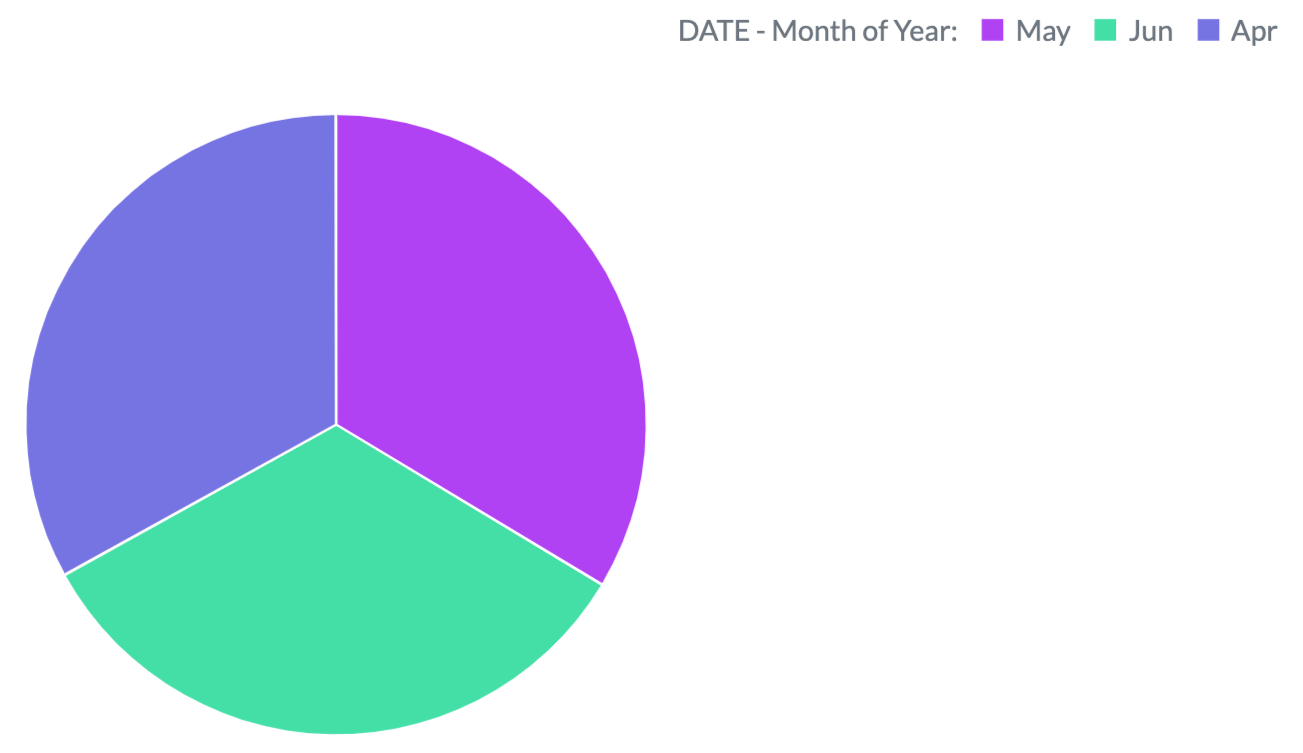
Out-of-the-box visualizations
Interactive and engaging for end users
Dynamic dashboards enable your end users to explore data from different perspectives:
- Drag and drop to change metrics, dimensions, or data visualization types from the out-of-the-box options.
- Add filters to entire dashboards or just a single visualization.
- Drill deeper into a visualization to examine the underlying data in more detail.
- Create aggregations (eg., sum, average) from pre-made metrics.
With your branding
Use dashboard theming to match your brand — fonts, colors, logos — in just a few clicks.
With live data
The freshest data at the click of a button ensures that end-users' dashboards and visualizations are always up to date.
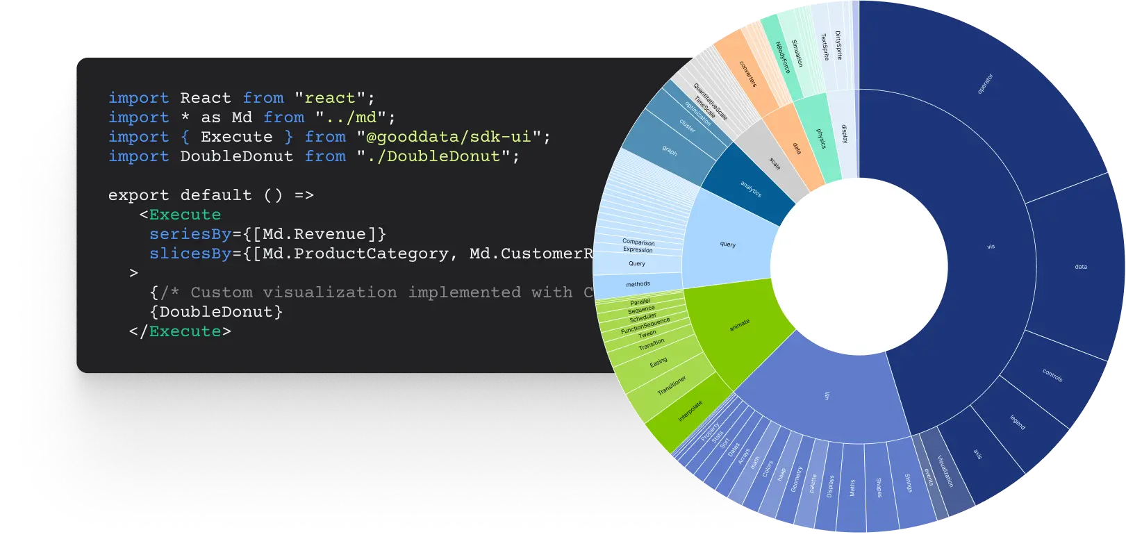
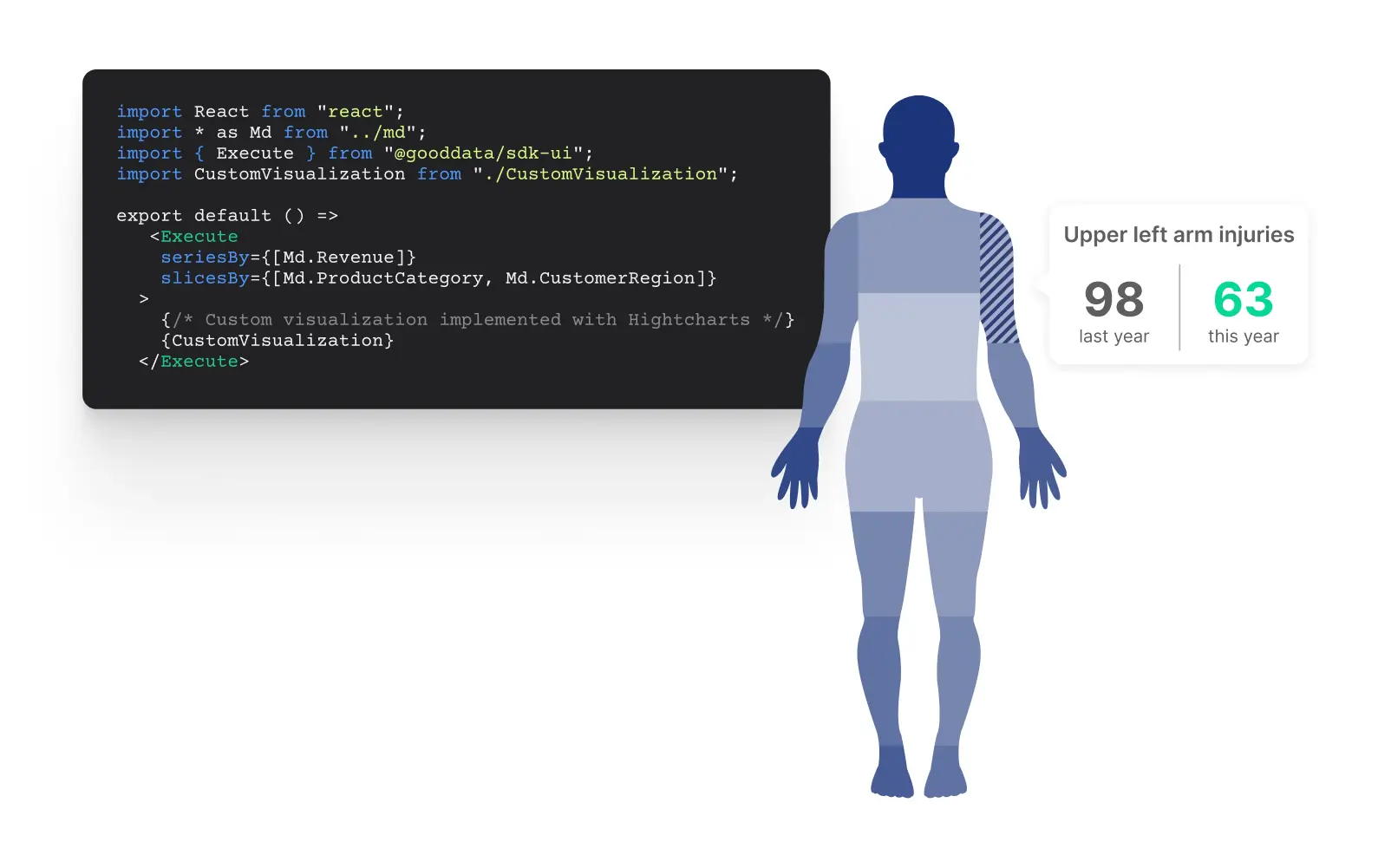
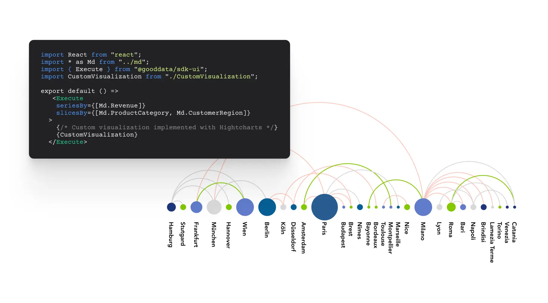
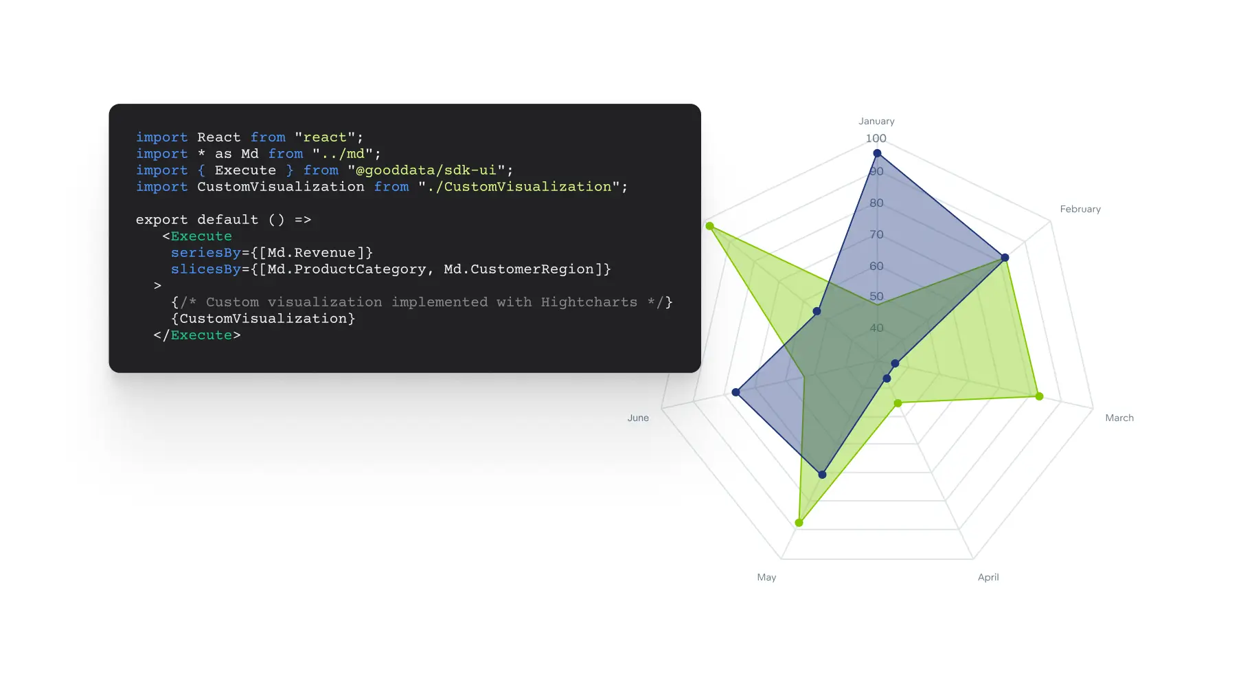
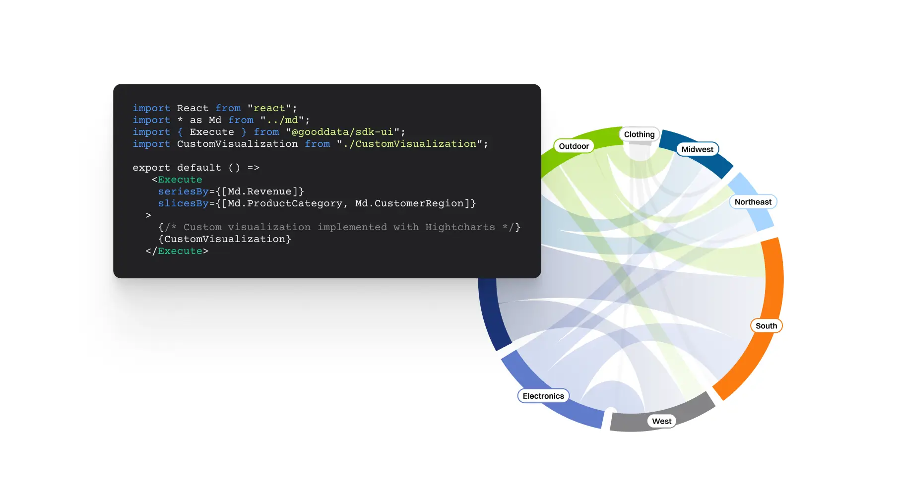
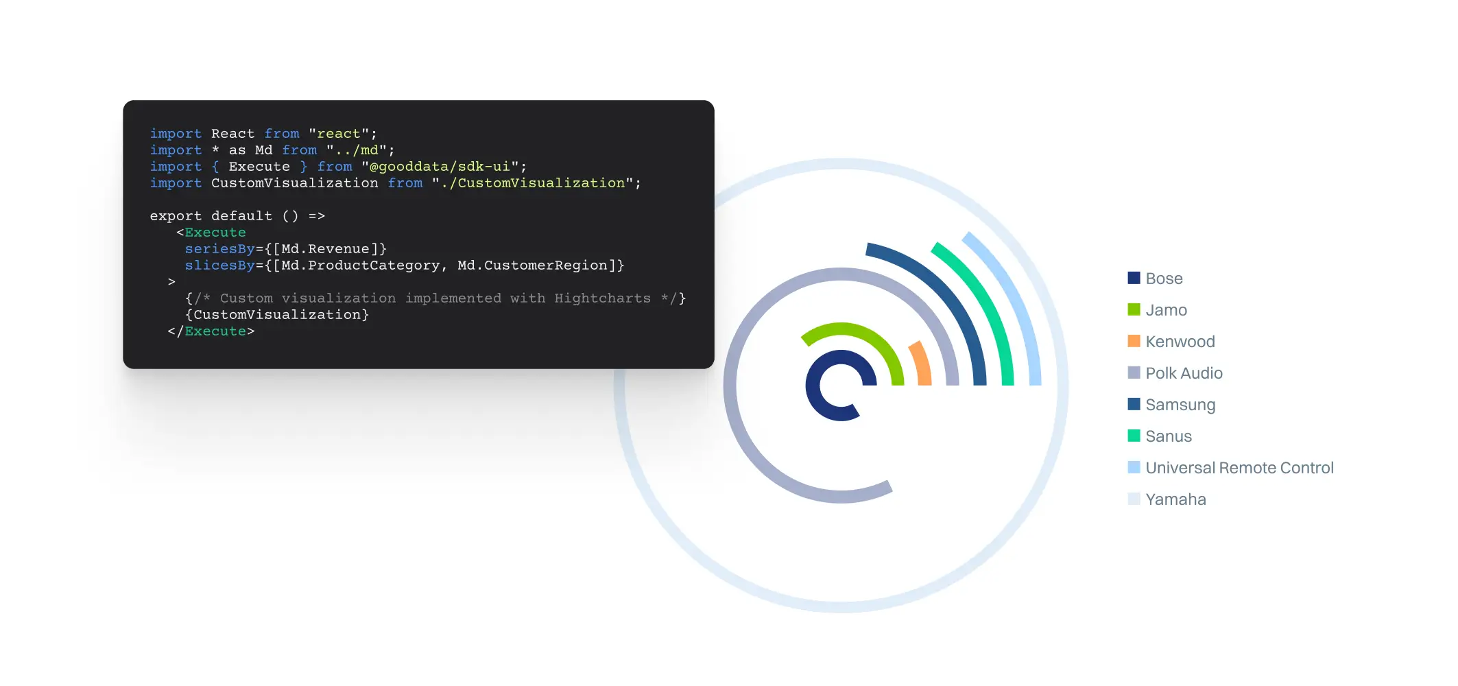
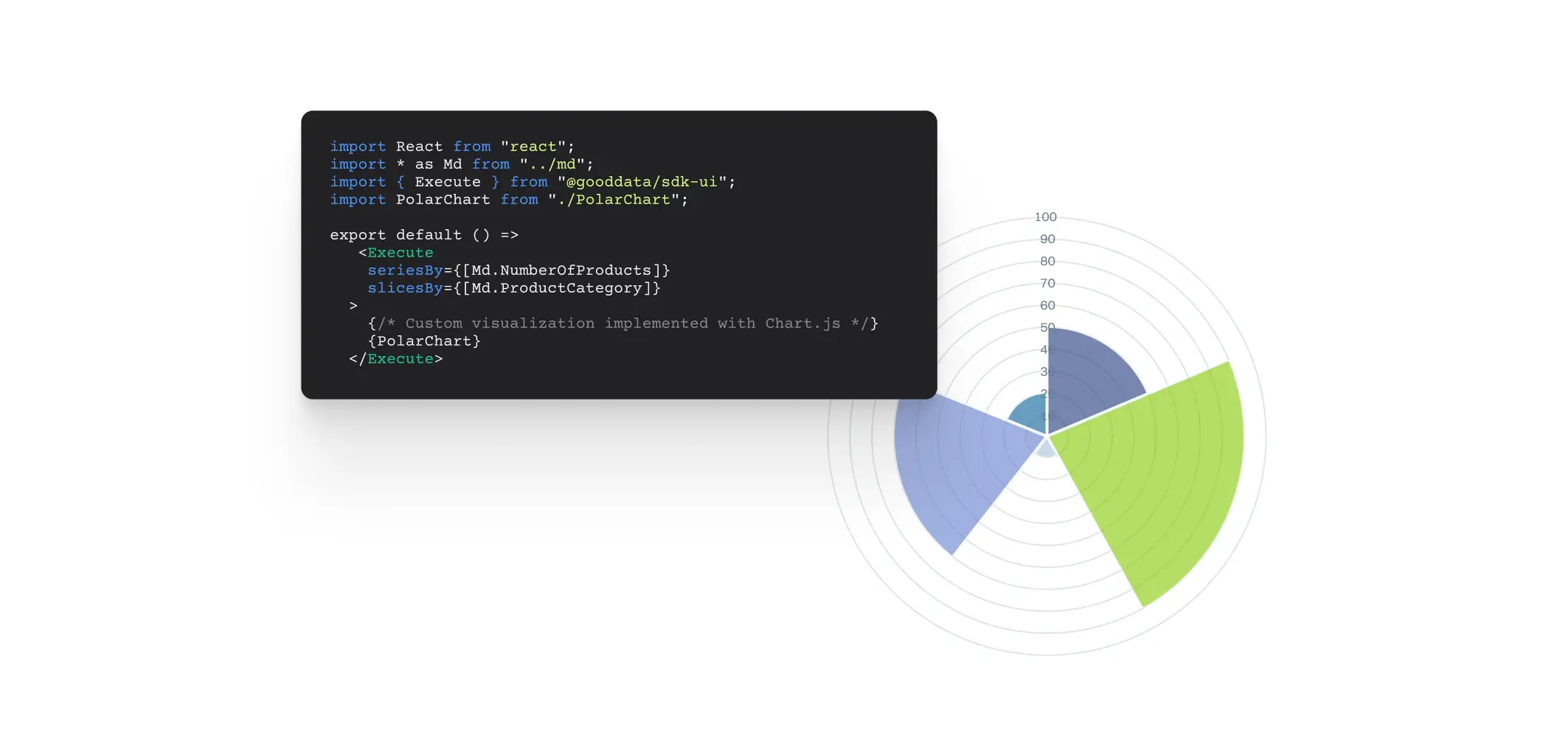
Custom visualizations
Tailor-made to your exact needs — without limits
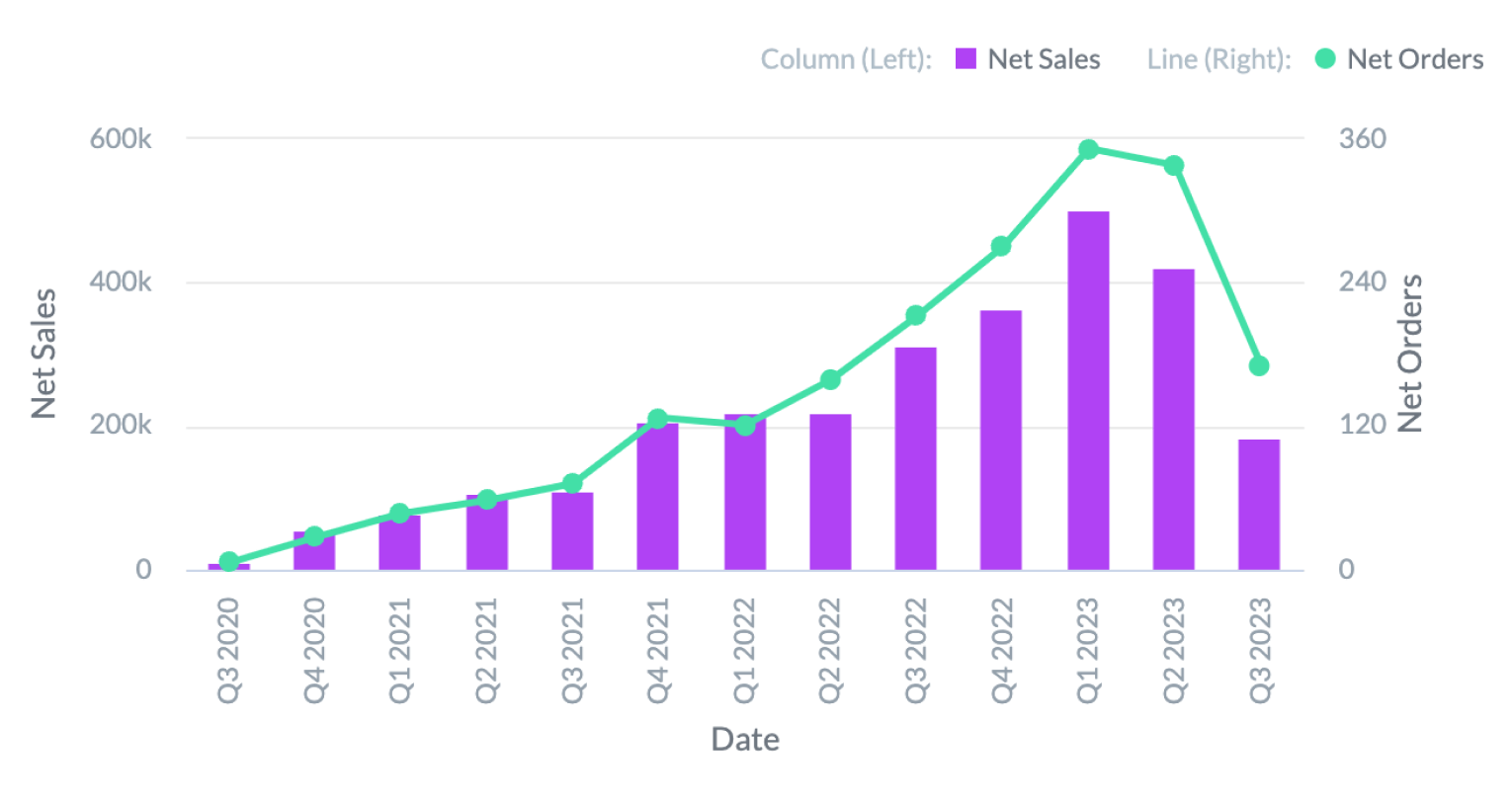
In addition to the out-of-the-box data visualization types, you can customize your dashboards with charts from any external visualization library.
- GoodData’s visualization tool is designed for creating advanced, custom-crafted dashboards, and complex business reporting solutions.
- Add and augment any data visualization from any charting library with only a few lines of code — D3, Chart.js, FusionCharts, Google Charts and more.
Implement using any third-party charting library
And ready to embed
Embed on the web
Instantly display dashboards on your web page by copy-pasting. The inserted dashboards are interactive allowing end users to both explore and accommodate the charts.
Embed into your application
Integrate individual visualizations or entire dashboards into your application and create a seamless data visualization and analytics experience for your end users (i.e., your customers, business network). The integration with apps is secure and fully customizable.
Check out GoodData’s types of embedding

Trust Radius.
237 reviews
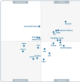
Gartner® Magic
Quadrant™️

G2.
579 reviews
Gartner.
187 reviews
Award-winning
agentic AI for
industry-leading
organizations

Satisfied customers

Dive deeper into the GoodData platform
Looking to find the right match for your company's needs? Get your answers quickly.
The Demo is a short call where all your pressing questions will be instantly answered.


