How Do You Choose the Right Visualization?
6 min read | Published


Do you remember our previous post on best data visualization practices, where we used a data set with James Bond movie details as an example? In this post, we’ll explore some additional data visualization best practices, regardless of whether you’re working with big data or just a small subset.
Data visualization brings life into sets of data that would otherwise be found dull or difficult to understand by your colleagues or customers. And whether you’re using a spreadsheet application for your once-per-year charts, an open-source visualization library, a rigid analytics module of your legacy ERP, or a mature business intelligence and data analytics product, such as the GoodData platform, it is important to keep in mind some basic rules to help your users understand the information you’re communicating through your data. However, as with anything, you can choose the fast and easy way, but the quality will suffer.
From our previous post, we already know the following best practices:
- Avoid displaying too much data and don’t overwhelm your users.
- Employ the right visualization for the right story. This is what we will focus on.
- Avoid mistakes with non-additive measures, as not everything can be counted up.
- Make the data easier to read and keep numbers short.
- Avoid pie charts as they are difficult to read properly.
- Focus on which colors you are using to represent the data, as the wrong choice may confuse the visualization reader.
- Changing the axis scale may confuse readers.
These points are particularly important when your analytical work is shared among your customers and colleagues because you’ll never know who, when, or in what circumstances someone will read or re-use the visualization you have prepared. Moreover, a lot of companies are printing these insights for formal meetings, but in an attempt to be environmentally conscious, they print in black and white. This may also impact the final comprehensibility of the insights. Besides printing, users are also using their mobile devices to read the insights.
Knowing that your users will use mobile devices rather the large monitors also determines which visualization you will use, potentially leading you to skip some really complicated charts and graphs with legends containing more than 10 descriptions.
Make it clear what you want to show
The same numbers can be interpreted and understood in completely different ways. It’s up to you to choose the right visualization for the message you want to convey.
You want to show a comparison
Comparison is a common reason for using visualizations. Nevertheless, there are many reasons why you would need to compare something, and each of those is best suited for a particular visualization.
You are comparing values among items
One of the most common reasons for comparison is comparing one variable per item in a few categories. If you have many items to compare, use a bar chart. In the example below, we compare flight carriers based on their delayed and canceled flight stats.
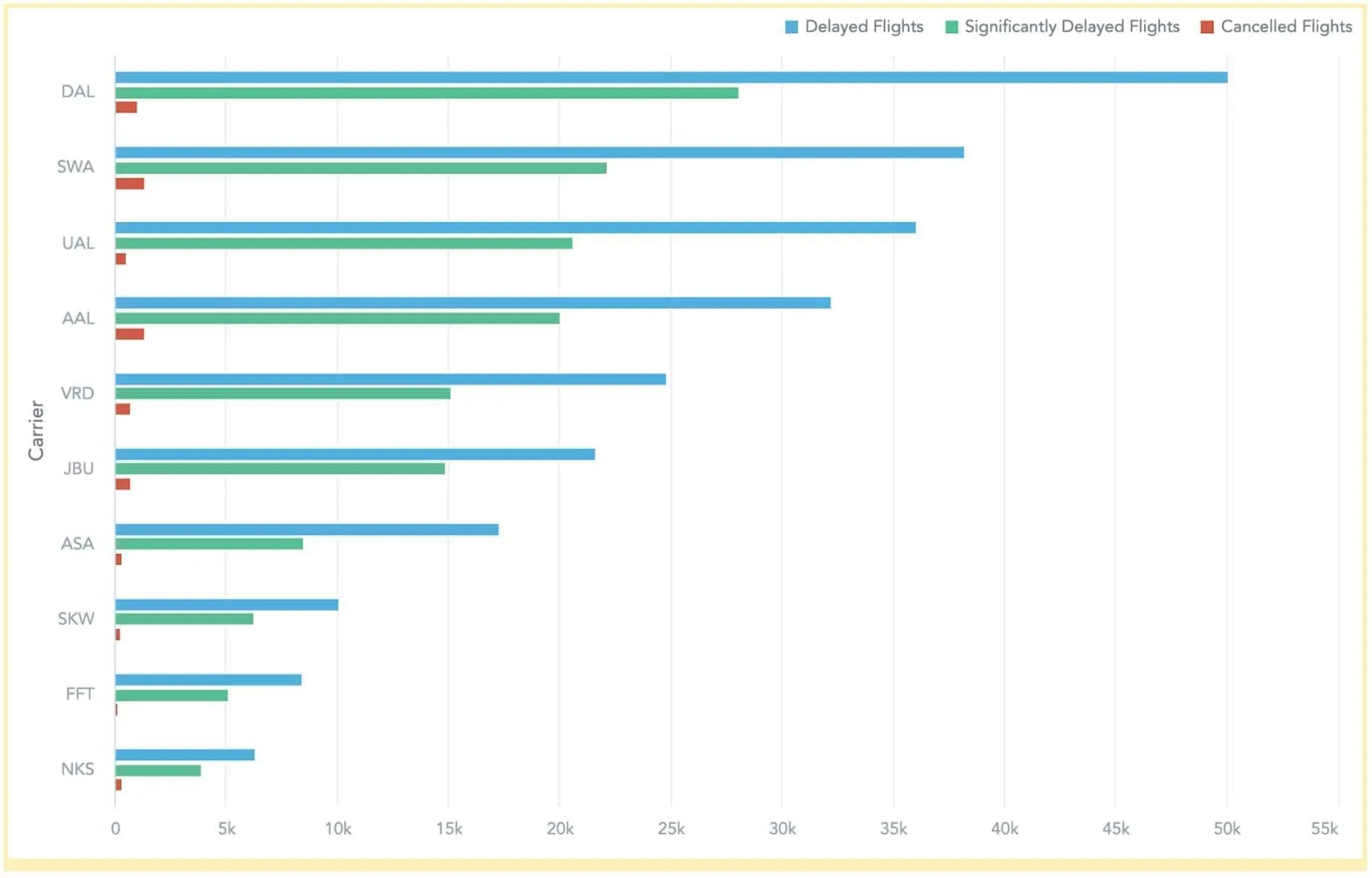
Bar charts allow for better readability when many items are placed on the chart, and you can add multiple bar charts next to each other, such as on our KPI Dashboard, which leverages BI dashboard best practices.
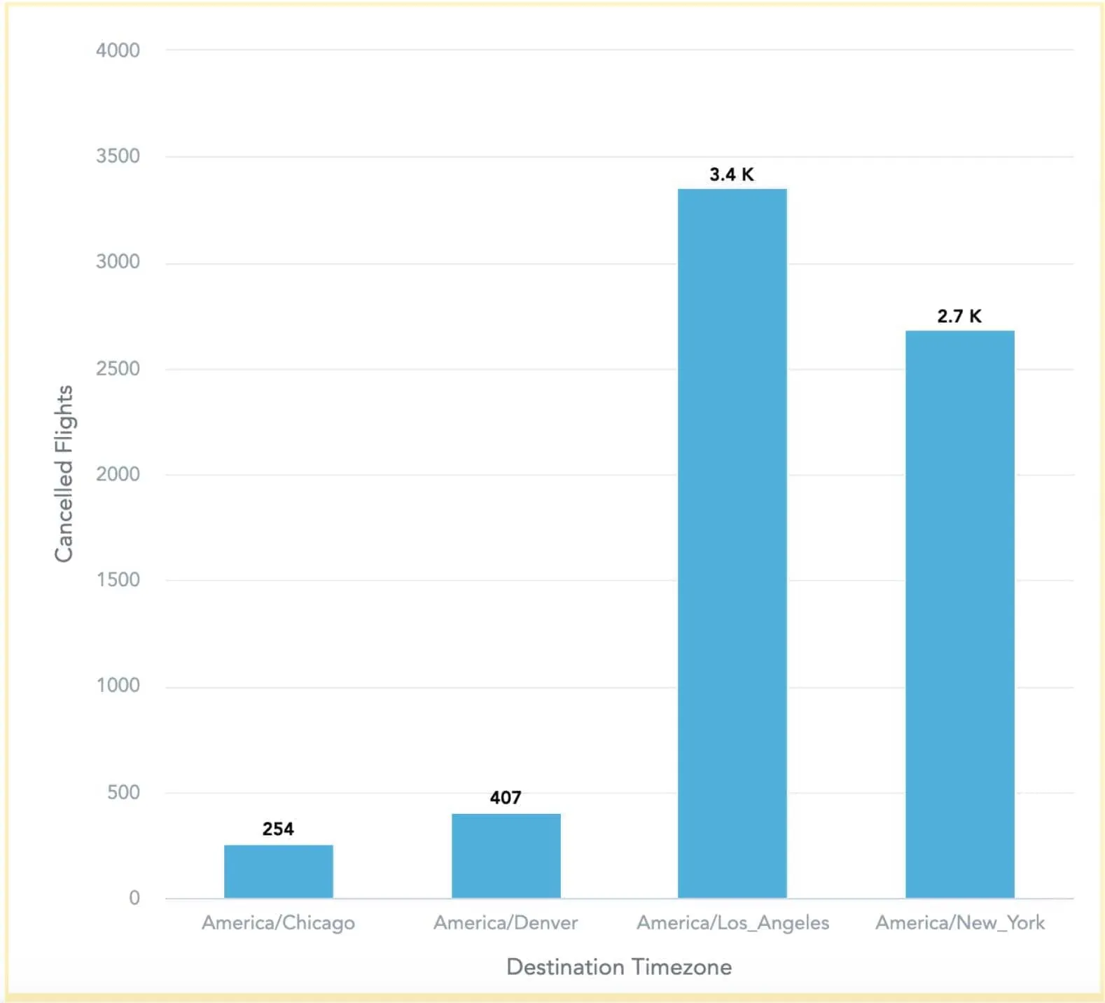
On the other hand, if you are only comparing a few items, it’s more appropriate to use a column chart, which provides better readability when the chart doesn’t need to be too wide, such as showing the number of canceled flights per time zone in the United States.
Other examples include:
- Comparison of stock items by the value of storage costs
- Number of patients with a pollen allergy by city, focusing on the environment where they live
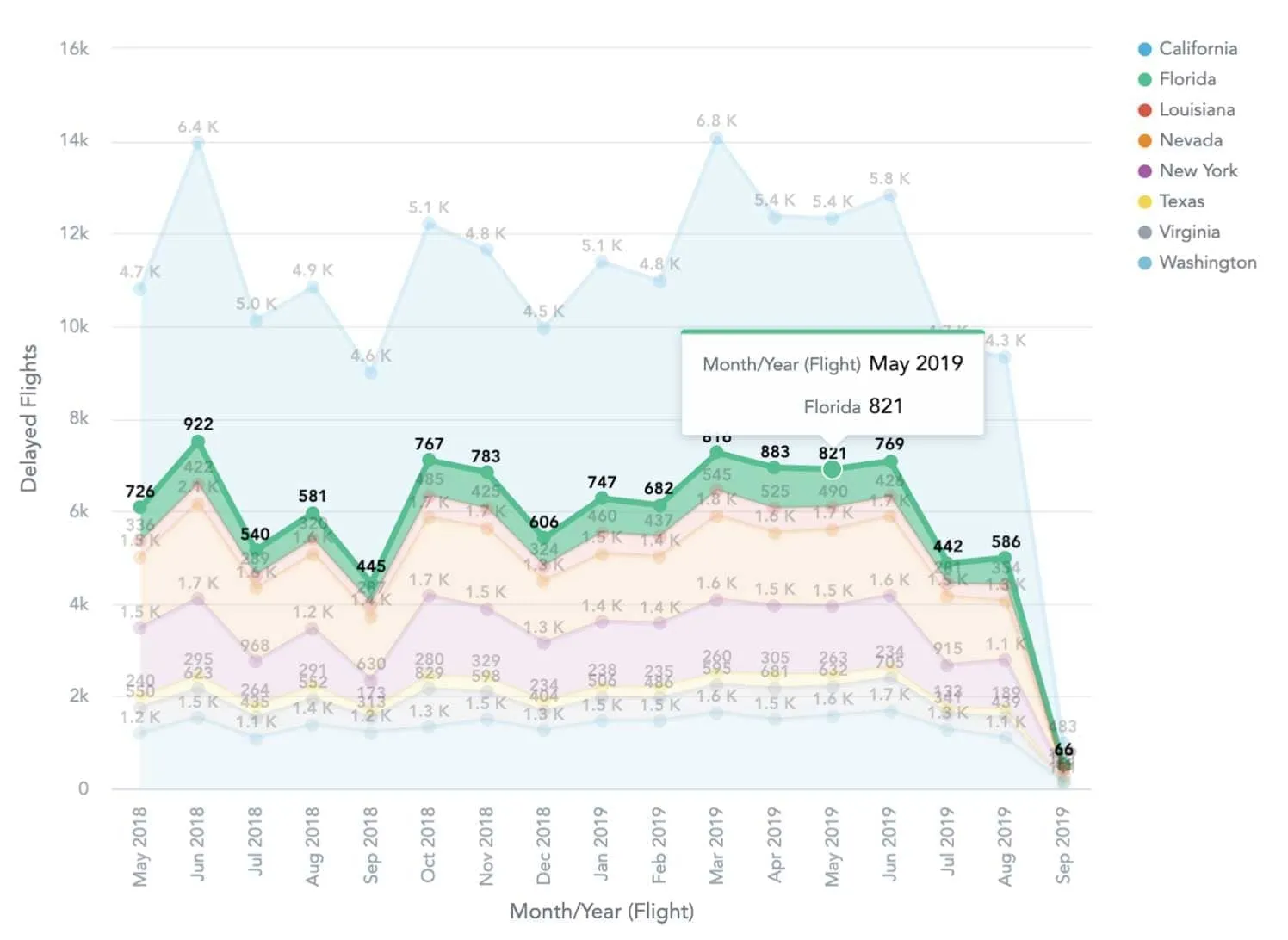
You are comparing over time
Do you want to compare values over time? The key question to ask yourself is whether you need to compare over many periods or just a few periods.
For just a few periods, it’s a smart idea to continue with a column chart, when you are comparing a single or couple of categories over time. However, if you want to compare many categories, it’s recommended to use a line chart, which will be easier to read than multiple columns. For instance, take a look at this chart showing the trend of delayed flights over 2019.
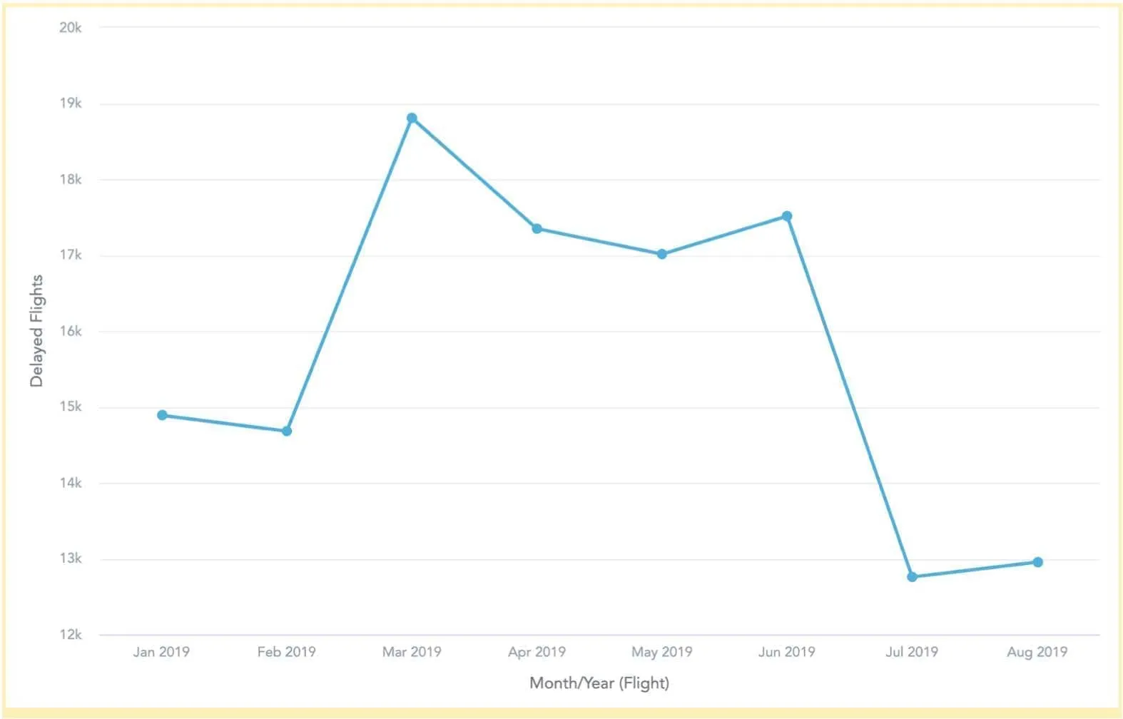
Also, if you need to compare data over many periods, a line chart is the simplest solution to go with if you are comparing non-cyclical data.
Other examples include:
- Company revenue per product category compared to the previous year to identify weak points
- Number of cinema visitors compared by week, grouped by age of visitors
You want to show a relationship
When you’re trying to illustrate a relationship between two or three variables, choosing the right chart is much simpler. Let’s take a look at data visualization use cases for relationships.
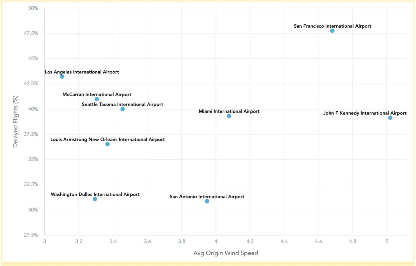
A relationship between two variables
To visualize a relationship between two variables, a scatter plot (or scatter chart) is the way to go. It is a type of diagram that is based on Cartesian coordinates, where the data is displayed as a collection of data points (therefore “scatter” plot or scatter chart) having value on a horizontal and vertical axis based on the value of a variable. On the scatter plot below, you can see the relationship between the average wind speed at the origin airport and the percentage of delayed flights there.
Other examples include:
- Estimate how fuel costs to salary affect the overall traffic in countries
- Determine whether salary depends on the education level
A relationship among three variables
As with a scatter plot, creating bubble charts is a good choice when visualizing relationships. In this case, we have three variables to compare. As with a scatter plot, the two variables are represented by Cartesian coordinates corresponding with a value on the horizontal or vertical axis. The third variable is visualized by the size of the bubble. Hence, we can think of bubble charts as a variation of scatter plots, where the particular point was transformed into a bubble by adding the third variable.
Other examples include:
- Campaign costs spent on a specific day with the revenue based on the campaign (bubble size will be the revenue)
- Calories consumed and time spent at the gym with weight loss
You want to explain the composition
The goal of composition is to visualize particular parts in the whole as a sum of their combination. Another reason for using composition is to explain the total value split and emphasize the importance of individual parts to the total value.
A composition that changes over time
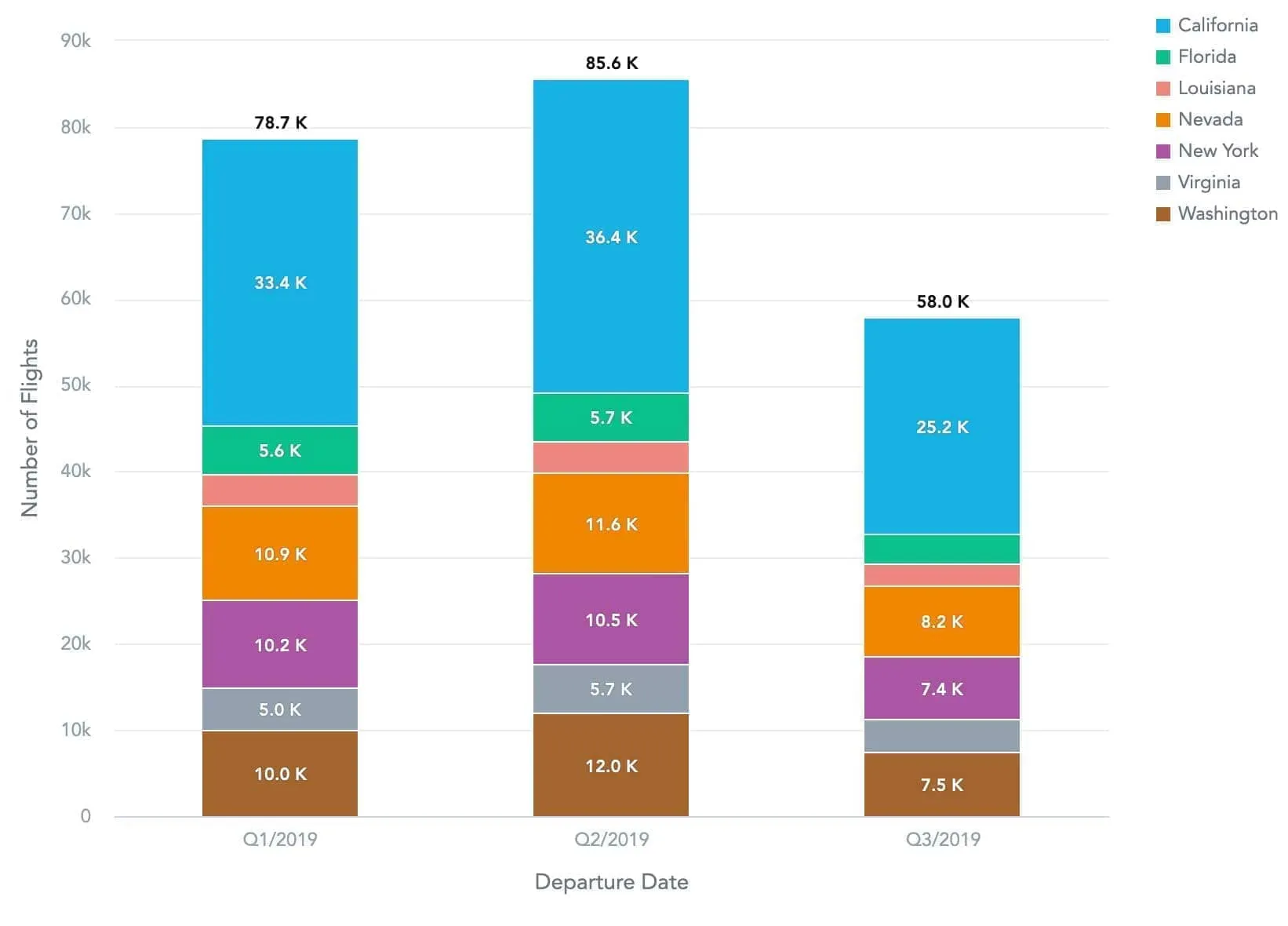
The first question you should ask when deciding which chart to use is whether the composition changes over time or not. If yes, the second question is whether it changes over a few periods or many periods and whether only relative or both relative and absolute differences matter. Let’s take a look at the examples below where we show the share of departure airports per state over the year, in terms of either time spent in the air or total flight numbers.
To ensure better readability, a stacked column chart is great when visualizing a few periods.
The difference whether a stacked column chart should be stacked to 100% or not is:
- If only relative differences matter, use a stacked column chart to 100%.
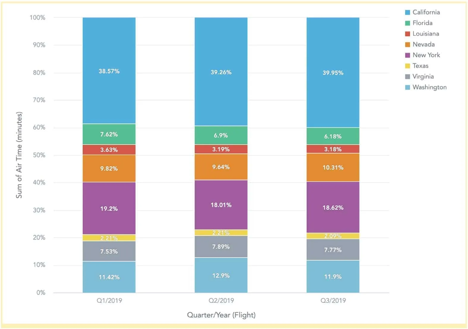
- If both relative and absolute differences matter (i.e. also specific numbers), use a standard stacked column chart.
When you visualize changing composition over many periods, a stacked area chart is what you need. Again, the decision of whether to keep it to 100% or not depends on if only relative difference matters or if the absolute difference matters as well.
Other examples include:
- Company market share in a specific region over time
- Company revenue by product categories over time
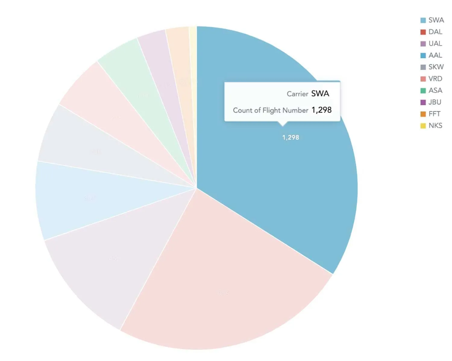
A composition that is static
A static composition, which doesn’t change over time, is the perfect match for the famous pie chart, where you show the simple share of the total result. In the example below, you can see the total number of departing flights operated by a given airport. However, as we already mentioned in our previous blog post, you have to act carefully when using pie charts. Pie charts are not suitable when showing accumulation or subtraction to the total. In this situation, a waterfall chart would be a better fit.
Other examples include:
- Company revenue by region
- World population by religion
- Market share with a few competitors
You want to describe the distribution
Describing distribution depends on the number of variables you’re using.
- For two variables, stick with a scatter chart, which we have already used for visualizing relationships.
- For three variables, a 3D area chart is the way to go.
Examples include:
- Visualizing the distribution of car age in the car market
- Localizing outliers in production line control results
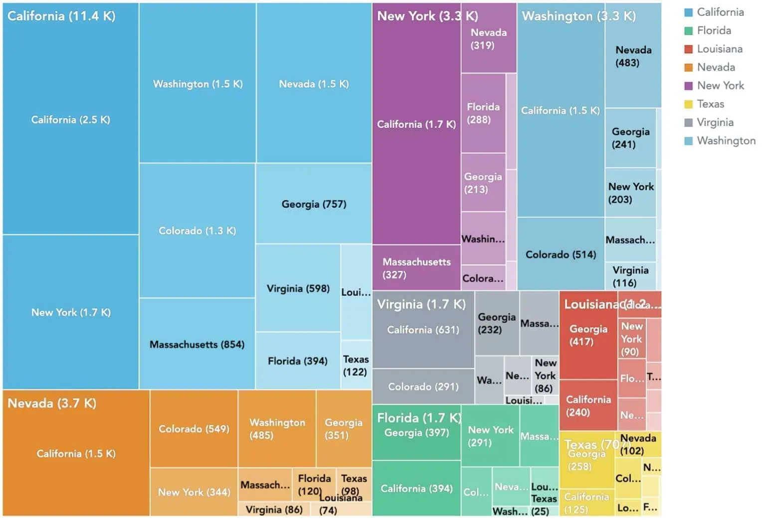
Treemaps and heatmaps
If you have already tried GoodData, via the free trial for example, you may have noticed some charts we haven’t talked about yet: treemaps and heatmaps.
Whenever you want to analyze data that is in a hierarchy, treemaps are the right choice. Treemaps are typically structured into a set of nested rectangles. The rectangle has a proportional size to the dimension of the data, colored to show separate dimensions of the data.
In this example, you can see the structure of target destinations per state and the total number of flights. When you see California under California, it means that 2.5K flights have been operated within California only.
Other examples include:
- Product inventory in stock by product group, then product category, and then product time by level of space required to store them
- Distribution of animal types in a zoo by class, order, and species with their count
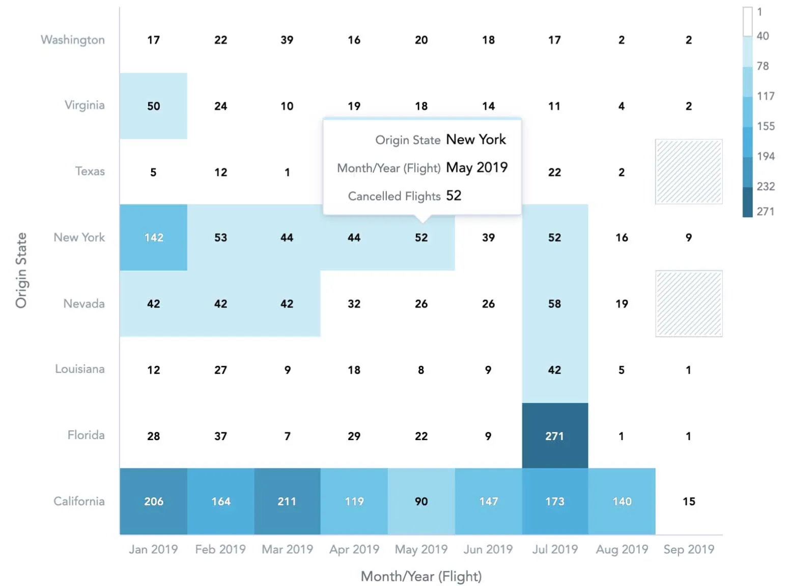
To use a heatmap as a visualization, you typically have a table with different values to which you want to give graphical emphasis. The higher the value, the darker the color. There are multiple forms of heatmaps used in analytics, such as a heatmap over a map or over a website to track the behavior of users.
In the GoodData platform, you’ll see the most common type: a heatmap table, which is a click map. In the example below, you can see the heatmap of canceled flights over nine months based on the state where the planes departed from.
Other examples include:
- Sales heatmap to visualize best sales figures over a week at a specific time
- Most delayed flights by carriers over a specific time period
There are plenty more visualization types that we have not talked about yet.