Engaging Analytics: Driving Value with Mission-Based Design
6 min read | Published


What if you built a analytical application and no one came?
What if you spend months evaluating vendors, connecting to data sources, designing beautiful dashboards and no revenue was generated?
What if your customer-facing analytical application became a cost center rather than a tool to drive customer engagement and revenue?
It's not a far-out scenario — it happens, and it happens frequently.
And it happened to me.
My experience in building an application to deliver analytical insights to users
While building one of my first analytical applications — what I call a “data product” — I thought I did everything right. I did the research, picked the best vendor for our situation, worked to ensure the technology was integrated into our core product and led the launch. And the users came! At least, at first.
When we launched, we thought we had a hit on our hands — people loved the new capabilities, and our management team was ecstatic that we'd implemented so much in such a short period. But the party didn't last.
After we launched, the utilization pattern started to follow what I now like to call the "Curve of Death." Users flocked to the analytics because they were new and who doesn't like shiny, new things? Engagement was very high at first as users played with the new filters, drilled into bar charts, and learned the new data product's features.
But then engagement started to wane as the users realized that, although the analytics looked great, they didn't help them perform their jobs. They visited less frequently over the next few months until utilization approached, but never quite reached zero.
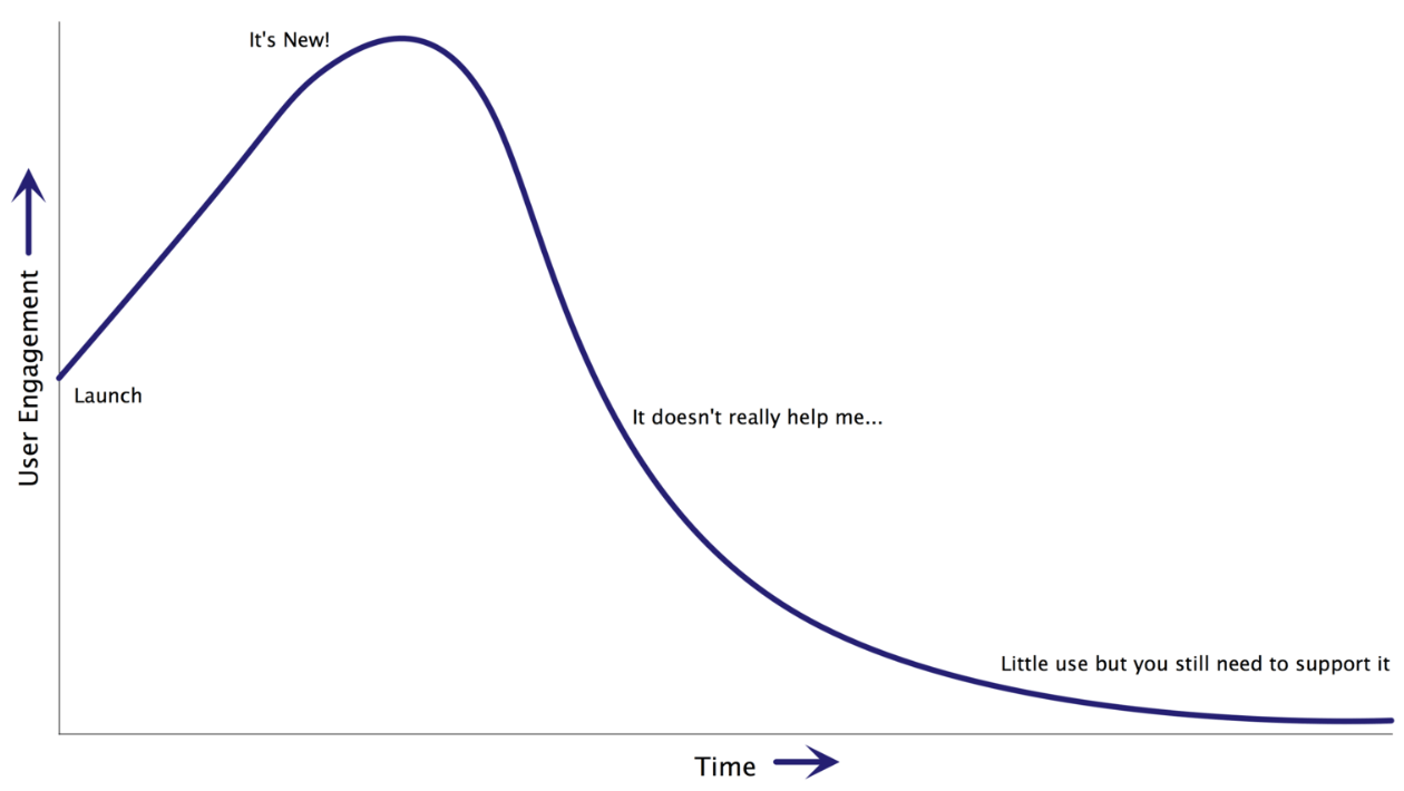
Enough people used the analytics that we needed to keep the lights on, but too few visited — much less were willing to pay — to warrant additional investment in the data-driven application.
We had made a big mistake in the design of our analytical application. Rather than focusing on solving user problems, we'd spent most of our time on the technical implementation of the analytic platform. We'd been so concerned about sourcing data, connecting to data sources, and calculating metrics that we'd neglected to build something useful.
Rather than thinking through the best ways to add value for our customers, we'd simply replicated the old reports that we used to email out on a monthly basis and "webified" them. They looked great and had more interactivity, but at their heart, they were the same old reports. And customers weren't willing to pay extra for what they were already receiving.
Avoiding this situation for your data product isn't as difficult as you might think. It's not luck; it's not a guessing game. It's a matter of understanding your users and what analytics you can deliver that will make their work lives better. I like to call it "Mission-Based Design" and here's how to do it:
Mission-Based Design
Step 1: Identify Your Users
Do you know who your users are? Not just "they're the people at that company paying us each month" — that's not a great answer. Do you know the specific types of users that will be utilizing your analytics as part of their job? You should have a list of possible users such as:
- Order Entry Representative
- Head of Product Marketing
- Marketing Analyst
- Salesperson
- Regional Sales Manager
- Head of Sales Operations
If you don't have a detailed list of the people that may use your analytical insights product, this is the first step to building engagement. If you don't have specific users in mind or, if the categories are too broad (e.g., Sales, executive, etc.) it's very tough to find content that will engage them. The same charts that will be beneficial to a senior sales leader will be useless to a junior order fulfillment staffer.
Brainstorm a list of possible user types ("personas") and be sure to include all levels from tactical to strategic, from management to entry-level employees.
Experience GoodData in Action
Discover how our platform brings data, analytics, and AI together — through interactive product walkthroughs.
Explore product toursStep 2: Target Select Personas
Once you've created a list of personas that might use your analytics, you need to pick the initial targets for your development activities. Trying to build engaging analytics for all personas is almost as ineffective as failing to recognize that different personas exist. You need to select a starting point.
The best way to pick target personas is to find a balance between personas that will derive maximum benefit from the analytical application and the complexity of delivering analytics to those users. In an ideal world, you'd target the very senior decision-maker of the company — likely the CEO — and tailor analytics functionality based on her needs. But if creating the functionality required by this user would take an unreasonable amount of time to develop, you might want to pick another starting point.
Choose 2-3 personas for whom you can deliver significant value with your dashboard and charts AND where the development won't be a resource killer. As you'll see in the next step to creating engagement, narrowing down the list to 2-3 personas is key. Tackle more in your first phases, and you'll lengthen your overall development cycle.
Step 3: Understand their Missions and Work Patterns
This is where the magic starts to happen. For each of the personas you selected, you need to understand their mission and workflow. Here's how it works...
Let's say you picked "Regional Sales Manager" as your starting persona. What does this person do — primarily – in this role? For this example, the mission is likely something such as "monitor and manage the sale activities for the western region and ensure that sales targets are being achieved." You can conduct interviews or even read job descriptions to get a sense of the mission for your persona, but it's important that you validate your assumptions. Note that some personas might have multiple missions for their role.
The mission for the persona will naturally lead to the next step in the process — work patterns. Work patterns are nothing more than the basic steps the persona might take to execute their mission. Going back to the Regional Sales Manager, a work pattern to achieve their mission might be:
- Review performance
- Identify underperforming areas
- Determine gaps in account coverage
- Project quarterly sales
- Adjust targets
You can use tools like flowcharts or mind maps to document these work patterns, but keep it simple. The work patterns themselves have no value. The only serve to help with the next, final step — identifying the gaps.
Step 4: Fill the Gaps
You can avoid the death curve by creating analytics that help your users understand their business and perform their roles. Create metrics, charts, and other analytics that help them, and they'll keep coming back. You can do this by closing any gaps that exist in their work patterns.
For each of the work patterns that you documented, such as "determine gaps in account coverage", talk to users and find out how they perform this task today, in the absence of analytics. If they use one Excel spreadsheet to review accounts without an assigned salesperson and another to see the total number of accounts each sales person owns, that's a gap.
Creating a dashboard or other analytic that shows unassigned accounts, their projected value, and available sales representatives side by side might be a big timesaver for the Regional Manager. You wouldn't have realized this without understanding their mission and work patterns. You wouldn't have found the gap that could be closed and the value that could be added.
Perform this gap search for each work pattern, for each mission, for each persona (see why you only want 2-3 personas?), noting the gaps that exist and the analytics you could provide that would close the gaps and add value. Close gaps for your users and make it easier for them to execute their missions and they'll continue to use analytics. Curve of death avoided.
Of course, I didn't do any of this the first time I created a data-driven application. Instead, we just took the reports that we were emailing out each month and cloned them using a modern data visualization platform. We didn't have specific personas we targeted — we mixed detailed data with high-level trend information, and we never thought about how the users performed their jobs. We certainly didn't try to add value by closing the gaps and frustrations that our users experienced.
The lesson I learned in creating an engaging data product
And we paid for it with low engagement. But we learned. We figured out that to create an engaging data product with our analytics, we needed to adopt a "mission-based" approach. We needed to deliver analytics that were designed to solve the real problem of specific personas and not just put pretty charts on a page.
It was a hard lesson to learn, but I'm glad I did. Now, every chart, every metric, every filter, every function I place on a dashboard in my data-driven application has a singular purpose — to help a persona fulfill a mission.
Now I follow the steps above each time I design an analytical application and that curve of death that I discovered a few years ago? I haven't seen it since.
Experience GoodData in Action
Discover how our platform brings data, analytics, and AI together — through interactive product walkthroughs.
Explore product tours