Data Analytics With Benchmarking: Power BI Alternative
6 min read | Published


This article series examines the different approaches to data analytics between Power BI and GoodData, with a specific focus on some of the most frequent data analytics use cases. We started by looking at the embedded and distributed use case: In this article, we will discuss how to build a custom analytical app with benchmarking; of particular interest to application developers. We will examine how GoodData could be an alternative choice to Power BI and how it could help you build a powerful, enterprise-grade analytics solution.
Often a requirement of large companies; the benefits of fully customized solutions are many. They are not only able to eliminate any differences between your original SaaS product or web portal and the analytics interface, but will also help you overcome any limitations that the out-of-the-box capabilities of the platform may impose. Apart from your developers getting access to greater flexibility, more importantly, they will enable you to provide added value to your customers.
On top of that, you can combine it with the ability to benchmark. A functionality that often goes hand in hand with multi-tenant use cases, and one that will allow you and your customers, or business partners, to gauge their overall performance and success relative to their competitors. This is done by allowing your users to compare their data with the anonymized data of their competitors, depending on which user is logged in. Let’s take a look at an example.
A financial institution, supplying payment systems, might decide to provide data analytics access to their partner banks. They want the analytics platform to be seamlessly integrated into their web portal, including fonts, colors, and custom filters. In addition, they want this application to be dedicated to benchmarking which would show their partner banks, for instance, portions of fraudulent transactions, portions of accepted vs. declined payments, and more.
So how can this use case be approached with GoodData and with Power BI?
Create Custom Visuals or an Entire Custom Analytics App
The possibilities to build a custom data analytics application exist in both Power BI and GoodData. A glance at both tools may indicate a lack of any real differences between the two tools in their approach to customization options. Both platforms have dedicated SDKs, and offer an open-source library of fully customizable data visualization elements based on JavaScript libraries. However, taking a second, deeper look will reveal nuanced differences that are of importance to developers, the time needed to develop a custom app, and the skillset your developers should have. Based on your requirements and expectations, you should consider which platform offers the most suitable approach to building a custom analytics app, which we will discuss herein.
Experience GoodData in Action
Discover how our platform brings data, analytics, and AI together — through interactive product walkthroughs.
Explore product toursCreating Custom Visuals in Power BI
Let’s take a closer look at Power BI first. In addition to the general set of visualizations, a wide range of customized visualizations like KPIs, maps, and charts are available in Power BI. These can be accessed through AppSource; the area for SaaS apps and other add-ins for your Microsoft products and services. Although plenty of custom visualizations are available there, you may be surprised to find out that not all of them are actually open-source but, instead, require you to pay for their usage.
Although you’ll be able to create your custom visualization or an entire custom app in Power BI, you’ll need to fulfill a couple of requirements. First, you’ll need to have a Power BI Pro or Premium per-user license. Assuming that you were able to create the visualization you wish to embed, you’ll need to register your custom app in Azure AD which may prove to be an even higher burden on the workflow and time of your developers.
Creating Custom Visuals in GoodData
GoodData’s GoodData.UI, on the other hand, was designed for the rapid development of interactive UIs and entire data analytics applications. Offered as NPM packages from which developers can access the source code, GoodData.UI is an open-source repository for JavaScript developers that helps them speed up the time needed for the development of their app. The reason why there are multiple packages — with filters, models, charts, or other features — is that this separation allows your developers to import only those pieces that are required for the development of the desired solution. As such, your program avoids the potential to be overwhelmed or slowed down.
Furthermore, GoodData.UI is a low-code platform that doesn’t require you to employ a full-stack developer. It also possesses the ability to work with many different environments; is based on React, the most commonly used library, ensuring it can be utilized by the majority of developers; and offers many visualizations for free. The development of custom visualizations, however, isn’t GoodData.UI’s sole focus. Its true power lies in the relatively easy development of an entirely customized application, the benefits of which we discussed in the previous article. Via communication with APIs, your developers can use it in their workflow for other tasks such as inviting new users into the analytical app and setting up user permissions.
If you’re reading this and wondering how you can make use of GoodData.UI while still increasing your time-to-market, you may want to consider the option to combine custom components with out-of-the-box iframe-embeddable visualizations to create a seamless user experience and introduce more versatility into your product. Ready to try that now? Then you’ll likely appreciate the option to try it in our free trial: no need to upgrade to any of our paid plans. Simply sign up, and access this tutorial or our series of GoodData University courses dedicated to GoodData.UI, and start building!

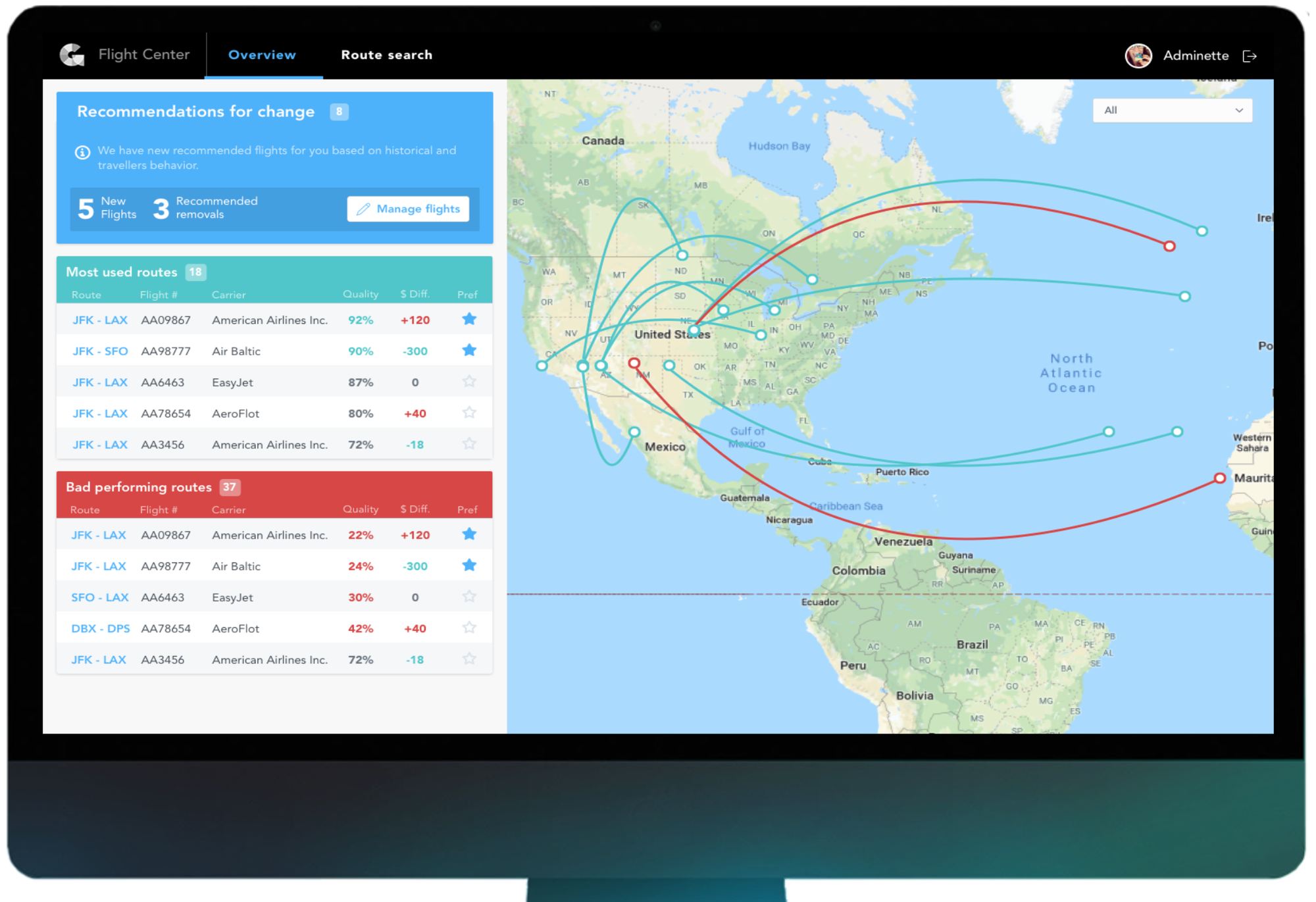
Custom data analytics application in GoodData

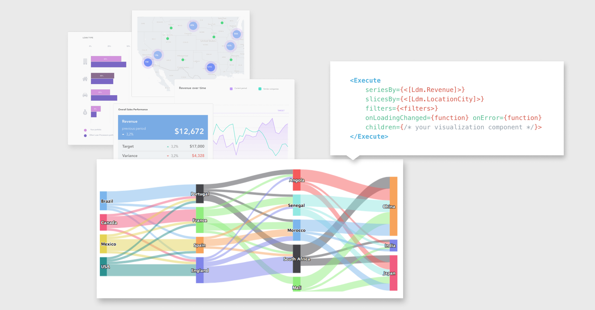
Creating custom visuals with GoodData.UI
Contextualize Your Performance via Benchmarking
While individual KPIs and the ability to compare data over time (in order to reflect your customers' performance) are going to be extremely important in your analytics solution, there are further areas of BI that are becoming must-haves. One such area is benchmarking, as presented earlier, in which the main goal is to provide comparative data linked to either competitor or industry standard, providing your individual performance a level of context. We have also presented an example of a financial institution and its benchmarking use case. However, that doesn’t mean that benchmarking cannot provide valuable insights for other industries or areas of focus. With that in mind, let’s have a look at how Power BI and GoodData approach benchmarking.
Benchmarking in Power BI
In multi-tenant scenarios, benchmarking faces a tough test. You generally want data to be available only for intended customers while limiting their view of anything related to competitors. For Power BI users with a multi-tenant use case and disparate data sources, several workarounds are required to be able to deliver a viable benchmarking solution. On top of that, there isn’t a standardized approach to delivering benchmarking, leaving it up to every Power BI customer to engage in a lengthy trial and error process before arriving at the desired state.
Usage of Row-Level Security (RLS) seems to be the only way to limit users’ access to seeing only data related to their company, however, it doesn’t bring back the desired aggregate statistics of competition. As such, there is no easy way of solving this problem effectively and, as such, the whole effect of benchmarking is thus missing. On top of that, you’ll need to have a deep knowledge of DAX — discussed in Part 2 of this series — to be able to deliver benchmarking to your customers. While, on the database level, the creation of queries and views containing aggregate data does not seem to be an issue, combining this with a multi-tenant approach and therefore effectively showing customers only the desired piece of information seems impossible.
Benchmarking in GoodData
While benchmarking, combined with a multi-tenant use case, is one of the tougher challenges BI tools face, GoodData has several capabilities in place to support this increasingly in-demand feature. Whether opting for an aggregated solution with a custom, end-to-end implementation on top of GoodData’s data warehouse or choosing to perform the transformations in your existing data warehouse (e.g., Azure, Snowflake, BigQuery, etc.) this step is fairly easy to perform. Like GoodData, Power BI is quite similar in this regard. However, where GoodData differentiates, is the combination of the other two capabilities that can support the benchmarking use case: the logical data model (LDM) and lifecycle management (LCM), also discussed in the previous blog post.
LCM provides you with full control over which data is going to be available to each of your customers or business partners, therefore effectively eliminating the risk of unintended audiences being able to see the data. The LDM allows you to adjust your data model by adding the aggregated data to the existing datasets, making them available to your customers or business partners. Depending on the configuration and functionality of your data model, this data could then be filtered by any attributes of the end user’s choosing. Ultimately, this enables you to monetize your data, with a comparison against benchmarks in individual territories, countries, or industries becoming the reason for customers to buy your analytics-based product or upgrade to a higher tier.
Ready To Try GoodData?
See for yourself how GoodData compares to Power BI and build a proof of concept with your own data sample. Start your free trial and begin building your first GoodData data insights, commitment-free. Or schedule a demo with GoodData experts who will walk you through all of GoodData’s capabilities and answer any questions you may have.
Experience GoodData in Action
Discover how our platform brings data, analytics, and AI together — through interactive product walkthroughs.
Explore product tours


