How to Create Metrics in Analytical Designer
4 min read | Published


The latest GoodData.CN (1.6.0) now contains a Metric Editor in Analytical Designer. With the help of this feature, you can create new metrics using MAQL for your visualizations without switching contexts — you can immediately verify the new metric in visualizations. This blog post will show you the basic steps of creating a metric while creating a visualization in Analytical Designer. If you are not familiar with MAQL, we encourage you to read the MAQL intro blog post.
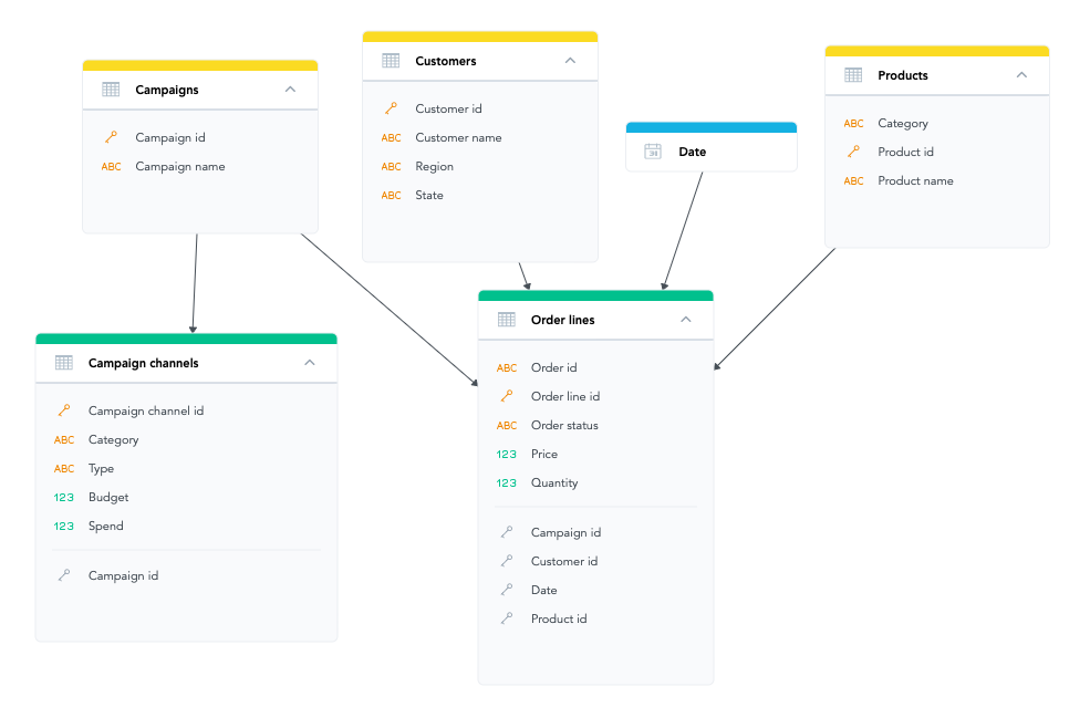
The image below is of the demo Logical Data Model (LDM) we will use for this article. The most exciting dataset is Order lines,which collects data from orders that we can analyze.
The goal is to develop a visualization that shows how successful the single quarters were over the year.
4 Steps How To Create New Visualization With Custom Metrics
1. Add Quantity Fact and Date Attributes
We can simply add the fact Quantity to the METRICS panel, but this single fact does not tell us a lot of valuable information. Therefore, we will break it down into quarters by the Date attribute, and for clarity, we can also add the year Date attribute. The result of this operation should be following:
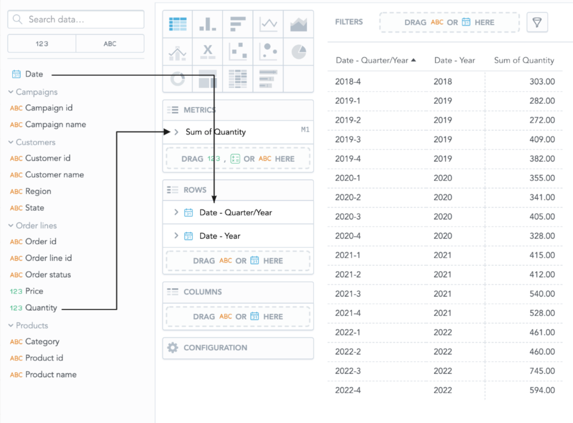
Perfect, now we can see the Quantity fact broken down by single quarters. What if we wanted to know the sum of the Quantity in each year? Of course, we can sum it up manually, but it is not very suitable, so let’s create a new metric for it.
Experience GoodData in Action
Discover how our platform brings data, analytics, and AI together — through interactive product walkthroughs.
Explore product tours2. Create New Metric
We will call the new metric Quantity BY Year, and the MAQL expression is as follows:
SELECT SUM({fact/order_lines.quantity}) BY {label/date.year}But where to put this definition of the new metric? Fortunately, we do not have to switch to another tab, and we can open Metric Editor using the Create metric button in the bottom left corner:
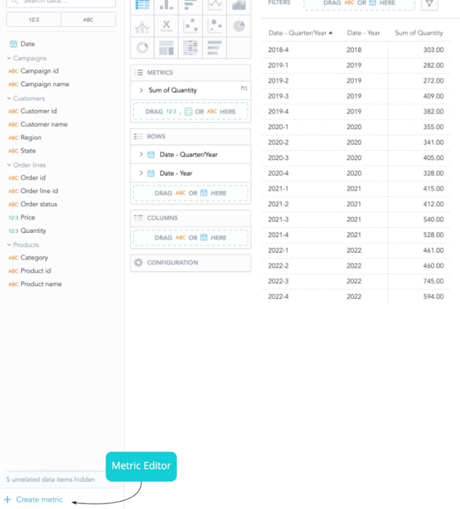
The button opens the Metric Editor, and we can put the MAQL definition in here:
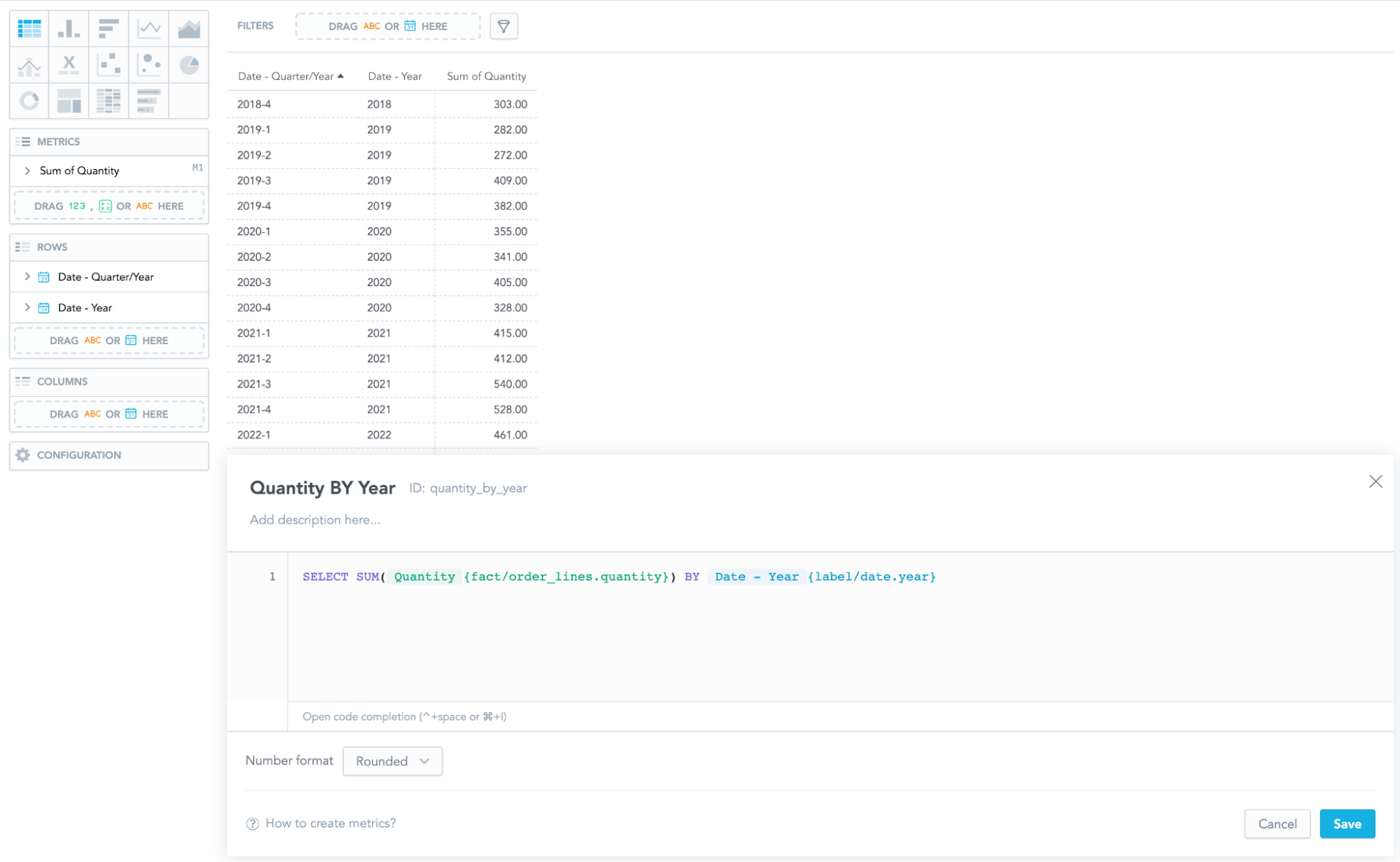
Let’s save it and immediately verify our new metric by adding it to the METRICS panel:
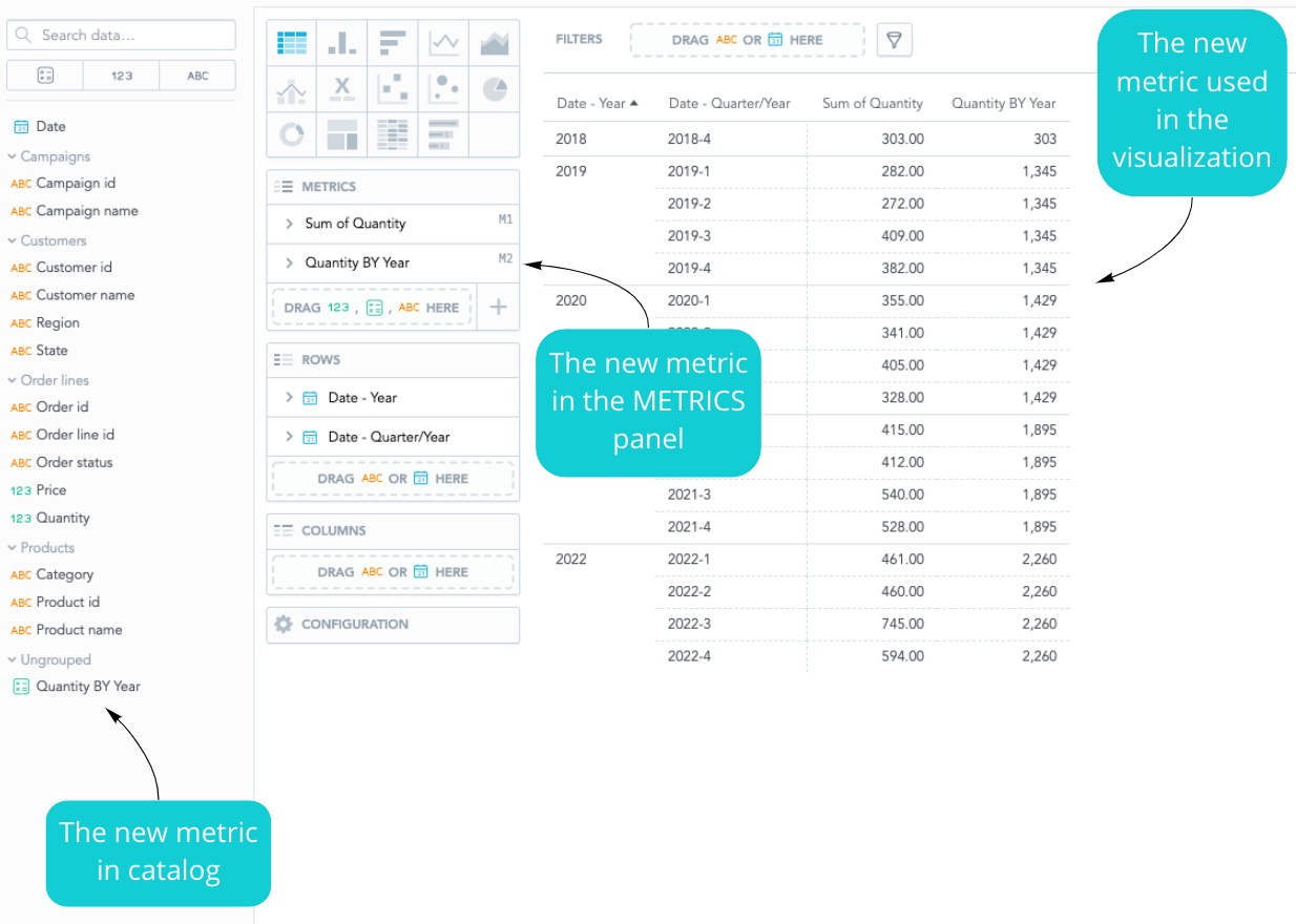
3. Create Metric Quantity/Quantity BY Year
We have the sum of the Quantity in each year, but our original goal was to develop a visualization that would show us how single quarters were successful. With a new metric definition, Quantity/Quantity BY Year, we can easily do that.
SELECT SUM({fact/order_lines.quantity}) /
{metric/quantity_by_year}
Since the new metric is the ratio between the sum of Quantity and Quantity BY Year, we want to save the new metric with the percentage number format.
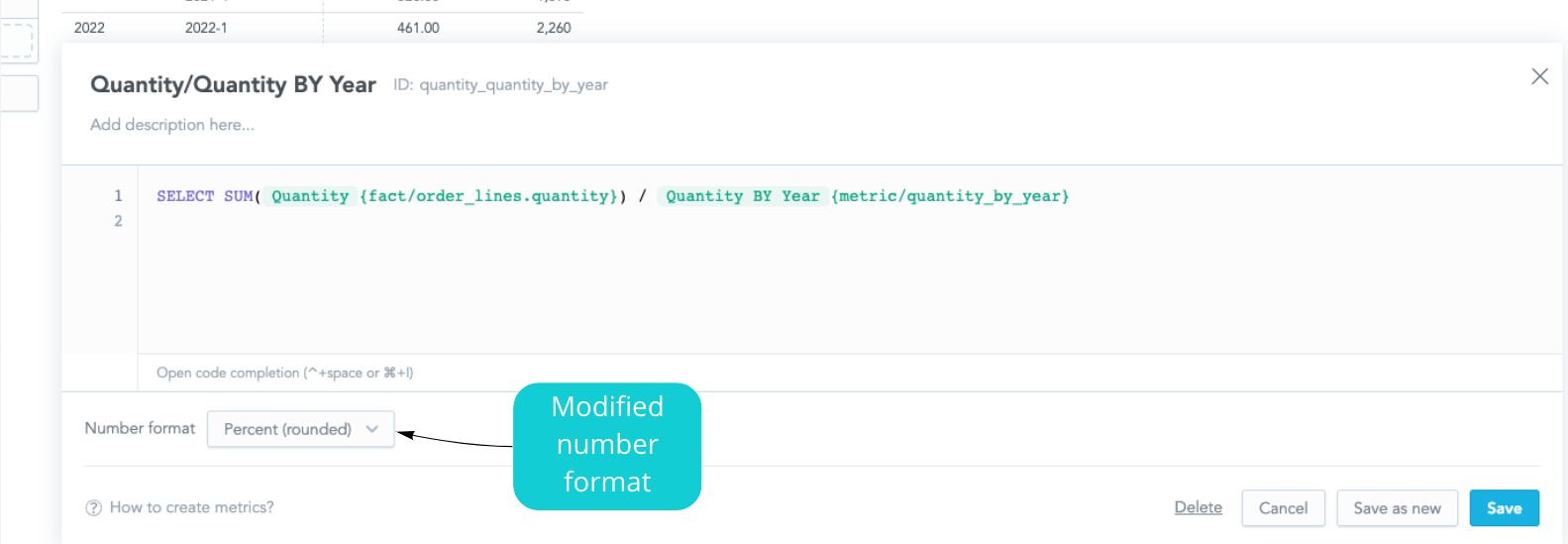
Notice that we are using the metric Quantity BY Year that we created earlier — this is a powerful aspect of MAQL and its reusability.
Let’s save the new metric and see it in action: We can simply evaluate the new metric by adding it to the METRICS panel:
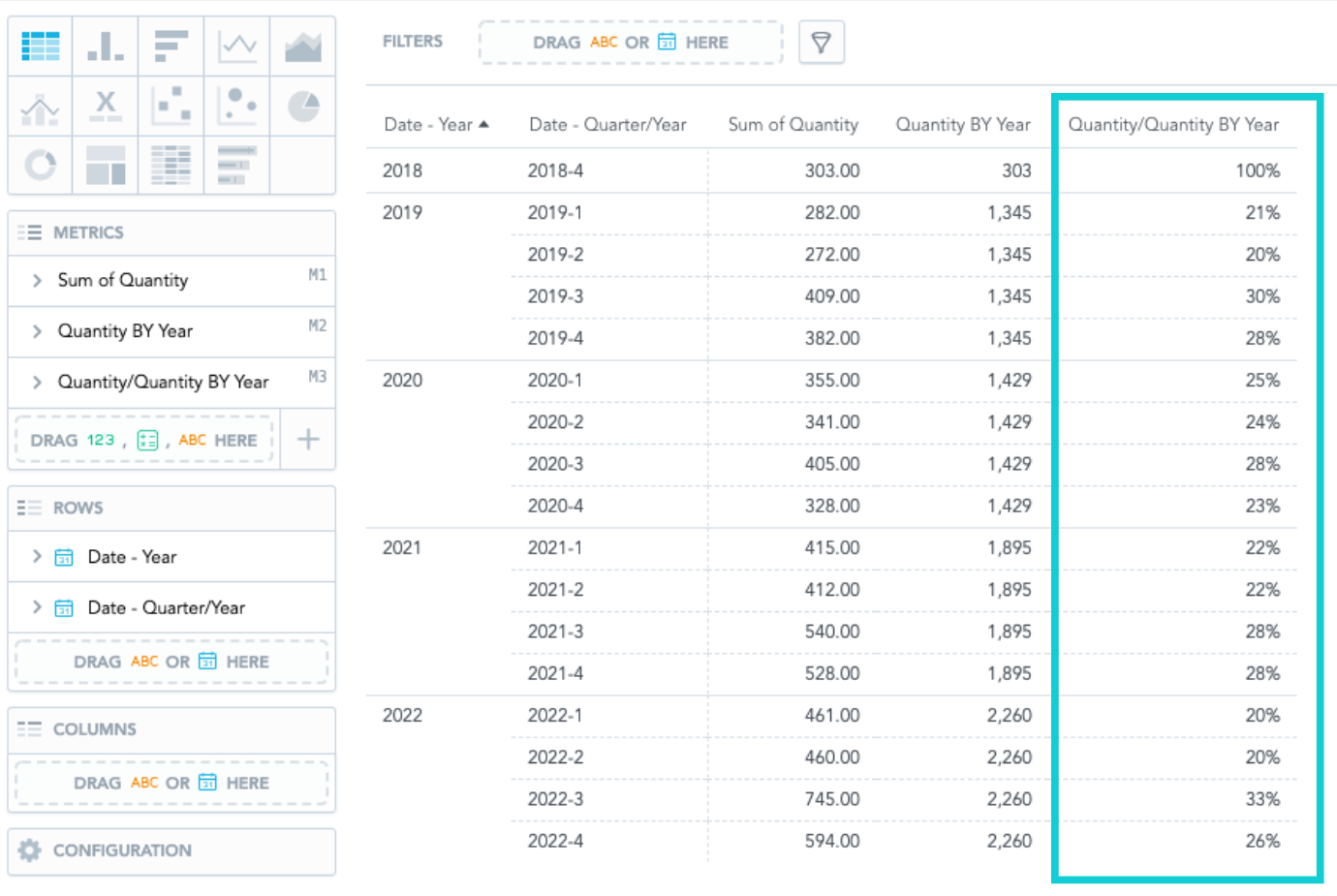
We now have the visualization that shows us two exciting metrics: Quantity BY Year and Quantity/Quantity BY Year. The metric Quantity/Quantity BY Year tells us how successful the single quarters were — for example, the third quarter in 2020 was the most successful, whereas the fourth quarter was the weakest.
(Note: You may have noticed on the screenshots that we are in part using data from the future. Stay tuned for a follow-up article on how GoodData leverages time travel to create their demo data sets.)
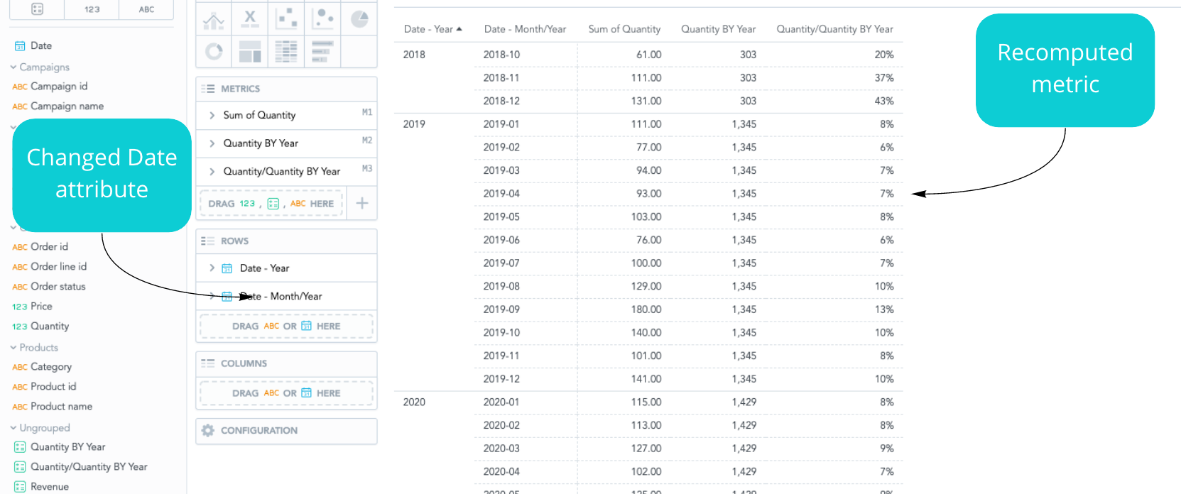
Let’s check out the context-awareness of the MAQL language. If we change the Date attribute to months instead of quarters, the whole visualization will recompute, and we will see how the months contributed to the year. The major benefit is that we do not have to change anything about the metric definition (MAQL). We just change the context in which it is being displayed:
4. Create Metric to Check Revenue
What kind of an analysis would it be without a finance report? Let’s create a straightforward metric that will compute revenue for us. The metric definition is as follows:
SELECT SUM({fact/order_lines.quantity}) *
(SELECT SUM({fact/order_lines.price}))
Again, we will put the MAQL definition into the Metric Editor in Analytical Designer, and we will name the metric Revenue:
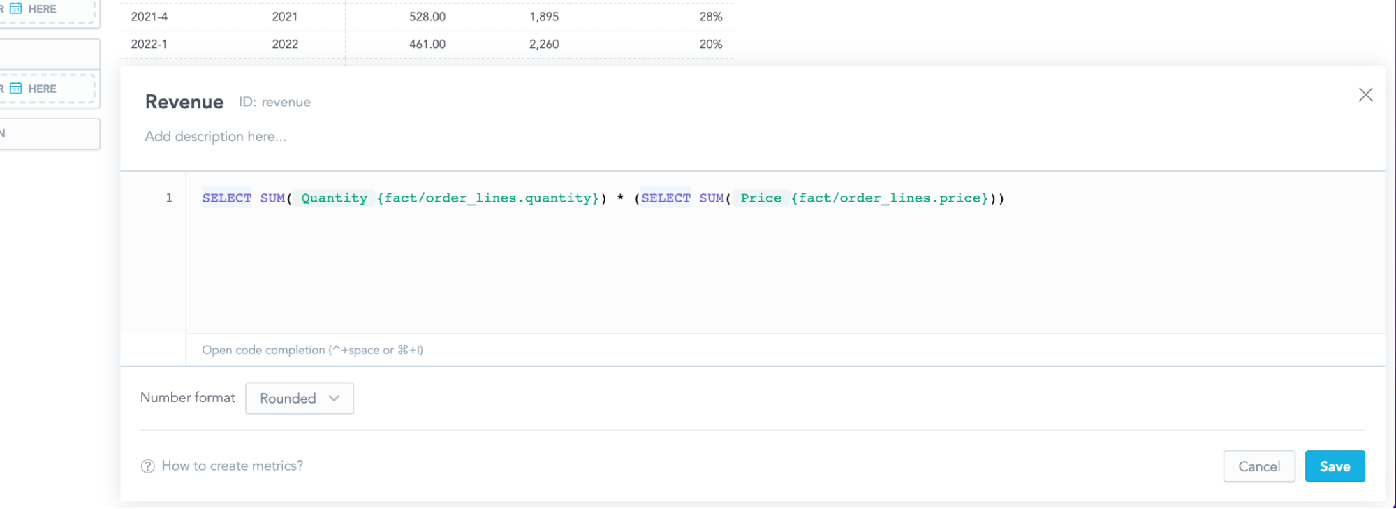
After saving the metric, we can immediately use it in our visualization:
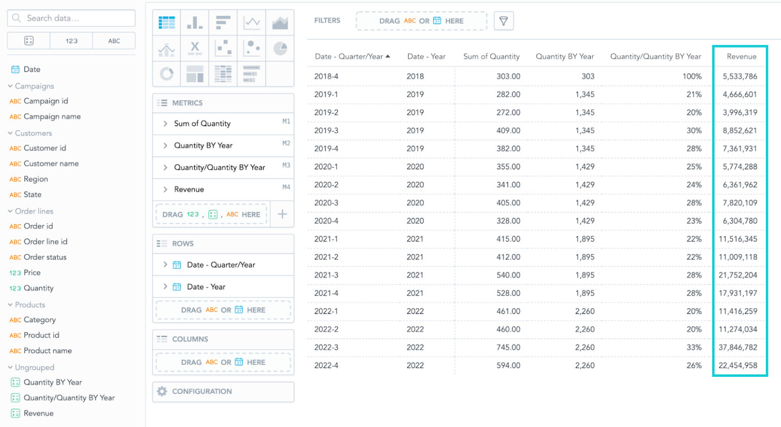
Note: You might have noticed that some quarters have different revenue but the same percentage of Quantity/Quantity BY Year metric. There are various product prices, but the quantity is still the same, which is the reason for different revenue.
Summary
If you are interested in this new feature, do not hesitate and try it yourself. Check the first four steps from our Getting Started documentation to get to the starting point of this article.
The article described the possibilities of how to create new metrics in Analytics Designer without having to switch to another tab. You can immediately verify the new metric in an insight, and if the new metric does not work as expected, you can edit it right away.
If you want to learn more about MAQL, you can follow our GoodData University MAQL course. For help and further info, see our MAQL documentation, community forum, and community slack channel.
Experience GoodData in Action
Discover how our platform brings data, analytics, and AI together — through interactive product walkthroughs.
Explore product toursIf you are interested in GoodData.CN, please contact us. Alternatively, sign up for a trial version of GoodData Cloud: https://www.gooddata.com/trial/


