Theming: Unify Your Embedded Analytics Experience
4 min read | Published

The importance of a first impression
When we empower our employees, customers, and stakeholders with analytics, we want to help them to make an impact. We want to help put a dent in the universe by placing easy-to-understand insights into the hands of all our end users, embedding insights directly into front-line applications, and automating relevant decisions. And we do this because we know that those who lead with analytics can expect significant differentiation, outsized returns, and, sometimes, longer-term survival.
And what is our biggest fear? That no one actually cares about the data we are providing. That after all the effort we made, the insights we thought will empower our users to make the difference, just slowly get forgotten. If the data isn’t utilized to make better business decisions, our analytics investment was made in vain, and life continues as nothing happened.
There are many pieces in the puzzle that affect user adoption of your analytics, but there is one particularly important piece: unified experience. A unified experience defines your colors, fonts, and design to help ensure that the whole experience is united in its look, feel, and use. The way your data is styled and presented is key to unlocking its full potential. If your analytics look and operate similarly to your main application, this similarity can reduce the time it takes your analytics end users to process your data, making it easier for them to uncover and utilize your insights.
One of the best ways to ensure your end users will not make use of those insights you so desperately want to put in their hands is to provide them with a miscellaneous embedded analytics experience that resembles a poorly made patchwork. Because just like with people, making a good first impression is important in the world of analytics, too.
Experience GoodData in Action
Fully managed, embedded analytics platform. Get instant access — no installation or credit card required.
Explore product toursThemes — your dashboard, your brand, your experience
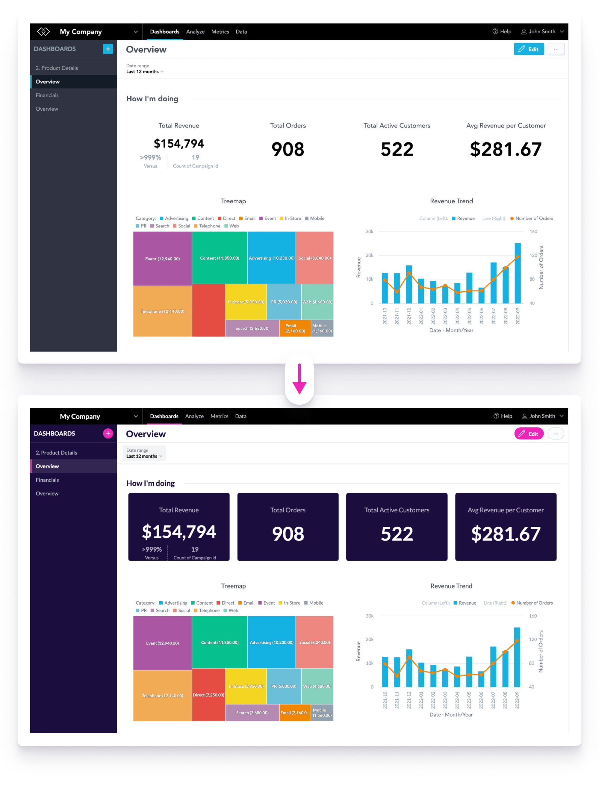
To help your developers create cohesive applications and enhance the end-user experience, GoodData empowers users to customize the visual style of their dashboards with theming. Using themes, you can customize the appearance of your analytics dashboards to make them seem like a native part of the app or web portal you are embedding them in.
Themes use special low-code JSON structures with CSS properties. Based on your and your end users' unique requirements, you can define the properties that you want to update in order to achieve a unified look and feel in your whole analytics environment. You can update any number of the properties (only one, a subset, or all of them), and the ones that you do not define in the JSON structure, remain intact. This low-code style — only modifying colors in JSON file — makes you better equipped to quickly adapt and respond to your fast-changing analytic environment.
Here you can see the complete set of all the possible properties that you can customize:
{
    "palette": {
        "primary": {
            "base": "#ED26B7"
        },
        "error": {
            "base": "#e54d42"
        },
        "success": {
            "base": "#00c18d"
        },
        "warning": {
            "base": "#f4d521"
        }
    },
    "typography": {
        "font": "url(https://fonts.gstatic.com/s/lato/v23/S6uyw4BMUTPHjx4wXiWtFCc.woff2)",
        "fontBold": "url(https://fonts.gstatic.com/s/lato/v23/S6u9w4BMUTPHh6UVSwiPGQ3q5d0.woff2)"
    },
    "button": {
        "borderRadius": "100",
        "dropShadow": false
    },
    "analyticalDesigner": {
        "title": {
            "color": "#1C0D3F"
        }
    },
    "dashboards": {
        "content": {
            "kpiWidget": {
                "title": {
                    "color": "#f2f4f6B2",
                    "textAlign": "center"
                },
                "kpi": {
                    "primaryMeasureColor": "#fff",
                    "secondaryInfoColor": "#f2f4f6B2"
                },
                "borderRadius": "6",
                "borderWidth": "1",
                "backgroundColor": "#1c0d3f",
                "dropShadow": false
            }
        },
        "title": {
            "color": "#1C0D3F",
            "backgroundColor": "#fff",
            "borderColor": "#DFE4E8"
        },
        "navigation": {
            "backgroundColor": "#1C0D3F",
            "title": {
                "color": "#fff"
            },
            "item": {
                "color": "#BFC9D1",
                "hoverColor": "#fff",
                "selectedColor": "#fff",
                "selectedBackgroundColor": "#FFFFFF1A"
            }
        },
        "filterBar": {
            "filterButton": {
                "backgroundColor": "#F2F4F6"
            },
            "backgroundColor": "#fff",
            "borderColor": "#DFE4E8"
        },
        "section": {
            "title": {
                "color": "#1c0d3f",
                "lineColor": "#DFE4E8"
            }
        }
    }
}
GoodData’s low-code approach removes complexity from building great, modern analytics dashboards. And this reduced complexity means you can easily modify everything, from the font family, text color, background color, and widget color, letting you ensure a unified embedded analytics experience for all your end-users. For example, if your use case requires it, you can create a theme like the one below. After all, it is your dashboard, your brand, and your experience.
Check out the step-by-step instructions for creating a dark theme for GoodData workspaces. You can also find more examples of various themes you can create for your workspaces. The examples come with example JSON codes that you can directly use or customize further.
Uniform embedded analytics experience promotes the adoption of your analytics
When you are designing your embedded analytics experience, it is important to spend enough time with the basics. Just like when building a house, also with analytics, the foundation needs to be solid before you can advance. And with embedded analytics, the solid foundation is based on informatics and easy-to-understand dashboards that visually blend in with the ecosystem, creating an illusion of one seamless application.
And because data belongs to everybody, GoodData theming functionality was created to make sure that no insight gets forgotten due to a bad first impression. Do not burn your resources building visually matching embedded dashboards from scratch when you can achieve a uniform embedded analytics experience with an agile and fast low-code approach. With theming, you can rapidly adopt the visual style of your host app, and create quick time-to-value dashboards that promote overall adoption of, and trust in, your whole embedded analytics experience.
Try it yourself
Want to learn more about how to unify your whole embedded analytics experience and drive user adoption with GoodData themes? Check out our documentation, and start using GoodData trial.
Experience GoodData in Action
Fully managed, embedded analytics platform. Get instant access — no installation or credit card required.
Explore product toursIf you are interested in GoodData.CN, please contact us. Alternatively, sign up for a trial version of GoodData Cloud: https://www.gooddata.com/trial/