


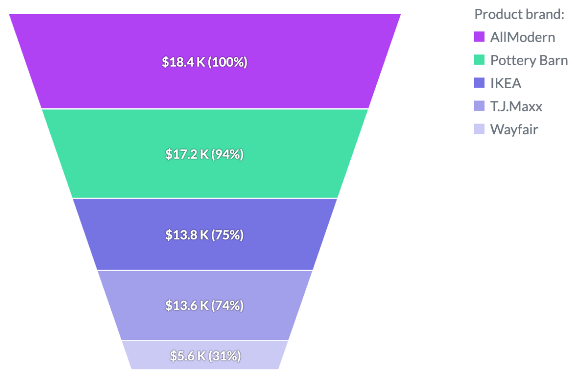
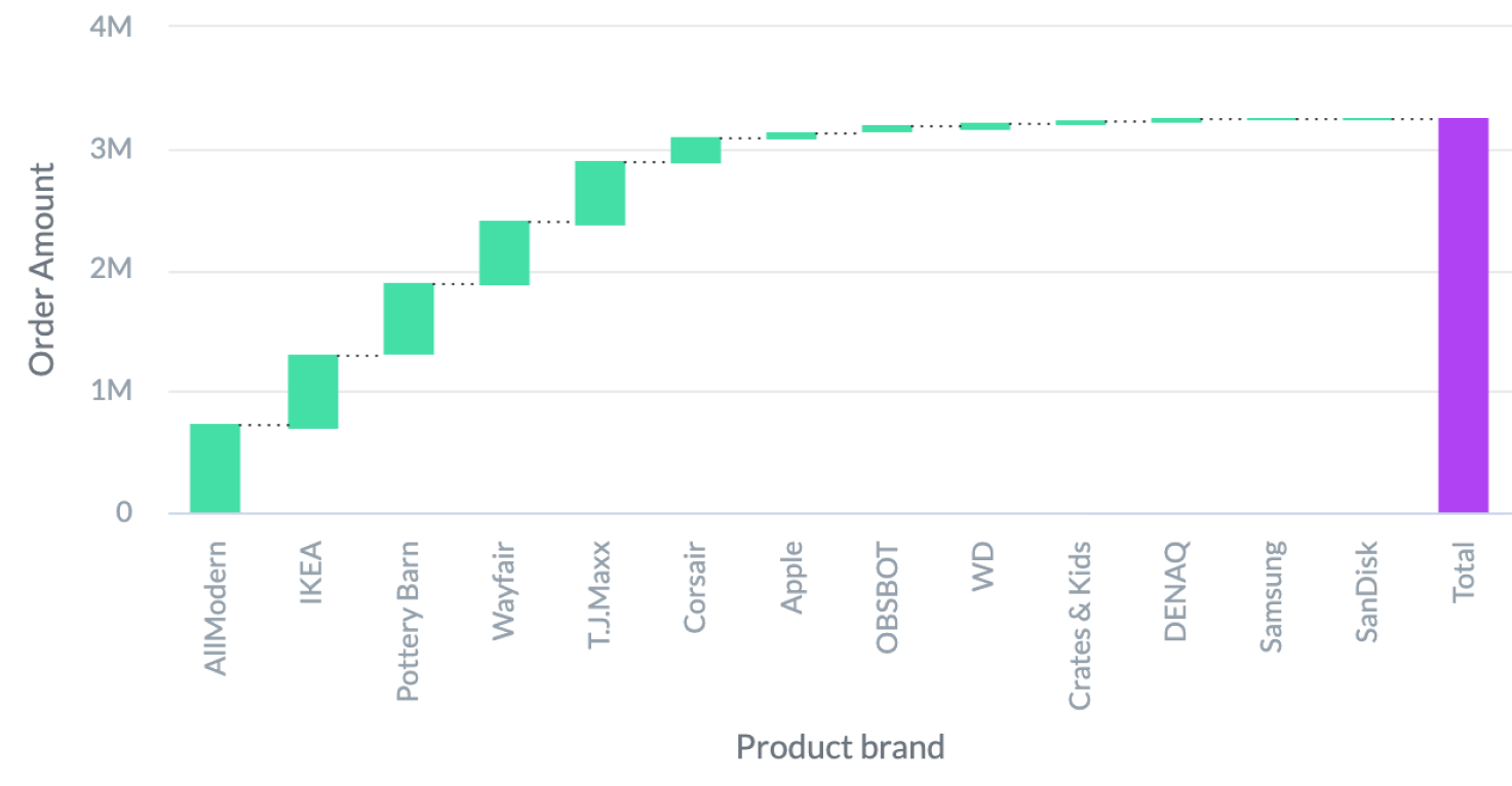
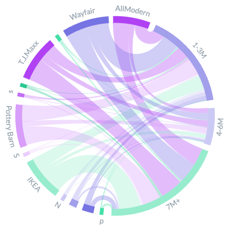
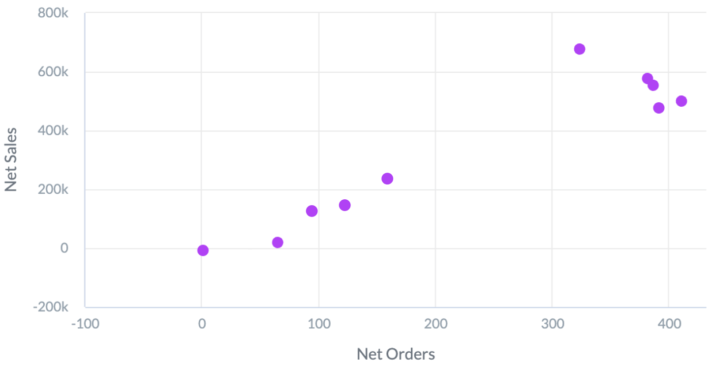
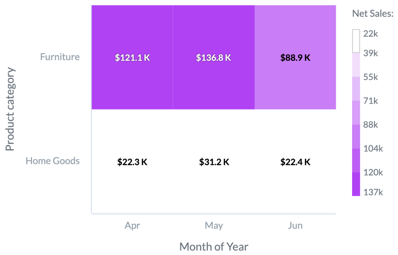
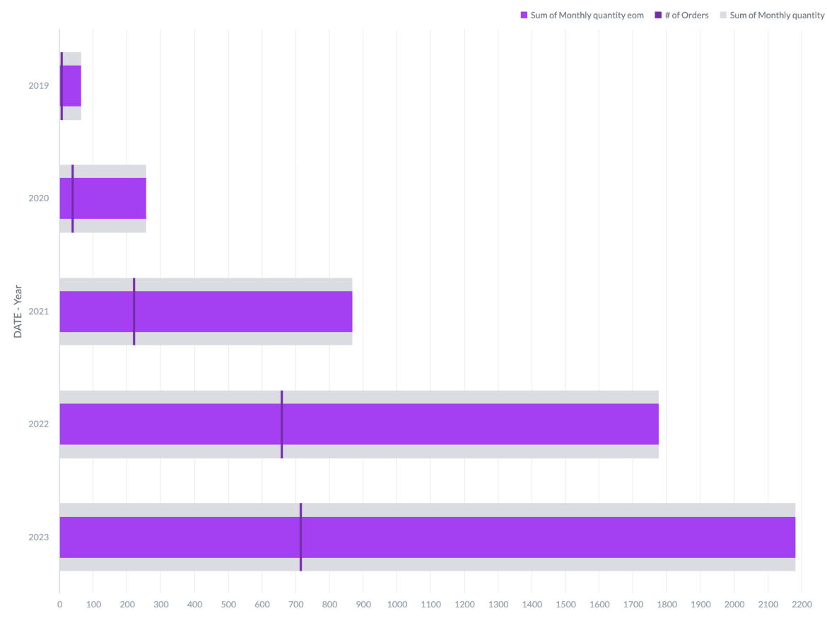
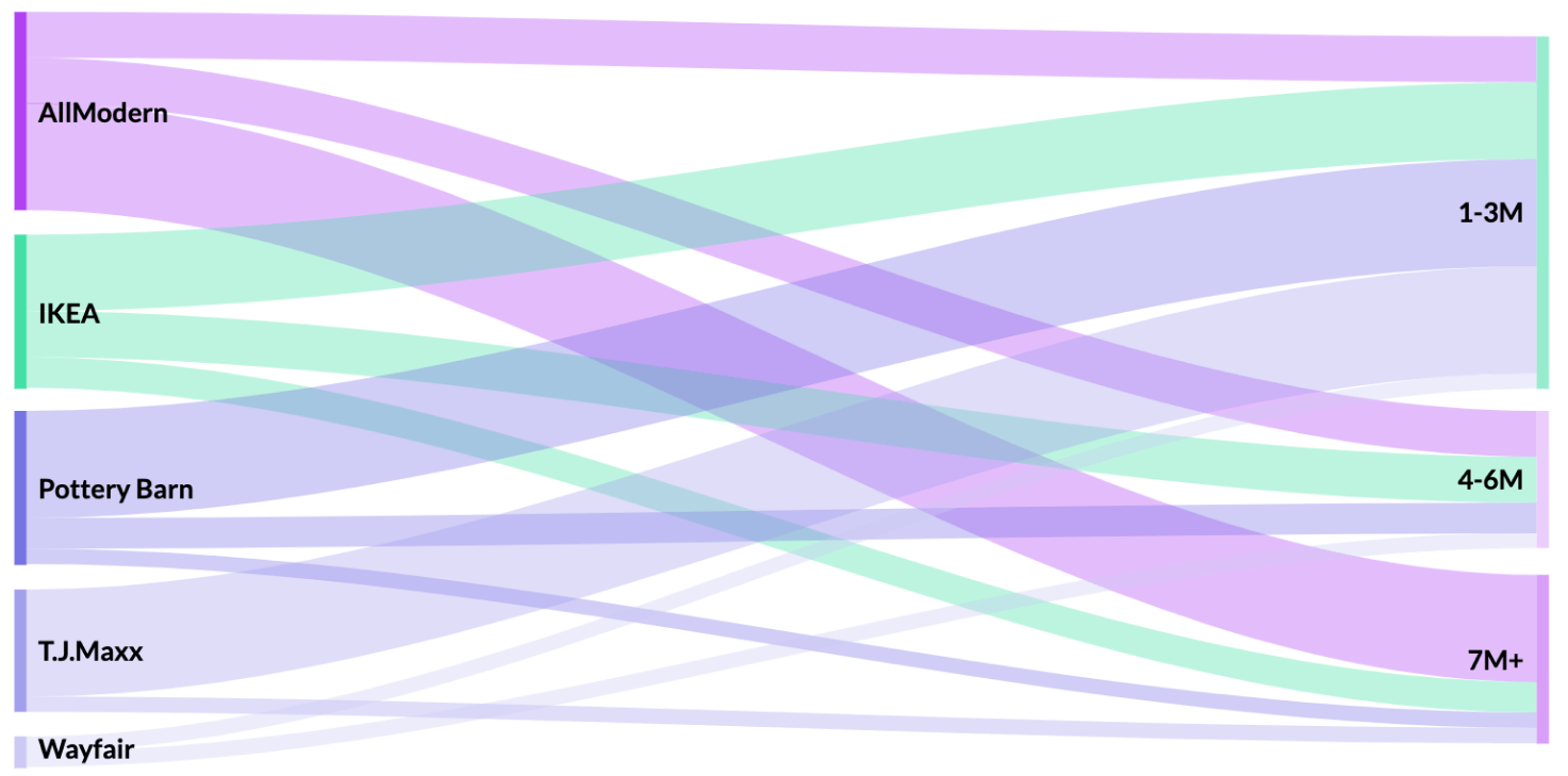
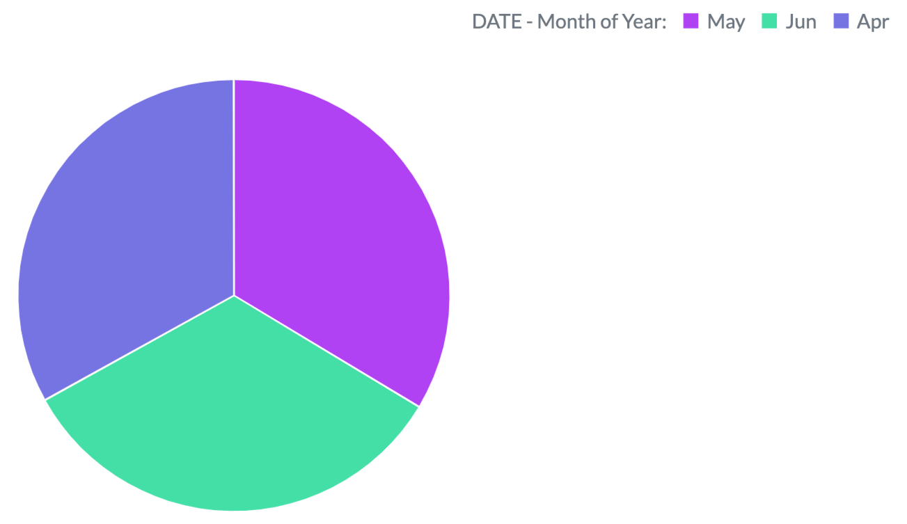
Out-of-the-box visualizations
Interactive and engaging for end users
Dynamic dashboards enable your end users to explore data from different perspectives:
- Drag and drop to change metrics, dimensions, or data visualization types from the out-of-the-box options.
- Add filters to entire dashboards or just a single visualization.
- Drill deeper into a visualization to examine the underlying data in more detail.
- Create aggregations (eg., sum, average) from pre-made metrics.
With your branding
Use dashboard theming to match your brand — fonts, colors, logos — in just a few clicks.
With live data
The freshest data at the click of a button ensures that end-users' dashboards and visualizations are always up to date.
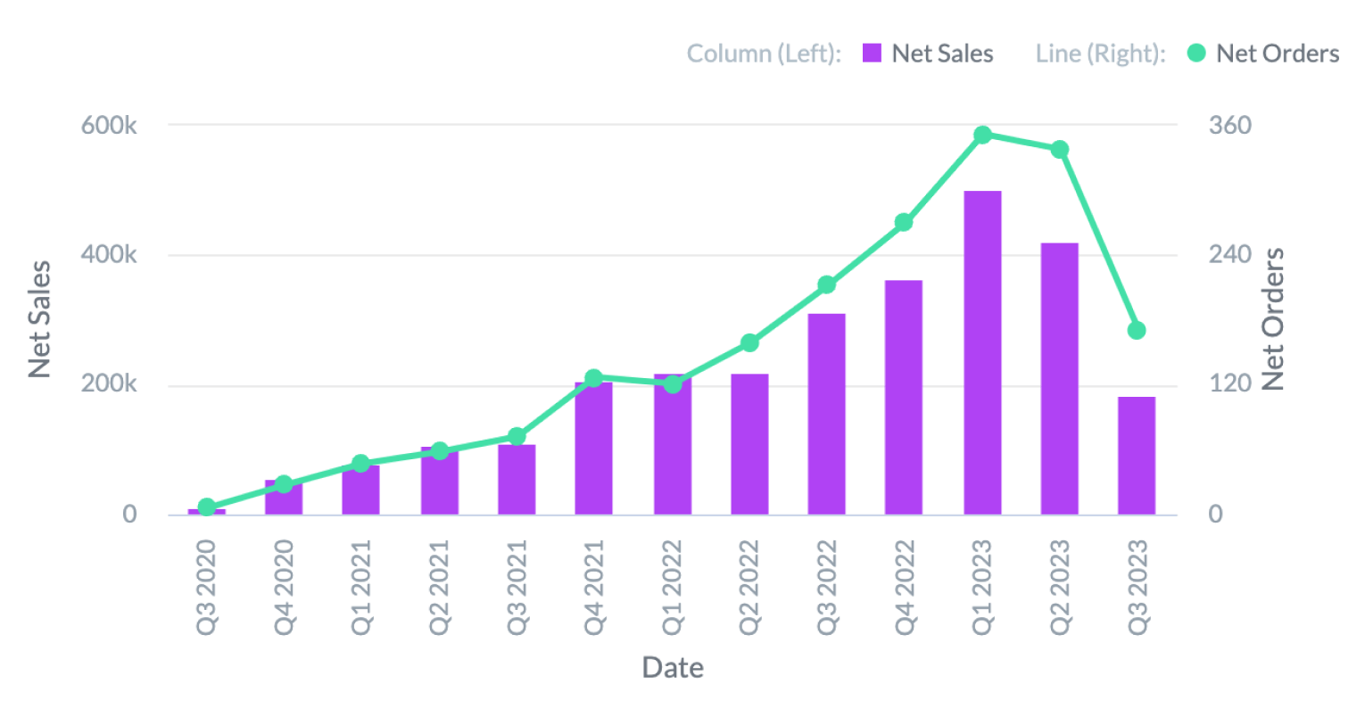
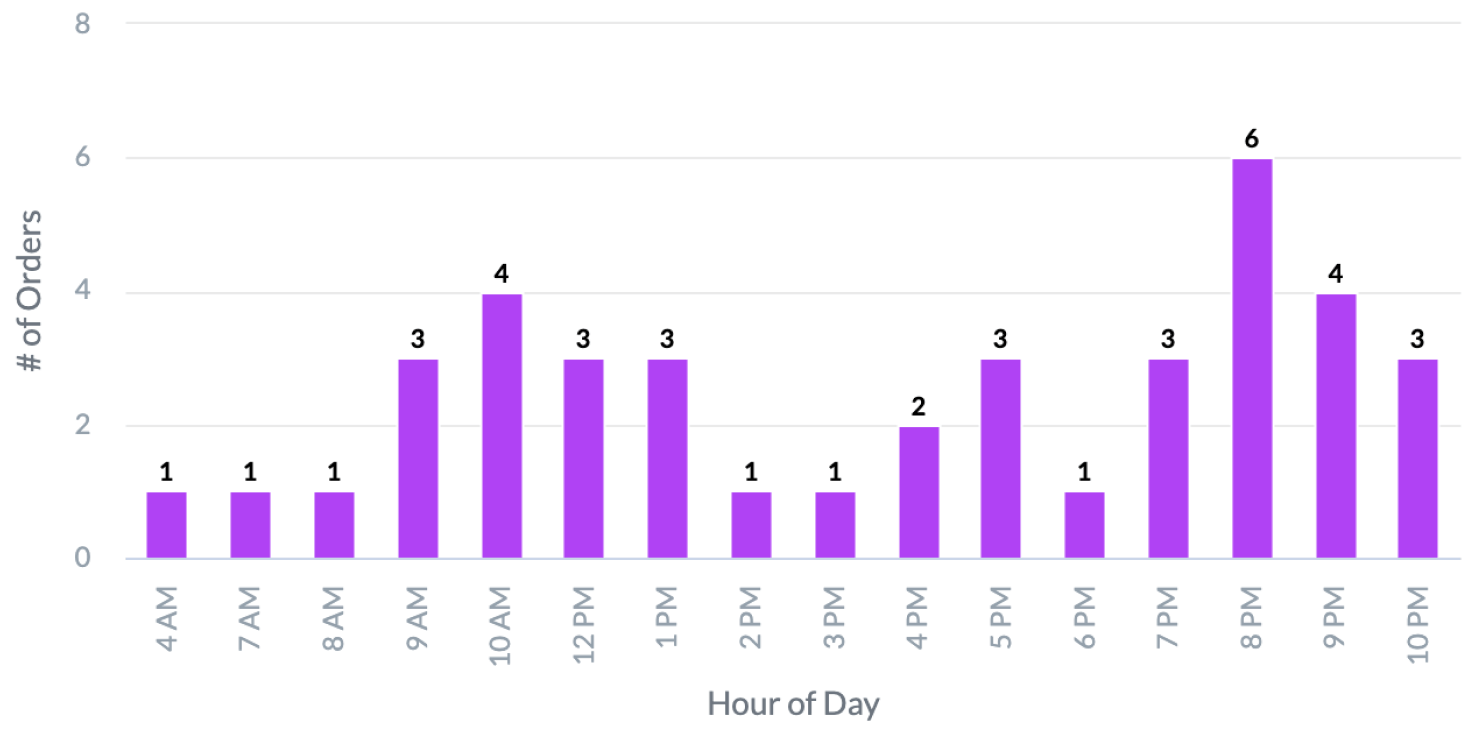
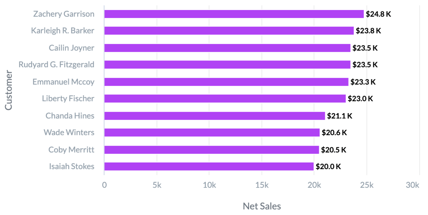
Choose from GoodData’s out-of-the-box visualizations
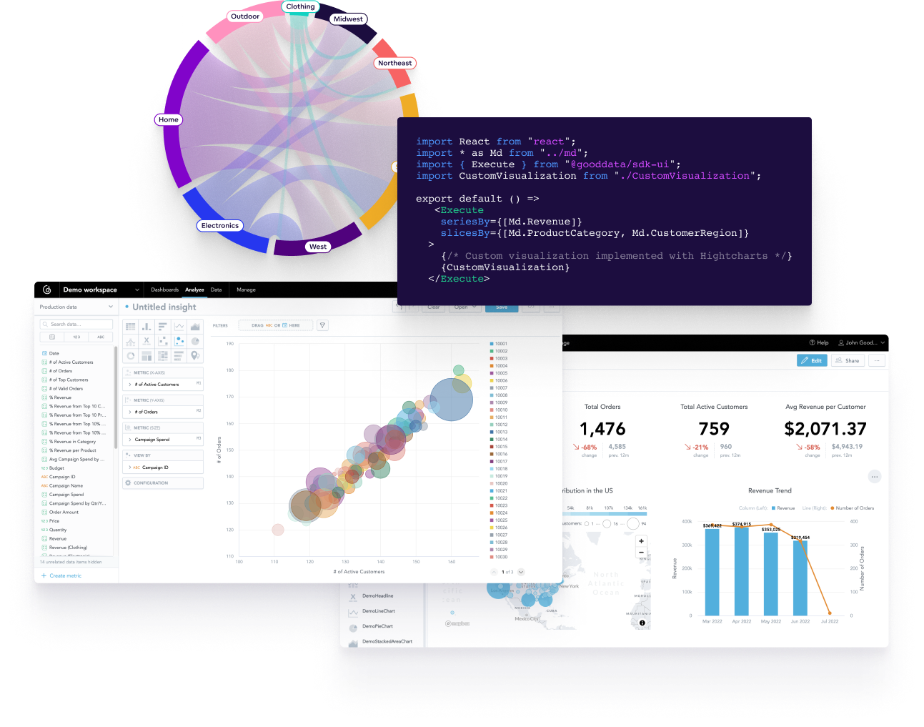
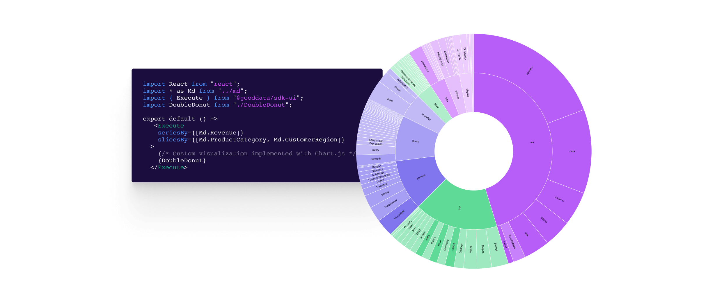
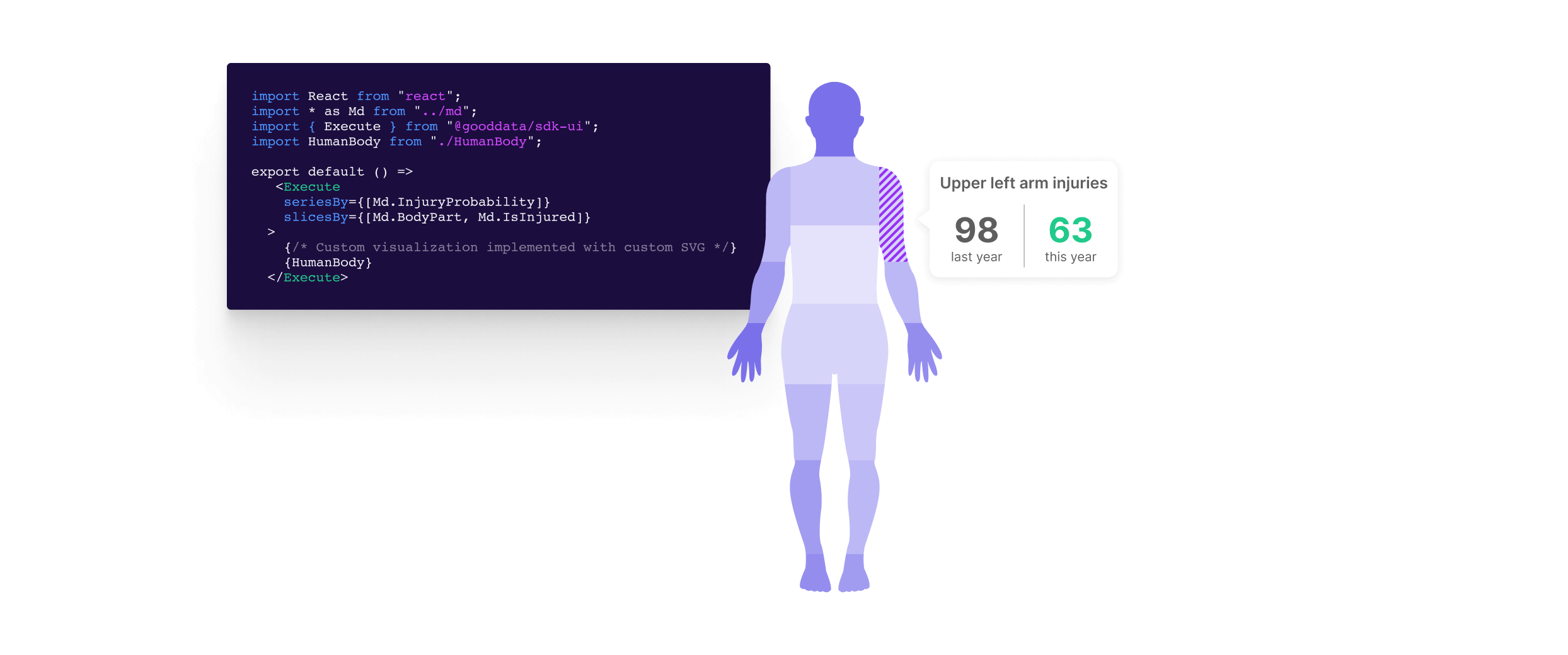
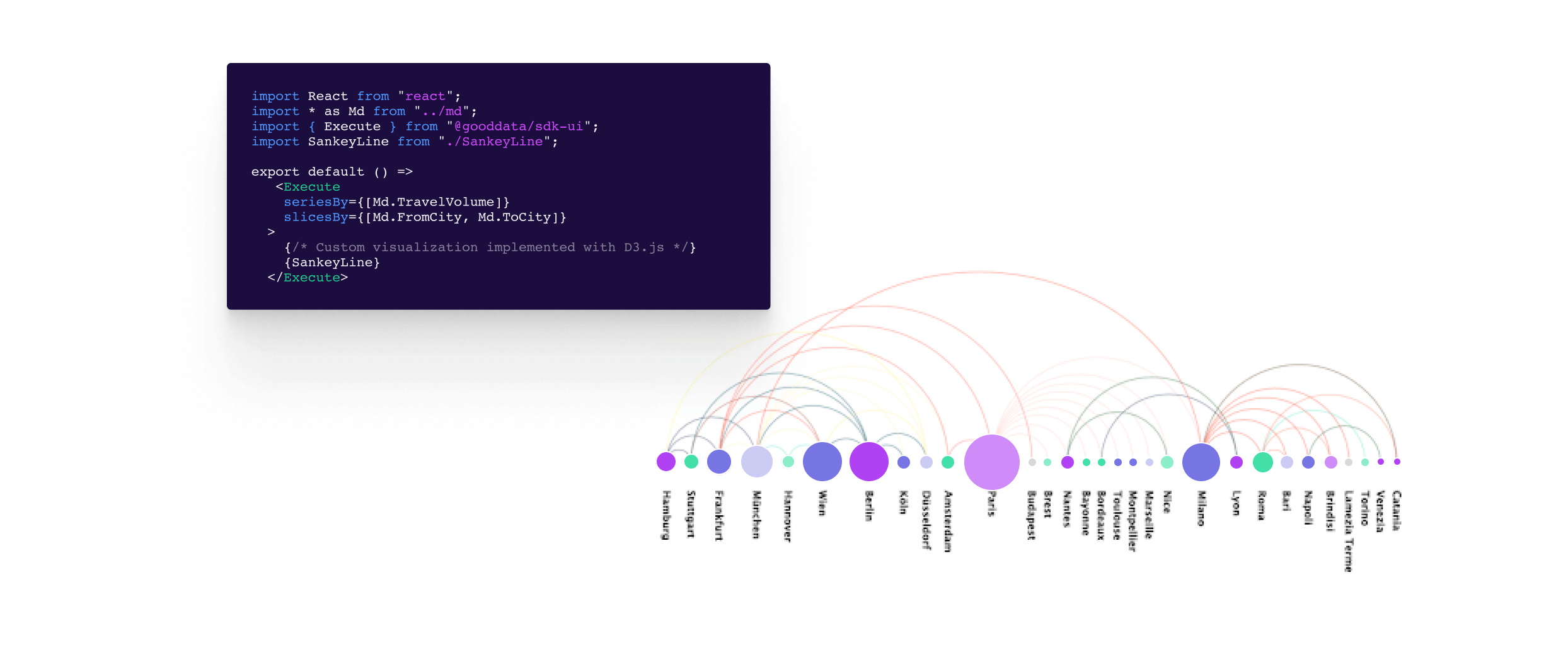
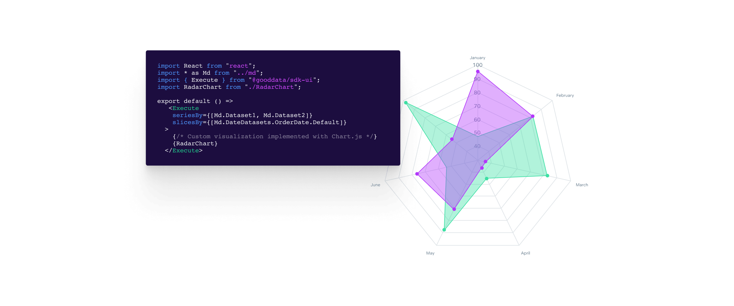
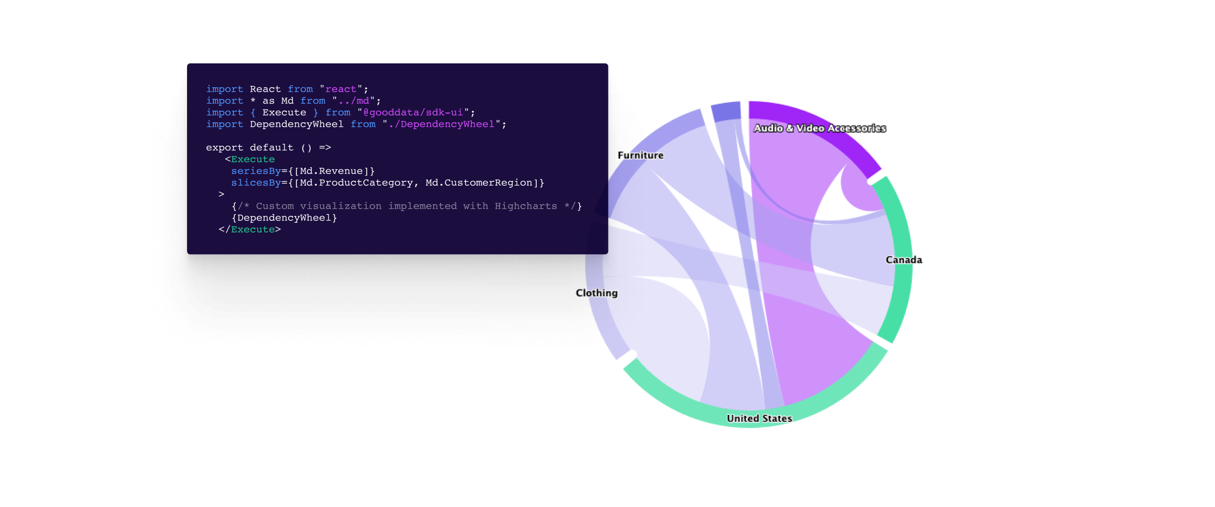
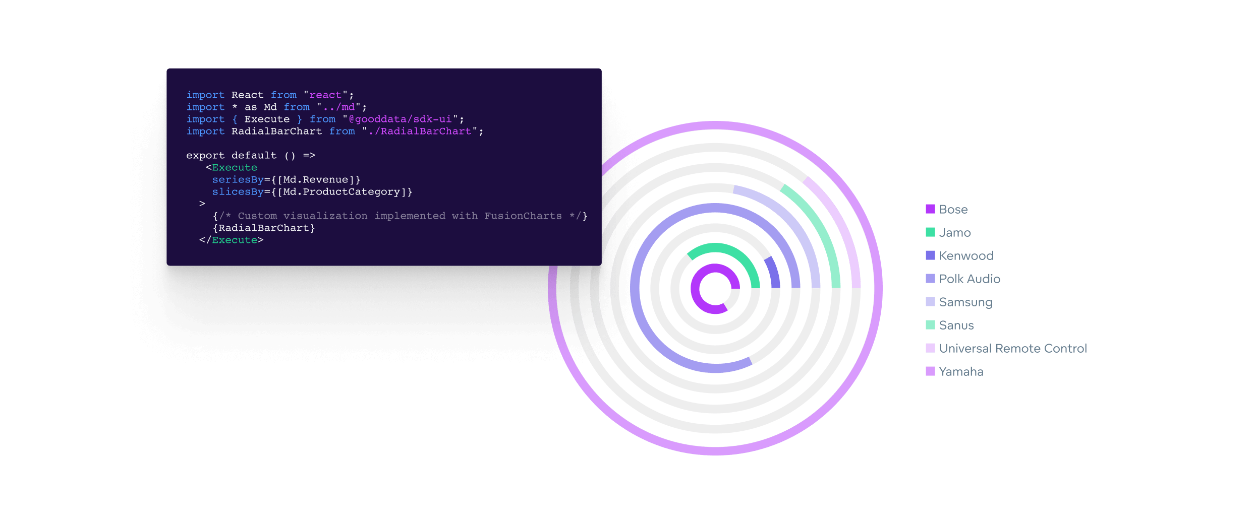
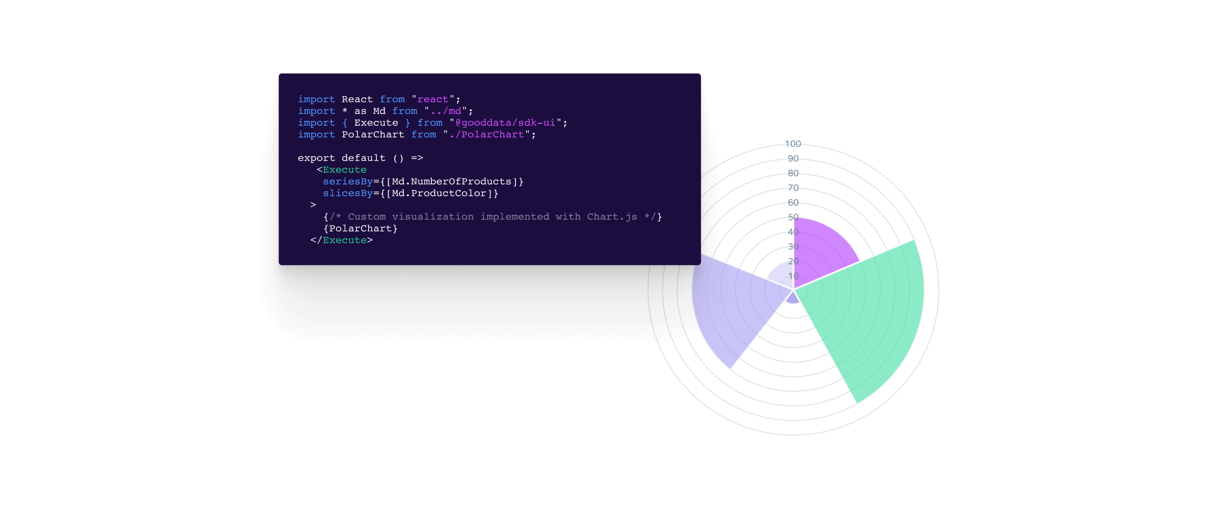
Custom visualizations
Tailor-made to your exact needs — without limits
In addition to the out-of-the-box data visualization types, you can customize your dashboards with charts from any external visualization library.
GoodData’s visualization tool is designed for creating advanced, custom-crafted dashboards, and complex business reporting solutions.
Add and augment any data visualization from any charting library with only a few lines of code — D3, Chart.js, FusionCharts, Google Charts and more.
Implement using any third-party charting library
And ready to embed
Embed on the web
Instantly display dashboards on your web page by copy-pasting. The inserted dashboards are interactive allowing end users to both explore and accommodate the charts.
Embed into your application
Integrate individual visualizations or entire dashboards into your application and create a seamless data visualization and analytics experience for your end users (i.e., your customers, business network). The integration with apps is secure and fully customizable.
Check out GoodData’s types of embedding
Hear from our customers
Business Intelligence Analyst | Enterprise
An analytics solution for a wide variety of businesses
A very robust solution that delivers what it's meant to - analytical dashboards to analyze any business operation, "data democratization", that allows any end user to have simple access to data, without any technical requirements, and support for long-term requirements from it's customers.
Account Manager | Mid-Market
My Experience with GoodData tool: A game changer!
Good Data is solving & addressing multiple business problems like consolidating scattered & unorganized data. Data spread on multiple platforms can be compiled on Good Data which makes it easily accessible to analyze. Also, Good Data simplifies complex analytics. Not everyone in a business is a data expert, so it makes analytics user-friendly. With clear visuals and straightforward insights, even non-tech-savvy team members can understand and use the data effectively. By providing real-time data, Good Data helps the business make effective decisions. It also helps in identifying trends and patterns which helps business in creating efficient future plans. Good Data is a superhero for many business problems.
Director of Operations | Small business
Couldn't have done it without GoodData.
The platform is second to none when it comes to embedded analytics. The charts are top-notch, and the accuracy is superb. They have the capability to tie into multiple data sources, data warehouses, databases, and data source managers.
Engineer | Small business
GoodData removed months of work from our IT department.
With GoodData we are able to deliver fine-grained dashboards in days not months. We check the dashboards on a daily basis, which gives us an almost real-time overview of the revenue, best-selling products, and warehouse status.
Mid-Market
Great BI tool for data visualizations.
Cool visual data model design. It's easy and intuitive to build and share insights with the team. I love the way I can embed insights. There's everything we need – ETL, data storage, dashboards.
Assistant Manager | Enterprise
Go with GoodData if you are looking for the best end-to-end BI solution.
GoodData is a really amazing and powerful solution which provides a semantic layer, metric layer, and on top of it also provides a data visualization tool. It is very user-friendly to build. Also you will get docs and videos which help you to understand the tool and how things work.
Marketing Director | Small business
Make the data work for you
GoodData makes it simple to connect data and transform it into dashboards for critical analysis. It is a simple system with which anyone on the team can analyze and suggest new data, without the need for an engineering team.
Account manager | Mid-Market
GoodData is my best decision so far!
We leverage GoodData to enhance business intelligence and analytics. The platform enables way to easy integration of various data sources, that helps us to get valuable insights. We use the customizable dashboards and reporting tools, my personal fav feature of GoodData. IT professionals like us can monitor performance and make data-driven decisions, fostering efficiency and innovation in their operations.
Data Analyst | Mid-Market
Incredible insight tool.
It's a beautiful tool for dealing with data coming from multiple sources and creating reports. GoodData helps my company connect the various points of analysis in one place, providing data-driven intelligence to everyone on my team.
Chief Product Officer | Small business
GoodData makes choosing a technology partner, not just a technology vendor, easy!
GoodData helps us scale quickly and allows us to build a modern data stack to serve the global travel and tourism industry. If you're looking to discover a partner with a vision for the modern data stack and analytics anywhere, then GoodData is exactly who you should partner with.