Pivot Table (Legacy)
Notice: This component will be replaced by PivotTableNext in the next major release.
A pivot table expands capabilities of a regular (flat) table by allowing you to reorganize and summarize selected data beyond the typical row-column relationship.
In GoodData.UI, a pivot table allows you to break measures into columns by setting attributes in the columns prop. You can also choose to display only attributes (without any measures). On the other hand, a flat table cannot display attributes in columns.
Compared to charts, pivot tables have higher limits for the number of datapoints to display.
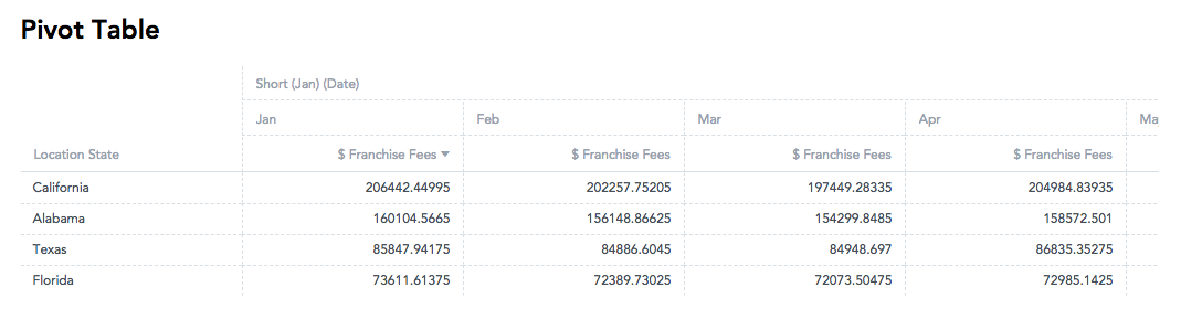
The following pivot table shows franchise fees (a measure), which are split down by location state (an attribute) horizontally and by month (a column attribute) vertically.
Structure
import "@gooddata/sdk-ui-pivot/styles/css/main.css";
import { PivotTable } from "@gooddata/sdk-ui-pivot";

<PivotTable
    measures={<measures>}
    rows={<rows>}
    columns={<columns>}
    …
/>
Examples
Pivot table
The following code sample shows an arrangement for a typical pivot table:
import "@gooddata/sdk-ui-pivot/styles/css/main.css";
import { PivotTable } from "@gooddata/sdk-ui-pivot";
import * as Md from "./md/full";

const style = { height: 300 };

<div style={style}>
    <PivotTable measures={[Md.$FranchiseFees]} rows={[Md.LocationState]} columns={[Md.DateMonth.Short]} />
</div>;
Flat table
You can also use the Pivot Table component to create a regular (flat) table.
import "@gooddata/sdk-ui-pivot/styles/css/main.css";
import { PivotTable } from "@gooddata/sdk-ui-pivot";
import * as Md from "./md/full";

const style = { height: 300 };

<div style={style}>
    <PivotTable measures={[Md.$FranchiseFees]} rows={[Md.LocationState]} />
</div>;
Pivot table transposition
By default, measures are rendered in columns together with column attributes.
If you want measures to create rows rather than columns you can use the config property measureGroupDimension and set it to rows (default is columns).
This will move the measure headers to the left, next to the row attributes. Measure values will be rendered as rows instead of columns. Together with the possibility to swap column and row attributes, this allows for full transposition of table (swapping rows and columns).
import "@gooddata/sdk-ui-pivot/styles/css/main.css";
import { PivotTable } from "@gooddata/sdk-ui-pivot";
import * as Md from "./md/full";

const style = { height: 300 };

<div style={style}>
    <PivotTable
        measures={[Md.$FranchiseFees]}
        rows={[Md.LocationState]}
        columns={[Md.DateDatasets.Date.MonthYear.Short]}
        config={{
            measureGroupDimension: "rows",
        }}
    />
</div>;
Column attribute name position
By default, column attribute names are rendered at the top of the table. However, in some cases, it may be preferable to render them on the left. For this option to be available, the table must have measures in rows and no row attribute defined. You can then use the config prop columnHeadersPosition and set it to left (the default is top).
Column names are then rendered on the left.
import "@gooddata/sdk-ui-pivot/styles/css/main.css";
import { PivotTable } from "@gooddata/sdk-ui-pivot";
import * as Md from "./md/full";

const style = { height: 300 };

<div style={style}>
    <PivotTable
        measures={[Md.$FranchiseFees]}
        columns={[Md.LocationState]}
        config={{
            measureGroupDimension: "rows",
            columnHeadersPosition: "left",
        }}
    />
</div>;
There is a limitation: when column names are moved to the left then columns cannot be resized.

Sorting in pivot tables
You can sort rows and attribute columns in any pivot table. Measures are always listed in the same order in which they were defined in the measures prop.
Important! Sorting must be applied to any column attribute that is used in the pivot table. For example, in the following table, you apply sorting to both the Franchise Fees (measure) and the Date (column attribute).
Example: Sorting by measure
import "@gooddata/sdk-ui-pivot/styles/css/main.css";
import { PivotTable } from "@gooddata/sdk-ui-pivot";
import { newMeasureSort, newAttributeLocator } from "@gooddata/sdk-model";
import * as Md from "./md/full";
import { monthDateIdentifierJanuary } from "./md/ext";

const sortBy = [
    newMeasureSort(Md.$FranchiseFees, "desc", [
        newAttributeLocator(Md.DateMonth.Short, monthDateIdentifierJanuary),
    ]),
];

const style = { height: 300 };

<div style={style}>
    <PivotTable
        measures={[Md.$FranchiseFees]}
        rows={[Md.LocationState]}
        columns={[Md.DateMonth.Short]}
        sortBy={sortBy}
    />
</div>;
Totals
You can display rows with aggregated measure data using the totals prop. For more information, see Specify Table Totals.
Alternatively, you can enable the menu through which you can turn on the totals and subtotals. For more information, see Configuration menu.

Grouping
By default, the same row attribute values in a column are grouped across the rows, which helps improve data readability in pivot tables. The header of the grouped columns is displayed at the top of the table even when you scroll through a long group.
The grouping is applied when the following conditions are both met:
- The table is sorted by the first row attribute (either in ascending or descending order).
- The table has two or more row attributes.

To disable grouping, set the groupRows property to false (see Configuration menu).
Maximum height
By default, the maximum hight is not specified, and the pivot table fills the whole container. If there is still some empty space within the container after all the rows have been displayed, and the table has a total specified, a gap may appear between the data and the total because the total row sticks to the bottom.
To avoid this gap, specify the maximum height of the table using the maxHeight prop. With the maxHeight set, the table is displayed as small as possible while not expanding beyond the maxHeight limit, thus avoiding the gap. For more information, see Configuration menu.
NOTE: The maxHeight must be specified in pixels. If you want your table to be responsive, consider using react-measure to derive the maxHeight value dynamically.
Column width resizing
Auto resizing
By default, the width of the columns is not set, and all columns have the same fixed width regardless of the actual content.
To automatically resize all the columns to fit their content, add the
columnSizingprop and set it todefaultWidth: "autoresizeAll":columnSizing: { defaultWidth: "autoresizeAll"; }To automatically resize only the columns that are visible in the initial viewport, add the
columnSizingprop and set it todefaultWidth: "viewport":columnSizing: { defaultWidth: "viewport"; }TIP: Use this option for large tables when a user cannot scroll the table content (for example, when a table is exported to PDF).
Before Version 8.5, you could set up the auto resizing using
defaultWidth: "viewport"and it worked the same way asdefaultWidth: "autoresizeAll". It changed in Version 8.5, and these two options now work differently. We recommend that you preferdefaultWidth: "autoresizeAll"for common cases.
The following considerations are applied:
- The size is calculated based on the content in the header of the column that represents the lowest level of the grouped attributes (see Grouping). If this is not applicable, the size is calculated based on the content in the header of the column with the measure name and the cells with the measure values.
- The maximum column width is 500 px.
- New columns (that is, those that are shown after the initial render) are resized only if the table has not been vertically or horizontally scrolled. This is useful especially for responsive tables with a dynamic width.
- A change of attributes, measures, filters, or totals in the table is handled as a new table. After the change is made, the column size is re-calculated based on the new data.
- Scrolling horizontally or vertically and sorting values in a column do not affect the column width.
- If you manually adjust the column width, the adjusted width is preserved only temporarily and will be reset to the previously set value after the table is re-rendered.
- Tables that use infinite scrolling (loading content continuously as a user scrolls down the page) are resized based on the first batch of rows. Dynamically loaded rows do not modify the size of the columns after the initial data load.
Manual resizing
To set the width of the columns, add the columnWidths prop to the columnSizing prop. The columnWidths is an array
of width items that specify which columns should be affected and what width to set.
You can create these items using the following factory functions:
newWidthForAttributeColumnsets the width of a row attribute column.newWidthForAllMeasureColumnssets the width of all measure columns.newWidthForAllColumnsForMeasuresets the width of all columns for a particular measure.setNewWidthForSelectedColumnssets the width for one or more columns specified by the locators.
The factory functions are exported from the @gooddata/sdk-ui-pivot package.
const config = {
    columnSizing: {
        columnWidths: [
            newWidthForAttributeColumn(Md.Date, 100),
            setNewWidthForSelectedColumns(
                Md.$FranchiseFees,
                [newAttributeColumnLocator(Md.DateMonth.Short, monthDateJanuaryUri)],
                200,
            ),
        ],
    },
};
The width of the table columns is set according to the provided column width definitions.
The width specified in a width definition or set by resizing the column manually in the UI can be between 60 px (minimum width) and 2000 px (maximum width). If the width is set outside of this range, the closest limit value is used instead.
Attribute and measure identifiers in width definitions are partially validated to match the items used in the table. If validation cannot be performed upon some width definitions, those width definitions are ignored.
If the column width definitions change, the table is re-rendered with the new column width definitions.
Scrolling horizontally or vertically, sorting values in a column, or adding totals do not affect the column width.
Changing the
measures,rows,columns, orfiltersprops in a table discards any changes in the column width done by resizing the columns manually in the UI. After that, you can manually resize the columns in the UI back to the preferable width.To get notified about the change in the width of columns done by resizing the column manually in the UI, add the
onColumnResizedprop with a callback function to the table props:<PivotTable measures="{measures}" rows="{rows}" columns="{columns}" sortBy="{sortBy}" config="{config}" onColumnResized="{handleOnColumnResized}" />A change of the column width calls the provided callback function with all the current column width definitions as a parameter.
To set the same width for all measure columns, use the width item created by the
newWidthForAllMeasureColumnsfunction:const config = { columnSizing: { columnWidths: [newWidthForAllMeasureColumns(200)], }, };To set the same width for all columns of a specific measure (applicable when column attributes are used), use the width item created by the
newWidthForAllColumnsForMeasurefunction:const config = { columnSizing: { columnWidths: [newWidthForAllColumnsForMeasure(Md.$FranchiseFees, 200)], }, };
Priorities of column width definitions
setNewWidthForSelectedColumns defined for a specific column overrides the value set by newWidthForAllColumnsForMeasure or newWidthForAllMeasureColumns.
Combining auto resizing and manual resizing
To combine auto resizing and manual resizing, add both the defaultWidth and columnWidths props under the columnSizing prop.
Example 1: In the following code sample:
- The width of the columns that are defined under
columnWidthsis set according to the values of thewidthparameter (see Manual resizing). - All the other columns are resized to fit the content (see Auto resizing).
const config = {
    columnSizing: {
        defaultWidth: "autoresizeAll",
        columnWidths: [
            newWidthForAttributeColumn(Md.Date, 100),
            setNewWidthForSelectedColumns(
                Md.$FranchiseFees,
                [newAttributeColumnLocator(Md.DateMonth.Short, monthDateJanuaryUri)],
                200,
            ),
        ],
    },
};
Example 2: In the following code sample:
- The width of all the measure columns is set to the value of the
widthprop passed tonewWidthForAllMeasureColumns(see Manual resizing). - However, the
setNewWidthForSelectedColumnsprop overrides the value set bynewWidthForAllMeasureColumnsfor the measure columns that are defined in the call tosetNewWidthForSelectedColumns. Notice that thewidthprop passed tosetNewWidthForSelectedColumnsis set to"auto"and not to a number as in Example 1. This means that at the initial rendering these measure columns will be resized to fit the content (see Auto resizing), while all the other measure columns will be set to the width defined bynewWidthForAllMeasureColumns. - All the attribute columns, if any, are resized to fit the content (see Auto resizing).
const config = {
    columnSizing: {
        defaultWidth: "autoresizeAll",
        columnWidths: [
            newWidthForAllMeasureColumns(200),
            setNewWidthForSelectedColumns(
                Md.$FranchiseFees,
                [newAttributeColumnLocator(Md.DateMonth.Short, monthDateJanuaryUri)],
                "auto",
            ),
        ],
    },
};
Example 3: In the following code sample:
- The width of all the measure columns is set to the value of the
widthprop passed toallMeasureColumnWidthItem(see Manual resizing). - The width of all columns of the selected measure is set to the value of the
widthprop passed tonewWidthForAllColumnsForMeasureand overrides the value fromnewWidthForAllMeasureColumns(see Manual resizing). - However, the
setNewWidthForSelectedColumnsprop overrides the value set bynewWidthForAllMeasureColumnsandnewWidthForAllColumnsForMeasurefor the measure column that is defined undersetNewWidthForSelectedColumns. Notice that thewidthprop passed tosetNewWidthForSelectedColumnsis set to"auto"and not to a number as in Example 1. This means that at the initial rendering this measure column will be resized to fit the content (see Auto resizing), while all the other measure columns will be set to the width defined bynewWidthForAllMeasureColumnsornewWidthForAllColumnsForMeasure. - All the attribute columns, if any, are resized to fit the content (see Auto resizing).
const config = {
    columnSizing: {
        defaultWidth: "autoresizeAll",
        columnWidths: [
            newWidthForAllMeasureColumns(200),
            newWidthForAllColumnsForMeasure(Md.$TotalSales, 200),
            setNewWidthForSelectedColumns(
                Md.$FranchiseFees,
                [newAttributeColumnLocator(Md.DateMonth.Short, monthDateJanuaryUri)],
                "auto",
            ),
        ],
    },
};
Resizing visible columns to fill up the container
To make the currently visible columns take the available screen space, add the growToFit prop to the columnSizing object and set it to true.
const config = {
    columnSizing: {
        defaultWidth: "autoresizeAll",
        growToFit: true,
    },
};
NOTES:
- This behavior is not applied to the manually resized columns. It is applied only to the columns that are not inside the
columnWidthsobject. - If auto resizing is enabled, the columns are automatically resized to fit their content. If these columns do not fit the screen, they will be resized to fill up the container.
Resizing a column to a custom width
Hover over the right side of the column header until a horizontal resize cursor appears.
Drag the column line.
The column is resized to the set width.
The new column width is propagated via the
onColumnResizedcallback array.
Resizing all measure columns at once to a custom width
Hover over the right side of the header of any measure column until a horizontal resize cursor appears.
Press and hold Ctrl or Command, and drag the column line.
All the measures columns are resized to the set width.
The new column widths are propagated via the
onColumnResizedcallback array. All thesetNewWidthForSelectedColumnsitems are removed. ThenewWidthForAllMeasureColumnsitem is added.
Resizing all columns of a specific measure at once to a custom width
Hover over the right side of the header of any column of the specific measure until a horizontal resize cursor appears.
Press and hold Alt or Option, and drag the column line.
All columns of the corresponding measure are resized to the set width.
The new column widths are propagated via the
onColumnResizedcallback array. All thesetNewWidthForSelectedColumnsitems for the corresponding measure are removed. ThenewWidthForAllColumnsForMeasureitem is added.
Resizing a column to fit its content
Hover over the right side of the column header until a horizontal resize cursor appears.
Double-click the column line.
The column is resized. The width is calculated to fit the content of all loaded rows in this column.
The new column width is propagated via the
onColumnResizedcallback array.
NOTES:
- This behavior is not applied if auto resizing is enabled and you double-click a column that was auto-resized at the initial rendering and then its width was manually adjusted in the UI. Such column is removed from the
onColumnResizedcallback array. - If auto resizing is enabled, and
columnWidthsincludes thenewWidthForAllMeasureColumnsornewWidthForAllColumnsForMeasureitems, and you double-click a measure column, thesetNewWidthForSelectedColumnsitem withwidthset to"auto"is added to theonColumnResizedcallback array.
Resizing all measure columns at once to fit their content
Hover over the right side of the header of any measure column until a horizontal resize cursor appears.
Press and hold Ctrl or Command, and double-click the column line.
All measure columns are resized to fit their content.
The new column widths are propagated via the
onColumnResizedcallback array. All thenewWidthForAllMeasureColumnsitems are removed.
Resizing all columns of a specific measure at once to fit their content
Hover over the right side of the header of any column of the specific measure until a horizontal resize cursor appears.
Press and hold Alt or Option, and double-click the column line.
All columns of the corresponding measure are resized to fit their content.
The new column widths are propagated via the
onColumnResizedcallback array. All thenewWidthForAllColumnsForMeasureitems are removed.
Switching to the default resizing
To switch to the default behavior (all columns have the same fixed size), do not provide columnSizing at all or set columnSizing to:
const config = {
    columnSizing: {
        defaultWidth: "unset",
        columnWidths: undefined,
    },
};
You can omit the columnWidths prop completely. It has the same effect as specifying columnWidths: undefined.
Configuration menu
You can configure the following settings:
- Totals and subtotals. If you enable the subtotals menu but disable totals, subtotals will be disabled too.
- Row grouping. See Grouping.
- Separators used when formatting numbers. See Change a separator in the number format.
- Maximum height. See Maximum height.
- Column width resizing. See Column width resizing.
const config = {
    groupRows: false,
    maxHeight: 800,
    menu: {
        aggregations: true,
        aggregationsSubMenu: true,
    },
    separators: {
        thousand: ",",
        decimal: ".",
    },
    columnSizing: {
        defaultWidth: "autoresizeAll",
        columnWidths: [
            newWidthForAttributeColumn(Md.Date, 100),
            setNewWidthForSelectedColumns(
                Md.$FranchiseFees,
                [newAttributeColumnLocator(Md.DateMonth.Short, monthDateJanuaryUri)],
                200,
            ),
        ],
    },
};

<PivotTable measures={measures} rows={rows} columns={columns} sortBy={sortBy} config={config} />;
Properties
| Name | Required? | Type | Description |
|---|---|---|---|
| measures | false | IMeasure[] | An array of measure definitions (either measures, or rows, or columns must be provided for the pivot table to render properly) |
| rows | false | IAttribute[] | An array of attribute definitions that breaks measure data into rows (either measures, or rows, or columns must be provided for the pivot table to render properly) |
| columns | false | IAttribute[] | An array of attribute definitions that breaks measure data into columns (either measures, or rows, or columns must be provided for the pivot table to render properly) |
| totals | false | ITotal[] | An array of total definitions |
| filters | false | IFilter[] | An array of filter definitions |
| config | false | IPivotTableConfig | The configuration object |
| sortBy | false | ISortItem[] | An array of sort definitions |
| backend | false | IAnalyticalBackend | The object with the configuration related to communication with the backend and access to analytical workspaces |
| workspace | false | string | The workspace ID |
| locale | false | string | The localization of the table. Defaults to en-US. |
| drillableItems | false | IDrillableItem[] | An array of points and attribute values to be drillable |
| ErrorComponent | false | Component | A component to be rendered if this component is in error state |
| LoadingComponent | false | Component | A component to be rendered if this component is in loading state |
| onError | false | Function | A callback when the component updates its error state |
| onExportReady | false | Function | A callback when the component is ready for exporting its data |
| onLoadingChanged | false | Function | A callback when the component updates its loading state |
| onDrill | false | Function | A callback when a drill is triggered on the component |