Column Chart
A column chart shows data in vertical columns. Column charts can display one or multiple measures side by side, divided by either attribute values or by a single measure stacked by attribute values.
Structure
import "@gooddata/sdk-ui-charts/styles/css/main.css";
import { ColumnChart } from "@gooddata/sdk-ui-charts";

<ColumnChart
    measures={<measures>}
    config={<chart-config>}
    …
/>
Example
import "@gooddata/sdk-ui-charts/styles/css/main.css";
import { ColumnChart } from "@gooddata/sdk-ui-charts";
import * as Md from "./md/full";
const style = { height: 300 };
<div style={style}>
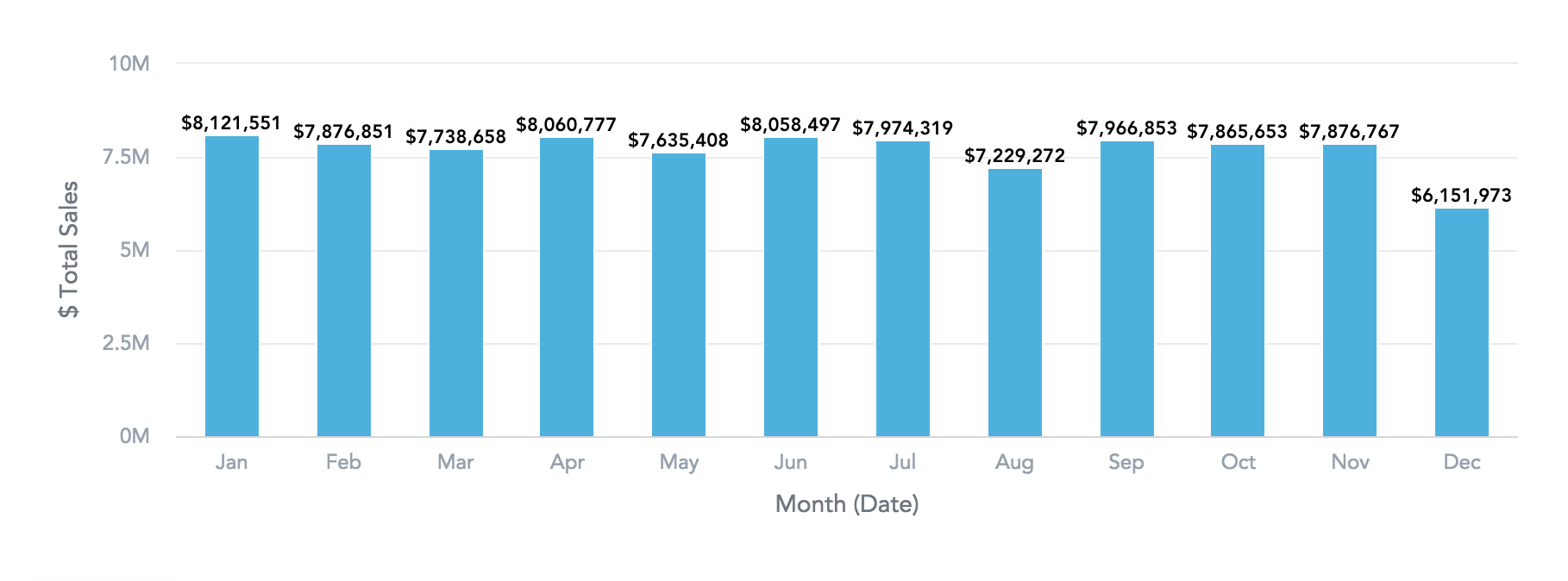
<ColumnChart
measures={[Md.$TotalSales]}
viewBy={Md.DateMonth.Short}
/>
</div>Properties
| Name | Required? | Type | Description |
|---|---|---|---|
| measures | true | IMeasure[] | An array of measure definitions |
| viewBy | false | IAttribute | Attribute[] | The attribute definition or an array of two attribute definitions. If set to a two-attribute array, the first attribute wraps up the second one. |
| stackBy | false | IAttribute | The attribute definition. Do not use stackBy in charts with multiple measures. |
| filters | false | IFilter[] | An array of filter definitions |
| sortBy | false | ISortItem[] | An array of sort definitions |
| config | false | IChartConfig | The chart configuration object |
| backend | false | IAnalyticalBackend | The object with the configuration related to communication with the backend and access to analytical workspaces |
| workspace | false | string | The workspace ID |
| locale | false | string | The localization of the chart. Defaults to en-US. |
| drillableItems | false | IDrillableItem[] | An array of points and attribute values to be drillable. |
| ErrorComponent | false | Component | A component to be rendered if this component is in error state |
| LoadingComponent | false | Component | A component to be rendered if this component is in loading state |
| onError | false | Function | A callback when the component updates its error state |
| onExportReady | false | Function | A callback when the component is ready for exporting its data |
| onLoadingChanged | false | Function | A callback when the component updates its loading state |
| onDrill | false | Function | A callback when a drill is triggered on the component |
The following example shows the supported config structure with sample values. For the descriptions of the individual options, see ChartConfig.
{
    colors: ["rgb(195, 49, 73)", "rgb(168, 194, 86)"],
    colorPalette: [{
        guid: "01",
        fill: {
            r: 195,
            g: 49,
            b: 73
        }
    }, {
        guid: "02",
        fill: {
            r: 168,
            g: 194,
            b: 86
        }
    }],
    colorMapping: [{
        predicate: (headerItem) => {
            return headerItem.measureHeaderItem && (headerItem.measureHeaderItem.localIdentifier === "m1_localIdentifier")
        },
        color: {
            type: "guid",
            value: "02"
        }
    }],
    xaxis: {
        visible: true,
        labelsEnabled: true,
        rotation: "auto"
    },
    yaxis: {
        visible: true,
        labelsEnabled: true,
        rotation: "auto",
        min: "20",
        max: "30"
    },
    legend: {
        enabled: true,
        position: "bottom",
    },
    dataLabels: {
        visible: "auto"
    },
    grid: {
        enabled: true
    }
    separators: {
        thousand: ",",
        decimal: "."
    }
}