Chart Config
This article describes the options for configuring a chart.
Structure
{
    chart: {
        verticalAlign: "top" // "top" | "middle" | "bottom"
    },
    colors: ["rgb(195, 49, 73)", "rgb(168, 194, 86)"], // array of strings
    xaxis: {
        visible: true, // boolean
        labelsEnabled: true, // boolean
        rotation: "auto", // "auto" or numeral string
        min: "10", // numeral string
        max: "20" // numeral string
    },
    yaxis: {
        visible: true, // boolean
        labelsEnabled: true, // boolean
        rotation: "auto", // string
        min: "30", // numeral string
        max: "40", // numeral string
        format: "auto" // "auto" | "inherit"
    },
    secondary_yaxis: {
        visible: true, // boolean
        labelsEnabled: true, // boolean
        rotation: "auto", // string
        min: "300", // numeral string
        max: "400", // numeral string
        format: "inherit", // "auto" | "inherit"
        measures: ["measureLocalIdentifier"]
    },
    legend: {
        enabled: true, // boolean
        position: "bottom", // "top" | "left" | "right" | "bottom"
        responsive: "autoPositionWithPopup" // "autoPositionWithPopup" | true | false
    },
    dataLabels: {
        visible: "auto" // "auto" | true | false
        percentsVisible: false // true | false, applies for funnel chart only
    },
    dataPoints: {
        visible: true // "auto" | true | false
    },
    grid: {
        enabled: true // boolean
    },
    separators: {
        thousand: ",",
        decimal: "."
    },
    stackMeasures: true, // boolean
    stackMeasuresToPercent: true, // boolean
    primaryChartType: "column", // string
    secondaryChartType: "area", // string
    dualAxis: false, // boolean
    tooltip: {
        enabled: true // boolean
    },
    enableCompactSize: true, // boolean
    forceDisableDrillOnAxes: false, // boolean
    enableJoinedAttributeAxisName: false // boolean
}
NOTE: primaryChartType, secondaryChartType, and dualAxis are available only for combo charts.
Custom sorting
To be able to utilize the sortBy prop in your visualizations (e.g. PieChart), simply set the IChartConfig.enableChartSorting to true.
Align a chart vertically
You can configure a vertical alignment for pie charts and donut charts.
To align a chart vertically, set config.chart.verticalAlign to one of the possible values: top, middle, or bottom. If not set, it defaults to middle.
import { InsightView } from "@gooddata/sdk-ui-ext";

// Example of embedding a visualization with a custom chart alignment
<InsightView
    insight=<InsightView-id>
    config={{
        chart: {
            verticalAlign: "bottom"
        }
    }}
/>
Configure colors
To configure colors, use the following options:
- Color array (the
colorsproperty) - Custom color palette (the
colorPaletteproperty) - Color mapping (the
colorMappingproperty)
If you have more than one option configured for a visualization, the following rules apply:
- The
colorsproperty overrides a custom color palette uploaded through the API. - The
colorPaletteproperty overrides thecolorsproperty and the custom color palette uploaded through the API. - The
colorMappingproperty overrides thecolorPaletteproperty, thecolorsproperty, and the custom color palette uploaded through the API.
Color array
The following are examples of a color array:
["rgb(195, 49, 73)", "rgb(168, 194, 86)"]["#fa0510", "#AA2030"]If there are fewer colors than data points, then the colors are repeated. For example, here is how colors will be used for two colors and three data points:
["rgb(195, 49, 73)", "rgb(168, 194, 86)", "rgb(195, 49, 73)"]To change colors in a chart, provide a config for each component where you want to change colors, or create a wrapped components with a config baked in.
NOTE: Heatmaps use only the first color from the provided colors as the base color, and generate the other colors themselves.
import { InsightView } from "@gooddata/sdk-ui-ext";

// Example of embedding a visualization with custom colors and palette options
<InsightView
    insight=<InsightView-id>
    config={{
        colors: ["rgb(195, 49, 73)", "rgb(168, 194, 86)"]
    }}
/>
Within one visualization:
- The
colorsproperty overrides a custom color palette uploaded through the API. - The
colorsproperty can be overridden by thecolorPaletteproperty or thecolorMappingproperty.
Custom color palette
If you uploaded a custom color palette to your workspace, the visualizations created based on the Visualization component use this palette instead of the default colors.
To override the uploaded custom color palette for a specific visualization, define the colorPalette property for this visualization.
import { InsightView } from "@gooddata/sdk-ui-ext";

// Example of embedding a visualization with a custom palette
<InsightView
   insight=<InsightView-id>
   colorPalette={[
       {
           guid: "01",
           fill: {
               r: 195,
               g: 49,
               b: 73
           }
       }, {
           guid: "02",
           fill: {
               r: 168,
               g: 194,
               b: 86
           }
       }, {
           guid: "03",
           fill: {
               r: 243,
               g: 217,
               b: 177
           }
       }
   ]}
/>
Within one visualization:
- The
colorPaletteproperty overrides the custom color palette uploaded through the API and thecolorsproperty. - The
colorPaletteproperty can be overridden by thecolorMappingproperty.
Color mapping
Color mapping allows you to assign colors to individual measures or attribute elements. To set up color mapping, set the colorMapping property.
The colorMapping property contains an array of objects. Each object is represented by a pair of a mapping predicate and a color (color GUID or color value).
- A mapping predicate is a function that takes a result header as the first argument and returns a Boolean value indicating whether the color will be assigned to a particular measure or attribute element.
- A color is an object that contains two keys,
typeandvalue.- To assign a color from a color palette (either the custom color palette uploaded through the API or the palette defined by the
colorPaletteproperty), settypetoguid, and setvalueto the GUID of the color from the palette. - To assign a custom color, set
typetorgb, and setvalueto an object containing the keysr,g, andbwith numerical values.
- To assign a color from a color palette (either the custom color palette uploaded through the API or the palette defined by the
The following example shows how to assign the color with GUID 02 to the measure with the local identifier m1_localIdentifier, and the black color to the measure with the local identifier m2_localIdentifier:
import { InsightView } from "@gooddata/sdk-ui-ext";

// Example of embedding a visualization with custom color mapping
<InsightView
    insight=<InsightView-id>
    config={{
        colorMapping: [{
            predicate: (headerItem) => {
                return headerItem.measureHeaderItem && (headerItem.measureHeaderItem.localIdentifier === "m1_localIdentifier")
            },
            color: {
                type: "guid",
                value: "02"
            }
        }, {
            predicate: (headerItem) => {
                return headerItem.measureHeaderItem && (headerItem.measureHeaderItem.localIdentifier === "m2_localIdentifier")
            },
            color: {
                type: "rgb",
                value: {
                    r: 0,
                    g: 0,
                    b: 0
                }
            }
        }]
    }}
/>
Within one visualization, the colorMapping property overrides the colorPalette property (while still can use its colors), the colors property, and the custom color palette uploaded through the API.
Change legend properties
To change the legend position, set the
config.legend.positionproperty to one of the possible values:"left","right","top", or"bottom".To make the legend responsive, set
config.legend.responsivetotrue.To make the legend appear as a popup in too small containers, set
config.legend.responsiveto"autoPositionWithPopup".For a better visual experience, we recommend that you enable the compact size together with making the legend appear as a popup.
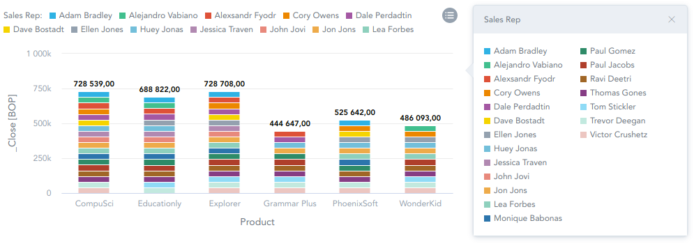
NOTE: When
config.legend.responsiveis set to"autoPositionWithPopup", theconfig.legend.positionproperty may be ignored for containers of a smaller size, and the legend position will be automatically adjusted anyway.To hide the legend, set
config.legend.enabledtofalse.
import { InsightView } from "@gooddata/sdk-ui-ext";

// Example of embedding a visualization with a custom legend position and responsive legend
<InsightView
    insight=<InsightView-id>
    config={{
        legend: {
            enabled: true,
            position: "bottom", // "left", "right", "top"
            responsive: "autoPositionWithPopup", // true, false
        }
    }}
/>
Change a separator in the number format
- To change the thousands separator, adjust the
config.separators.thousandproperty. - To change the decimal separator, adjust the
config.separators.decimalproperty.
import { InsightView } from "@gooddata/sdk-ui-ext";

// Example of embedding a visualization with a custom separator in the number format
<InsightView
    insight=<InsightView-id>
    config={{
        separators: {
            thousand: ",",
            decimal: "."
        }
    }}
/>
Configure axes
The properties listed in this section are specific to the X axis. To get the properties for the Y axis, replace xaxis with yaxis in a property’s name.
To hide the axis, set
config.xaxis.visibletofalse. If not set, it defaults totrue(the axis is visible).To hide axis labels, set
config.xaxis.labelsEnabledtofalse. If not set, it defaults totrue(the axis labels are visible).NOTE: When
config.xaxis.visibleis set tofalse, axis labels are hidden automatically regardless of whatconfig.xaxis.labelsEnabledis set to.To rotate axis labels, set
config.xaxis.rotationto a desired value.To set the axis scale, set
config.xaxis.minandconfig.xaxis.maxto desired values.To show measures on a secondary axis, set
config.secondary_xaxis.measuresto the measures that you want to display. Ifconfig.secondary_xaxis.measuresis not set, all measures are displayed on the main axis by default.To hide the axis name, set
config.xaxis.name.visibletofalse. If not set, it defaults totrue(the axis name is visible).To set the axis name position, set
config.xaxis.name.positionto one of the possible values:low,middle,high.NOTE: If an axis represents more than one attribute/measure, the
config.xaxis.name.visibleandconfig.xaxis.name.positionproperties are both ignored, and the axis name is hidden. However, you can override this behavior for an axis that represents two attributes (see Display the name for an axis with two attributes). You cannot override this behavior for an axis that represents two measures.
import { InsightView } from "@gooddata/sdk-ui-ext";

// Example of embedding a visualization with settings for the x-axis
<InsightView
    insight=<InsightView-id>
    config={{
        xaxis: {
            visible: false,
            labelsEnabled: false,
            rotation: "-90",
            min: "150",
            max: "440",
            name: {
                position: "low", // "low", "middle", "high"
            }
        },
        secondary_xaxis: {
            visible: true,
            labelsEnabled: true,
            rotation: "-90",
            min: "1500",
            max: "4400",
            name: {
                visible: false
            }
            measures: ["measureLocalIdentifier1", "measureLocalIdentifier2"]
        }
    }}
/>
Disable drilling on axis labels
To disable drilling on labels for the both axes, see Disabled drilling on axis labels.
Display the name for an axis with two attributes
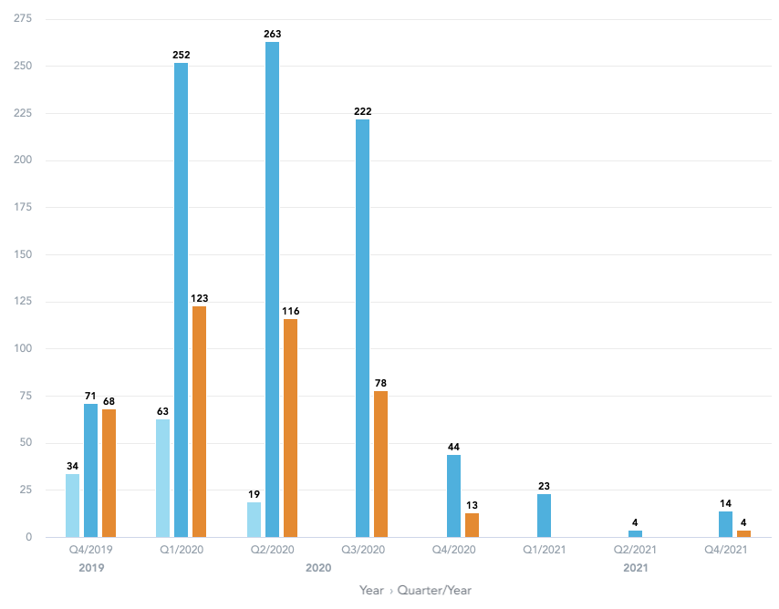
In column charts, bullet charts, and bar charts, if an axis represents two attributes, the axis name is hidden by default. To make the axis name visible, set config.enableJoinedAttributeAxisName to true. The axis name is generated as the attribute names joined by › (for example, Year › Quarter/Year).
import { InsightView } from "@gooddata/sdk-ui-ext";

// Example of embedding a visualization with the name visible for an axis with two attributes
<InsightView
    insight=<InsightView-id>
    config={{
        enableJoinedAttributeAxisName: true
    }}
/>
Configure canvases
- To configure data labels, set the
config.dataLabelsproperty. - To hide data points from a chart, set
config.dataPointstofalse. This applies to the following types of charts:- Line charts
- Area charts
- Combo charts with at least one of the combined charts being a line chart or an area chart.
import { InsightView } from "@gooddata/sdk-ui-ext";

// Example of embedding a visualization with settings for the canvas
<InsightView
    insight=<InsightView-id>
    config={{
        dataLabels: true,
        dataPoints: false,
        grid: {
            enabled: false
        }
    }}
/>
Configure stacking
- You can configure stacking for the following types of charts:
NOTE: In combo charts using column or area charts, stacking is applied only to the measures shown on the left axis.
Charts with the secondary axis
- To display the total contribution of each measure, set
config.stackMeasurestotrue.- For area charts,
config.stackMeasuresis set totrueby default. - For bar charts, column charts, and charts with the secondary axis,
config.stackMeasuresis ignored when the chart has only one measure.
- For area charts,
- To display the percentage contribution of each measure, set
config.stackMeasuresToPercenttotrue.- If both
config.stackMeasuresToPercentandconfig.stackMeasuresare present,config.stackMeasuresToPercentoverwritesconfig.stackMeasures. - For charts with the secondary axis,
config.stackMeasuresToPercentis applied only to the left axis.
- If both
import { InsightView } from "@gooddata/sdk-ui-ext";

// Example of embedding a visualization with stacking
<InsightView
    insight=<InsightView-id>
    config={{
        stackMeasures: false,
        stackMeasuresToPercent: true
    }}
/>
Configure tooltip visibility
To hide a tooltip, set config.tooltip.enabled to false.
import { InsightView } from "@gooddata/sdk-ui-ext";

// Example of embedding a visualization with stacking
<InsightView
    insight=<InsightView-id>
    config={{
        tooltip: {
            enabled: true
        }
    }}
/>
Enable a compact size
To allow the charts to be rendered in small containers by hiding less important parts, set config.enableCompactSize to true.
import { InsightView } from "@gooddata/sdk-ui-ext";

// Example of embedding a visualization with the enabled compact size
<InsightView
    insight=<InsightView-id>
    config={{
        enableCompactSize: {
            true
        }
    }}
/>
NOTE: For a better visual experience, we recommend that you make the legend appear as a popup together with enabling the compact size.
Minimum height
The following table shows the minimum height (in pixels) for each chart type:
| Visualization | Min height (px) |
|---|---|
| Area chart | 334px |
| Bar chart | 134px |
| Bubble chart | 334px |
| Bullet chart | 134px |
| Column chart | 134px |
| Combo chart | 334px |
| Donut chart | 134px |
| Geo pushpin chart | 334px |
| Headline (primary measure) | 34px |
| Headline (primary + secondary measure) | 94px |
| Heatmap | 334px |
| Line chart | 134px |
| Pie chart | 134px |
| Pivot table | 134px |
| Scatter plot | 334px |
| Treemap | 334px |
Chart responsiveness
Small charts with a compact size disabled take on a small area and cannot identify the items properly.
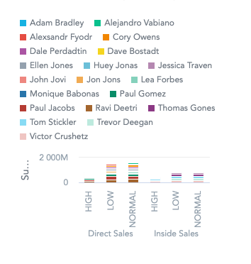
Once config.enableCompactSize is set to true, the axis labels are hidden, and the chart becomes more readable.
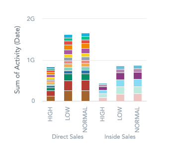
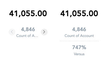
A headline chart with config.enableCompactSize set to true adjusts its content responsively to fit small containers. Otherwise, it may not be able to fit small containers.
Responsive legend
For configuring a responsive legend, see Change legend properties.
Disabled drilling on axis labels
To disable drilling on axis labels, set config.forceDisableDrillOnAxes to true.