Visual Components
GoodData.UI comes with ready-made visual components. You can use these visual components as-is or customize them. You can also use the unique InsightView component that simply renders any chart that you create in GoodData.
This article provides components examples and basic instructions on component usage. For details about each component, see its page. For details on common ways of customizing charts (colors, sorting, legend) see Chart Config. To explore live examples of code within your browser check Interactive Examples.
All examples in this section showcase the use of the code generated by catalog-export and assume that the application is set up with BackendProvider and WorkspaceProvider as described in Integrate into and Existing Application.
Currently available out-of-the-box visualizations:
| Name | Visual | Description |
|---|---|---|
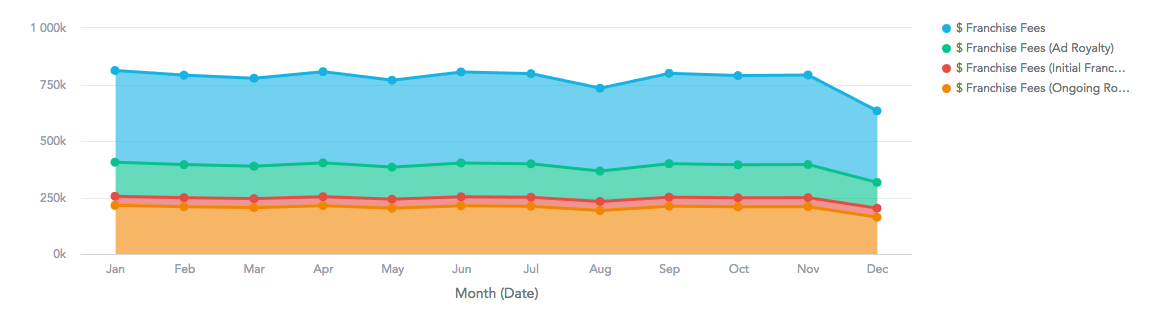
| Area Chart |
| Shows data as an area under a line intersecting dots. Can display multiple measures or a single measure split by one attribute. |
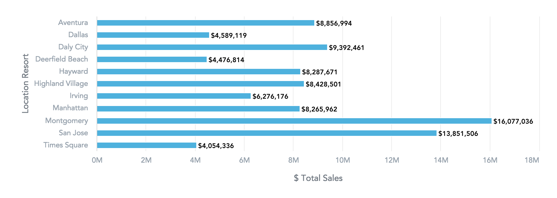
| Bar Chart |
| Horizontal visual commonly used to illustrate trends, comparisons, and distributions. |
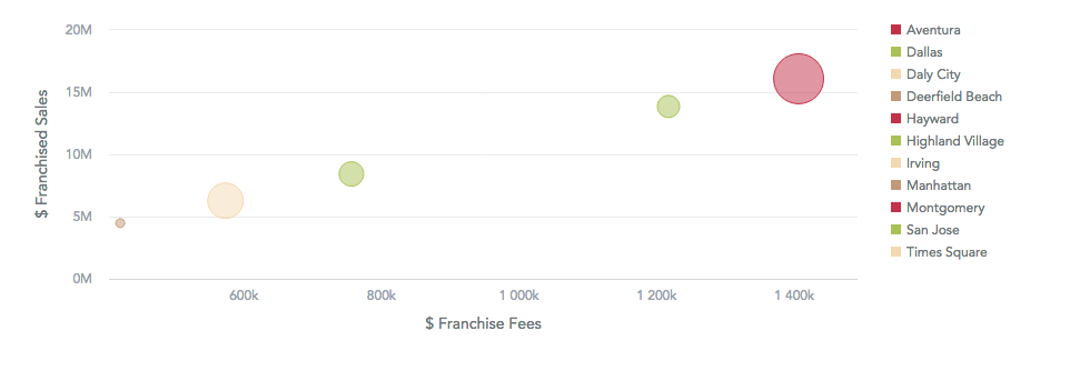
| Bubble Chart |
| Shows data as bubbles using Cartesian coordinates. Typically shows three measures for X-axis, Y-axis, and one for the size. |
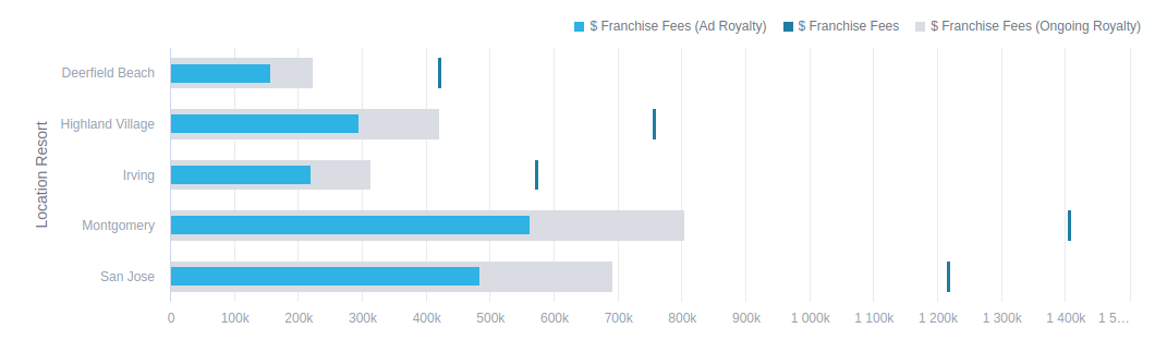
| Bullet Chart |
| Displays performance of a primary measure and its progress towards a goal, with optional comparison to another measure. |
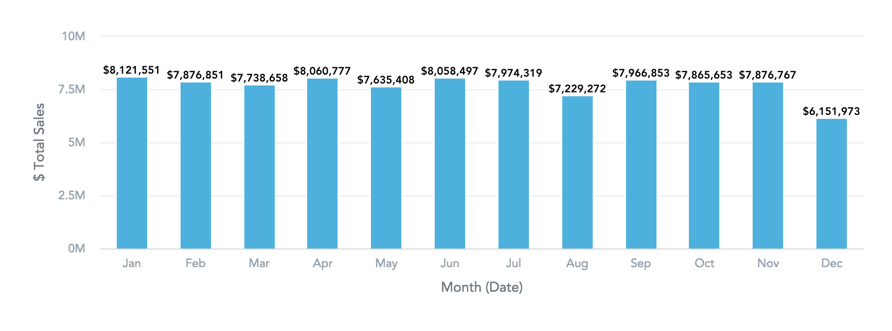
| Column Chart |
| Shows data in vertical columns. Can display one or multiple measures. |
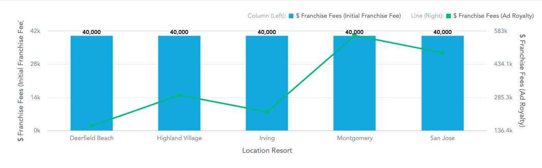
| Combo Chart |
| Combines two types of visualizations, usually, a column chart and a line chart. |
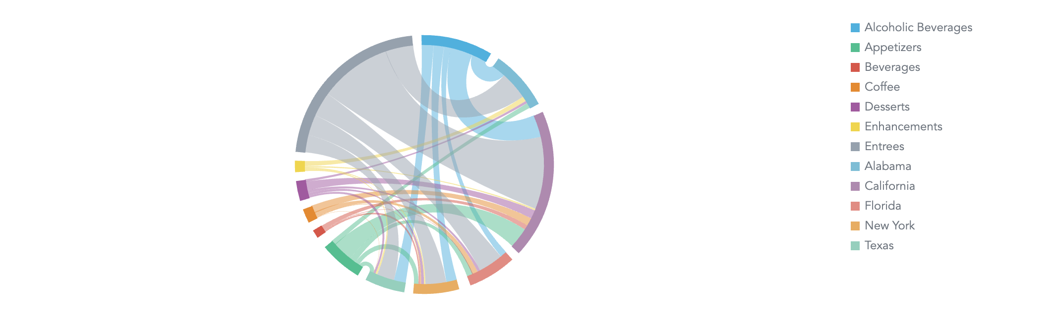
| Dependency Wheel Chart |
| Visualizes nodes in a circle with links between them, showing flow quantity or weight proportionally through link width and node size. |
| Donut Chart |
| Shows data as proportional segments of a disc with hollowed out center. Can be segmented by either multiple measures or an attribute. |
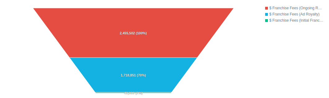
| Funnel Chart |
| Shows data as parts of a funnel, segmented by multiple measures or a single attribute, displaying values as progressively decreasing proportions. |
| Geo Pushpin Chart |
| Visualizes point data on a map using latitude and longitude attributes. |
| Geo Area Chart |
| Visualizes data by geographic regions (countries, states, …) on a map. |
| Geo Chart |
| Multi-layer geo visualization composed of pushpin and area layers. |
| Headline |
| Shows a single number or compares two numbers. |
| Heatmap |
| Represents data as a matrix where individual values are represented as colors. Helps discover trends and understand complex datasets. |
| Line Chart |
| Shows data as line-connected dots. Can display either multiple measures as individual lines or a single measure split by one attribute into multiple lines with points intersecting attribute values. |
| Pie Chart |
| Shows data as proportional segments of a disc. Can be segmented by either multiple measures or an attribute. |
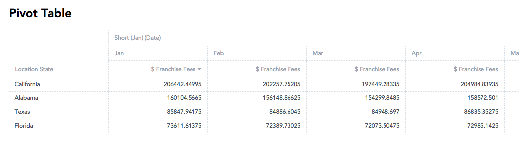
| Pivot Table |
| Expands capabilities of a regular (flat) table by allowing to reorganize and summarize selected data beyond the typical row-column relationship. |
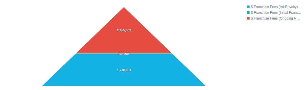
| Pyramid Chart |
| Displays values as proportional segments in a triangular shape, perfect for showing hierarchical structures and relative proportions. |
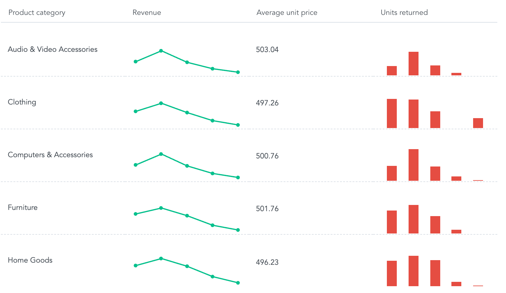
| Repeater |
| Displays multiple simple visualizations or values side-by-side across rows, for each key attribute value, allowing quick trend comparison and data changes. |
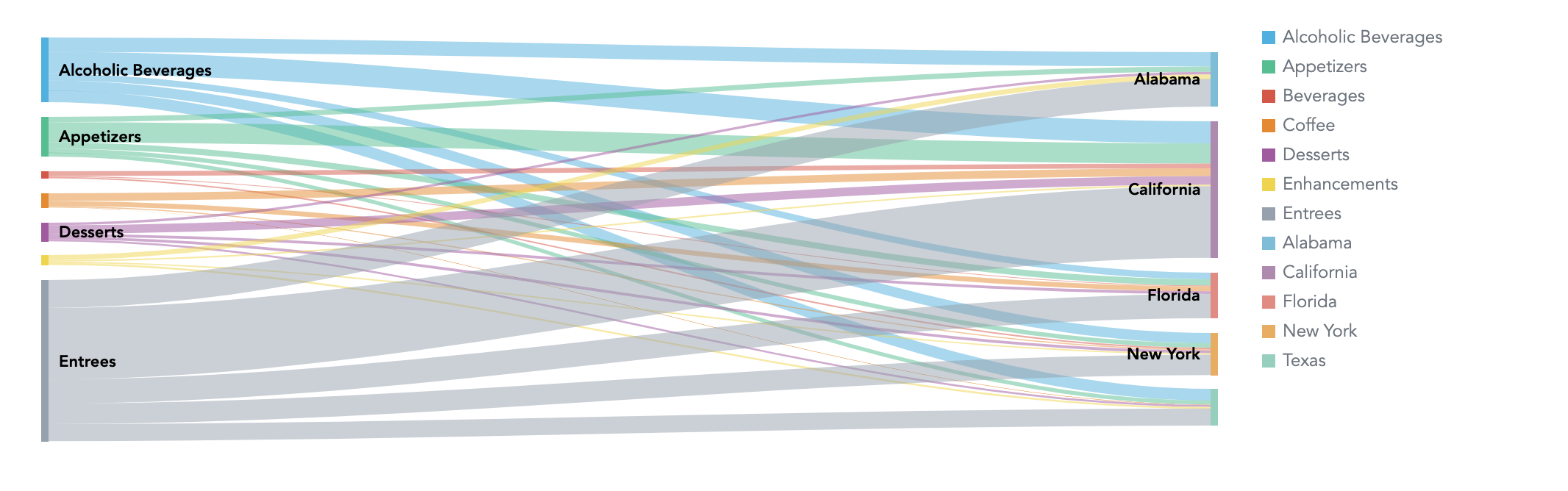
| Sankey Chart |
| Visualizes flow quantity proportionally through the width of links between nodes. Can display one measure as flowing between values of two attributes. |
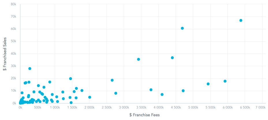
| Scatter Plot |
| Shows data as points using Cartesian coordinates. Typically have a minimum of two measures, one for the X-axis and the other for the Y-axis, and one attribute, which determines the meaning of each data point. |
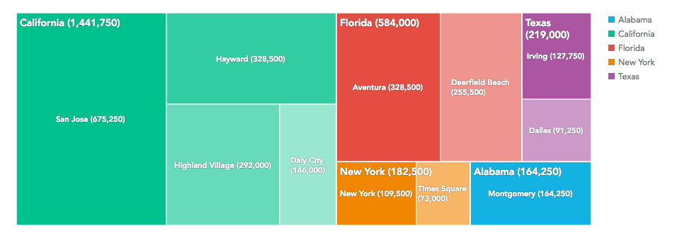
| Treemap |
| Presents data hierarchically as nested rectangles, useful for comparing proportions within a hierarchy. |
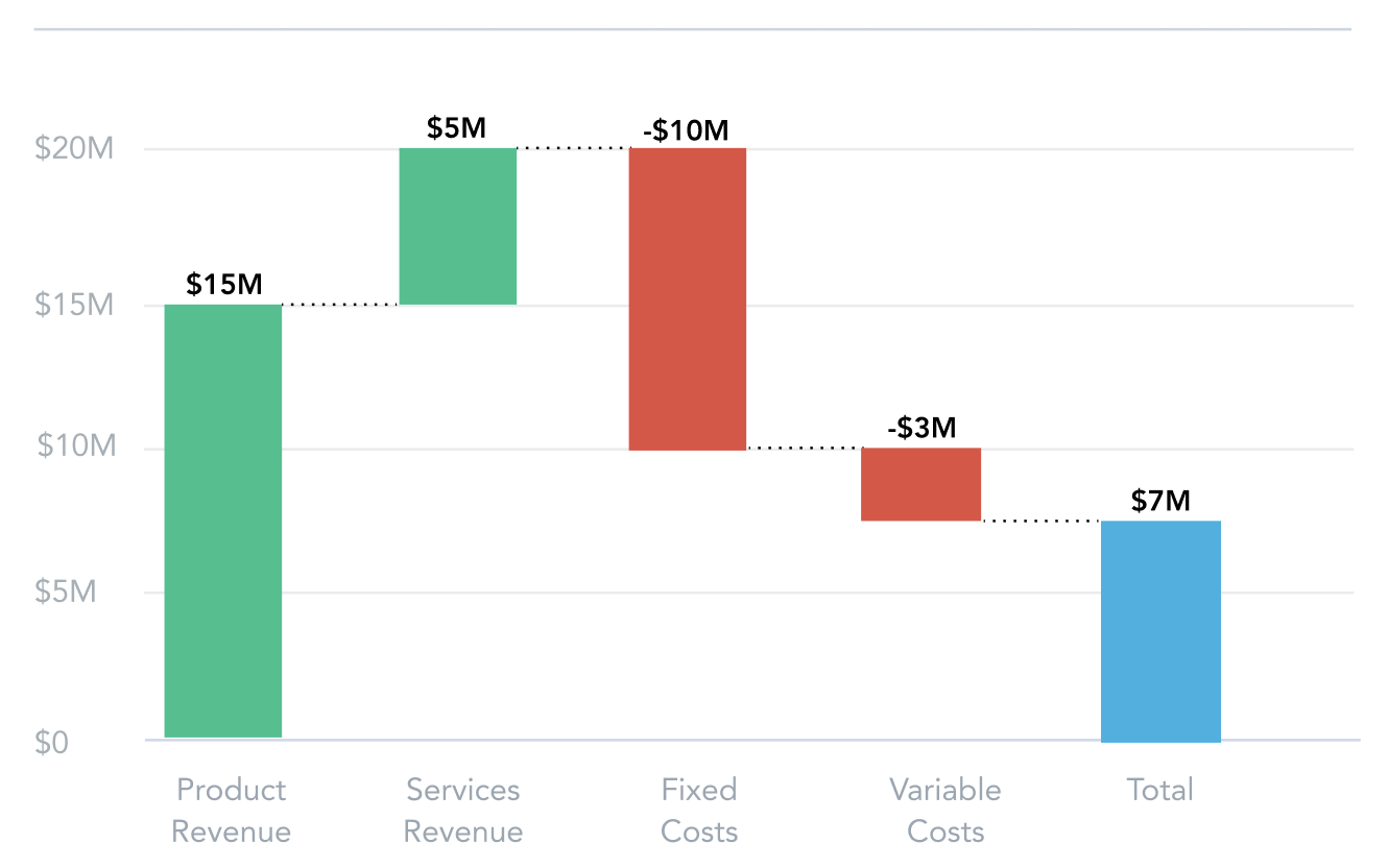
| Waterfall Chart |
| Shows the cumulative impact of sequentially introduced positive or negative values, useful for displaying financial data like profit and loss statements or budget analysis. |