Date Filter
Known issues:
availableGranularitiesinrelativeFormhas been removed. Use theavailableGranularitiesfrom the Date Filter component instead.
The Date Filter component is a dropdown component that lists date filter options. You can pass allowed options and a callback function, which receives a list of the selected values when a user clicks Apply.

In the Date Filter component, you can optionally define the following:
The attribute values that should be selected in the filter by default
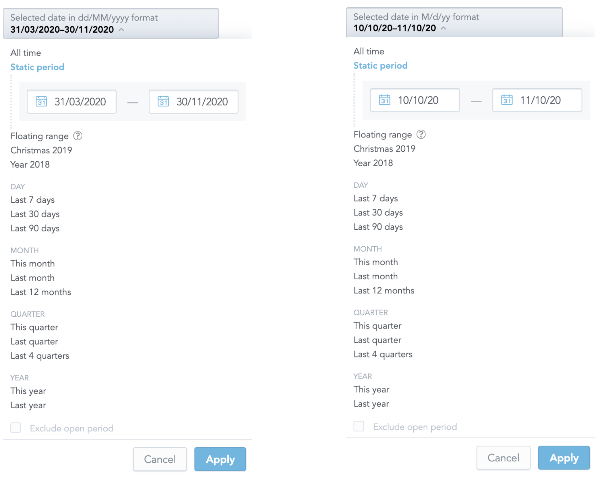
The format in which dates should be displayed
To define the date format, use any value supported by the date-fns library.

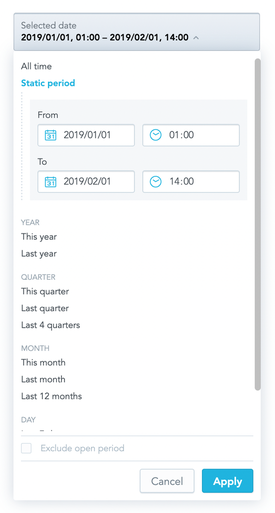
Support for time filtering.
Only available for GoodData Cloud and GoodData.CN.

Example
In the following example, attribute values are listed and the onApply callback function is triggered when a user clicks Apply to confirm the selection.
import React, { Component } from "react";
import { DateFilter, defaultDateFilterOptions } from "@gooddata/sdk-ui-filters";
import { myDateFilterOptions } from "myDateFilterConfiguration";

import "@gooddata/sdk-ui-filters/styles/css/main.css";

const availableGranularities = [
    "GDC.time.month",
    "GDC.time.year",
    "GDC.time.quarter",
    "GDC.time.date"];

// You can either provide your custom date filter options
const dateFilterOptions = myDateFilterOptions();
// or use the default we provide
const dateFilterOptions = defaultDateFilterOptions;

export class DateFilterComponentExample extends Component {
    constructor(props) {
        super(props);

        this.state = {
            selectedFilterOption: dateFilterOptions.allTime,
            excludeCurrentPeriod: false,
        };
    }

    onApply = (dateFilterOption, excludeCurrentPeriod) => {
        this.setState({
            selectedFilterOption: dateFilterOption,
            excludeCurrentPeriod,
        });
        // eslint-disable-next-line no-console
        console.log(
            "DateFilterExample onApply",
            "selectedFilterOption:",
            dateFilterOption,
            "excludeCurrentPeriod:",
            excludeCurrentPeriod,
        );
    };

    render() {
        return (
            <div style={{ width: 300 }}>
                <DateFilter
                    excludeCurrentPeriod={this.state.excludeCurrentPeriod}
                    selectedFilterOption={this.state.selectedFilterOption}
                    filterOptions={dateFilterOptions}
                    availableGranularities={availableGranularities}
                    customFilterName="Date filter name"
                    dateFilterMode="active"
                    dateFormat="M/d/yy"
                    onApply={this.onApply}
                />
            </div>
        );
    }
}
Properties
| Name | Required? | Type | Description |
|---|---|---|---|
| excludeCurrentPeriod | true | boolean | The state of the “Exclude current period” checkbox |
| selectedFilterOption | true | DateFilterOption | The selected filter option |
| filterOptions | true | DateFilterOptions | Available filter options |
| availableGranularities | true | DateFilterGranularity[] | An array of available types of granularity for the Relative Form |
| customFilterName | false | string | A custom filter label |
| dateFilterMode | true | string | Filter mode; can be readonly, hidden, or active |
| dateFormat | false | string | Date format. Defaults to MM/dd/yyyy. For the supported values, see the date-fns library. |
| customIcon | false | IFilterButtonCustomIcon | A custom icon with associated tooltip information. |
| FilterConfigurationComponent | false | Component | A component to be rendered when the configuration button is clicked. |
| backend | false | IAnalyticalBackend | The object with the configuration related to communication with the backend and access to analytical workspaces |
| workspace | false | string | The workspace ID |
| isTimeForAbsoluteRangeEnabled | false | boolean | Determine whether the static period form allows the user to set also the time of the date range or only the date. |
| locale | false | string | The localization of the component. Defaults to en-US. |
| onApply | true | Function | A callback when the selection is confirmed by the user |
| onCancel | false | Function | A callback when the selection is canceled by the user |
| onOpen | false | Function | A callback when the filter dropdown is opened by the user |
| onClose | false | Function | A callback when the filter dropdown is closed by the user |
How to Modify Date Filters in Dashboards
You can adjust the date filters in your dashboard to show specific time granularities (e.g., only days, months, or years) using the dateFilterConfig metadata object. Here’s a simple guide:
Setting Up dateFilterConfig
You can configure dateFilterConfig at two levels:
- Organization Setting: /api/v1/entities/organizationSettings
- Workspace Setting: /api/v1/entities/workspaces/{workspaceId}/workspaceSettings
Example Payload for dateFilterConfig
To create this metadata object, send a POST request with the following payload. Update the type to workspaceSetting if needed:
{
    "data": {
        "id": "dateFilterConfig",
        "type": "organizationSetting",
        "attributes": {
            "content": {},
            "type": "DATE_FILTER_CONFIG"
        }
    }
}
Editing Granularities in Relative Period
The relative period defines which granularities (e.g., days, weeks, months) are available in the date filter. Supported granularities include:
- GDC.time.week_us
- GDC.time.month
- GDC.time.year
- GDC.time.quarter
- GDC.time.date
- GDC.time.hour
- GDC.time.minute
Example Configuration
{
    "config": {
        "absoluteForm": {
            "localIdentifier": "absoluteForm",
            "name": "",
            "visible": true
        },
        "allTime": {
            "localIdentifier": "allTime",
            "name": "All time",
            "visible": true
        },
        "relativeForm": {
            "granularities": [
                "GDC.time.week_us",
                "GDC.time.month",
                "GDC.time.year",
                "GDC.time.quarter",
                "GDC.time.date",
                "GDC.time.hour",
                "GDC.time.minute"
            ],
            "localIdentifier": "relativeForm",
            "name": "",
            "visible": true
        },
        "relativePresets": [
            {
                "from": -6,
                "to": 0,
                "granularity": "GDC.time.date",
                "localIdentifier": "relative_last_7_days",
                "name": "Last 7 days",
                "visible": true
            },
            {
                "from": -29,
                "to": 0,
                "granularity": "GDC.time.date",
                "localIdentifier": "relative_last_30_days",
                "name": "Last 30 days",
                "visible": true
            }
            // Add more presets as needed
        ],
        "selectedOption": "relative_this_month"
    }
}
Adding Predefined Periods
You can customize the relativePresets section to define periods like “Last 10 days” or “Last month.” Each preset includes:
- Granularity: Defines the time unit (e.g., day, week, month).
- From/To: Relative to today (0 represents today).Examples:
- Last 3 days: from: -2, to: 0
- This year: from: 0, to: 0
- Local Identifier: A unique name for the filter.
- Name: The display name on the dashboard.
- Visible: Controls if the filter is shown.
Example: Last 10 Days Filter
{
    "from": -9,
    "to": 0,
    "granularity": "GDC.time.date",
    "localIdentifier": "last_10_days",
    "name": "Last 10 days",
    "visible": true
}
Removing Granularities
To remove granularities, delete the corresponding items in the relativeForm section. For example, to include only months and years:
"relativeForm": {
  "granularities": [
    "GDC.time.month",
    "GDC.time.year"
  ],
  "localIdentifier": "relativeForm",
  "name": "relativeForm",
  "visible": true
}
Deleting dateFilterConfig
To delete the configuration, send a DELETE request to the following endpoints:
- Organization: /api/v1/entities/organizationSettings/dateFilterConfig
- Workspace: /api/v1/entities/workspaces/{workspaceId}/workspaceSettings/dateFilterConfig