Attribute Filter Button
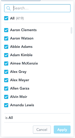
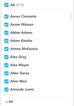
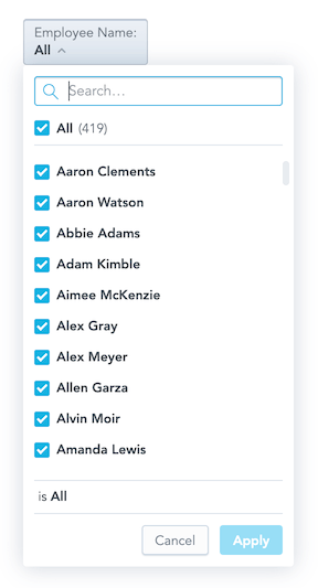
The Attribute Filter Button component is a dropdown component that lists attribute values.
To implement the component, choose one of the following methods:
You pass a callback function, which receives a list of the selected values when a user clicks Apply.
The component handles the change after calling itself via the
connectToPlaceholderproperty.The
onApplyfunction is not needed. UseonApplyonly if you need a specific callback to be fired.
Optionally, you can define what attribute values should be selected in the filter by default.
When implementing the Attribute Filter Button component, consider the following::
GoodData Cloud and GoodData.CN support filters with attribute elements defined by their
primary keythat is equal to the title of the respective element.
Example
In the following example, attribute values are listed and the onApply callback function is triggered when a user clicks Apply to confirm the selection.
The onApply callback receives a new filter definition that you can use to filter charts.
import { useState } from "react";
import { AttributeFilterButton, Model } from "@gooddata/sdk-ui-filters";
import { newNegativeAttributeFilter } from "@gooddata/sdk-model";

import "@gooddata/sdk-ui-filters/styles/css/main.css";

import * as Md from "./md/full";

const defaultFilter = newNegativeAttributeFilter(Md.EmployeeName.Default, []);

export const AttributeFilterExample = () => {
    const [filter, setFilter] = useState(defaultFilter);

    return (
        <AttributeFilterButton
            filter={filter}
            onApply={(updatedFilter) => {
                console.log("Applying updated filter:", updatedFilter);
                setFilter(updatedFilter);
            }}
        />
    );
};
Attribute Filter Button component vs. Attribute Filter component
The Attribute Filter Button component is functionally similar to the Attribute Filter component. You can use either of them. The only difference is what the filter dropdown button looks like.
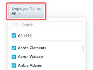
<AttributeFilterButton
    filter={newPositiveAttributeFilter(Md.EmployeeName.Default, ["Abbie Adams"])}
    onApply={this.onApply}
/>
Single Value Selection
You can configure the attribute filter to allow only a single value to be selected at a time by setting the selectionMode property to "single".
import { useState } from "react";
import { AttributeFilterButton } from "@gooddata/sdk-ui-filters";
import { newPositiveAttributeFilter } from "@gooddata/sdk-model";

import * as Md from "./md/full";

const singleValueFilter = newPositiveAttributeFilter(Md.Region.Default, []);

export const SingleSelectionExample = () => {
    const [filter, setFilter] = useState(singleValueFilter);

    return (
        <AttributeFilterButton
            filter={filter}
            selectionMode="single"
            selectFirst={true} // Automatically select first available element
            onApply={(updatedFilter) => {
                console.log("Single selection applied:", updatedFilter);
                setFilter(updatedFilter);
            }}
        />
    );
};
Single Selection Properties
When using single selection mode:
- The filter must be a positive filter with at most one selected element
- The dropdown automatically closes after selection
- You can use
selectFirstto automatically select the first available element for empty filters
Define a parent-child relationship between two attribute filters
To define a parent-child relationship between two attribute filters, hand over the parentFilters and parentFilterOverAttribute properties to the filter that should become a child filter dependent on the other attribute filter.
The parentFilterOverAttribute property defines the relationship between the parent filter and the child filter. You specify this attribute in the child filter via either a reference to an attribute in the parent filter or a reference to any independent attribute common for a parent filter attribute and a child filter attribute. This attribute must represent the way how the two filters are connected.
You can define the parent filter as an AttributeFilter or a visualization definition placeholder.
<div>
    <AttributeFilterButton filter={parentFilter} onApply={setParentFilter} />
    <AttributeFilterButton
        filter={filter}
        parentFilters={parentFilter ? [parentFilter] : []}
        parentFilterOverAttribute={idRef("attr.restaurantlocation.locationid")}
        onApply={setFilter}
    />
</div><div>
<AttributeFilterButton connectToPlaceholder={parentFilterPlaceholder} />
<AttributeFilterButton
connectToPlaceholder={filterPlaceholder}
parentFilters={parentFilterPlaceholder ? [parentFilterPlaceholder] : []}
parentFilterOverAttribute={idRef("attr.restaurantlocation.locationid")}
/>
</div>Advanced Dependent Filters
You can create more complex dependent filter relationships:
Multiple Parent Filters
<AttributeFilterButton
    filter={childFilter}
    parentFilters={[parentFilter1, parentFilter2]}
    parentFilterOverAttribute={idRef("attr.common.connectionid")}
    onApply={setChildFilter}
/>
Dynamic Parent Filter Over Attribute
<AttributeFilterButton
    filter={childFilter}
    parentFilters={[parentFilter]}
    parentFilterOverAttribute={(parentFilter) => {
        // Return different connection attributes based on parent filter
        if (isRegionFilter(parentFilter)) {
            return idRef("attr.region.id");
        }
        return idRef("attr.country.id");
    }}
    onApply={setChildFilter}
/>
Dependent Date Filters
<AttributeFilterButton
    filter={attributeFilter}
    dependentDateFilters={[dateFilter]}
    onApply={setAttributeFilter}
/>
Filtering by Metrics, Facts, or Attributes
You can filter the list of available attribute values by specifying metrics, facts, or attributes that the values must be compatible with using the validateElementsBy property.
import { useState } from "react";
import { AttributeFilterButton } from "@gooddata/sdk-ui-filters";
import { newNegativeAttributeFilter } from "@gooddata/sdk-model";

import * as Md from "./md/full";

const filteredFilter = newNegativeAttributeFilter(Md.Product.Name, []);

export const FilteredByMetricsExample = () => {
    const [filter, setFilter] = useState(filteredFilter);

    return (
        <AttributeFilterButton
            filter={filter}
            validateElementsBy={[
                Md.Revenue, // Metric
                Md.Product.Category, // Attribute
                Md.FactSalesAmount, // Fact
            ]}
            onApply={(updatedFilter) => {
                console.log("Filtered selection applied:", updatedFilter);
                setFilter(updatedFilter);
            }}
        />
    );
};
This feature ensures that only attribute values that have data for the specified metrics, facts, or attributes are available for selection. This is particularly useful for:
- Filtering products that have sales data
- Showing only regions with active customers
- Displaying only time periods that have recorded transactions
Note: This feature requires backend support and will be ignored by backends that don’t support it.
Properties
| Name | Required? | Type | Description |
|---|---|---|---|
| onApply | false | OnApplyCallbackType | A callback that contains the updated filter when the selection change is confirmed by a user |
| onError | false | (error: GoodDataSdkError) => void; | A callback that is triggered when the component runs into an error |
| filter | false | IAttributeFilter | The attribute filter definition |
| parentFilters | false | AttributeFiltersOrPlaceholders | An array of parent attribute filter definitions. This feature is not yet supported by GoodData.CN and GoodData Cloud. |
| connectToPlaceholder | false | IPlaceholder | The visualization definition placeholder used to get and set the value of the attribute filter |
| parentFilterOverAttribute | false | ParentFilterOverAttributeType | A reference to the parent filter attribute over which the available options are reduced, or the function called for every parent filter that returns such reference for the given parent filter |
| validateElementsBy | false | ObjRef[] | Specify items (metrics, attributes, or facts) that are used for elements availability validation. Only elements compatible with the provided items will be shown in the filter. |
| dependentDateFilters | false | IDashboardDateFilter[] | An array of date filters that will be used to reduce options for the current attribute filter |
| selectionMode | false | “multi” | “single” | Specify whether the filter allows multiple selections (default: “multi”) or single selection only |
| selectFirst | false | boolean | If true, automatically selects the first available element for empty single selection filters (default: false) |
| attributeFilterMode | false | string | Filter mode; can be readonly, hidden, or active |
| customIcon | false | IFilterButtonCustomIcon | A custom icon with associated tooltip information. |
| displayAsLabel | false | ObjRef | Specify an attribute display form to use for displaying filter elements instead of the default one |
| elementsOptions | false | { limit: number } | Configure options for loading attribute elements, such as the page size limit |
| hiddenElements | false | string[] | Specify elements that will be excluded from the selection list. Elements can be specified by their URIs or values. |
| staticElements | false | IAttributeElement[] | Provide elements to show in the selection list instead of loading them from the backend. |
| withoutApply | false | boolean | If true, the filter operates without an apply button and changes are applied immediately |
| onSelect | false | OnSelectCallbackType | A callback triggered when the user changes the working selection (before applying) |
| backend | false | IAnalyticalBackend | The object with the configuration related to communication with the backend and access to analytical workspaces |
| workspace | false | string | The workspace ID |
| locale | false | string | The localization of the chart. Defaults to en-US. |
| fullscreenOnMobile | false | boolean | If true, adjusts the filter to be properly rendered on mobile devices |
| title | false | string | A custom label to show on the dropdown button |
| titleWithSelection | false | string | The label displays the attribute title and also the applied selection. This option is not applied, if title property is set. |
NOTE: The uri property (the URI of the attribute displayForm used in the filter) and the identifier property (the identifier of the attribute displayForm used in the filter) are deprecated. Do not use them.
To define an attribute, use the filter or connectToPlaceholder property.
Customize AttributeFilterButton components
AttributeFilterButton component customizations are still in a beta stage. We appreciate any feedback and experiences that can help us improve this feature in the future.
If you want to customize the look of the AttributeFilterButton, you can provide your own components for rendering of its specific parts.
<AttributeFilterButton
    filter={newNegativeAttributeFilter(Md.EmployeeName.Default, [])}
    onApply={setFilter}
    // Provide your own component for rendering "Apply" and "Cancel" buttons
    DropdownActionsComponent={CustomActions}
    // Provide your own component for rendering of the attribute element
    ElementsSelectItemComponent={CustomItem}
/>
See the table below with the customization properties to check all the customization possibilities.
Accessing internal AttributeFilterButton context
In some cases, properties provided to the custom components may not be sufficient for you. In this case, you can use useAttributeFilterContext hook to obtain the full internal state of the component, and obtain the data and callbacks you need.
const { attribute } = useAttributeFilterContext();Currently, we recommend to use the component customizations mainly for smaller tweaks of the AttributeFilter UI. In case you need a really specific custom UI that differs a lot from the AttributeFilter component.
Customization Properties
| Name | Required? | Type | Description |
|---|---|---|---|
| ErrorComponent | false | Component | A component to be rendered if the initialization of the attribute filter fails. |
| LoadingComponent | false | Component | A component to be rendered if the initialization of the attribute filter is running. |
| DropdownButtonComponent | false | Component | A component to be rendered instead of the default dropdown button.
|
| DropdownBodyComponent | false | Component | A component to be rendered instead of the default dropdown body.
|
| DropdownActionsComponent | false | Component | A component to be rendered instead of the default dropdown actions.
|
| ElementsSearchBarComponent | false | Component | A component to be rendered instead of the default elements search bar.
|
| ElementsSelectComponent | false | Component | A component to be rendered instead of the default elements select.
|
| ElementsSelectLoadingComponent | false | Component | A component to be rendered instead of the default elements select loading.
|
| ElementsSelectItemComponent | false | Component | A component to be rendered instead of the default elements select item.
|
| ElementsSelectActionsComponent | false | Component | A component to be rendered instead of the default elements select actions.
|
| ElementsSelectErrorComponent | false | Component | A component to be rendered instead of the default elements select error.
|
| EmptyResultComponent | false | Component | A component to be rendered instead of the default empty result.
|
| StatusBarComponent | false | Component | A component to be rendered instead of the default status bar.
|

