Extra Visualizations
Private Beta Feature
Interested in trying these features? The functionality detailed in this article is in private beta testing. To request exclusive access, please sign up for the waitlist.
We are currently testing the following new types of visualizations:
Bar Race
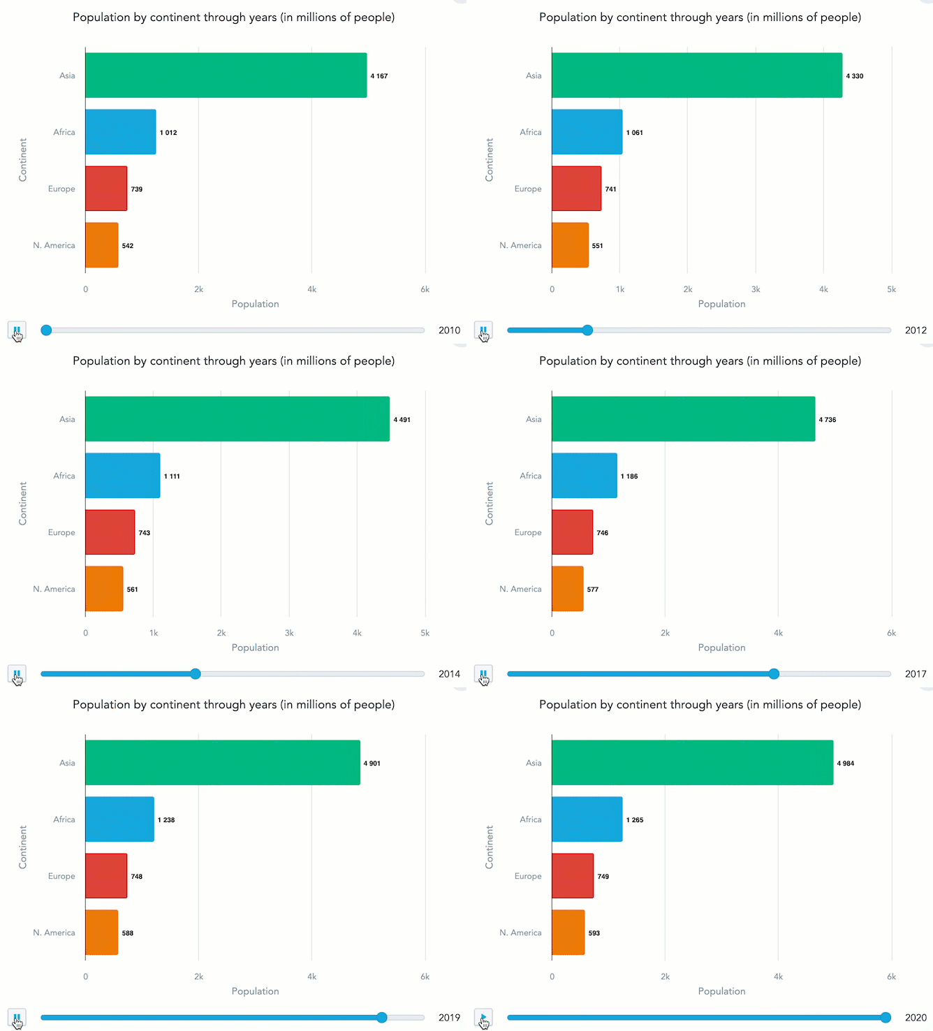
Traditional static bar charts are limited in conveying the dynamic shifts and progressions over time in data sets. Especially in situations where data changes rapidly, it’s challenging to visually capture and understand the movements and interplay of different data points across a time-series.
Enter the bar race visualization. This animated feature breathes life into the standard bar chart, showcasing time-series data in motion. As the bars jostle and rearrange based on their values, viewers can intuitively grasp the changing landscape of their data. Whether it’s tracking product sales, website traffic, or global rankings, the bar race offers an engaging and informative way to visualize data evolution.
Usage in the Demo Environment
To create your own bar race visualization in the GoodData Labs demo environment, you need to create a pivot table that includes the string #bar-race in its name when you are creating it in the Analytical Designer. You can later rename it in the Dashboard edit view. The table must have a metric, an attribute in rows, and a date in columns.
Chart Navigator
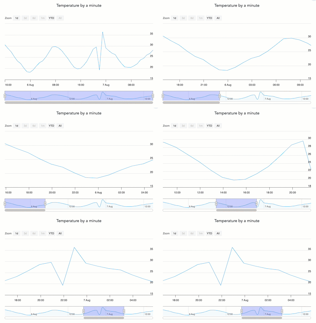
When dealing with time-series charts spanning long durations, it can be challenging for users to analyze specific intervals or periods without being overwhelmed. Accessing granular details for specific time frames, especially in extensive datasets spanning years or decades, can become cumbersome. Users need an efficient way to focus on particular sections of the data without having to load entirely new charts or sift through massive amounts of information.
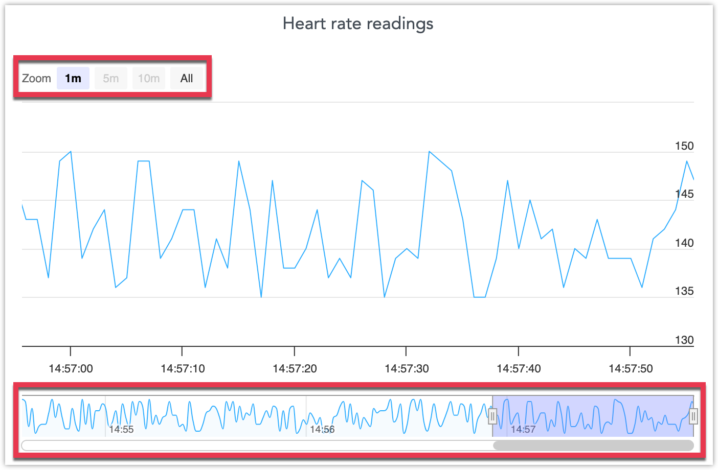
The introduction of a range slider (also known as “data zoom”) addresses this challenge. These sliders, typically positioned at the bottom of a time-series chart, allow users to seamlessly zoom into specific periods or slide through the timeline. By simply adjusting the range on the navigator, the main chart dynamically updates its view, honing in on the selected time frame. This interactive tool empowers users to access detailed insights from specific intervals without the clutter of the full dataset, providing a more efficient and user-friendly data analysis experience.
This feature is currently supported only for line charts.
You can freely resize the the zoom-in period, slide it around the navigator and zoom in or out using the automatically generated time-series bookmarks in the bottom left corner:
Usage in the Demo Environment
To create your own range slider visualization in the GoodData Labs demo environment, you need to create a line chart that includes the string #range in its name when you are creating it in the Analytical Designer. You can later rename it in the Dashboard edit view.
Data Streaming
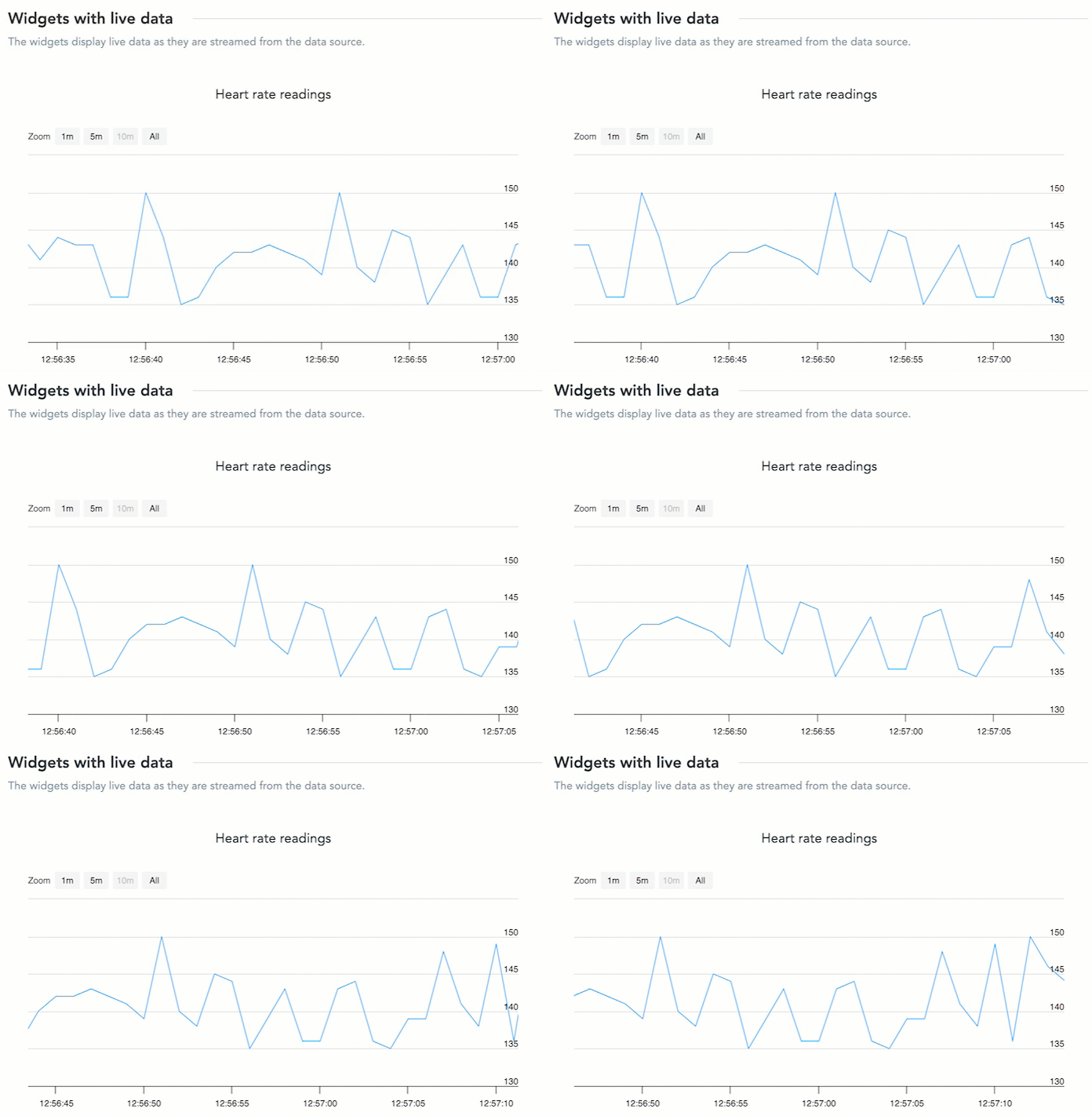
Some data is extremely time-sensitive, with values fluctuating within seconds or minutes. For domains like stock trading, weather monitoring, or real-time event tracking, static charts that update on daily or hourly intervals can be vastly insufficient. Users in such domains require a way to visualize data as it changes in real-time to make informed decisions quickly and efficiently.
We are aiming to introduce data streaming to our platform, a functionality that brings live data directly into our visualizations. With this enhancement, users can watch line charts animate in real time, showcasing the most up-to-date information as it’s received. This feature shines particularly in scenarios such as tracking stock values, where prices can vary significantly in mere moments. By offering live, animated visualizations, we equip users to remain ahead of the curve, respond to emerging trends on the spot, and ensure no critical data point goes unnoticed.
This feature is currently supported only for line charts.
Usage in the Demo Environment
To create your data streaming visualization in the GoodData Labs demo environment, you need to create a line chart that includes the string #streaming in its name when you are creating it in the Analytical Designer. You can later rename it in the Dashboard edit view.
You also need to run a script or create a pipeline that will continously feed data to the data source you are connected to. The visualization is updated everytime your data source cache is invalidated.


