Line Style by Metric
When you collect data over time and visualize it in a line chart, it’s common for data from recent months to remain incomplete due to possible retroactive updates or corrections. If you want the chart to visually distinguish between complete and incomplete data, you can use a dedicated control metric that indicates which segments of the timeline should be rendered as dashed or solid. A solid line is used for completed months and a dashed line for those still subject to change.
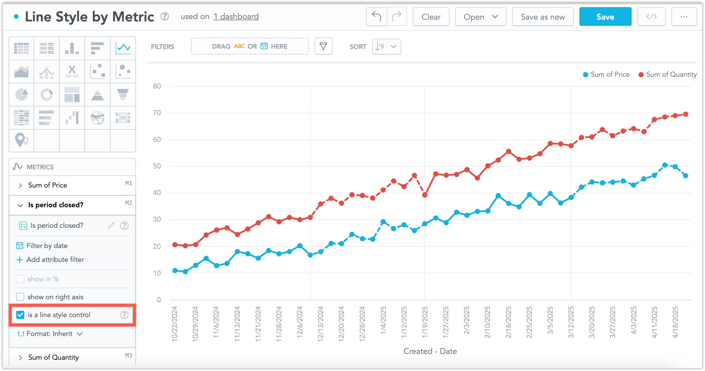
Only one metric can be used as a line style control to influence the appearance of other metrics in the chart.
In the line chart’s metrics bucket, select a metric that you want to use as a line style control. In its configuration panel, tick the checkbox labeled Is a line style control.
- The checkbox is disabled if the visualization contains only one metric.
- If one metric has the checkbox selected, it is disabled for all other metrics in the chart.
When a metric is marked as a line style control:
It is not rendered in the chart as a line or included in the legend.
Its values are used to define threshold zones in the remaining chart series:
- A continuous sequence of
nullor0values defines a dashed segment. - A continuous sequence of any other values defines a solid segment.
- A continuous sequence of
Transitions between dashed and solid lines are marked by horizontal grid lines on the chart.