Data Profiling
This feature scans connected tables to create a detailed profile, highlighting key characteristics like missing values, data types, and distribution. This helps you quickly understand data quality, ensuring accurate and reliable analytics. Profiling information, available in the Data profiling tab, provides insights into table dimensions, empty values, and value distribution, allowing you to spot anomalies and ensure data accuracy.
Review Your Dataset at a Glance
Once you connect a data source to the LDM, you go on to create a new datasets from the available tables. After dataset creation, GoodData automatically gathers profiling information for the dataset. You can review this information in the Data profiling tab that resides in the dataset’s View details dialog:
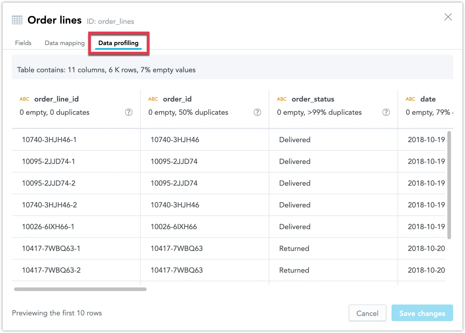
You can hover over the columns to display additional information about the field. Overall the data profiling tab provides information about:
- Table dimensions
- Empty (null) values
- MIN, MAX, AVG and a histogram of values for facts
- Frequency distribution of unique values for attributes
Spot Anomalies in Your Data
Use the Data profiling tab to do a quick review of the database tables you have connected to ensure your mental model of the data is in line with reality.
Table Dimensions
Something as simple as checking what the table dimensions are might reveal useful insights.
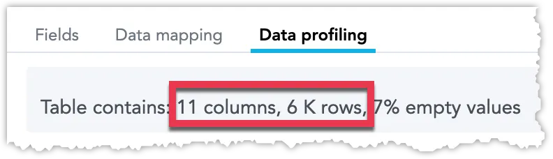
Are you dealing with annual sales data for your entire company? Is 6000 rows, corresponding to 6000 transactions a plausible number? If you believe you only made 100 sales, or conversely if you believe your company made at least 1 million sales over the past year, this may be an indication that there is an issue with your data.
Suspicious Outliers
Reviewing the profiling information will let you do a quick “sanity check” on your data. For example a suspicious looking histograms can alert you to data outliers:
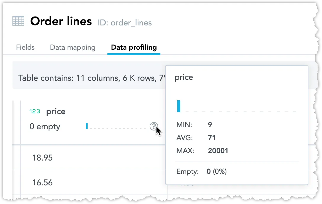
Do you really expect there to be an item worth $20,001 if your average item price is less than $100?
Missing Values
Fields with missing values will display warnings:
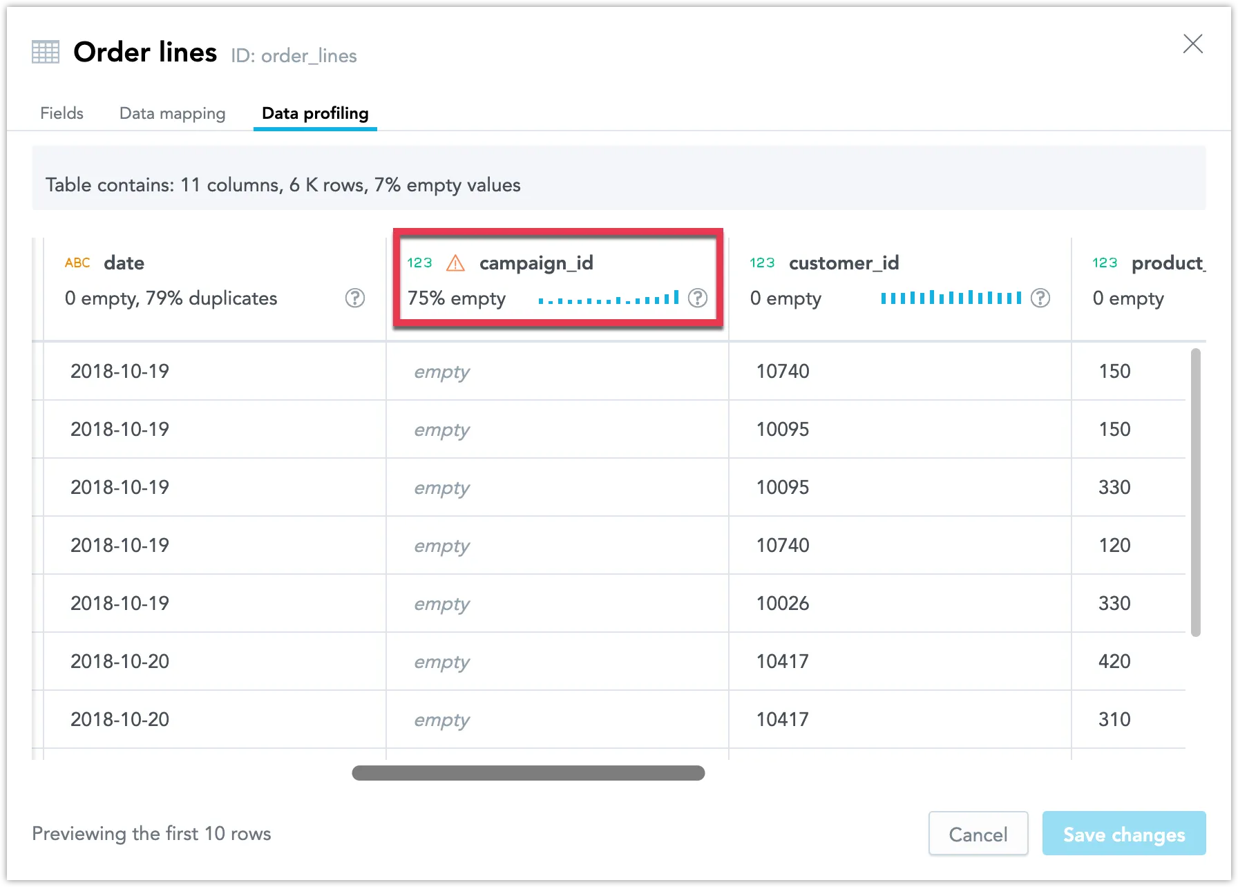
GoodData can work with empty values, but they can create unseemly gaps in your data when it is visualized, so it is good to know the gaps are there before you start building analytics on top of the data.