Machine Learning in Dashboards
This set of features introduces machine learning functionality in dashboards to enhance data visualization and decision-making. This experimental feature is designed to be accessible to all users, from business executives to data scientists, offering ML insights with a single click. The one click solution allows you to generate forecasts and detect anomalies effortlessly, though it is not a substitute for comprehensive ML tools and relies on high-quality data for accurate results.
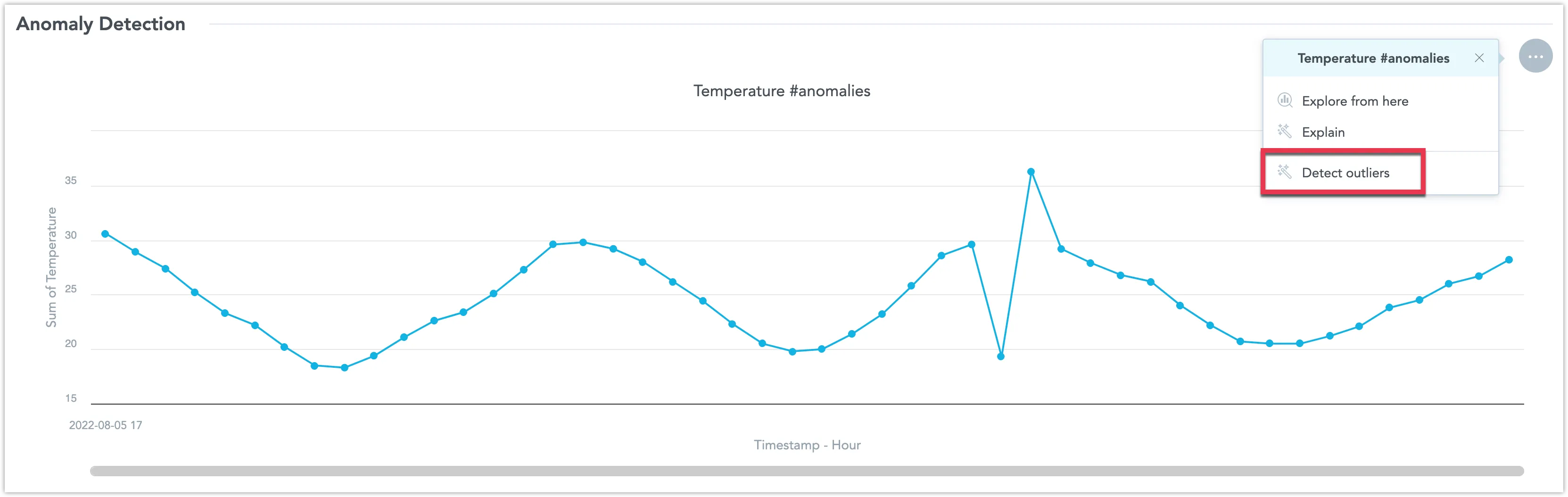
Detect Outliers
To create a visualization which detects outliers, you need to create a line chart that includes the string #anomalies in its name when you are creating it in the Analytical Designer. Only one # string per visualization is allowed. You can later rename it in the Dashboard edit view.
Steps:
Open the dashboard in Edit mode.
Open the visualization’s context menu and select Detect outliers.
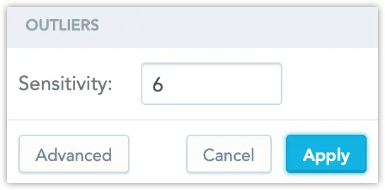
Set a sensitivity and click Apply.
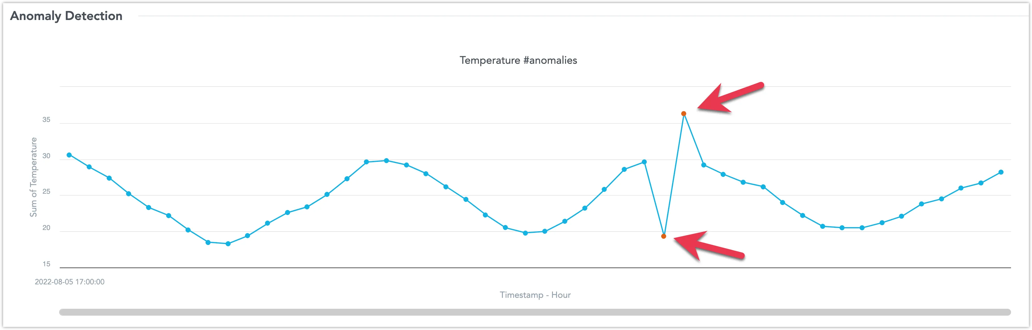
The algorithm detects and highlights data point outliers: