Theme Settings Reference
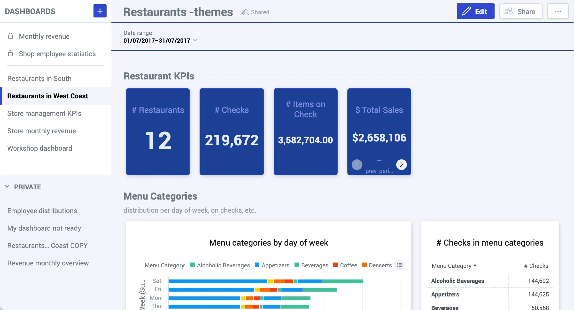
Themes in GoodData are defined using JSON structures that mirror CSS-style properties. This reference guide outlines the full range of customizable properties available in GoodData themes. You’ll learn how to define base colors, typography, layout styling, and detailed visual elements for dashboards, widgets, tooltips, and more.
Complete JSON examples are provided alongside descriptions of each configurable property to ensure clarity and practical implementation support. Whether you’re styling buttons or fine-tuning visualization elements, this document provides the building blocks for full appearance customization.
Complete JSON Structure
Below is an example of the properties you can customize:
{
  "palette": {
    "primary": { "base": "#3049D1" },
    "error": { "base": "#E54D42" },
    "success": { "base": "#00C18D" },
    "warning": { "base": "#F4D521" }
  },
  "typography": {
    "font": "url(https://cdn.jsdelivr.net/npm/roboto-font@0.1.0/fonts/Roboto/roboto-regular-webfont.ttf)",
    "fontBold": "url(https://cdn.jsdelivr.net/npm/roboto-font@0.1.0/fonts/Roboto/roboto-bold-webfont.ttf)"
  },
  "button": {
    "borderRadius": "2",
    "dropShadow": true
  },
  "modal": {
    "title": {
      "color": "#6D7680",
      "lineColor": "#DAE2EA"
    },
    "borderColor": "#FFFFFF",
    "borderRadius": "6",
    "borderWidth": "2",
    "dropShadow": true,
    "outsideBackgroundColor": "#DAE2EA"
  },
  "tooltip": {
    "color": "#C8D0FF",
    "backgroundColor": "#07124E"
  },
  "analyticalDesigner": {
    "title": {
      "color": "#6D7680"
    }
  },
  "dashboards": {
    "title": {
      "color": "#6D7680",
      "backgroundColor": "#F4F5FB",
      "borderColor": "#1B4096"
    },
    "navigation": {
      "title": { "color": "#6D7680" },
      "borderColor": "#DAE2EA",
      "item": {
        "color": "#6D7680",
        "hoverColor": "#000000",
        "selectedColor": "#000000",
        "selectedBackgroundColor": "#F4F5FB"
      },
      "backgroundColor": "#FFFFFF"
    },
    "filterBar": {
      "filterButton": { "backgroundColor": "#F4F5FB" },
      "backgroundColor": "#F4F5FB",
      "borderColor": "#1B4096"
    },
    "section": {
      "title": {
        "color": "#6D7680",
        "lineColor": "#DDE4EB"
      },
      "description": {
        "color": "#999EA5"
      }
    },
    "content": {
      "kpiWidget": {
        "title": {
          "color": "#8292E3",
          "textAlign": "center"
        },
        "kpi": {
          "primaryMeasureColor": "#E8EAF7",
          "secondaryInfoColor": "#8292E3"
        },
        "borderColor": "#3049D1",
        "borderRadius": "6",
        "borderWidth": "1",
        "backgroundColor": "#1B4096",
        "dropShadow": true
      },
      "widget": {
        "title": {
          "color": "#101010",
          "textAlign": "center"
        },
        "borderColor": "#FFFFFF",
        "borderRadius": "6",
        "borderWidth": "2",
        "dropShadow": true,
        "backgroundColor": "#FFFFFF"
      },
      "backgroundColor": "#F4F5FB"
    }
  }
}
Properties
The following sections describe individual properties, examples, and sample code.
Colors
Basic colors for dashboards and the Analytical Designer are defined in the palette section.
Primary Color
Used for primary buttons, links, and highlighted elements.
"primary": {
  "base": "#3049D1"
}
Default:
Custom:
Error Color
Used for error states and messages.
"error": {
  "base": "#7d07f2"
}
Default:
Custom:
Success Color
Used for success states and confirmations.
"success": {
  "base": "#00c18d"
}
Default:
Custom:
Warning Color
Used for warnings or cautionary states.
"warning": {
  "base": "#e60000"
}
Default:
Custom:
Complementary Color
The complementary palette contains up to 10 colors (c0 to c9) which are used in Dashboards for various UI elements like borders, lines, shadows, and labels.
"complementary" : {
        "c0" : "#282a36",
        "c1" : "#4d4466",
        "c2" : "#725e97",
        "c3" : "#9778c8",
        "c4" : "#bd93f9",
        "c5" : "#c8a7f7",
        "c6" : "#d4bbf6",
        "c7" : "#e0cff4",
        "c8" : "#ece3f3",
        "c9" : "#f8f8f2"
    }
The individual colors serve the following purposes:
c0– Dashboard background, backgrounds for widgets, dialogs, and buttons such as Share, Embed Dashboard, and Dashboard Options.c1– Contrast background color.c2– High contrast background color.c3– Grid lines within visualizations, the “three dots” options button on visualizations, and the hover background for visualization names in the visualization switcher dropdown.c4– Medium border color.c5– Light text and dark border color.c6– Attribute values on chart axes (x/y), and labels such as Change, Versus, and Previous Period Value within KPI (headline) visualizations when using period comparisons.c7– Names of dashboard filters, visualization legends, and attribute/metric names shown within visualization tooltips.c8– Values within dashboard filters, titles of visualizations on dashboards, dashboard section titles, and dashboard names within the dashboard navigation.c9– Metric values within visualizations, attribute/metric values shown in tooltips, and the name of the currently selected dashboard in the dashboard navigation.
You can define the colors in different ways:
- Define all 10 colors explicitly.
- Define only the first (
c0) and the last (c9) colors. These two are mandatory. - Optionally define additional colors between
c0andc9. Any missing values will be generated automatically based on the defined colors.
Info
- Do not rename the colors.
- If the background color (
c0) is darker than the last color (c9), you can create a “dark” mode. - The complementary palette also applies to all elements that are not specifically defined in your theme.
Fonts
Fonts are configured in the typography section.
If you use a custom font hosted on an external domain, you must ensure that the font’s host is included in your Content Security Policy (CSP) settings.
For example, if you’re referencing a font from https://cdn.example.com, you need to explicitly allow this domain in your CSP under the font-src and optionally style-src directives (if using @font-face in CSS).
Failing to do so will result in the browser blocking the font due to CSP violations, and the fallback font will be used instead.
Only fonts hosted on https://fonts.gstatic.com/ are allowed by default. To use others, update your CSP accordingly and contact GoodData support for guidance.
If you need fonts from another URL, you must:
- Add the font domain to your CSP font-src directive
- Or contact our support for assistance with CSP configuration
Defining Fonts
You must define both regular and bold variants from the same font family.
For external fonts, use the following formats:
- Absolute URL only (recommended) -
"font": "url(https://somewebsite.com/path/to/font.woff)" - Explicit format -
"font": "url(https://somewebsite.com/path/to/font.woff) format('woff')"
Important
Avoid format specifications in URLs: Do not include format('woff2') or similar format specifications directly in the URL path. Use the explicit format syntax shown above instead.
For local fonts, use the following formats:
"font": "local(Arial)""font": "local(Times New Roman)""font": "local('Times New Roman')"
To specify a regular font, use the following code:
"font" : "url(https://cdn.jsdelivr.net/npm/roboto-font@0.1.0/fonts/Roboto/roboto-regular-webfont.ttf)"To specify a bold font, use the following code:
"fontBold": "url(https://somewebsite.com/path/to/font-bold.woff)"Recommended fonts include:
| Sans Serif | Serif |
|---|---|
| Lato | Crimson Text |
| Assistant | Old Standard TT |
| Noto Sans | Kameron |
| Source Sans Pro | Copse |
| Libre Franklin | Playfair Display |
| Open Sans | Lora |
| Roboto | Merriweather |
| Titillium Web | PT Serif |
| Varela Round | Source Serif Pro |
Working Examples
Here are tested, working font configurations:
Open Sans (Alternative Source)
"typography": {
    "font": "url(https://db.onlinewebfonts.com/t/629a55a7e793da068dc580d184cc0e31.woff2)",
    "fontBold": "url(https://db.onlinewebfonts.com/t/50145685042b4df07a1fd19957275b81.woff2)"
}
Roboto (CDN)
"typography": {
    "font": "url(https://cdn.jsdelivr.net/npm/roboto-font@0.1.0/fonts/Roboto/roboto-regular-webfont.woff2)",
    "fontBold": "url(https://cdn.jsdelivr.net/npm/roboto-font@0.1.0/fonts/Roboto/roboto-bold-webfont.woff2)"
}
CSP Configuration Required
For the alternative font sources shown above, you must add the respective domains to your CSP font-src directive:
- For
db.onlinewebfonts.com: Addhttps://db.onlinewebfonts.comto your font-src - For
cdn.jsdelivr.net: Addhttps://cdn.jsdelivr.netto your font-src
Troubleshooting Font Issues
If your custom fonts are not loading, check the following:
1. Console Errors
Open your browser’s Developer Tools (F12) and check the Console tab for errors like:
Refused to load the font 'https://example.com/font.woff2' because it violates the following Content Security Policy directive: "font-src 'self' data: ..."Solution: Add the font domain to your CSP font-src directive.
2. Font URL Format Issues
Problem: URLs containing format('woff2') in the path don’t work
// ❌ This doesn't work
"font": "url(https://fonts.gstatic.com/font.woff2) format('woff2')"Solution: Remove format specifications from the URL path
// ✅ This works
"font": "url(https://fonts.gstatic.com/font.woff2)"
3. Corrupted Font Files
Some Google Fonts URLs may reference corrupted files. If a font doesn’t work despite proper CSP configuration:
- Try alternative font sources (like
db.onlinewebfonts.comorcdn.jsdelivr.net) - Test the font URL directly in your browser
- Use different font variants or weights
4. Missing Bold Variant
Ensure you specify both font and fontBold properties:
"typography": {
    "font": "url(https://example.com/font-regular.woff2)",
    "fontBold": "url(https://example.com/font-bold.woff2)"
}
Visual Elements
Customize buttons, modal windows, and tooltips.
Buttons
"button": {
  "borderRadius": "0",
  "dropShadow": false
}
Default:
Custom:
Overlay Windows (Modals)
"modal": {
  "title": {
    "color": "#6D7680",
    "lineColor": "#DAE2EA"
  },
  "borderColor": "#ffffff",
  "borderRadius": "6",
  "borderWidth": "2",
  "dropShadow": true,
  "outsideBackgroundColor": "#DAE2EA"
}
Tooltips
"tooltip": {
  "color": "#C8D0FF",
  "backgroundColor": "#07124E"
}
Default:
Custom:
Analytical Designer
Customize the title of visualizations.
"analyticalDesigner": {
  "title": {
    "color": "#d6044e"
  }
}
Default:
Custom:
Visualization Properties
Visualizations support extensive styling. Below are examples of JSON keys and their purposes:
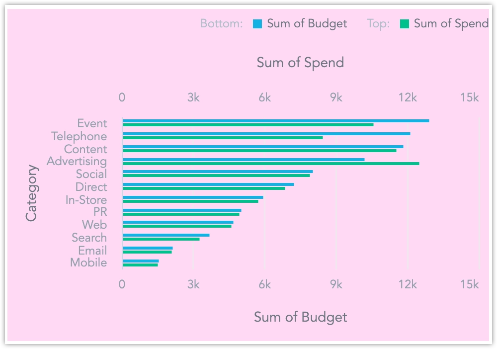
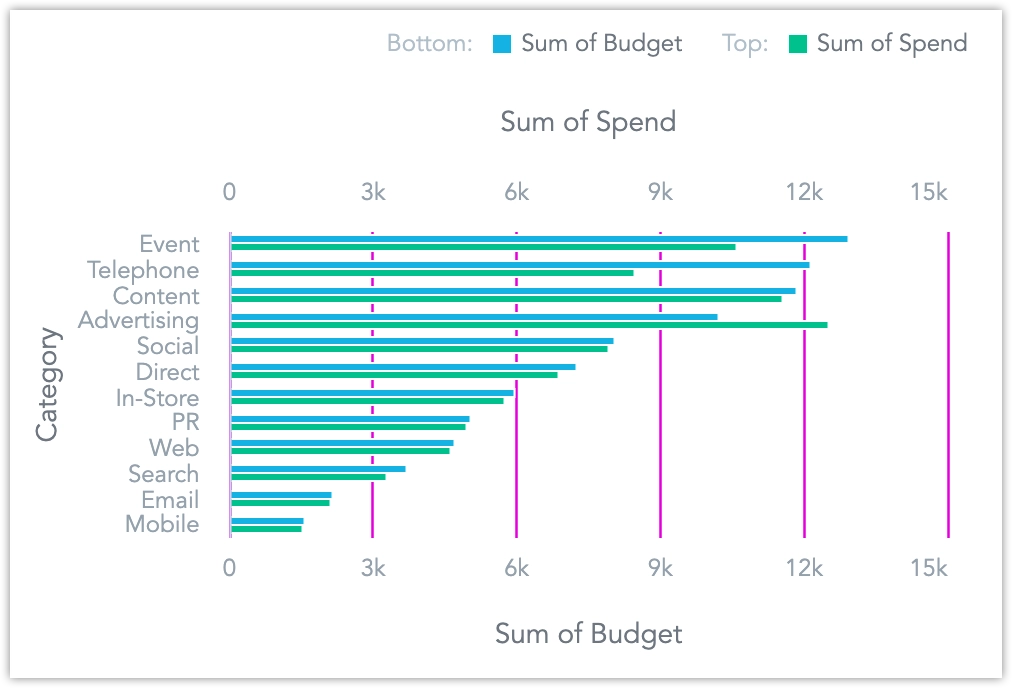
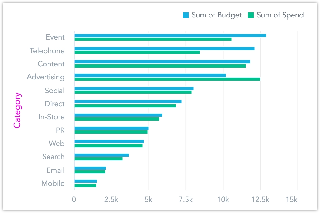
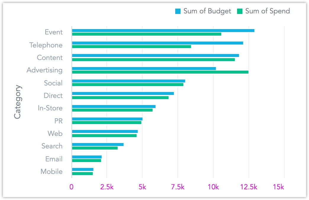
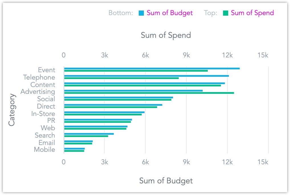
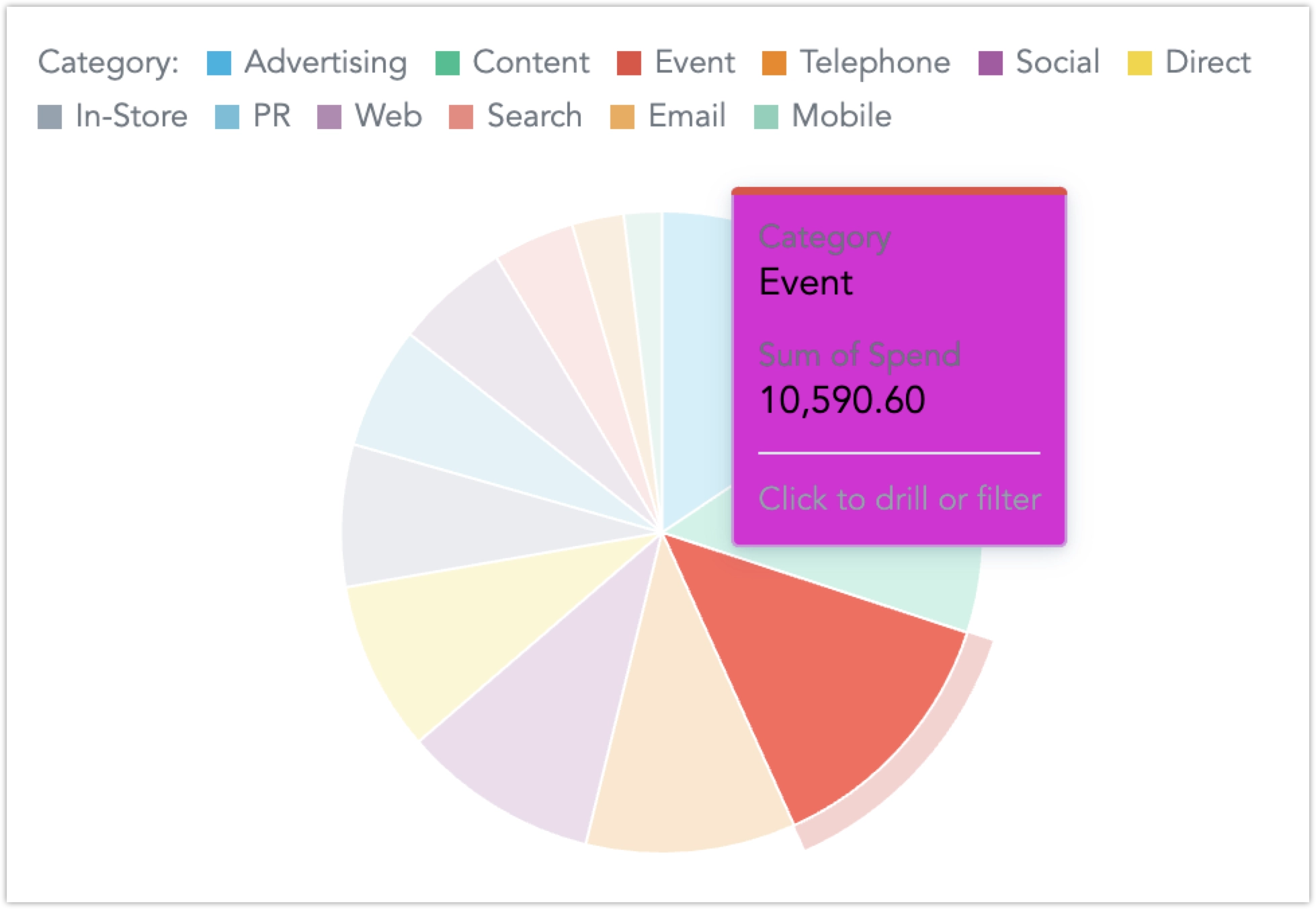
backgroundColorSets the background color of the entire visualization container (e.g., for charts or tables).gridColorDefines the color of grid lines inside chart visualizations (e.g., horizontal/vertical lines in bar or line charts).axisColorSets the color of axis lines, such as the x-axis and y-axis outlines in charts.axisLabelColorDefines the color of axis labels — the textual names along the axes (e.g., categories like “Country” or “Date”).axisValueColorSets the color of the numerical or tick values shown on the axes (e.g., 0, 50, 100).legendValueColorChanges the color of the labels in the chart legend (e.g., series names like “Sales”, “Profit”).plotLineColorSpecifies the color of plot lines — reference lines used to highlight thresholds or targets on charts.tooltipBackgroundColorSets the background color of tooltips that appear when hovering over chart elements.tooltipBorderColorDefines the border color of the tooltip window to help it visually separate from the chart background.tooltipLabelColorSets the color of the label (typically the dimension/category name) inside the tooltip.tooltipValueColorSets the color of the value inside the tooltip (e.g., revenue amount or count).valueColorChanges the text color of all data values within a table visualization (e.g., numbers, strings).nullValueColorDefines the color used to display null, empty, or missing values in tables.hoverBackgroundColorSpecifies the row background color when hovering over a row in a table visualization.loadingIconColorSets the color of the animated dots used to indicate loading in a row (not the whole table or chart).headerLabelColorChanges the text color of column headers in tables.headerHoverBackgroundColorDefines the background color of column headers when hovered over with a cursor.subtotalBackgroundColorSets the background color of subtotal rows in pivot tables or grouped tables.totalBackgroundColorSets the background color of total rows in tables (e.g., grand totals).totalValueColorSpecifies the text color of values within total rows to make them stand out.
Examples:
"chart": {
  "backgroundColor": "#FFD9F5",
  "gridColor": "#E100D8",
  "axisColor": "#E100D8",
  "axisLabelColor": "#E100D8",
  "axisValueColor": "#E100D8",
  "legendValueColor": "#E100D8",
  "plotLineColor": "#E100D8",
  "tooltipBackgroundColor": "#E100D8",
  "tooltipBorderColor": "#E100D8",
  "tooltipLabelColor": "#E100D8",
  "tooltipValueColor": "#E100D8"
},
"table": {
  "valueColor": "#E100D8",
  "nullValueColor": "#E100D8",
  "hoverBackgroundColor": "#FFD9F5",
  "loadingIconColor": "#E100D8",
  "headerLabelColor": "#E100D8",
  "headerHoverBackgroundColor": "#FFD9F5",
  "subtotalBackgroundColor": "#FFD9F5",
  "totalBackgroundColor": "#FFD9F5",
  "totalValueColor": "#E100D8"
}
Headline Comparison Colors (KPI Widgets)
Unlike other visual elements, positive and negative headline comparison colors cannot be selected from the predefined color palette.
This is intentional, because mixing comparison colors (e.g., green for positive, red for negative) with chart series colors from the theme’s palette could lead to visual conflicts or unintended styling overlaps in charts and dashboards.
Instead, the positive and negative headline comparison colors must be explicitly defined using the JSON structure below. The neutral headline comparison color (indicating that no change has occured) is taken from the definition of the c6 color.
Example:
positiveColor: Green →#27fe9anegativeColor: Purple →#6d38ea
{
  "palette": {
    "complementary": {
      "c0": "#FFFFFF",
      "c6": "#696969",
      "c9": "#000000"
    }
  },
  "dashboards": {
    "content": {
      "kpiWidget": {
        "kpi": {
          "value": {
            "negativeColor": "#27fe9a",
            "positiveColor": "#6d38ea"
          }
        }
      }
    }
  }
}
Dashboards
Customize the dashboard’s core layout and styling.
Dashboard Title
"title": {
  "color": "#0392bd",
  "backgroundColor": "#eafafd",
  "borderColor": "#1b4096"
}
Default:
Custom:
Navigation
"navigation": {
  "title": { "color": "#3973ac" },
  "borderColor": "#DAE2EA",
  "item": {
    "color": "#3973ac",
    "hoverColor": "#000",
    "selectedColor": "#000",
    "selectedBackgroundColor": "#F4F5FB"
  },
  "backgroundColor": "#ffffff"
}
Default:
Custom:
Filter Bar
"filterBar": {
  "filterButton": {
    "backgroundColor": "#F4F5FB"
  },
  "backgroundColor": "#F4F5FB",
  "borderColor": "#1b4096"
}
Default:
Custom:
Dashboard Sections
"section": {
  "title": {
    "color": "#3b6ba1",
    "lineColor": "#85abd6"
  },
  "description": {
    "color": "#85abd6"
  }
}
Default:
Custom:
Visualizations on Dashboards
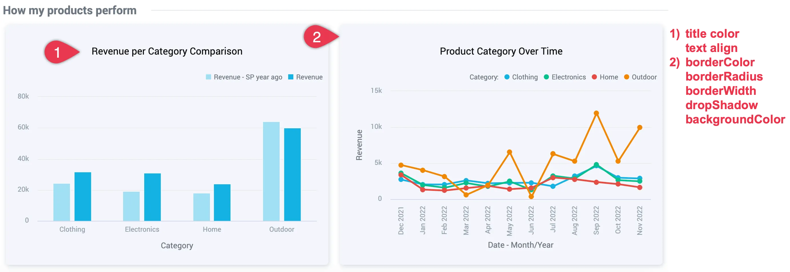
"widget": {
  "title": {
    "color": "#101010",
    "textAlign": "center"
  },
  "borderColor": "#F4F5FB",
  "borderRadius": "6",
  "borderWidth": "2",
  "dropShadow": true,
  "backgroundColor": "#F4F5FB"
}
Info
For Headline visualizations, keep the border radius at 4px or less to avoid rendering issues in exported PDFs.
Default:
Custom:
Background Color
"backgroundColor": "#F4F5FB"Default:
Custom:
Logo and Background Image
These theme properties are currently used in Slide Deck exports for PDF and PPTX. When exporting dashboards to PDF or PPTX, GoodData applies colors and styles from theming (for example, text color and background color). Because you can also include a logo in exports, it is configured directly in the theme. This allows logos and background images to adapt when different themes are applied.
logodefines the image that replaces the{{logo}}variable in exports.coverImagedefines the background image that is used whenbackgroundImageis set totrue.
Supported Image Formats
- Use JPEG or PNG images only.
- Do not use shortened URLs.
- Maximum file size is 1 MB.
If these conditions are not met, the placeholder text YOUR LOGO is displayed instead of the image.
Example
The example below shows how the logo and backgroundImage properties are used in a default slide deck template:
{
  "type": "exportTemplate",
  "id": "myDefaultTemplate",
  "attributes": {
    "name": "string",
    "dashboardSlidesTemplate": {
      "appliedOn": [
        "PDF",
        "PPTX"
      ],
      "coverSlide": {
        "header": {
          "right": "{{logo}}"
        },
        "descriptionField": "Exported at: {{exportedAt}}",
        "backgroundImage": true
      },
      "introSlide": {
        "header": {
          "right": "{{logo}}"
        },
        "titleField": "Introduction",
        "descriptionField": "About:\n{{dashboardDescription}}\n\n{{dashboardFilters}}",
        "backgroundImage": true
      },
      "sectionSlide": {
        "header": {
          "right": "{{logo}}"
        },
        "backgroundImage": true
      },
      "contentSlide": {
        "footer": {
          "left": "{{currentPageNumber}} / {{totalPages}}",
          "right": "{{logo}}"
        },
        "descriptionField": "{{dashboardFilters}}"
      }
    },
    "widgetSlidesTemplate": {
      "appliedOn": [
        "PDF",
        "PPTX"
      ],
      "contentSlide": {
        "footer": {
          "left": "{{currentPageNumber}} / {{totalPages}}",
          "right": "{{logo}}"
        }
      }
    }
  }
}
For details about how these templates work, see Export Templates.
