Theme Examples
The following sections showcase example themes, available as templates in the Appearance section. You can use the provided JSON as-is or modify it to fit your needs.
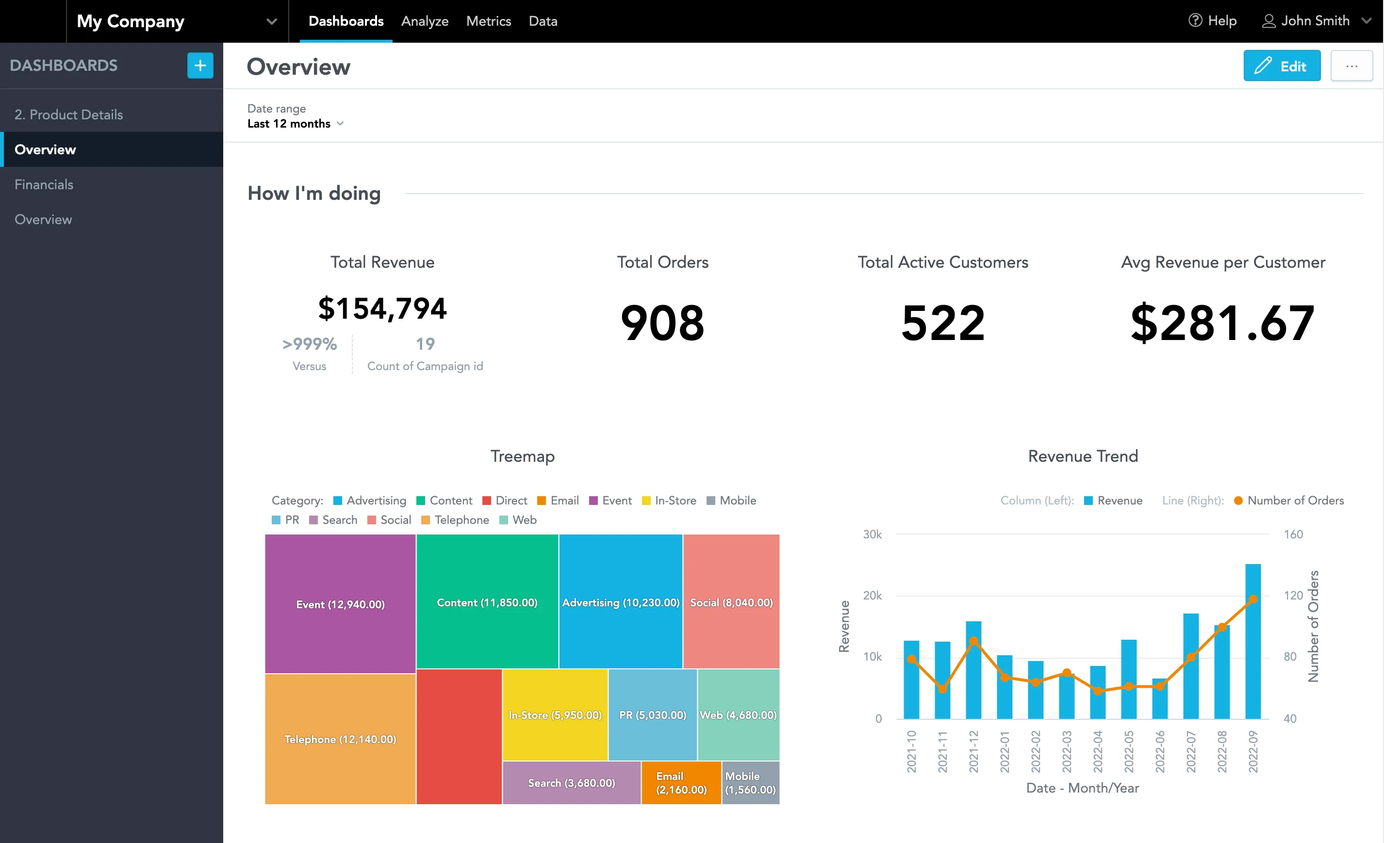
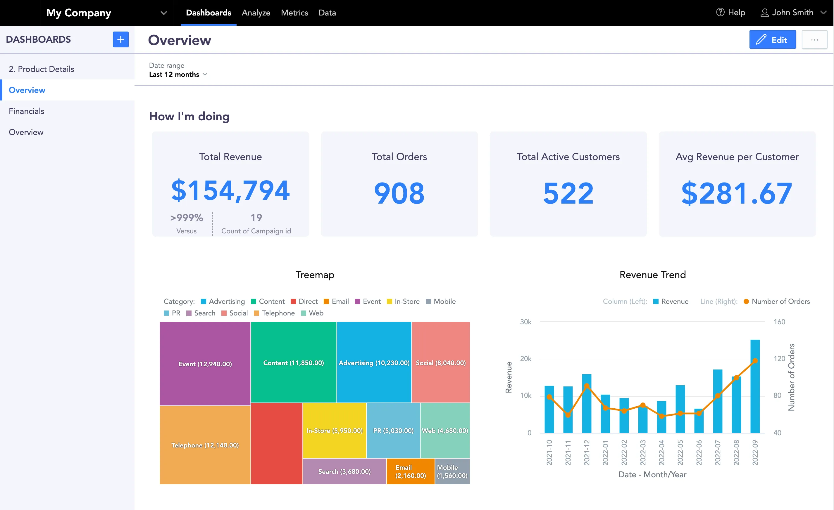
Here’s the default theme for comparison:
Pink Light
Light theme with a pink primary color, custom fonts, and rounded buttons.
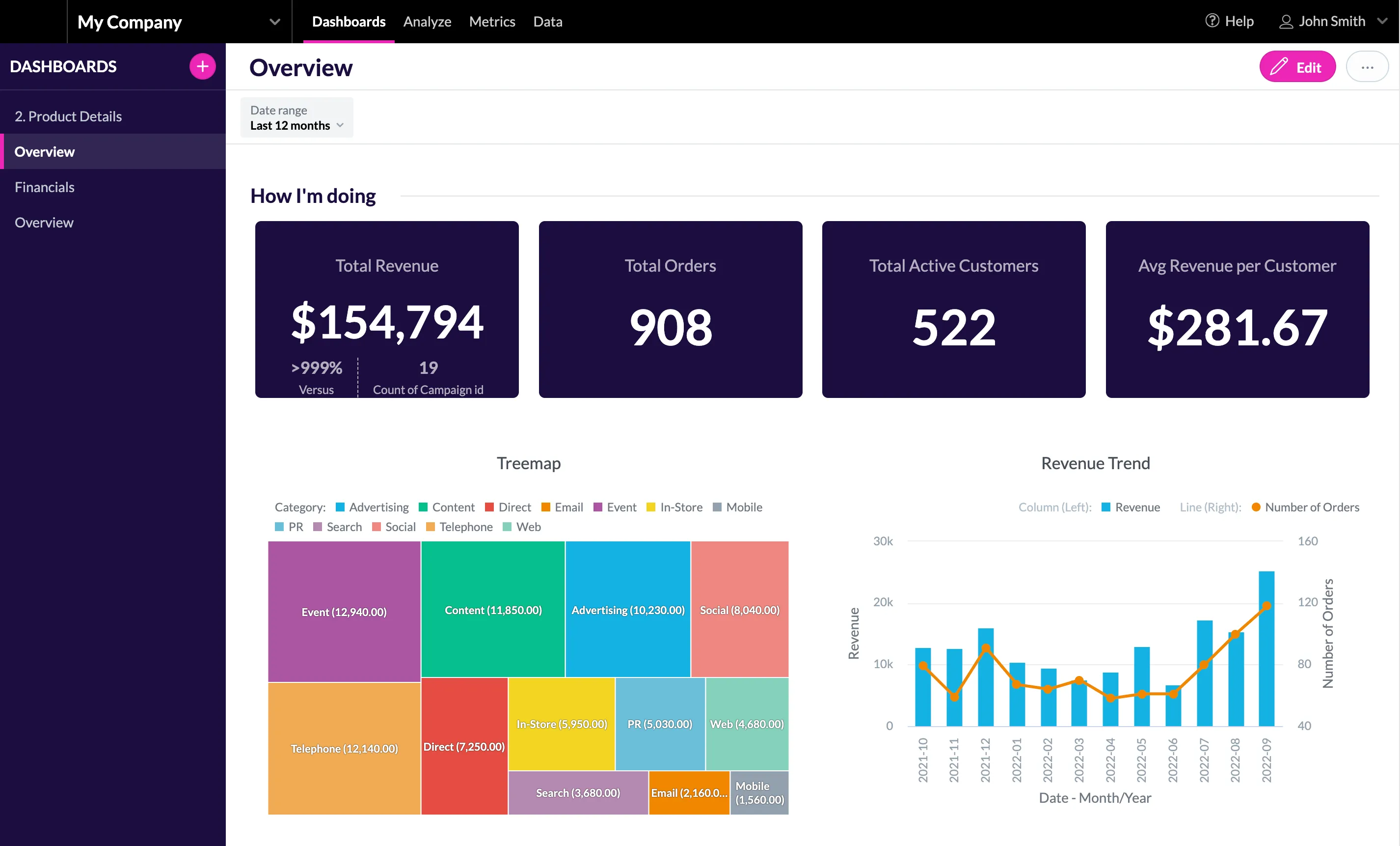
Use this code to create the theme:
{
    "palette": {
        "primary": {
            "base": "#ED26B7"
        },
        "error": {
            "base": "#e54d42"
        },
        "success": {
            "base": "#00c18d"
        },
        "warning": {
            "base": "#f4d521"
        }
    },
    "typography": {
        "font": "url(https://fonts.gstatic.com/s/lato/v23/S6uyw4BMUTPHjx4wXiWtFCc.woff2)",
        "fontBold": "url(https://fonts.gstatic.com/s/lato/v23/S6u9w4BMUTPHh6UVSwiPGQ3q5d0.woff2)"
    },
    "button": {
        "borderRadius": "100",
        "dropShadow": false
    },
    "analyticalDesigner": {
        "title": {
            "color": "#1C0D3F"
        }
    },
    "dashboards": {
        "content": {
            "kpiWidget": {
                "title": {
                    "color": "#f2f4f6B2",
                    "textAlign": "center"
                },
                "kpi": {
                    "primaryMeasureColor": "#fff",
                    "secondaryInfoColor": "#f2f4f6B2"
                },
                "borderRadius": "6",
                "borderWidth": "1",
                "backgroundColor": "#1c0d3f",
                "dropShadow": false
            }
        },
        "title": {
            "color": "#1C0D3F",
            "backgroundColor": "#fff",
            "borderColor": "#DFE4E8"
        },
        "navigation": {
            "backgroundColor": "#1C0D3F",
            "title": {
                "color": "#fff"
            },
            "item": {
                "color": "#BFC9D1",
                "hoverColor": "#fff",
                "selectedColor": "#fff",
                "selectedBackgroundColor": "#FFFFFF1A"
            }
        },
        "filterBar": {
            "filterButton": {
                "backgroundColor": "#F2F4F6"
            },
            "backgroundColor": "#fff",
            "borderColor": "#DFE4E8"
        },
        "section": {
            "title": {
                "color": "#1c0d3f",
                "lineColor": "#DFE4E8"
            }
        }
    }
}
Red Light
Light theme with a red primary color, serif fonts, and rounded buttons.
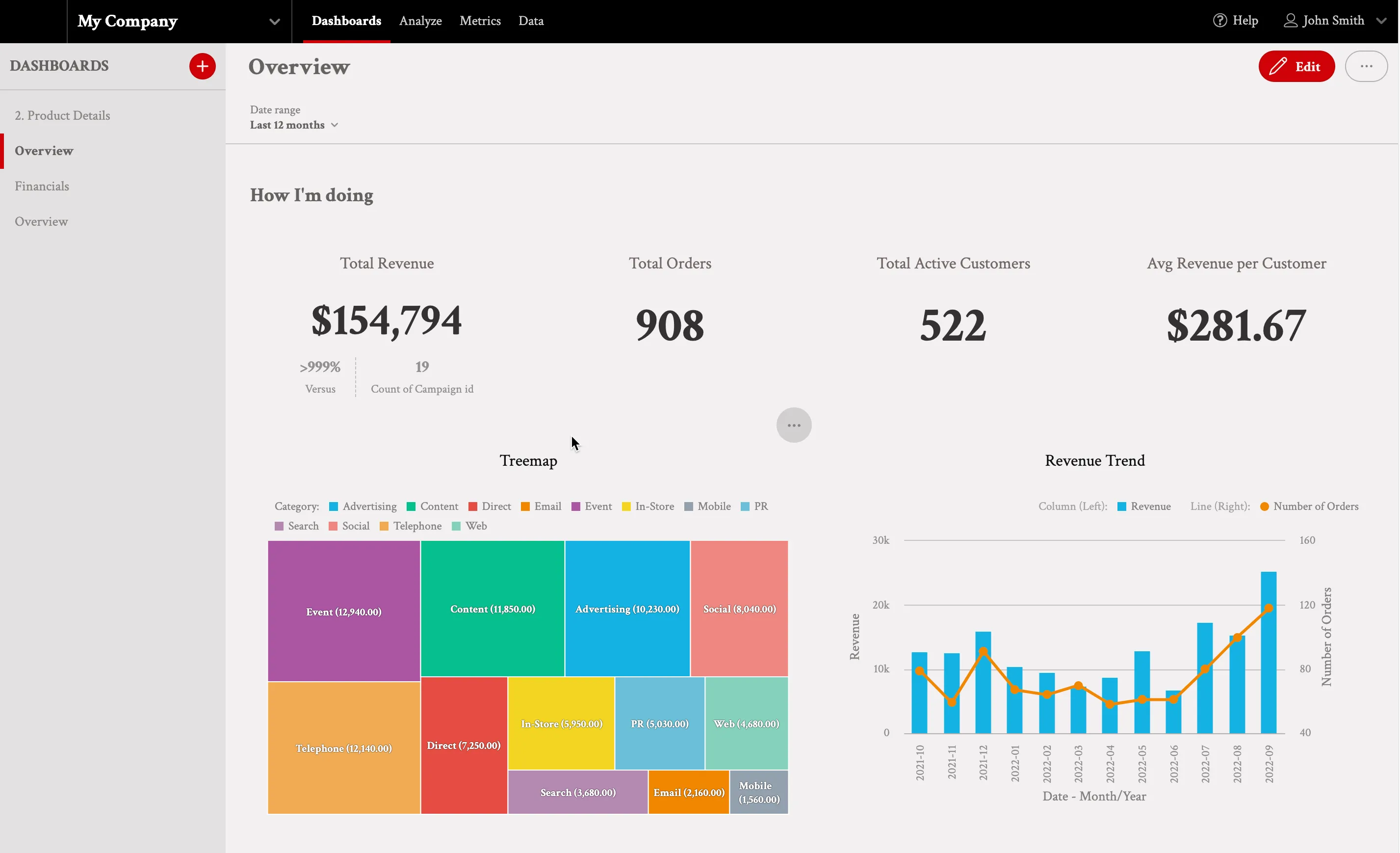
Use this code to create the theme:
{
    "palette": {
        "primary": {
            "base": "#D00008"
        },
        "error": {
            "base": "#FF0000"
        },
        "success": {
            "base": "#25a953"
        },
        "warning": {
            "base": "#FF9546"
        },
        "complementary": {
            "c0": "#F2F0F0",
            "c9": "#666262"
        }
    },
    "typography": {
        "font": "url(https://fonts.gstatic.com/s/crimsontext/v19/wlp2gwHKFkZgtmSR3NB0oRJfbwhTIfFd3A.woff2)",
        "fontBold": "url(https://fonts.gstatic.com/s/crimsontext/v19/wlppgwHKFkZgtmSR3NB0oRJX1C1GDNNQ9rJPfw.woff2)"
    },
    "button": {
        "borderRadius": "18",
        "dropShadow": false
    },
    "modal": {
        "title": {
            "color": "#666262",
            "lineColor": "#C9C3C3"
        },
        "borderColor": "#C9C3C3",
        "borderRadius": "6",
        "borderWidth": "1",
        "dropShadow": false,
        "outsideBackgroundColor": "#FFFFFF"
    },
    "analyticalDesigner": {
        "title": {
            "color": "#666262"
        }
    },
    "dashboards": {
        "title": {
            "color": "#666262",
            "backgroundColor": "#F2F0F0",
            "borderColor": "#F2F0F0"
        },
        "navigation": {
            "title": {
                "color": "#666262"
            },
            "borderColor": "#C9C3C3",
            "item": {
                "color": "#8C8787",
                "hoverColor": "#D00008",
                "selectedColor": "#666262",
                "selectedBackgroundColor": "#E3E1E1"
            },
            "backgroundColor": "#E3E1E1"
        },
        "filterBar": {
            "filterButton": {
                "backgroundColor": "#F2F0F0"
            },
            "backgroundColor": "#F2F0F0",
            "borderColor": "#C9C3C3"
        },
        "section": {
            "title": {
                "color": "#666262",
                "lineColor": "#F2F0F0"
            },
            "description": {
                "color": "#999EA5"
            }
        },
        "content": {
            "kpiWidget": {
                "title": {
                    "color": "#736767",
                    "textAlign": "center"
                },
                "kpi": {
                    "primaryMeasureColor": "#333131"
                },
                "borderColor": "#F2F0F0",
                "borderRadius": "6",
                "borderWidth": "1",
                "backgroundColor": "#F2F0F0",
                "dropShadow": false
            },
            "widget": {
                "title": {
                    "color": "#101010",
                    "textAlign": "center"
                },
                "borderColor": "#F2F0F0",
                "borderRadius": "6",
                "borderWidth": "2",
                "dropShadow": false
            }
        }
    }
}
Pompelmo Light
Light theme with a soft red primary color and sans-serif fonts.
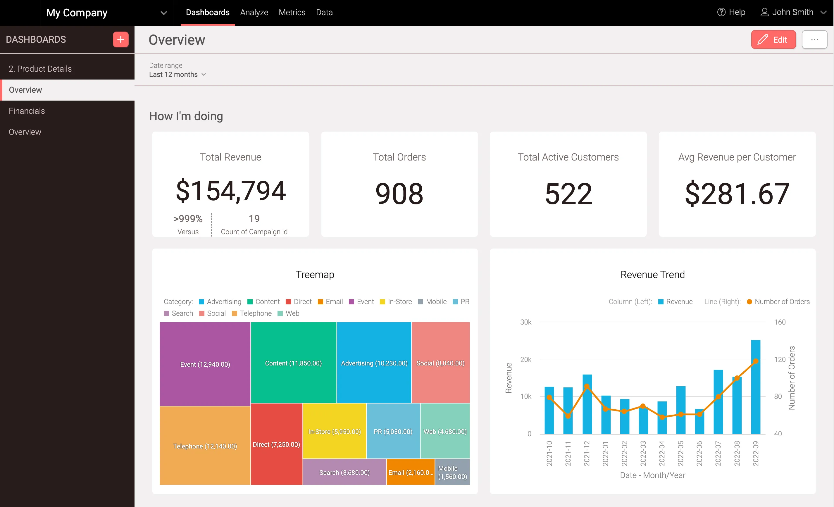
Use this code to create the theme:
{
    "palette": {
        "primary": {
            "base": "#FF6868"
        },
        "error": {
            "base": "#d13049"
        },
        "success": {
            "base": "#25a953"
        },
        "warning": {
            "base": "#FF9546"
        },
        "complementary": {
            "c0": "#FFFFFF",
            "c1": "#F2F0F0",
            "c9": "#585555"
        }
    },
    "typography": {
        "font": "url(https://fonts.gstatic.com/s/roboto/v30/KFOlCnqEu92Fr1MmSU5fBBc4AMP6lQ.woff2)",
        "fontBold": "url(https://fonts.gstatic.com/s/roboto/v30/KFOmCnqEu92Fr1Mu4mxKKTU1Kg.woff2)"
    },
    "button": {
        "borderRadius": "6",
        "dropShadow": true
    },
    "modal": {
        "title": {
            "color": "#585555",
            "lineColor": "#DFE0E5"
        },
        "borderColor": "#ffffff",
        "borderRadius": "6",
        "borderWidth": "2",
        "dropShadow": true,
        "outsideBackgroundColor": "#F2F0F0"
    },
    "analyticalDesigner": {
        "title": {
            "color": "#585555"
        }
    },
    "dashboards": {
        "title": {
            "color": "#585555",
            "backgroundColor": "#F2F0F0",
            "borderColor": "#D1BEBE"
        },
        "navigation": {
            "title": {
                "color": "#D1BEBE"
            },
            "borderColor": "#D1BEBE",
            "item": {
                "color": "#D1BEBE",
                "hoverColor": "#FF6868",
                "selectedColor": "#585555",
                "selectedBackgroundColor": "#F2F0F0"
            },
            "backgroundColor": "#261D1D"
        },
        "filterBar": {
            "filterButton": {
                "backgroundColor": "#F2F0F0"
            },
            "backgroundColor": "#F2F0F0",
            "borderColor": "#D1BEBE"
        },
        "section": {
            "title": {
                "color": "#585555",
                "lineColor": "#F2F0F0"
            },
            "description": {
                "color": "#999EA5"
            }
        },
        "content": {
            "kpiWidget": {
                "title": {
                    "color": "#736767",
                    "textAlign": "center"
                },
                "kpi": {
                    "primaryMeasureColor": "#261D1D",
                    "secondaryInfoColor": "#736767"
                },
                "borderColor": "#fff",
                "borderRadius": "6",
                "borderWidth": "1",
                "backgroundColor": "#fff",
                "dropShadow": false
            },
            "widget": {
                "title": {
                    "color": "#101010",
                    "textAlign": "center"
                },
                "borderColor": "#ffffff",
                "borderRadius": "6",
                "borderWidth": "2",
                "dropShadow": false
            },
            "backgroundColor": "#F2F0F0"
        }
    }
}
Blue Light
Light theme with a blue primary color and subtle shadow effects.
Use this code to create the theme:
{
"palette": {
"primary": {
"base": "#347EFF"
},
"error": {
"base": "#d13049"
},
"success": {
"base": "#25a953"
},
"warning": {
"base": "#FF9546"
}
},
"button": {
"borderRadius": "2",
"dropShadow": true
},
"modal": {
"title": {
"color": "#413C5E",
"lineColor": "#DFE0E5"
},
"borderColor": "#ffffff",
"borderRadius": "6",
"borderWidth": "2",
"dropShadow": true,
"outsideBackgroundColor": "#DFE0E5"
},
"tooltip": {
"color": "#FFFFFFCC",
"backgroundColor": "#413C5E"
},
"analyticalDesigner": {
"title": {
"color": "#413C5E"
}
},
"dashboards": {
"title": {
"color": "#413C5E",
"backgroundColor": "#FFFFFF",
"borderColor": "#BFC4E0"
},
"navigation": {
"title": {
"color": "#413C5E"
},
"borderColor": "#BFC4E0",
"item": {
"color": "#413C5E",
"hoverColor": "#2A80F8",
"selectedColor": "#2A80F8",
"selectedBackgroundColor": "#fff"
},
"backgroundColor": "#F4F5FB"
},
"filterBar": {
"filterButton": {
"backgroundColor": "#FFFFFF"
},
"backgroundColor": "#FFFFFF",
"borderColor": "#BFC4E0"
},
"section": {
"title": {
"color": "#413C5E",
"lineColor": "#FFFFFF"
},
"description": {
"color": "#999EA5"
}
},
"content": {
"kpiWidget": {
"title": {
"color": "#413c5e",
"textAlign": "center"
},
"kpi": {
"primaryMeasureColor": "#2a80f8",
"secondaryInfoColor": "#413C5E99"
},
"borderColor": "#2168E5",
"borderRadius": "6",
"borderWidth": "0",
"backgroundColor": "#F4F5FB",
"dropShadow": false
},
"widget": {
"title": {
"color": "#101010",
"textAlign": "center"
},
"borderColor": "#ffffff",
"borderRadius": "6",
"borderWidth": "2",
"dropShadow": false
},
"backgroundColor": "#FFFFFF"
}
}
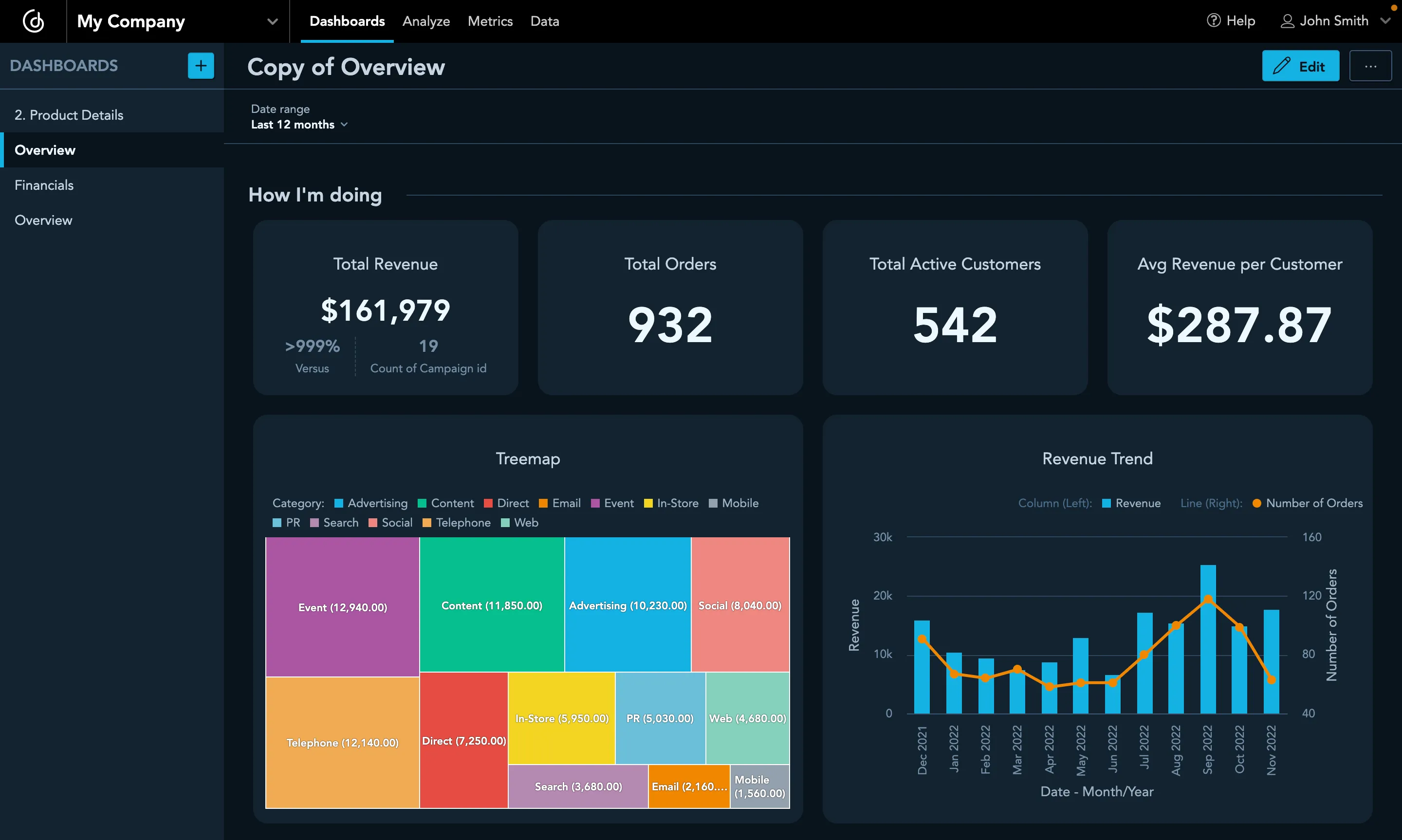
}Green Dark
Dark theme with a green primary color and modern typography.
Use this code to create the theme:
{
"palette": {
"primary": {
"base": "#1DB954"
},
"complementary": {
"c0": "#000",
"c1": "#262626",
"c2": "#323333",
"c3": "#3F403F",
"c4": "#585958",
"c5": "#707370",
"c6": "#898C89",
"c7": "#A1A6A2",
"c8": "#BABFBA",
"c9": "#D2D9D3"
}
},
"typography": {
"font": "url(https://fonts.gstatic.com/s/roboto/v30/KFOlCnqEu92Fr1MmSU5fBBc4AMP6lQ.woff2)",
"fontBold": "url(https://fonts.gstatic.com/s/roboto/v30/KFOmCnqEu92Fr1Mu4mxKKTU1Kg.woff2)"
},
"dashboards": {
"filterBar": {
"borderColor": "#000"
},
"content": {
"kpiWidget": {
"borderRadius": "4",
"backgroundColor": "#262626"
}
}
}
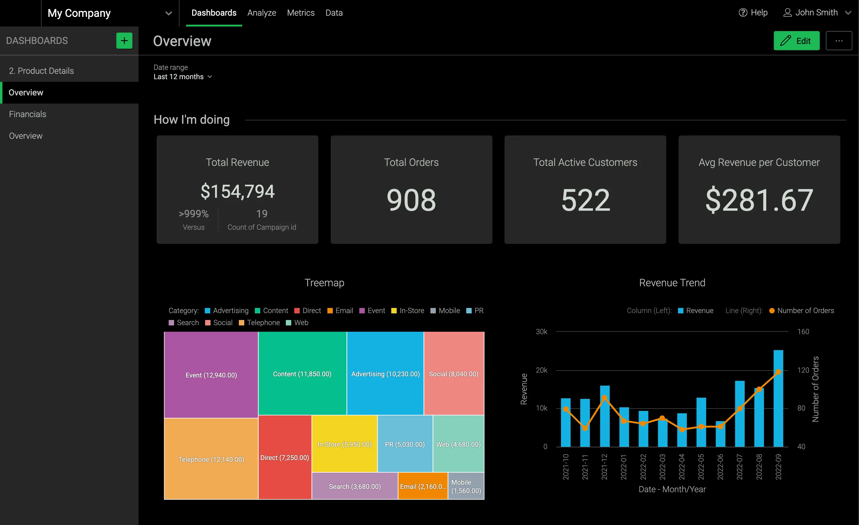
}Indigo Dark
A dark variant of the default Indigo theme with updated primary and widget background colors.
Use this code to create the theme:
{
    "palette": {
        "primary": {
            "base": "#14B2E2"
        },
        "complementary": {
            "c0": "#09131B",
            "c1": "#122330",
            "c5": "#4A6C89",
            "c9": "#F0F8FF"
        }
    },
    "dashboards": {
        "content": {
            "widget": {
                "backgroundColor": "#122330"
            }
        }
    }
}