Waterfall Chart
This visualization type is only available in GoodData Cloud.
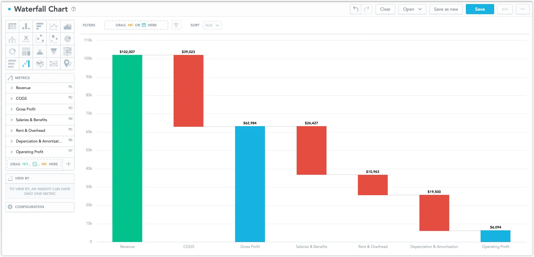
Waterfall charts are useful for showing the total effect of positive and negative changes on a final value. They are most commonly used in financial analysis. For example, a waterfall chart can show the breakdown of a company’s net profit, starting with the initial value and then displaying additions and deductions to arrive at the final value.
There are two ways how to use a waterfall chart:
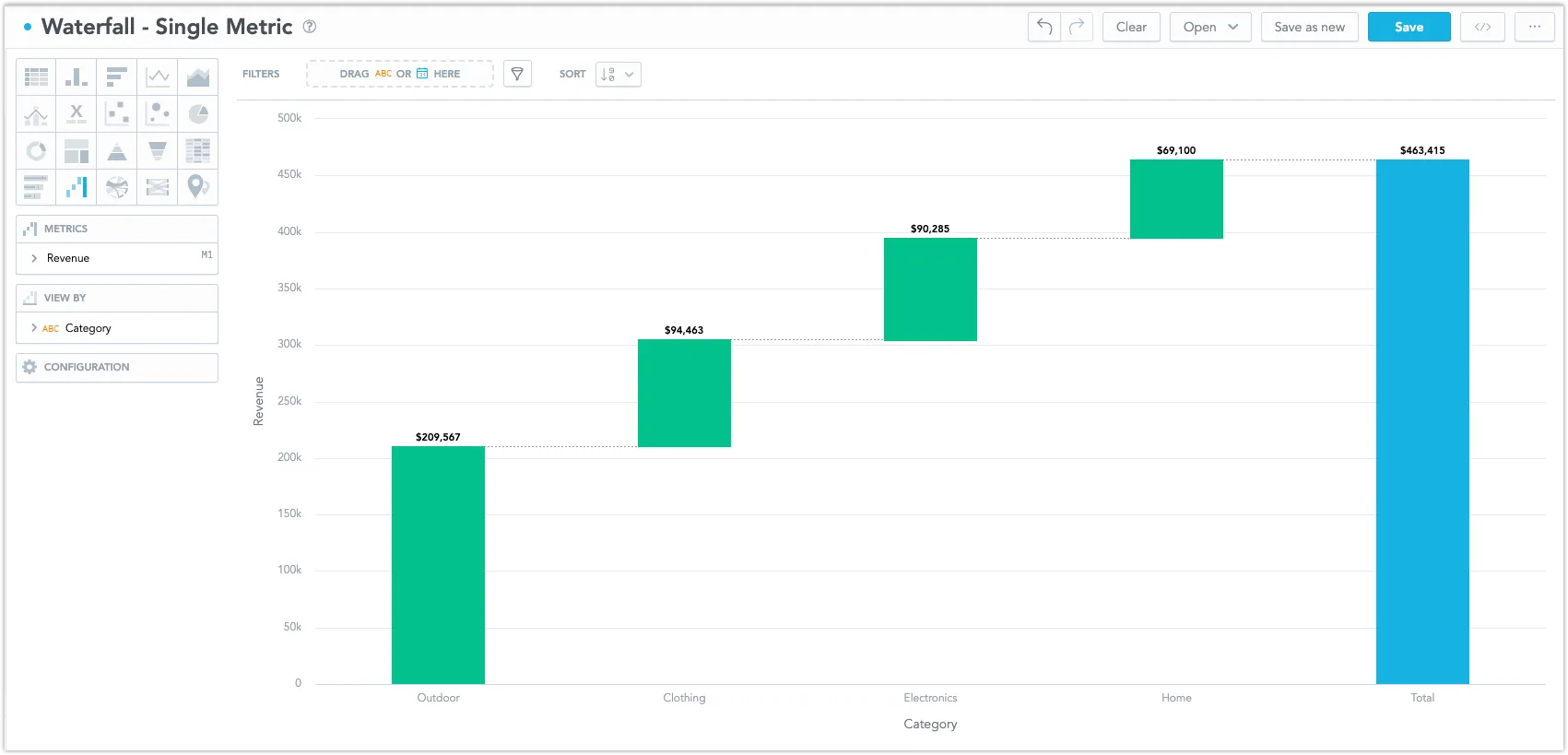
A metric broken down by an attribute
This is typically used to show financial data, where individual values of an attribute contribute to a final sum. For example, the metric contains data on a company’s revenue and the attribute breaks it down according to individual product types.
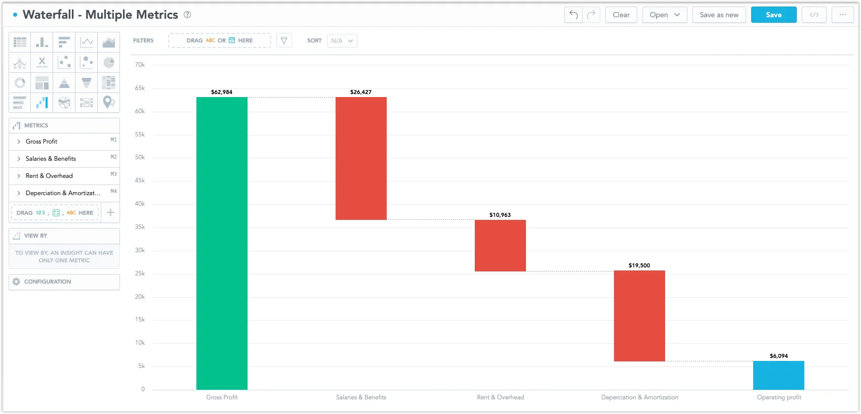
Multiple metrics
This is typically used to show the contributions of different metrics to the whole. For example, metrics containing data on a company’s gross profit and expenses are combined to calculate its net profit. The net profit is shown in the Total column, which is calculated as the sum of the used metrics.
Options
The Waterfall chart has the following sections:
- Metrics
- View by
- Configuration
Its settings are similar to those of the column chart. However, its features differ in some details:
By default, the Total column is displayed to show the total sum of all values. You can remove it by disabling Total in the Configuration section.
The Configuration > Colors and Fills section allows you to define only the colors of positive, negative, and total columns.
In Configuration > Colors and Fills > Fill, you can choose how chart segments are displayed:
- Pattern fill: Replaces solid colors with patterns (like crosshatching). This makes values easier to tell apart because they differ by both color and texture.
- Outline fill: Tones down solid colors and shows emphasized outlines. This style is useful when you want to overlap another chart (for example, a line chart on top of a column chart) because it improves contrast and separation.
See the Change Chart Fills section for further details.
In Configuration > Canvas > Labels style, you can choose Backplate to add a background behind chart labels. This makes labels easier to read because the backplate (white by default) creates higher contrast with the chart colors.
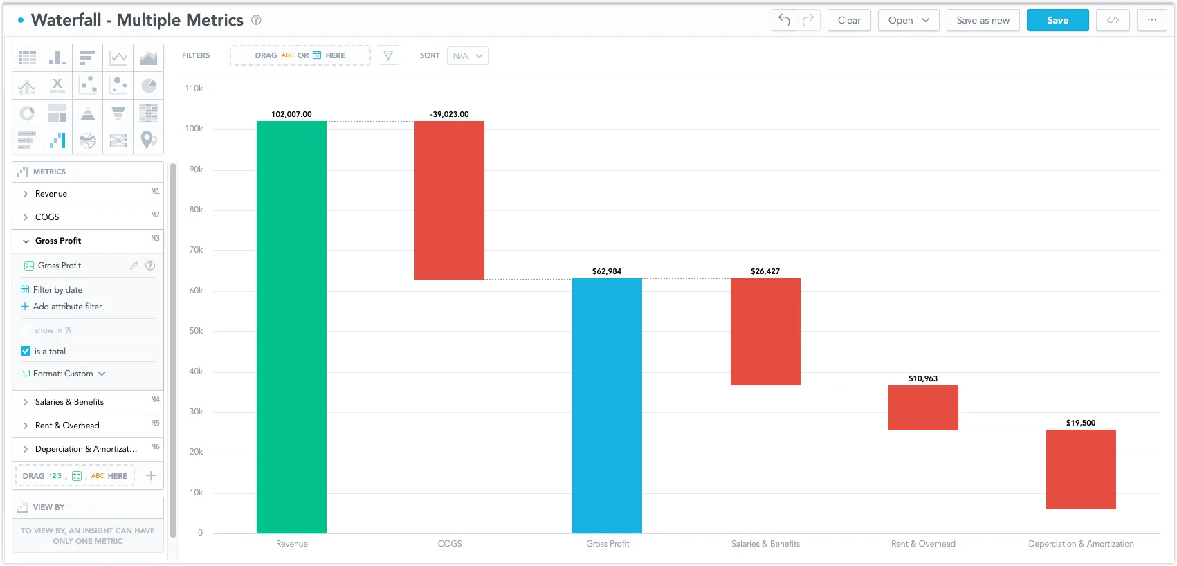
If you are using multiple metrics, you can add multiple columns showing different sums of values. For example, you can show total sums of positive and negative values as individual columns. To do so, create a metric (e.g. Total Revenue) that is defined as a sum of other metrics and check the Is a Total checkbox in its settings to display it as a column showing the total sum. Using a metric as a total disables the Total option in the Configuration section.
This is useful if you want to show subtotal values in your chart, or have a non-zero value as a starting point.

Waterfall charts can be displayed in horizontal and vertical orientations, which can be selected in Configuration > Canvas > Orientation. Typically, vertical waterfall charts are used for numerous categories, while horizontal ones excel with fewer categories.
If you are visualizing a single metric broken down by an attribute, you can define the order of columns using the Sort section. By default, positive values are shown first and the sorting is set from the largest to the smallest, i.e. the largest positive value is shown as the leftmost column and the smallest negative value as the rightmost column.
However, if you are visualizing multiple metrics, the Sort section is disabled and the visualization follows the order of metrics in the Metrics section. Drag and drop them to change their order.
For information about common characteristics and settings of all visualizations, see the Visualization Types section.
Limits
| Bucket | Limit |
|---|---|
| Metrics | 20 metrics (to add more than one metric, View by bucket must be empty) |
| View by | 1 attribute (this bucket is available only if there is exactly one metric) |