Treemap
Treemaps display data hierarchically as nested rectangles. They are commonly used to represent proportions, sizes, or values of categories within a hierarchy. For example, a treemap chart can show the market share of different product categories within various regions, with each rectangle representing a category and its size indicating the relative proportion.
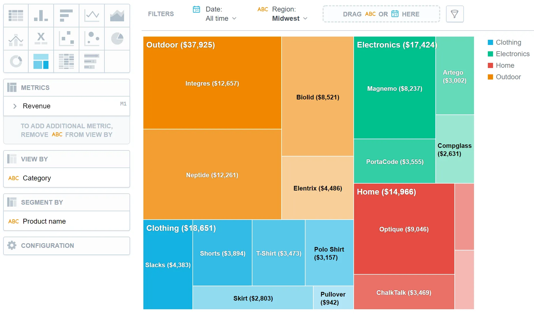
Treemaps have the following sections:
- Metrics
- View by
- Segment by
- Configuration
In treemaps, you can also:
Display the values as a percentage.
To do so, add a date or an attribute to the View by section.
Segment a treemap by attributes. The treemap shows the attributes as different shades of a color.
To add attributes to the Segment by section, you must have only one item in the Metrics section.
In Configuration > Colors and Fills > Fill, you can choose how chart segments are displayed:
- Pattern fill: Replaces solid colors with patterns (like crosshatching). This makes values easier to tell apart because they differ by both color and texture.
- Outline fill: Tones down solid colors and shows emphasized outlines. This style is useful when you want to overlap another chart (for example, a line chart on top of a column chart) because it improves contrast and separation.
See the Change Chart Fills section for further details.
In Configuration > Canvas > Labels style, you can choose Backplate to add a background behind chart labels. This makes labels easier to read because the backplate (white by default) creates higher contrast with the chart colors.

For information about common characteristics and settings of all visualizations, see the Visualization Types section.
Limits
| Bucket | Limit |
|---|---|
| Metrics | 20 metrics (to add more than one metric, View by bucket must be empty) |
| View by | 1 attribute (this bucket is available only if there is exactly one metric) |
| Segment by | 1 attribute |