Sankey Diagram
This visualization type is only available in GoodData Cloud.
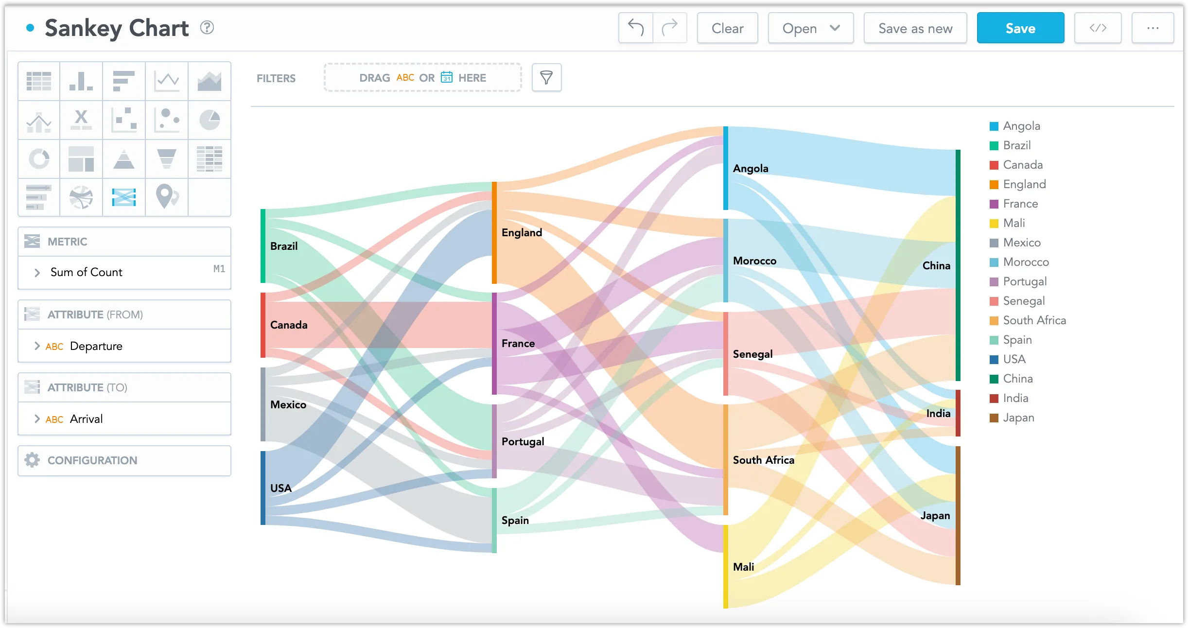
Sankey diagrams show the unidirectional flows of values from the ultimate sources to the ultimate targets, with emphasis on visualization of the flow intensity. For example, a Sankey diagram can show the movement of goods at each stage of a supply chain, such as production, transportation, and consumption. This makes it useful for highlighting flow trends and resource optimization.
Sankey Diagrams have the following sections:
- Metrics
- Attribute (From)
- Attribute (To)
- Configuration
In Sankey diagrams, you can also:
Display the values as a percentage of the total sum. To do so, check the Show in % checkbox in the Metric section.
In Configuration > Canvas > Labels style, you can choose Backplate to add a background behind chart labels. This makes labels easier to read because the backplate (white by default) creates higher contrast with the chart colors.
This diagram cannot show a circular/backward flow. If 2 nodes are both a source and a target to each other, for example, flow from node A to node B and then back to A (or from A back to A directly, e.g.), the diagram will not be properly generated. Your data sources must be preprocessed to contain only values describing the flow in one direction.
Please note that the Sankey diagram is designed exclusively to visualize the flows in oriented graphs without cycles. Only forward flows are allowed in it, therefore. The same values in either “From” or “To” entries are assigned to the same node in the Sankey diagram.
For information about common characteristics and settings of all visualizations, see the Visualization Types section.
Limits
| Bucket | Limit |
|---|---|
| Metric | 1 metric |
| Attribute (from) | 1 attribute |
| Attribute (to) | 1 attribute |