Line Chart
Line charts show data as line-connected dots. Line charts can display changes in metrics across time or progress across a series of stages, making them widely used in various fields including finance, analytics, and research. They are commonly used to represent continuous data such as stock prices, temperature variations, or sales trends. For example, a line chart can showcase the monthly sales performance of a product, with each point on the line representing the sales value for a specific time period.
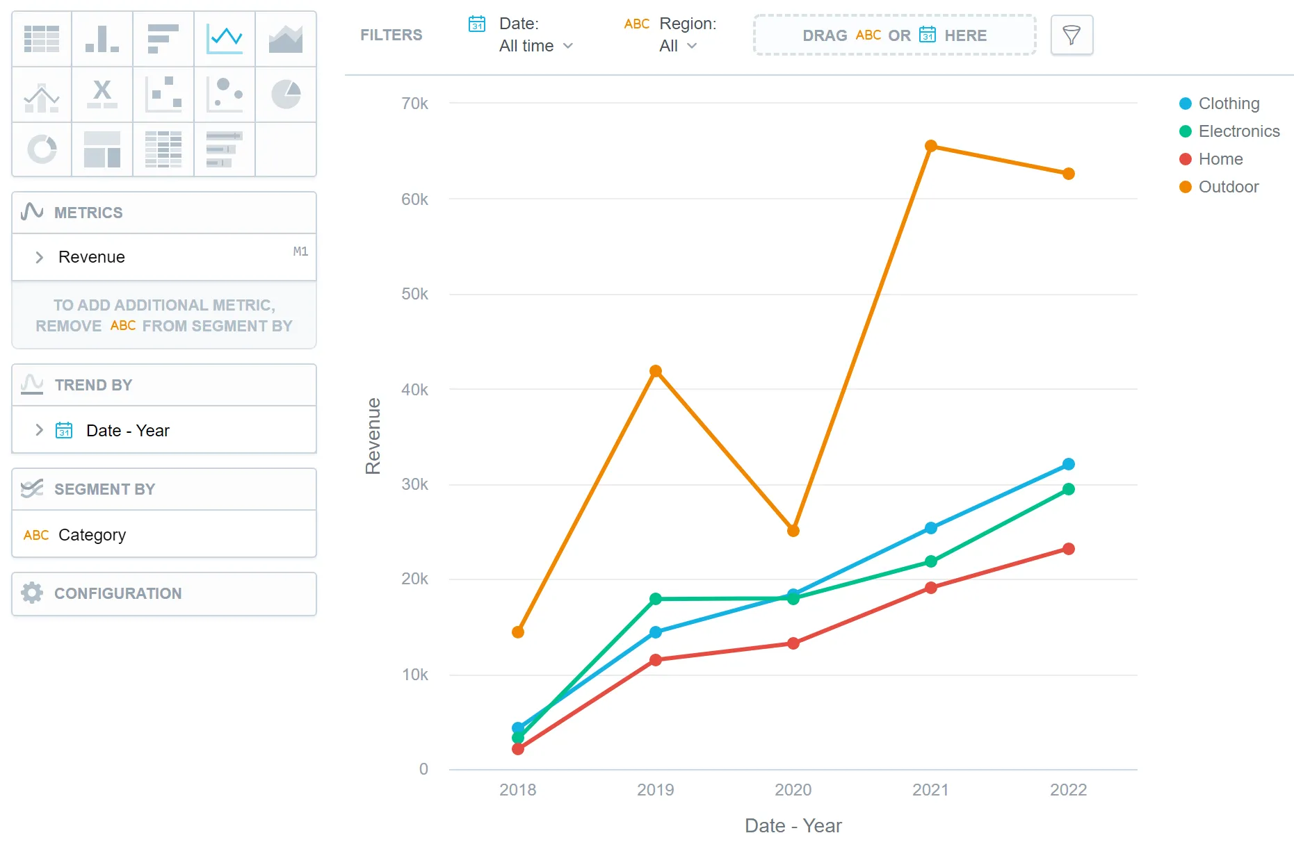
Line charts have the following sections:
- Metrics
- Trend by
- Segment by
- Configuration
If you configure the Trend by section and add a date or an attribute, you display a trend line. Trend lines connect individual metric/attribute values.
In line charts, you can also:
Display the values as a percentage.
To do so, add a date or an attribute to the Trend by section.
Display individual values of an attribute.
To do so, add an attribute to the Segment by section. You must have only one item in the Metrics section.
Display the chart as a continuous line even if some values are missing.
To do so, check the Continuous line checkbox in the Configuration > Canvas section. If checked, the line skips the missing value and connects the next available value.
Compare your data to the previous period or the same period of the previous year.
For details, see the Time over Time Comparison section.
Display a secondary y-axis on the right side.
To do so, select the show on right axis checkbox in a metric’s settings.
Add forecasting.
In Configuration > Canvas > Labels style, you can choose Backplate to add a background behind chart labels. This makes labels easier to read because the backplate (white by default) creates higher contrast with the chart colors.
In Configuration > Canvas, you can enable Distinct point shapes to make data points easier to tell apart. When enabled, charts use different shapes (such as squares, diamonds, or triangles) instead of a single uniform shape for all data points. See the Change Data Point Shapes section for further details.
- Use a line style control metric to indicate which segments of the timeline should be rendered as dashed or solid.
For information about common characteristics and settings of all visualizations, see the Visualization Types section.
Line Style by Metric
When you collect data over time and visualize it in a line chart, it’s common for data from recent months to remain incomplete due to possible retroactive updates or corrections. If you want the chart to visually distinguish between complete and incomplete data, you can use a dedicated control metric that indicates which segments of the timeline should be rendered as dashed or solid. A solid line is used for completed months and a dashed line for those still subject to change.
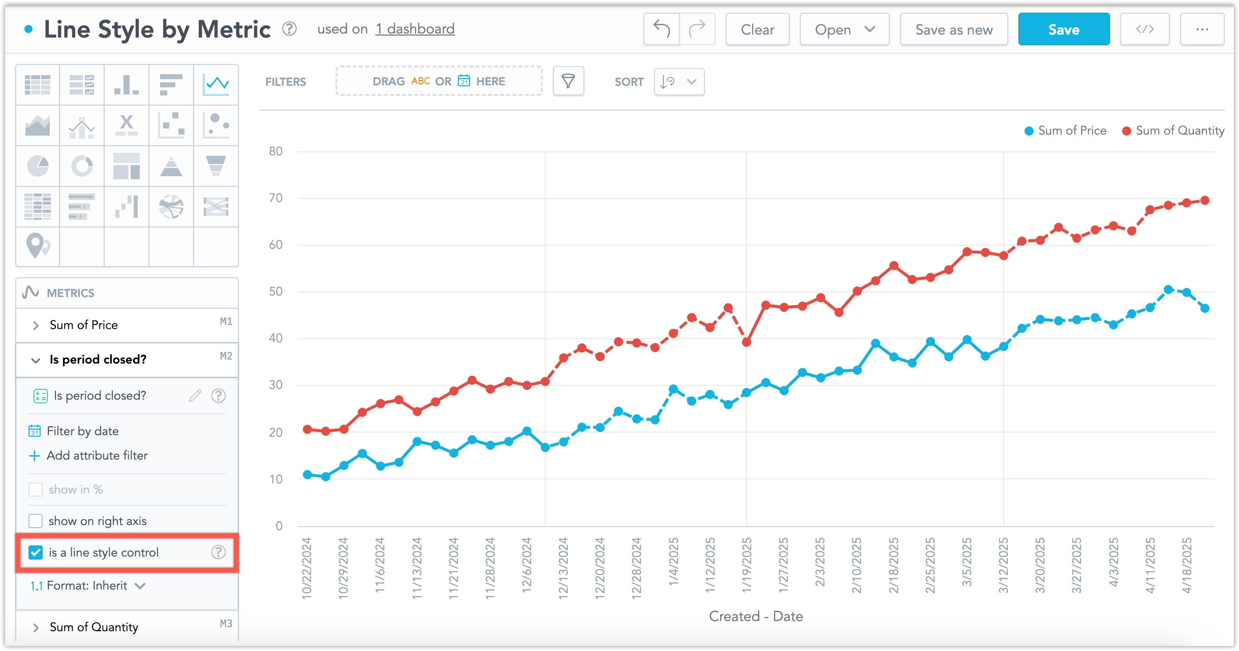
Only one metric can be used as a line style control to influence the appearance of other metrics in the chart.
In the line chart’s metrics bucket, select a metric that you want to use as a line style control. In its configuration panel, tick the checkbox labeled Is a line style control.
- The checkbox is disabled if the visualization contains only one metric.
- If one metric has the checkbox selected, it is disabled for all other metrics in the chart.
When a metric is marked as a line style control:
It is not rendered in the chart as a line or included in the legend.
Its values are used to define threshold zones in the remaining chart series:
- A continuous sequence of
nullor0values defines a dashed segment. - A continuous sequence of any other values defines a solid segment.
- A continuous sequence of
Transitions between dashed and solid lines are marked by vertical grid lines.
Limits
| Bucket | Limit |
|---|---|
| Metrics | 20 metrics (to add more than one metric, Stack by bucket must be empty) |
| View by | 2 attributes |
| Stack by | 1 attribute (this bucket is available only if there is exactly one metric) |
| Feature | Limit | Comment |
|---|---|---|
| Maximum data points in one chart | 3,000 | This is a display (visualization) limit. If you exceed this limit and want to see all data, change the visualization type to Table. |