Funnel Chart
This visualization type is only available in GoodData Cloud.
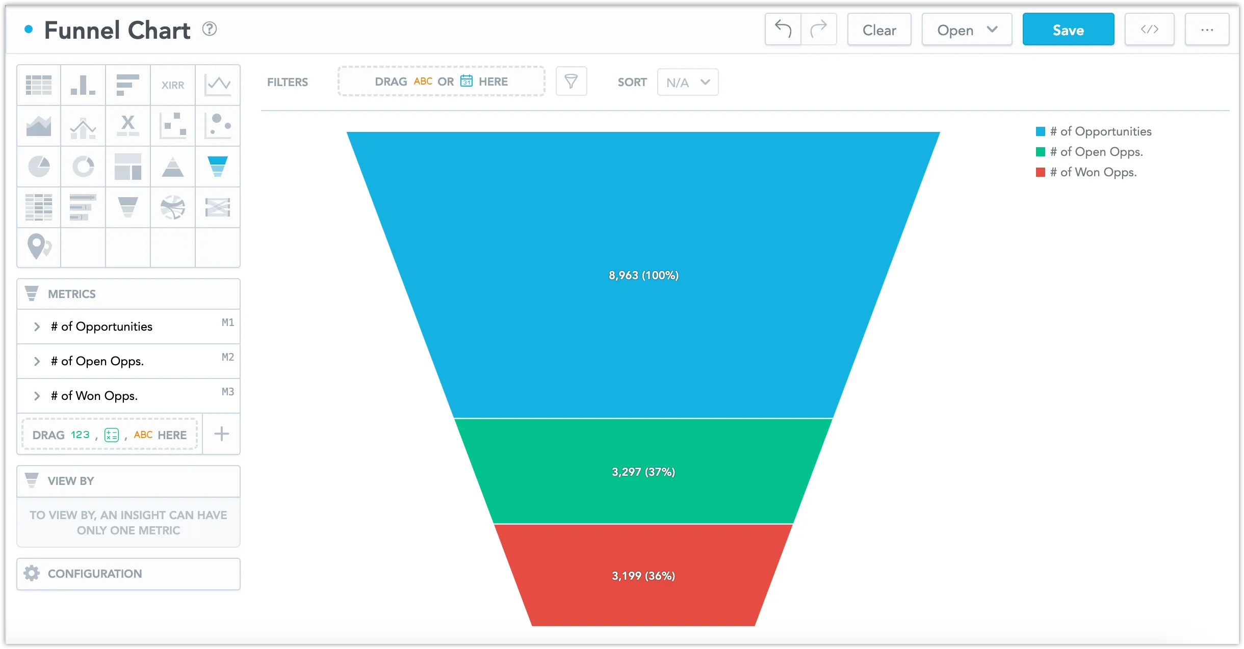
Funnel charts are great at showing the progressive stages of a process or workflow. They are mostly used for displaying customer journeys or conversion funnels. Because they can effectively demonstrate the drop-offs at each stage of the process, they can help identify bottlenecks or optimize conversion rates.
Funnel Charts have the following sections:
- Metrics
- View By
- Configuration
By default, the values are shown as a percentage of the first stage. If you want to see only the numeric values, uncheck the Percentage checkbox in the Configuration section.
In funnel charts, you can also:
In Configuration > Colors and Fills > Fill, you can choose how chart segments are displayed:
- Pattern fill: Replaces solid colors with patterns (like crosshatching). This makes values easier to tell apart because they differ by both color and texture.
- Outline fill: Tones down solid colors and shows emphasized outlines. This style is useful when you want to overlap another chart (for example, a line chart on top of a column chart) because it improves contrast and separation.
See the Change Chart Fills section for further details.
In Configuration > Canvas > Labels style, you can choose Backplate to add a background behind chart labels. This makes labels easier to read because the backplate (white by default) creates higher contrast with the chart colors.

For information about common characteristics and settings of all visualizations, see the Visualization Types section.
Limits
| Bucket | Limit |
|---|---|
| Metrics | 20 metrics (to add more than one metric, Stack by bucket must be empty) |
| View by | 1 attribute (this bucket is available only if there is exactly one metric) |