Stack Metrics in Visualizations

Stacking can help you with contribution versus comparison analysis.

You can display:

  • Contribution of each metric to the whole displayed in numbers
  • Percentage contribution of each metric

You can stack metrics in the following types of visualizations:

If a chart has a secondary axis, the stacking is displayed only on the left axis.

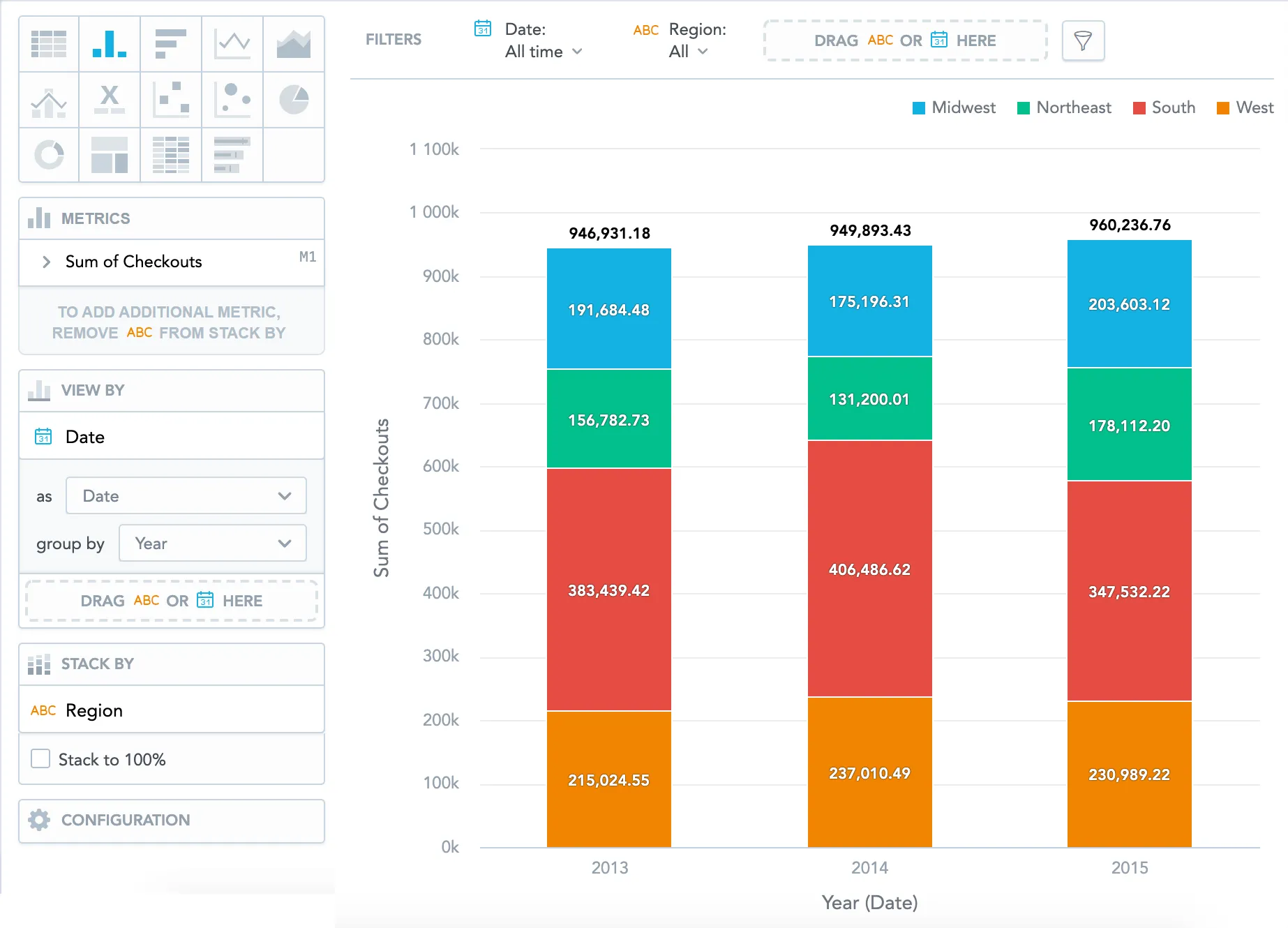
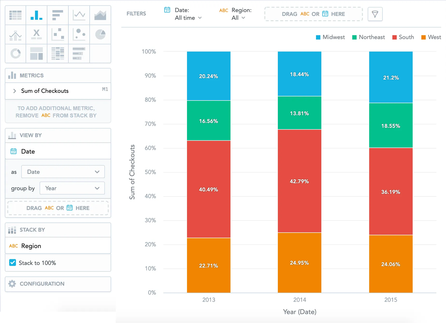
Example 1 - Stack a single metric by an attribute

You have the sum of checkouts and you want to see how each region contributed to the yearly sum.

Steps:

  1. Drag the Checkouts metric to the Metrics section.

  2. Drag a date to the View by section and set it to Year.

  3. Drag Region to the Stack by section.

    The column chart displays how regions contributed in absolute numbers.

  4. In the Stack by section, select Stack to 100% to view the contribution.

    The column chart displays how regions contributed in percentage.

Column chart showing total number of checkouts per region and year in absolute values. Each bar is split into four color-coded segments representing regions. Metric and stack configuration is visible in the left panel, with stack to 100 percent unchecked.
Column chart showing percentage contribution of different regions to the total number of checkouts per year. The stack to 100 percent option is selected in the left panel. Each bar is divided into four color-coded sections representing Midwest, Northeast, South, and West, with percentage labels inside the segments.

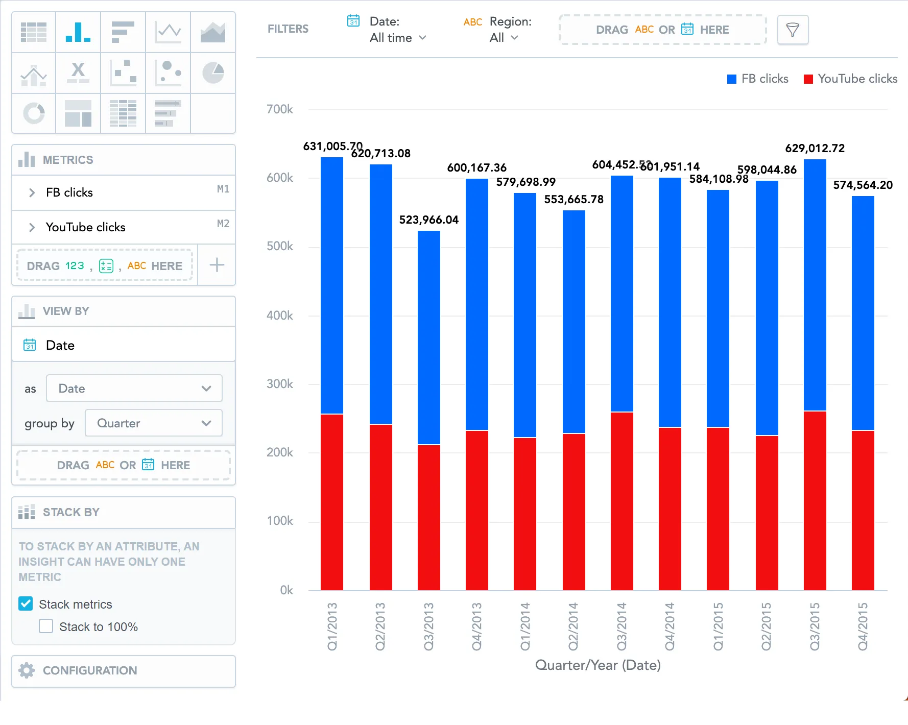
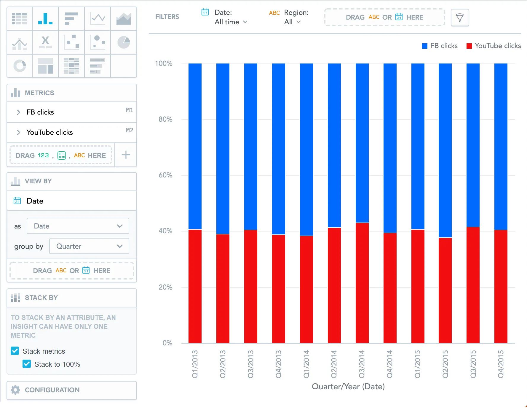
Example 2 - Stack multiple metrics and view them by date

You want to see how two metrics contributed to the total amount. The example shows the amount of Facebook and YouTube clicks each quarter.

Steps:

  1. Drag the FB clicks and YouTube clicks metrics to the Metrics section.
  2. Drag a date to the View by section and set it to Quarter.
  3. In the Stack by section:
    1. Select Stack metrics to view the contribution of Facebook and YouTube clicks.
    2. Select Stack to 100% to see the contribution in percentages.
Column chart displaying stacked Facebook and YouTube clicks by quarter. The left panel shows both metrics in the metrics bucket and a checked option to stack metrics in the Stack by section. Each bar is split into red and blue segments representing YouTube and Facebook clicks respectively, with values shown on top of each bar.
Column chart displaying the same data as the previous chart but stacked to 100 percent. The left panel shows Facebook and YouTube clicks in the metrics bucket and the stack metrics and stack to 100 percent checkboxes selected. Each bar reaches 100 percent height with relative proportions shown by segment size.

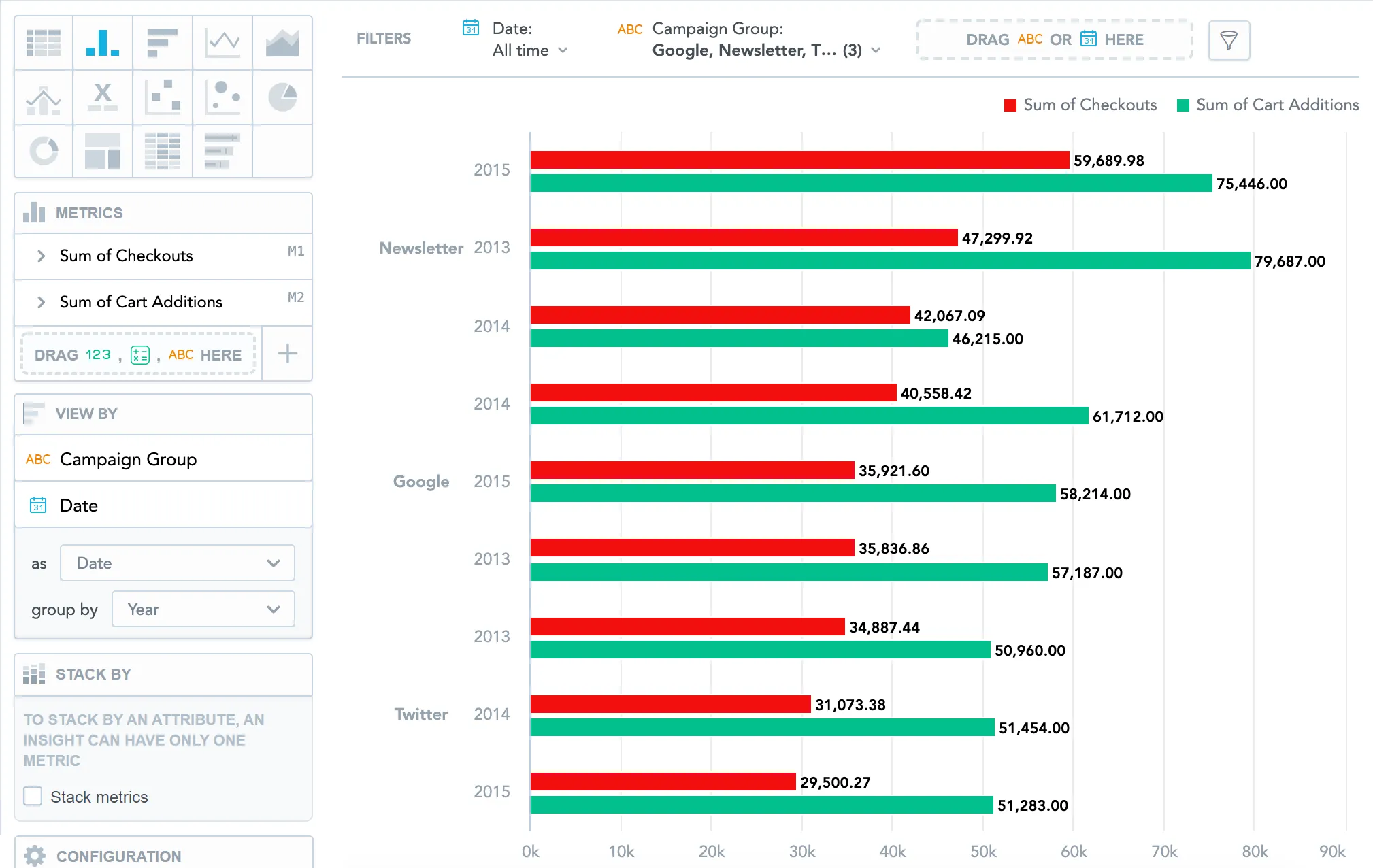
Example 3 - View metrics by two attributes

You want to compare the price of goods that customers added to their carts with the price of goods they purchased. You want to view the numbers by campaign group each year.

Steps:

  1. Drag the Cart additions and Checkouts metrics to the Metrics section.
  2. Drag a date and Campaign Group to the View by section.
  3. Set the date to Year.
Horizontal bar chart showing a side-by-side comparison of cart additions and checkouts per campaign group and year. Red bars represent checkouts, green bars represent cart additions. The left panel shows both metrics listed, and campaign group and date set under view by.

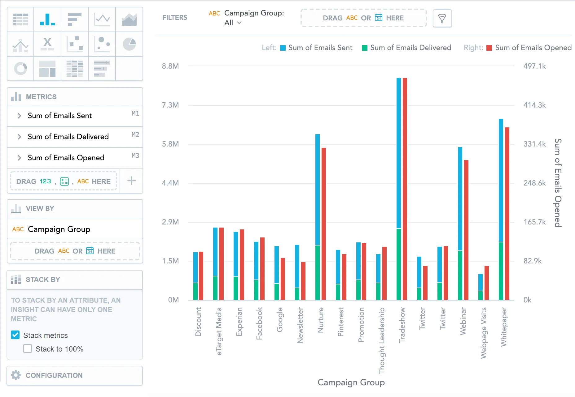
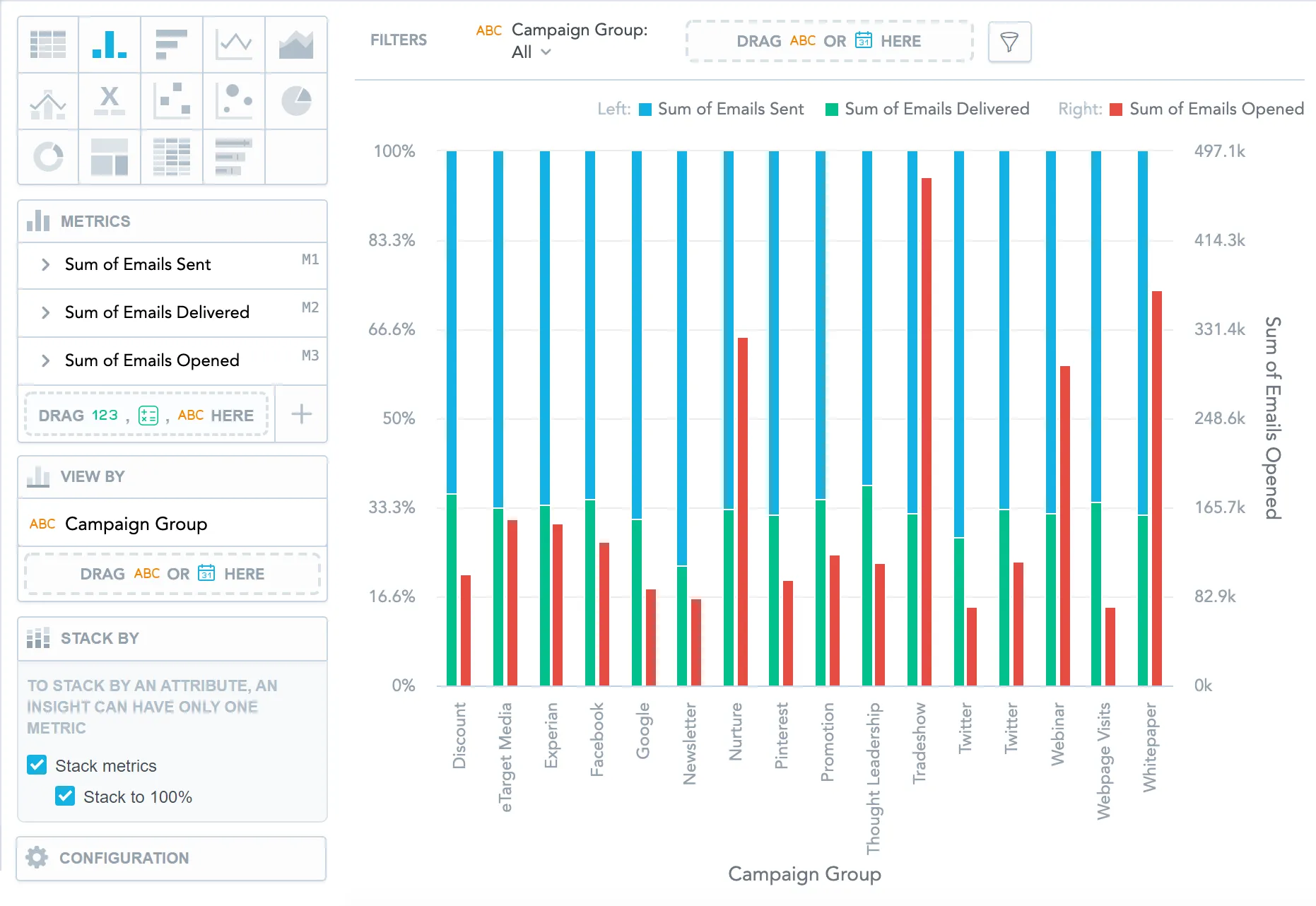
Example 4 - Stack multiple metrics, add a secondary axis, and view by date

You want to compare the amount of emails that you sent with the number of emails that were delivered. You also want to compare it to the number of emails that customers actually opened and to compare the trend for each quarter.

Steps:

  1. Drag the Emails Sent, Emails Delivered, and Emails Opened metrics to the Metrics section.

  2. In the Metrics section, click Emails Opened and select show on right axis.
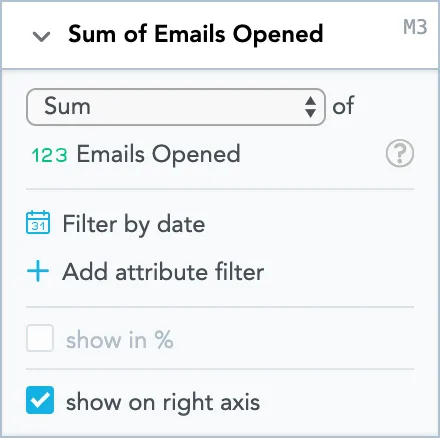
    Metric configuration panel for sum of emails opened. The panel includes a dropdown to choose aggregation type, set to sum, and a selected metric labeled emails opened. Below are options to filter by date, add attribute filters, show values as percentages, and a checkbox labeled show on right axis, which is selected.
  3. Drag Campaign Group to the View by section.

  4. In the Stack by section:

    1. Select Stack metrics to view the amounts of emails sent and emails delivered.
    2. Select Stack to 100% to compare the contribution over time.
Column chart showing email campaign performance per campaign group. Bars are divided into stacked segments showing total number of emails sent and delivered. The number of emails opened is shown as separate red bars. Left panel shows stacking and is enabled.
Same chart as previous, now with the stack to 100 percent option selected. The bar combinig the emails sent and delivered metrics reaches full height and is divided by proportion of emails sent and delivered, with emails opened shown as a separate bar.