Sort Data in Visualizations
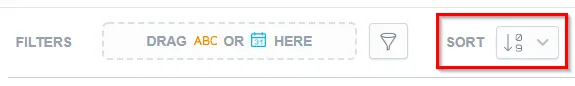
You can use sorting to order the data in your visualization. To configure sorting, click the sorting icon on the filter bar:
To sort the data, you must slice your data with at least one attribute.
Sorting is available for:
- bar charts
- column charts
- area charts
- combo charts
- bullet charts
- pie charts
- donut charts
- heatmaps
You can sort data:
- Alphabetically
- Numerically
- Chronologically
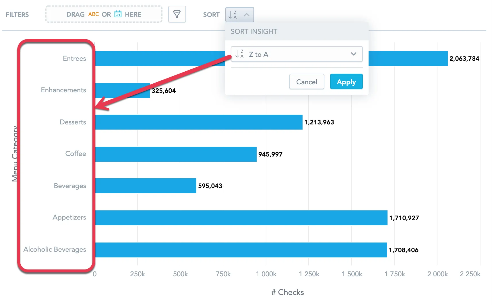
Alphabetical Sorting
You can sort the data alphabetically from A to Z, or vice versa. The data is sorted using the attribute values.
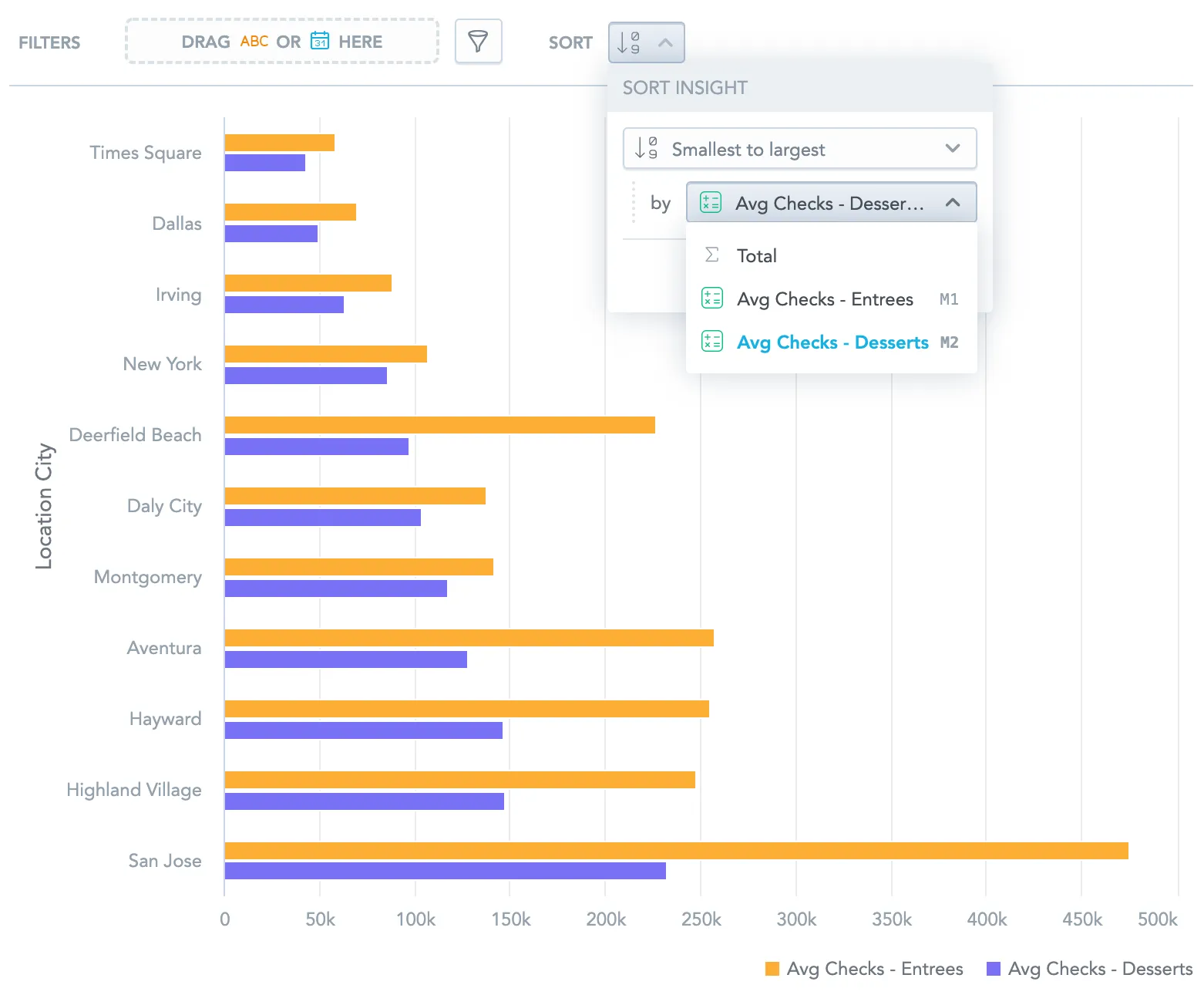
Numerical Sorting
You can sort the data numerically from the smallest number to the largest, or vice versa. The data is sorted using the metric values.
If the visualization contains multiple metrics, select the metric you want to use for sorting
If you select Total, the data is sorted by the sum of all metric values.
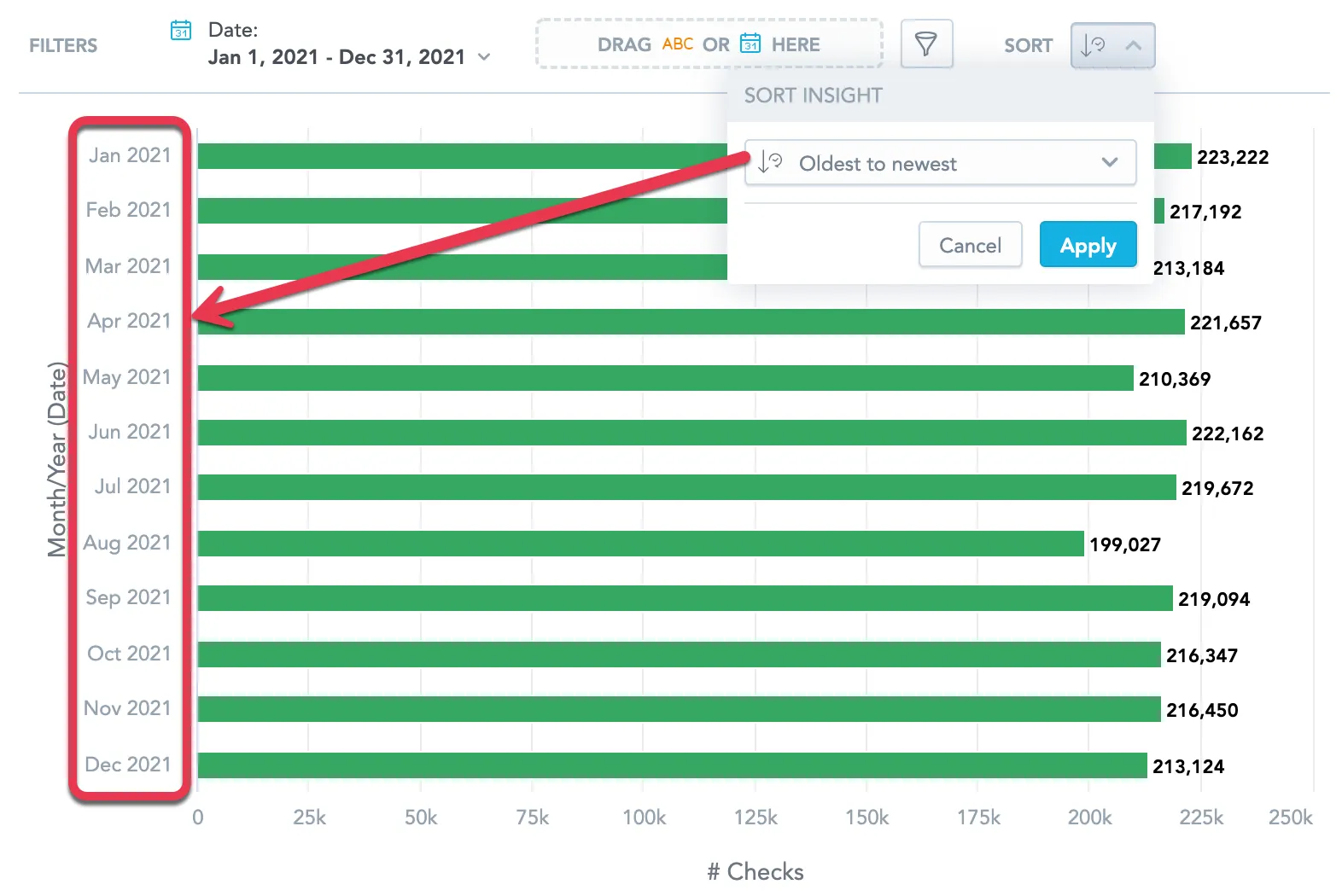
Chronological Sorting
If you add a date attribute, you can sort your data chronologically from the oldest to the newest, or vice versa. The data is sorted using the date attribute values.
Note
You must group the data by Day, Week, Month, Quarter, or Year. Other groupings, such as day of week or month of quarter, do not support chronological sorting.
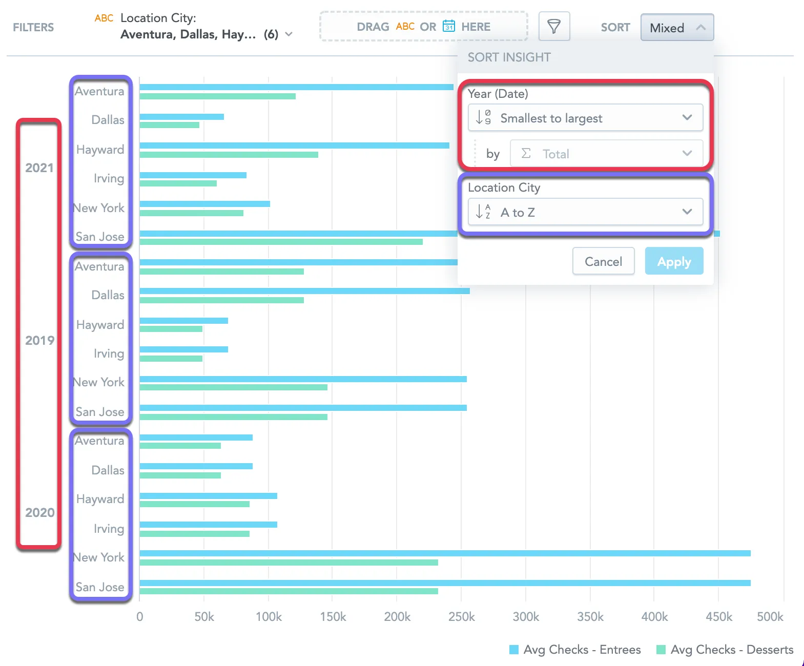
Mixed Sorting
If you slice your data by multiple attributes, you can use different type of sorting for each attribute.
Note
If you select numerical sorting for the first attribute, the data is always sorted by the total sum of all metrics for each attribtue value.
In the following example, the Average number of checks with desserts and Average number of checks with entrees are sliced by Date (Year) and Location City.
- For Date (Year), the data is sorted numerically from smallest to largest by the sum of all metrics
- For Location City, the data is sorted alphabetically.