Use Smart Functions
Smart functions represent our effort to leverage advanced statistical methods to help you gain more insights from your data with just a click of a button.
Forecasting
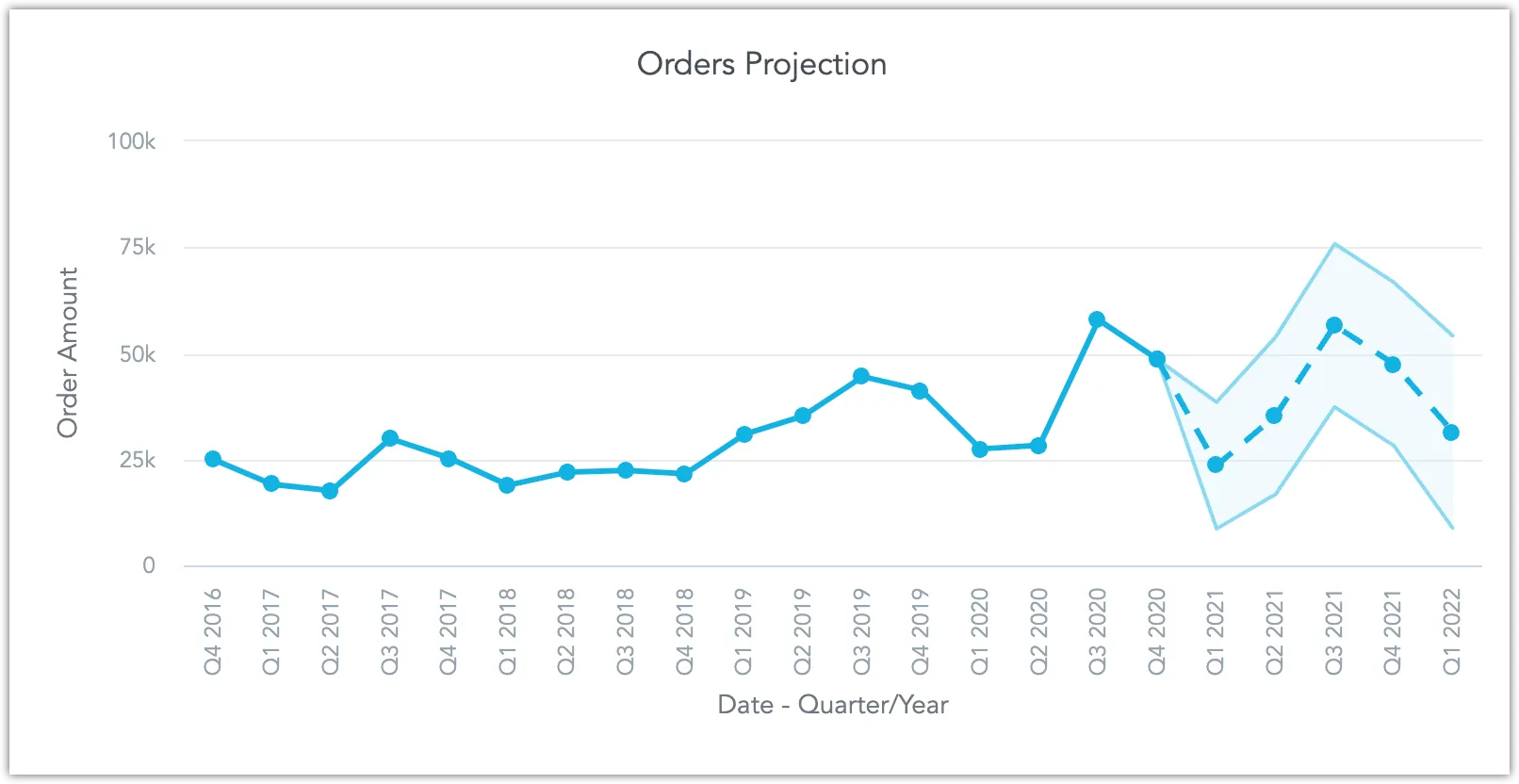
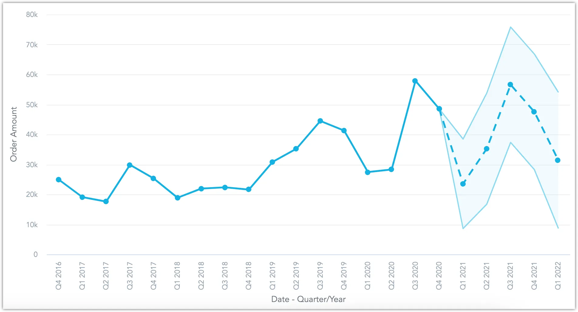
The forecasting function uses an autoregressive AR-X(p) model to create forecasts of future trends based on your data. Forecasting is supported for line charts:
Steps:
Create or open a line chart visualization in the Analytical Designer.
Ensure that:
You are using only one metric and trending it by date.
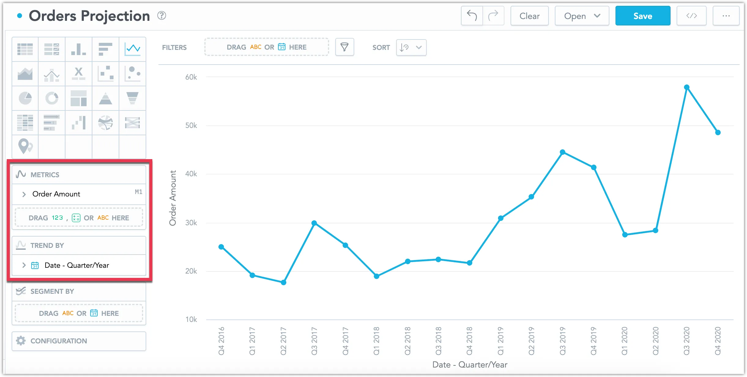
The data contains no missing values.
Under Configuration, toggle on Forecasting.
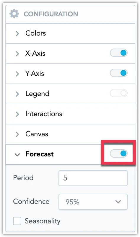
The number of predicted Periods must be smaller than the number of displayed data points.
The Confidence level determines the size of the shaded error region. A 95% confidence level means that the shaded region should be large enough to contain the predicted future data point 95% of the time.
Turn on Seasonality if your data is highly periodic to increase the accuracy of the forecast. For example, if your ice cream sales reliably grow every summer and plummet every winter. Note that if you enable this option, the number of predicted periods should be significantly smaller than the number of displayed data points.
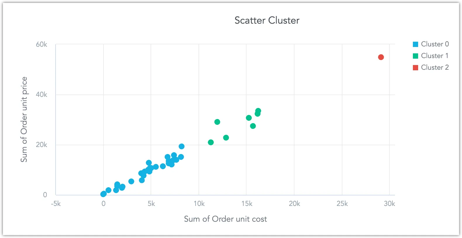
Clustering
This function uses the BIRCH algorithm to group your data points into N clusters based on their inherent similarities, where N is defined by the user. Each cluster is color-coded for easy distinction. This clustering function is available for scatter plots:
Steps:
Create or open a scatter plot visualization in the Analytical Designer.
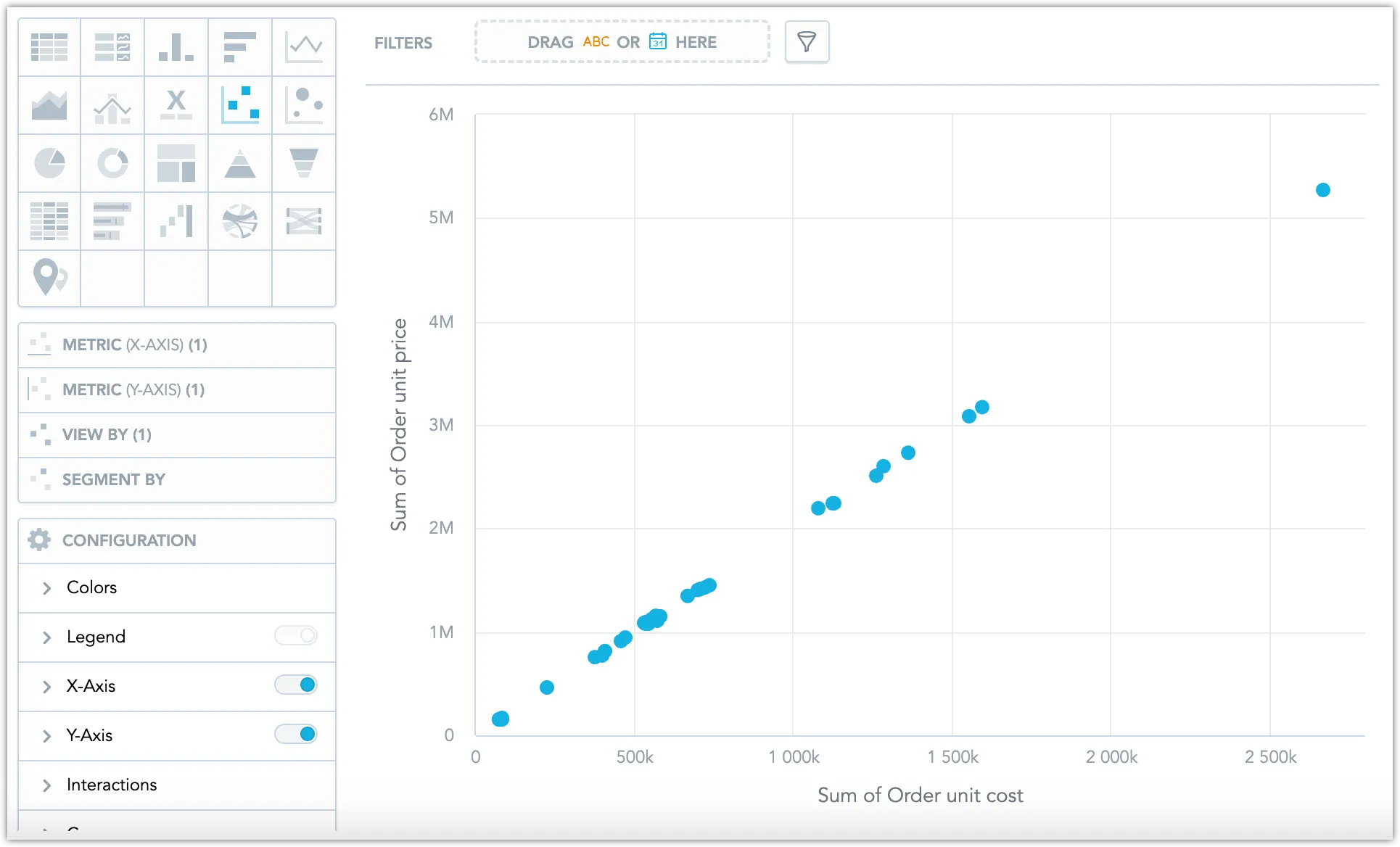
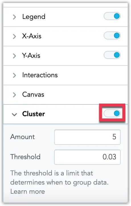
Under Configuration, toggle on Cluster.
The clusters are highlighted:
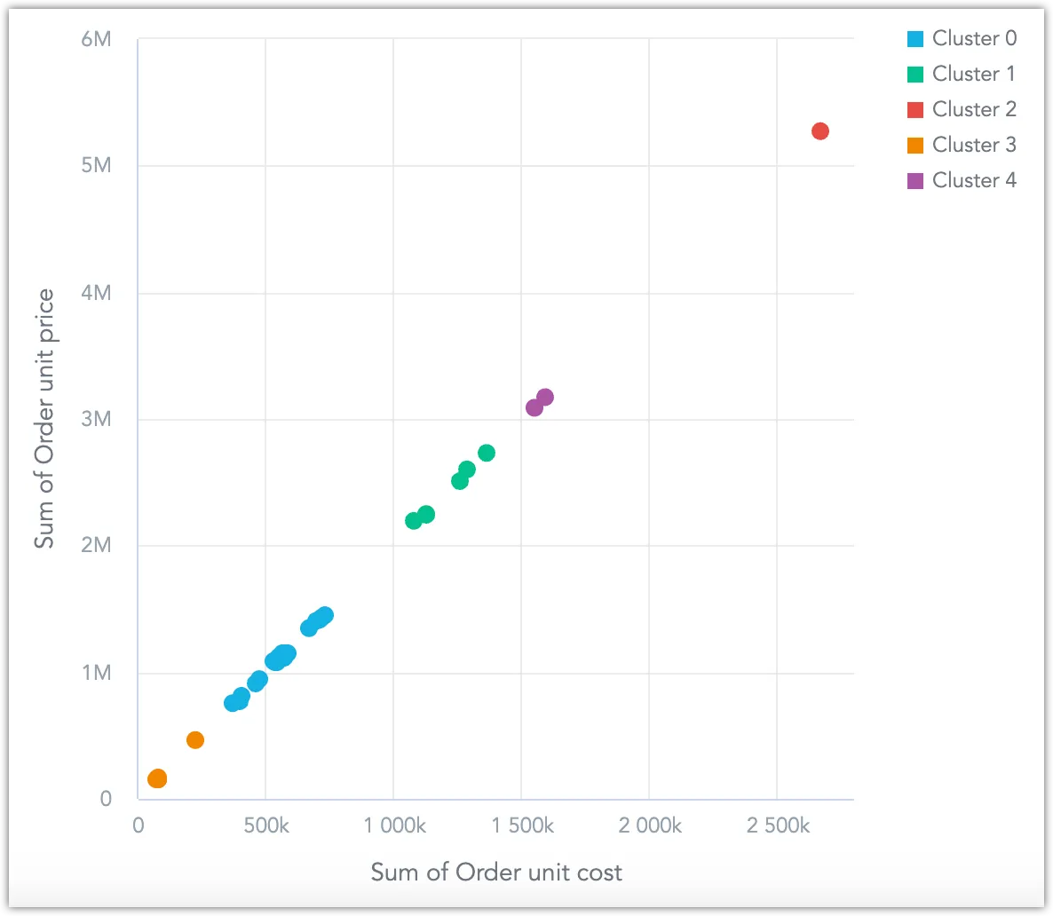
You can adjust the number of clusters.
Additionally, you can adjust the threshold parameter of the BIRCH algorithm, which ranges between 0 to 1 (exclusive). A threshold closer to 0 results in more numerous, smaller clusters, making the algorithm more sensitive to minor variations in the data.
Insert this section at the end of the article:
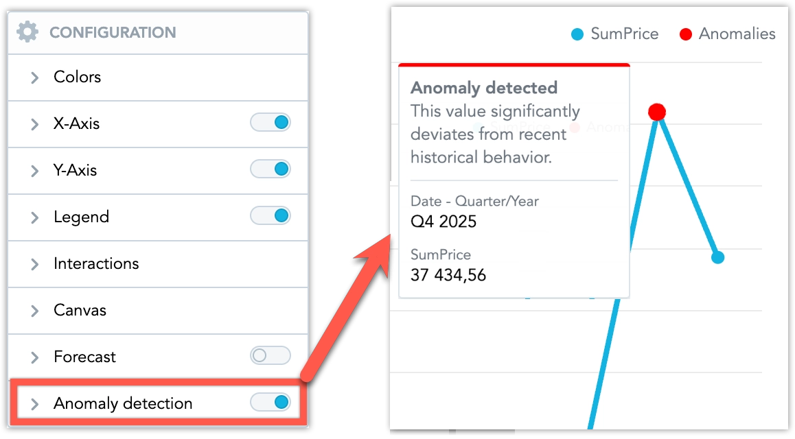
Anomaly Detection
The anomaly detection function highlights unusual values directly in a visualization so users can notice unexpected changes without leaving the dashboard. It is available for line charts that use exactly one metric sliced by a date attribute. When enabled, normal data points remain unchanged and anomalous points are emphasized visually. This capability is available only to users who have permission to use the AI Assistant.
Steps:
Create or open a line chart visualization in the Analytical Designer.
Ensure that:
- You are using exactly one metric.
- The metric is sliced by a date attribute.
Under Configuration, toggle on Anomaly detection.
- Sensitivity controls how aggressively anomalies are detected:
- Low detects only large, rare deviations.
- Medium provides a balanced signal-to-noise ratio and is the default setting.
- High detects more anomalies, including smaller deviations.
- Indicator color controls the color of anomaly markers.
- Indicator size controls the size of anomaly markers.
- Indicator shape cannot be controlled directly. It follows the Distinct point shapes setting in Canvas.
- Sensitivity controls how aggressively anomalies are detected:
Review the updated line chart.
Normal data points keep their standard styling. Anomalies are highlighted so they stand out in the visualization. When you hover over a highlighted point, a tooltip explains that the value significantly deviates from recent historical behavior and shows the affected period and metric value.
Save the visualization.
When anomaly detection is enabled on a line chart with one metric, the legend can help explain the anomaly markers. Legend visibility is still controlled in the visualization settings.
Important Notice
If anomaly alerts are scheduled for a visualization where anomaly markers are hidden, alert recipients may receive notifications that are not reflected visibly in the dashboard.