Use Time-over-Time Comparison in Visualizations
Use a date filter for time-over-time comparison to analyze your data without using complex MAQL syntax.
You can compare data in the following types of visualizations:
You can use the compare feature in Analytical Designer for the most common scenarios.
Types of Time-over-Time Comparison
You can compare your data to:
The same period of the previous year
For example, you can display data for March 2018 and compare it to March 2017.
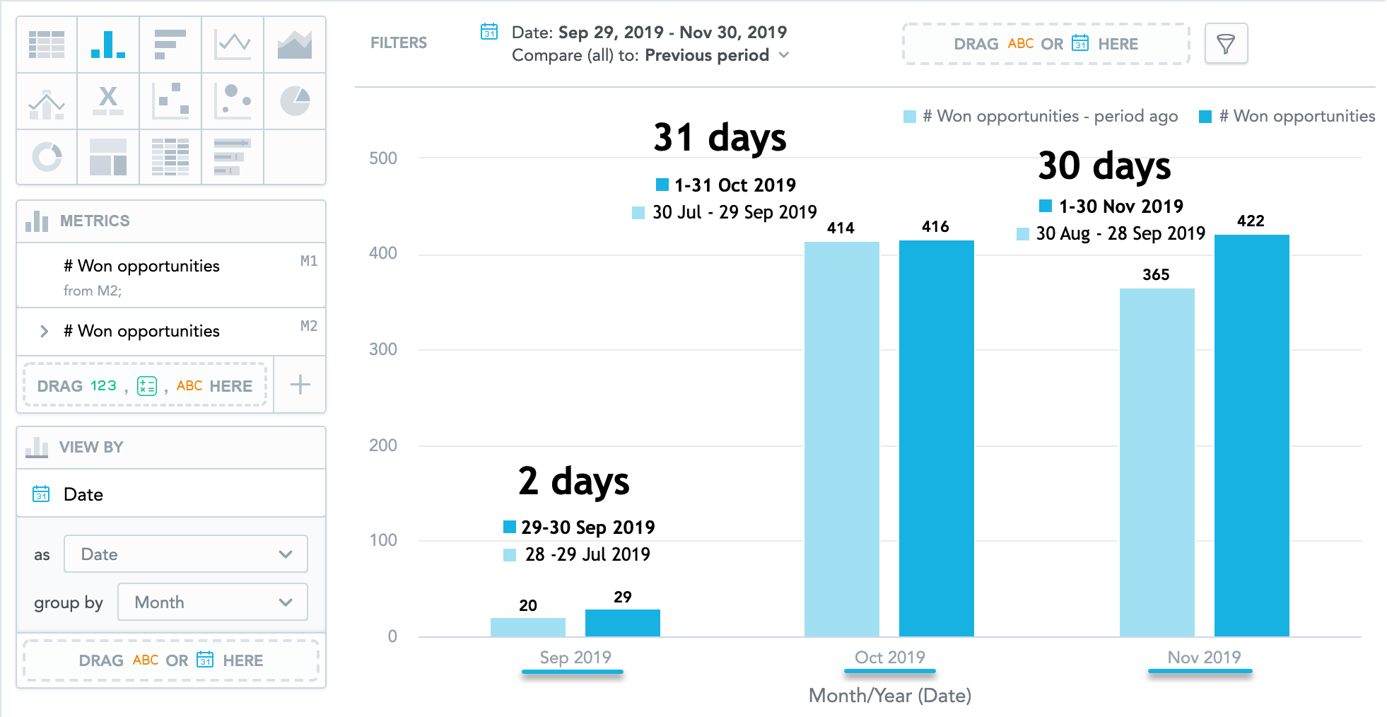
The previous period
For example, if you filter data for March 21-30 and apply the Previous period comparison, Analytical Designer displays also your data for March 11-20.
If you set the date filter to All time, you cannot enable the comparison.
Apply Time-over-Time Comparison to a Visualization
Steps:
Add a date to the filter bar.
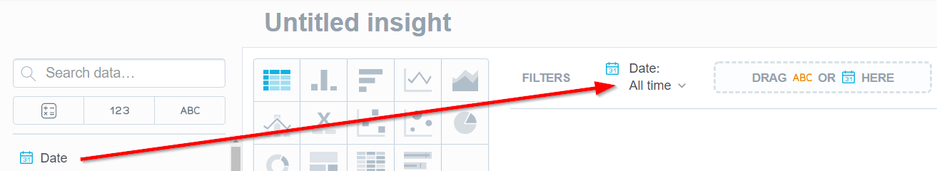
Click the newly created date filter.
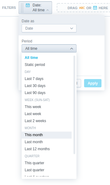
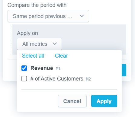
In the Period dropdown list, select the period to analyze.
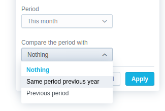
In the Compare the period with dropdown list, select Same period previous year or Previous period.
 If you select All time in the Period dropdown, you cannot enable the comparison.
In the Apply on dropdown list, select the metrics that you want to compare, and click Apply.
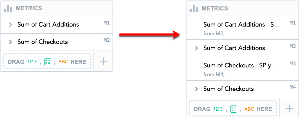
Time-over-time comparison is applied to the visualization. The comparison metrics derived from the original metrics used in the comparison are created.
If you select All metrics, the settings automatically apply to any new items that you add to the Metrics section.
Derived Metrics
When you apply time-over-time comparison, Analytical Designer creates new metrics (derived metrics) in the Metrics section.
If a headline visualization has only one metric, the derived metric is placed in the other Metrics section. If the headline has two metrics, the visualization compares the metric from Metric (primary) and places the derived metric to the Metric (secondary) section.
The derived metrics are placed above the original metrics (the metrics that they are derived from). To reorder the metrics, drag and drop them.
Sequence Labels
All items in the Metrics section have dynamic sequence labels displayed in the top right corner of the item.
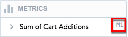
The sequence labels are floating. This means that the first item always has the label M1, the second one has the label M2, and so on. When you reorder the items, their labels dynamically change.
Properties
The derived metrics:
Have information from which metric they are derived.

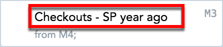
Have SP year ago or previous period added to their name. To rename a derived metric, click its name.
For details, see Rename Metrics.
Have the same formatting and the same filters applied as the original metrics do. You cannot add attribute filters or date filters to the derived metrics.
Derived Metrics vs. Original Metrics
If you remove the original metric, the derived metric (the previous period or the same period previous year) and the metrics derived from it are also removed.
When you are dragging the original metric to the Data Catalog to remove it, Analytical Designer highlights all the metrics to be removed together with the original metric and then displays a message.
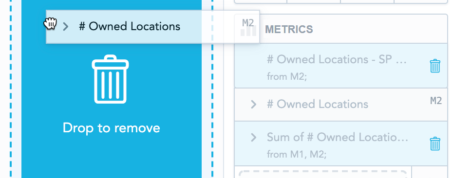
If you delete the derived metric, the original metric stays.
Frequently Asked Questions (FAQ)
Why do I see “Displaying only supported metrics” when applying compare?
You cannot compare metrics that have a date filter specified. Analytical Designer displays this message in the comparison dialog.
For information about date filters, see Filter Metrics by Date.
Why can’t I apply comparison to some visualizations?
Some visualization types do not allow comparison. To use comparison, switch to another visualization type.
Also, you cannot compare calculated arithmetic metrics that are created from the metrics already created in Analytical Designer. For details, see Create Calculated Metrics in Visualizations.
Why do I see “Unsupported metrics and attributes are hidden” when I apply time over time comparison?
Analytical Designer displays this message in scenarios such as:
- You apply comparison to a visualization and then switch to another visualization type that does not support comparison.
- You apply comparison to visualizations with Stack by/Segment by.
- You apply comparison to headlines with two metrics.
How can I use comparison with the previous period in combination with a static date interval?
We do not recommend using a static date interval with previous period comparison when the visualization is viewed by date and grouped by month, quarter, or year.
The data for the previous periods is calculated and displayed based on the actual number of days in the original period. This can lead to a situation when the previous period is spread over more groups (for example, months) than the original period and does not match the displayed granularity of the original period.