Use Ranking Filter
Overview
In your visualizations, you can filter your data by a number of top or bottom metric values. For example, you can display the top 5 restaurants based on their revenue.
Each visualization with at least one item in the Metrics section and one attribute or date in other than the Metrics section (except Headlines) can have one top/bottom value filter. The filter is applied after the date, metric value, and attribute filters.
You can use any local fact or metric (that is, any fact or metric already in your visualization) to filter by its top/bottom values.
The top/bottom filter is also applied when you add the visualization to a dashboard.However, you can edit this filter only in Analytical Designer.
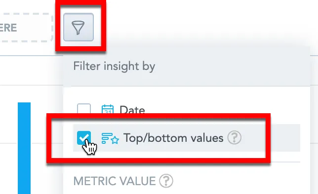
Configure a top/bottom filter
In the visualization you want to filter, click the filter bar dropdown icon.
Select Top/bottom values.
Click Apply.Analytical Designer adds the filter to the filter bar.
Click the filter in the filter bar.
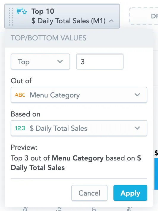
Select if you want to see top or bottom values and specify a number.You can select the number from the dropdown menu or write your own.
In Out of, select the attribute whose values will be filtered.You can select one attribute or All attributes (if your visualization includes multiple attributes).
In Based on, select a fact or metric to use for filtering.
Click Apply.
Analytical Designer now filters your data according to your configuration.
- To use the ranking filter and also filter fact/metrics by values, you must select All in the Out of section. If you want to select one attribute in the Out of section, disable the filtering by value.
- The ranking filter is not compatible with the Rollup (total) aggregate function in tables. If you use this aggregate function and enable the top/bottom filter, the rollup (total) is removed.
- If you display a fact or metric in per cent (the Show in % option is selected), the ranking filter disables this option.
Examples
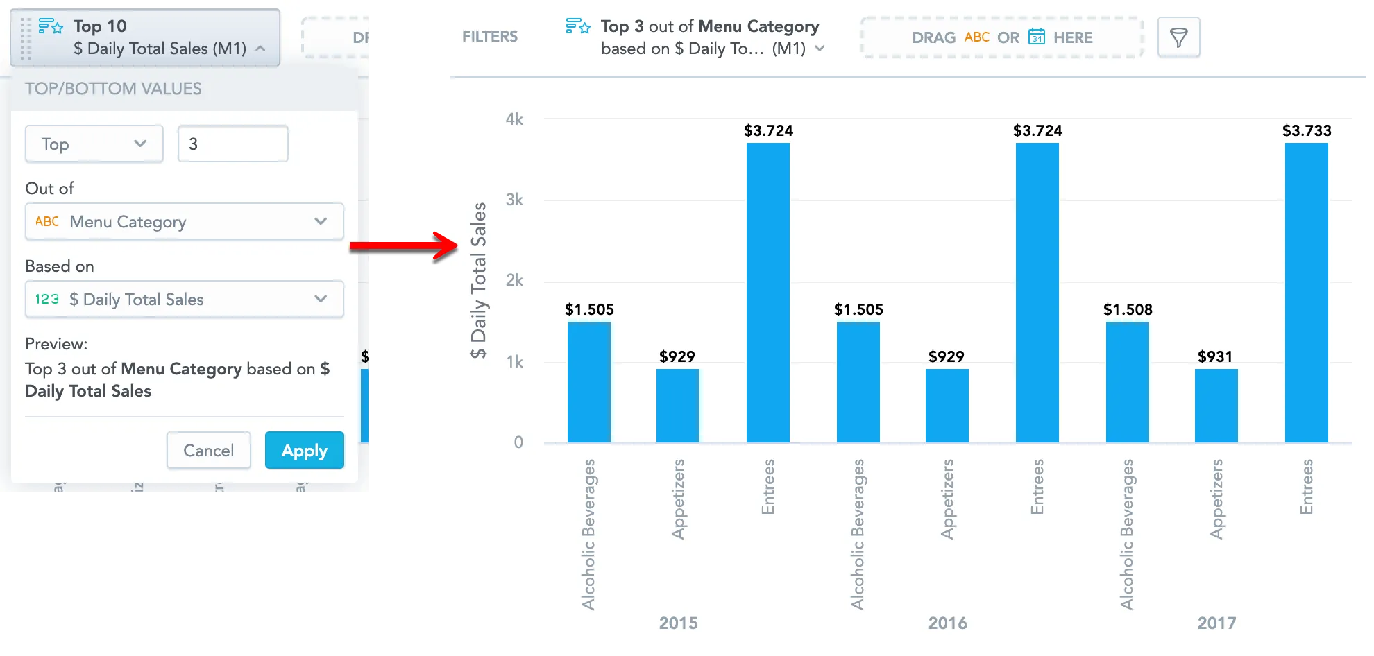
Your visualization contains Daily Total Sales of your restaurant viewed by Year and Menu Category.
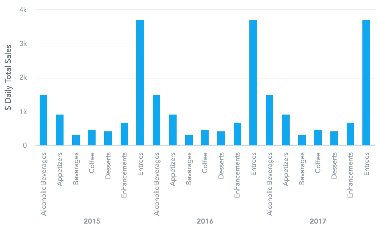
You want to see which are the top three menu categories that sold best each year - select Top 3 out of Menu Category based on Daily Total Sales.
You want to see which are the top five menu categories that have sold best - select Top 5 out of All based on Daily Total Sales.
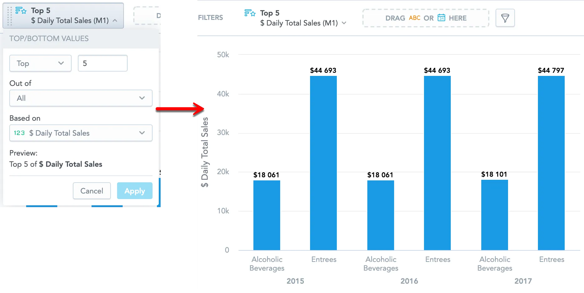
Why does top 5 display 6 items and only 4 values?
If multiple items have the same value, the ranking filter in Analytical Designer shows all items with this value. The visualization may then display more items than the number set.
Example:
You want to see the top 5 menu categories that sold best.
The table displays 6 items with 4 different values (the last example above, now shown in a table).
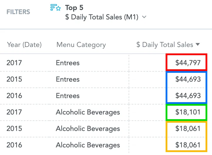
Explanation:
- The highest sales value is $44,797 (red in the image) → 1
- Then two items with $44,693 (blue) → 2 and 3Since the two items have the same value, Analytical Designer displays both.
- Then $18,101 (green) → 4
- Then two items with $18,061 (yellow) → 5 and 6Since the two items have the same value, Analytical Designer displays both.