Filter Visualizations by Attributes or Dates
To refine the data that your visualization shows, add attribute filters or date filters to the visualization. To do so, add attributes or a date to the filter bar.
You can choose from the following options:
Drag and drop attributes or a date from the Data Catalog to the filter bar.Analytical Designer enables the filter automatically.
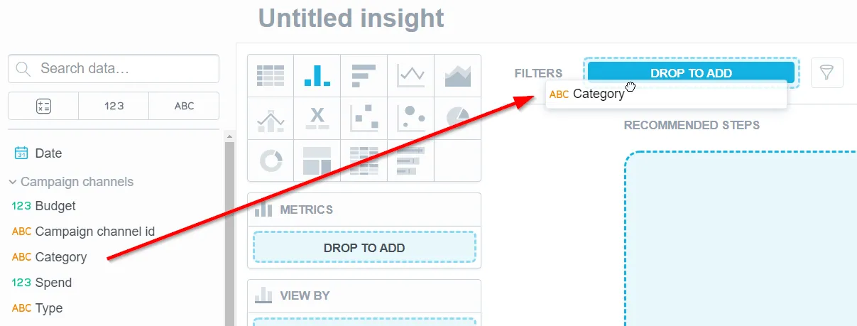
Add attributes or a date to the visualization (other than the Metrics section) and enable it in the filter bar dropdown menu. Then, refine your data.
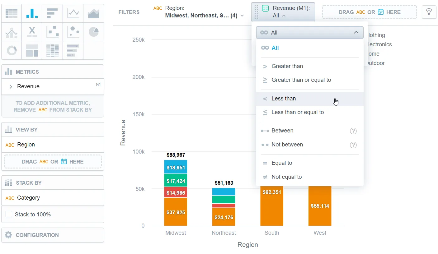
Select any metric from the visualization in the filter bar dropdown menu. Then, refine your data.
Select Top/bottom values in the filter bar dropdown menu. Then refine your data.
Refine the Filters Applied to a Visualization
Steps:
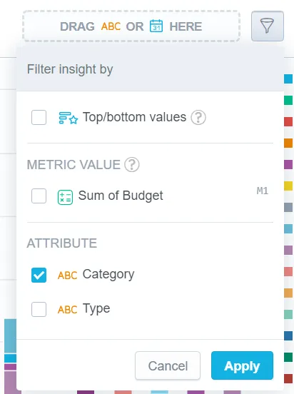
Click the filter name in the filter bar.
Do the following:
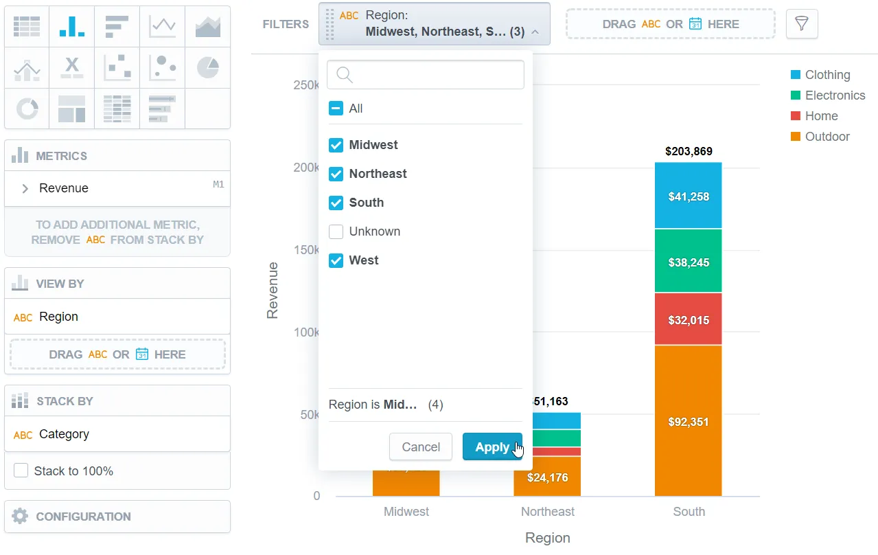
- For attributes, select the options to display or hide.
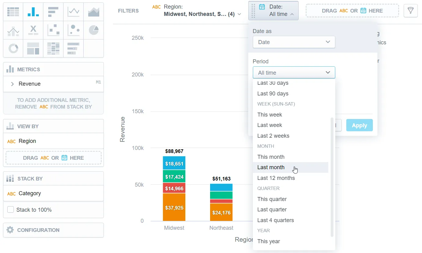
- For dates, select the period to be filtered.
- For metrics, specify the filter. For details, see Filter Visualizations by Metric Values.
- For top/bottom values, specify the filter.
Click Apply.
If you first add an attribute to filter the visualization and then you add unrelated metrics or attributes to the Metrics section, the attribute stays in the visualization but does not filter the data. Analytical Designer displays an informative message.
If your attribute has multiple display labels, you can select the label in the filter definition.
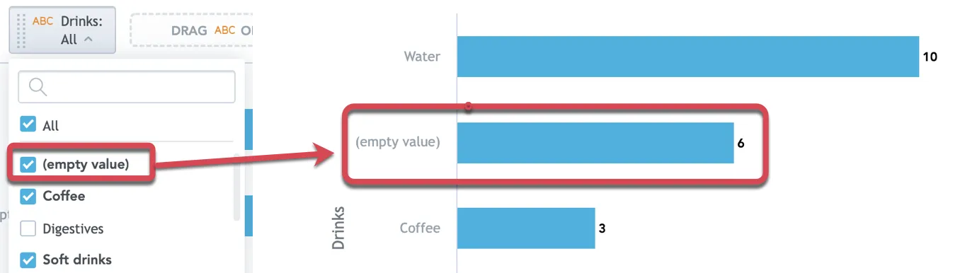
If the attribute has any empty (NULL) values, you can include them in the filter as well by selecting (empty value) in the filter definition.
Filter Text Attributes
In Analytical Designer, you can filter text attributes in two additional ways:
- by using text conditions such as
contains,starts with, andends with - by typing or pasting values directly into the filter
Filter by Text Condition
In addition to selecting explicit values, you can filter a text attribute by condition. You can select whether the filter is case-sensitive or not. Supported operators include:
ContainsStarts withEnds withDoesn't containDoesn't start withDoesn't end with
Use text conditions when you want to match values by part of the text instead of selecting them one by one. This is useful for text fields with many distinct values, such as names, codes, or identifiers.
Text-condition filters also reduce the need to work with long value lists, which can be slow or impractical for high-cardinality attributes.
Enter Values Manually
You can also type or paste values directly into an attribute filter, including bulk value input via copy & paste.
This is useful when:
- you already know the values you want to filter by
- the list of available values is too large
- you want to paste multiple IDs, codes, or names from another system
Manual values are applied using exact-match filtering. If you enter a value that does not exist in the data, the filter returns no matching results, but it does not cause an error.
Visualization Date Filters
If you want to filter your visualization by date, in the filter definition you can:
Select the date dimension (the Date as option). If you change the date dimension, the Additional filters are reset.
Select the Period from which to filter the data.
All time that includes all available data
Predefined periods for minutes, hours, days, weeks, months, quarters, and years relative to today:
last 15 minutes,last 2 quarters,this month,last 2 yearsFor (YTD), (QTD), (MTD), (WTD) options see To-Date Filters
Static period where you specify an exact range including time:
1/1/2022 09:00 - 30/6/2022 17:00Relative period where you specify a range that is relative to today and changes in time:
from last week to tomorrow,from 5 hours ago to 2 hours ahead.
Add Additional filters to filter by additional date granularities and attributes, such as day of week or month of year.
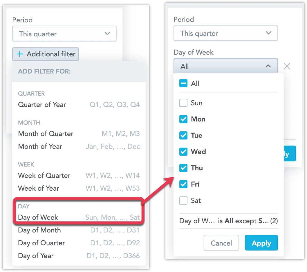
You can add multiple additional filters.
You can also add Empty values here if you want to show the option only when needed. When added, it is set to Include by default.
You can choose one of these options:
- Exclude – exclude records without a date.
- Include – include records without a date together with dated records.
- Only – include only records without a date. This disables the selected date range and any additional filters.
Notes:
- You can include empty values only when Period is set to All time. If you select a different period, Include is disabled.
- When you select Only, the Period selector and any additional filters are disabled.
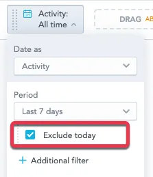
Exclude data from the current period (select Exclude < period >).
If you want to display average daily revenue from the last 7 days, you exclude today because it contains only incomplete/partial data. The visualization then shows the 7 days before today.
Compare data to another period (the Compare the period with option). For details, see Time over Time Comparison.
The time format (12h or 24h) is based on your operating system settings.
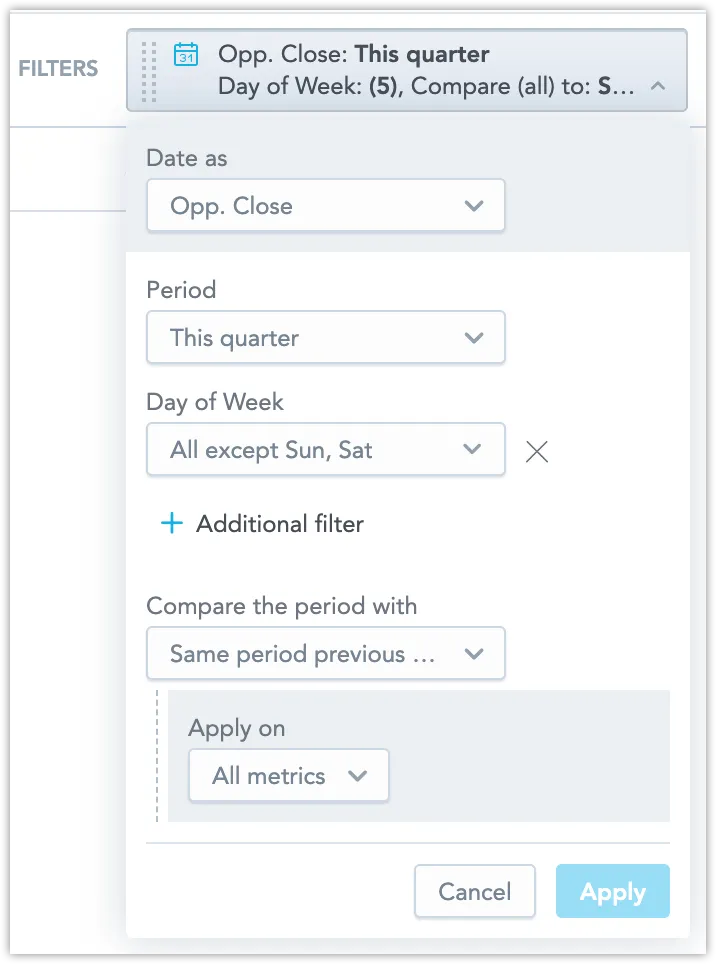
The following image shows a date filter that filters to workdays (Monday to Friday) in the current quarter and compares the data to the same period of the previous year.
To-Date Filters
Some of the time periods are to-date values: Year-to-Date (YTD), Quarter-to-Date (QTD), Month-to-Date (MTD), and Week-to-Date (WTD).
These filters help you quickly analyze performance or trends from the start of a specific period up to the current day. For example, MTD includes data from the first day of the current month up to today. On July 21, 2025, MTD covers the period from July 1, 2025, through July 21, 2025.
When used together with period to period comparison, both periods are shortened to end on the current day as well.
Multiple Date Filters
Adding multiple date filters to a visualization can significantly enhance its interactive time-based analysis capabilities. For instance, it’s possible to configure the visualization to only show data for leads generated within a certain period, like the past year, and then further refine it to display only those closed within a different timeframe, such as the last quarter.
However, similar to how attribute filters cannot apply the same attribute more than once, each date filter introduced must correspond to a distinct date dimension.
Comparisons of data across different time periods can only be conducted using the primary (leftmost) date filter in the visualization.
In the context of charts that offer recommendations for next steps, such as bar charts, these suggestions are generated based solely on the first date filter.
Multiple date filters are also compatible with dashboards. For detailed instructions on their application, refer to the Use Date Filter on Dashboards section.
Disable a Filter for a Visualization
To disable a filter, drag the filter from the filter bar and drop in to the Data Catalog, or unselect it in the filter bar dropdown menu.