Filter Visualizations by Metric Values
You can filter your data by the values of metrics. For example, you can display data that corresponds to a specific metric value, falls within or outside of a certain interval, or is greater than a specified value.
The metric value filter is available in all visualizations with at least one attribute or date (outside the Metrics section), except for headlines. The filter is applied after date and attribute filters.
You can create a metric value filter even if the metric is not used in the visualization buckets.
Add a Metric Value Filter to a Visualization
You can add a metric value filter in two ways:
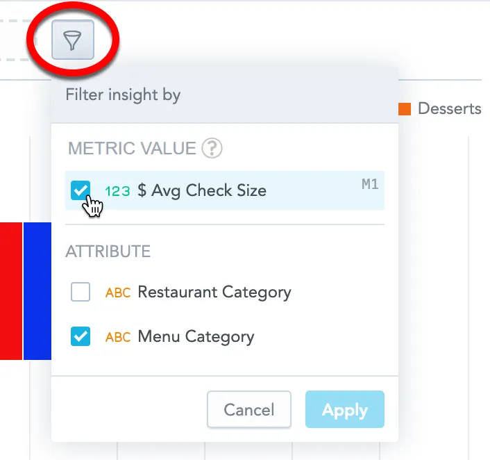
- select a metric in the Metric value section in the filter dropdown, or
- drag a metric into the Filters dropzone in the left panel
Facts cannot be used to create a metric value filter.
Steps:
In the visualization that you want to filter, click the filter bar dropdown icon.
In the Metric value section, select the metric that you want to use for filtering, and click Apply.
Analytical Designer adds the metric to the filter bar.
Alternatively, you can drag a metric into the Filters dropzone in the left panel. The dropzone highlights when it can accept the metric. When you drop the metric, Analytical Designer creates a new metric value filter with the initial condition set to All.
Click the metric in the filter bar and select one of the logical operators.
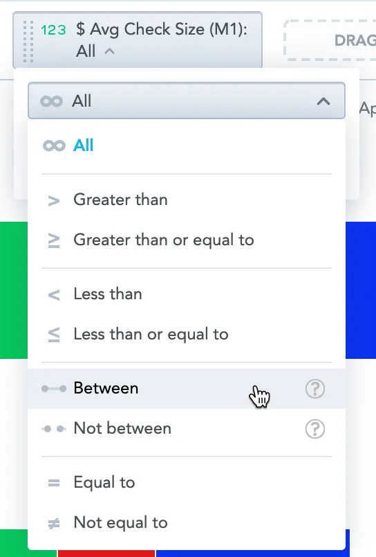
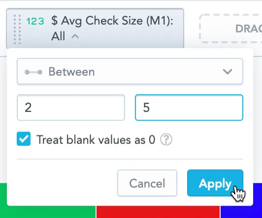
Specify the values for filtering, and click Apply.
If your visualization displays data as percentages (the options Stack to 100% or Show in %), you must use the original values when specifying the filter, not the percentages.
Analytical Designer now filters your data according to your configuration.
Linking behavior between metric and filter
Whether the filter stays in sync with the visualization depends on how you add the metric:
If you add the metric to the Metrics bucket first, and then add the same metric to Filters, the filter and the metric are linked. If you later remove the metric from the Metrics bucket, the filter is removed as well.
If you add the metric to Filters first and then add the metric to the Metrics bucket, the filter and the metric are not linked. If you later remove the metric from the Metrics bucket, the filter remains.
If you remove all attributes and dates from your visualization, the metric value filter is removed.
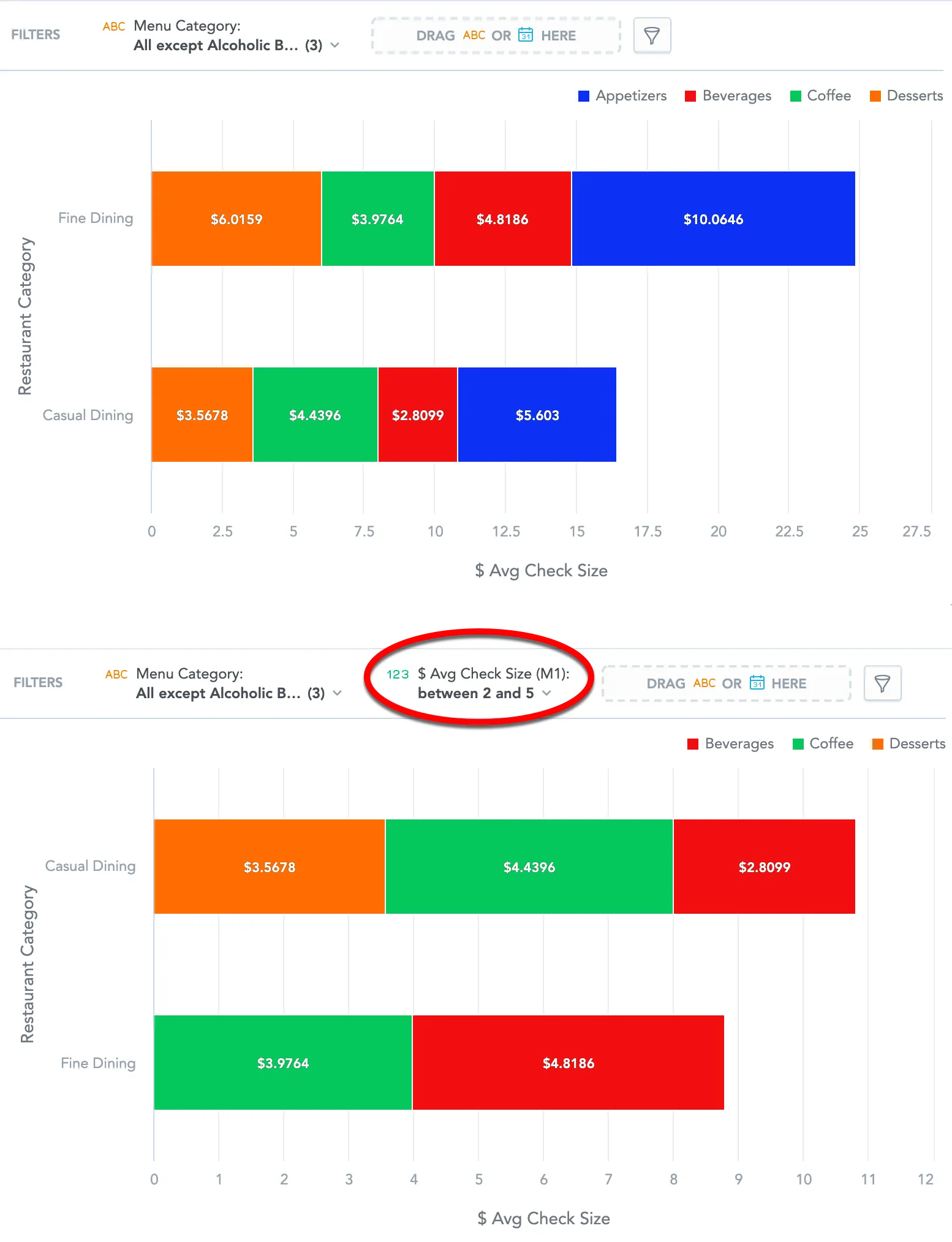
The following image shows a visualization before and after filtering is applied.
Multiple Conditions in One Metric Value Filter
The Analytical Designer supports adding multiple numeric conditions within a single metric value filter.
All conditions inside the filter are combined using OR, which means that at least one condition must be satisfied. For example, you can configure the filter to show values between 200 and 300, OR between 500 and 600.
Choose how the filter is evaluated (For each)
Metric value filters are evaluated on a specific granularity. When you open a metric value filter, you can see the For each section. It lists the attributes and dates that define the visualization grain.
Filter on partial granularity of the visualization
You can remove items from the For each section to evaluate the filter on a coarser grain.
- Each listed attribute or date has a remove action (X).
- If you remove any item, these actions appear:
- Reset (restores the visualization granularity)
- + (lets you add attributes or dates)
When you apply the filter after removing an item from the For each section, the filter uses only the remaining items for its calculation.
Reset behavior
Clicking Reset adds back:
- attributes or dates you removed, and
- new attributes or dates you added to the visualization since the filter was changed
When For each matches the current visualization granularity:
- Reset is hidden
- + is disabled
Behavior when the visualization grain changes
- If you add a new attribute or date to the visualization, existing filters that are not fully aligned with the visualization grain show Reset in the filter dropdown.
- If you remove an attribute or date from the visualization buckets, it is not removed from the For each section for filters that currently include it.
Filter on a different granularity than the visualization
You can also evaluate the filter on a grain that is different from the visualization grain, including attributes or dates that are not used in the visualization buckets.
- Open the filter dropdown.
- In the For each section, click +.
- In Add attributes or dates, select attributes or dates to add.
If the For each section includes attributes or dates that are not in the visualization buckets, removing an attribute or date from the visualization bucket does not remove it from the For each section.
Filter Null Values
A null value (null) means that there is no data available. Null values are displayed as dashes (-). Null values are not the same as zero values (0).
When you filter your data and the target values include null values, you can decide whether such values should be included in the final filtered visualization.
Treat blank values as 0
To include null values, select the Treat blank values as 0 checkbox.
The option Treat blank values as 0 is shown only when it is relevant:
- It is visible when the filter condition is not fully configured (for example, the value field is empty).
- It becomes hidden when the condition cannot include 0.
- It becomes visible when the condition can include 0.
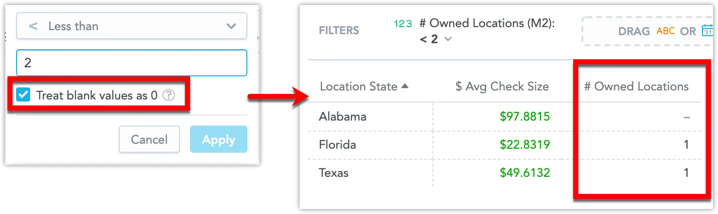
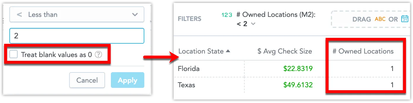
For example, you have a visualization that displays an average check size ($ Avg Check Size) and the number of owned locations (# Owned Locations) in different states. The visualization is filtered to display only the states with fewer than two owned locations.
In this picture, the visualization has a filter with the option Treat blank values as 0 selected and therefore it shows the states with no owned locations (null values are included).
In this picture, the visualization has a filter with the option deselected and therefore shows only the states with at least one location owned.
Filters created in previous versions
When you open a metric value filter that was created before the January 2026 changes, the filter dialog shows an information message:
For each currently follows the visualization’s attributes. Editing the filter will stop this and let you choose which attributes it uses.
After you edit and apply the filter, the message disappears and the filter behavior switches to the new configuration model. From that point on, the For each setup does not change automatically based on visualization bucket changes.