Use Custom Dashboard Plugins
GoodData’s Plugin Development Toolkit, based on our React SDK, empowers developers to create custom dashboard plugins tailored to specific needs or business objectives.
We offer a selection of premade plugins, detailed below, for the enhancement of your dashboards. Some plugins are ready-to-use, others may require additional implementation on our side to fit your use case. If you are interested in implementing these plugins, get in touch with us for a guided process:
Note that the deployment of plugins marked with an asterisk (*) may require additional development effort on our side.
Alternatively, for your unique requirements, you can develop your own dashboard plugins following our step-by-step tutorial.
Visualizations
This section encompasses a range of plugins that enable the transformation of data into various visual formats. These tools provide advanced capabilities for data representation and analysis, including custom chart types and mapping solutions.
Polar Area Chart
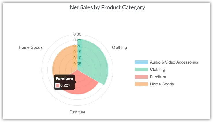
This plugin transforms multivariate data into a circular, spider web-like chart, with multiple axes for different variables and lines connecting data points, enabling easy comparison and scaling of comparative data.
Radial Bar Chart
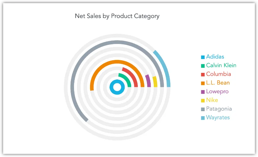
A visually engaging plugin that plots bar charts on a polar coordinate system, with bars radiating from the center to represent values of categories, ideal for comparing cyclical or periodic data sets in a space-efficient manner.
Gauge Chart
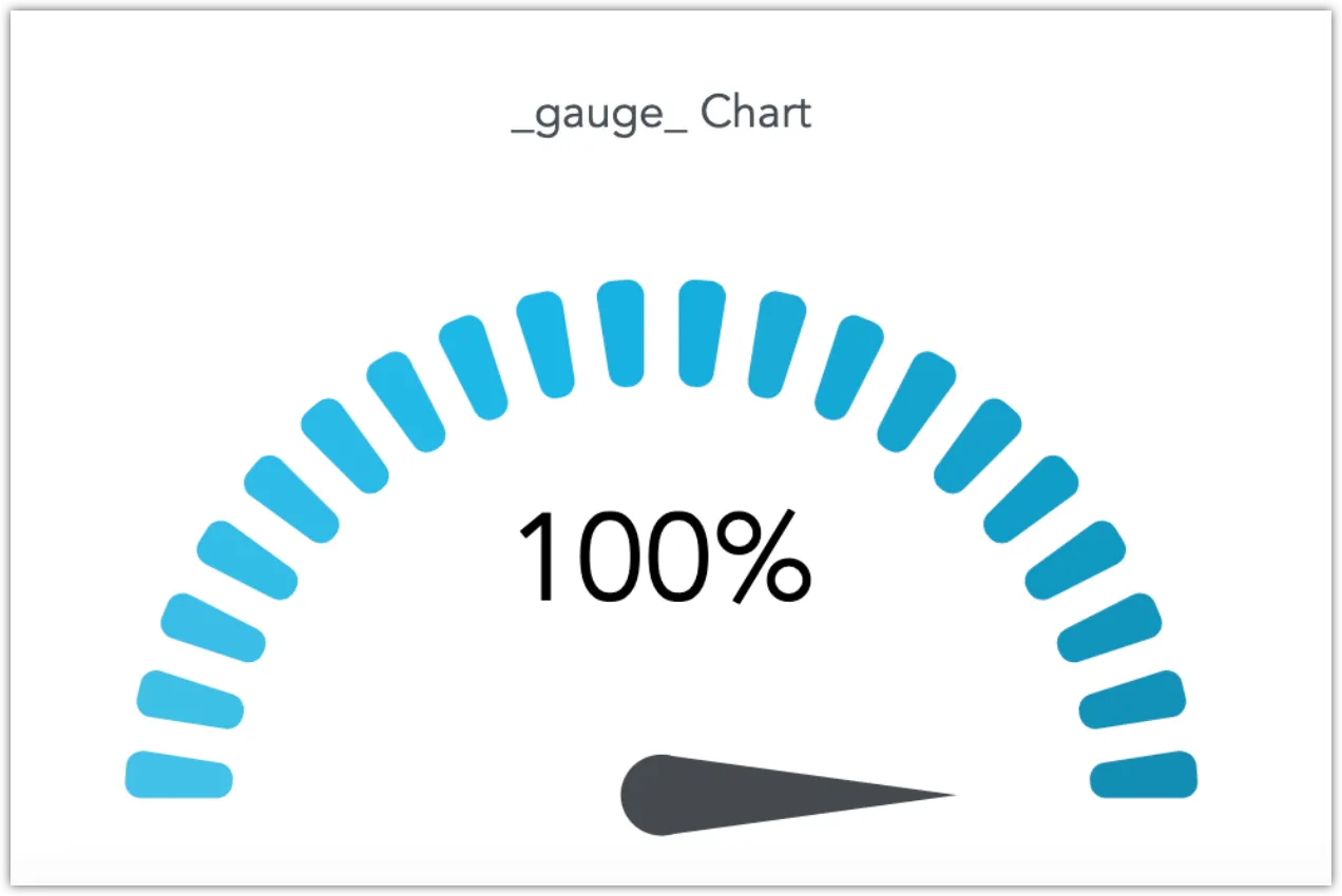
This plugin offers a dial-like visualization with a radial scale, divided into color-coded segments, allowing for an immediate assessment of values against expected ranges. Ideal for detailed, intuitive data representation.
Target Gauge KPI
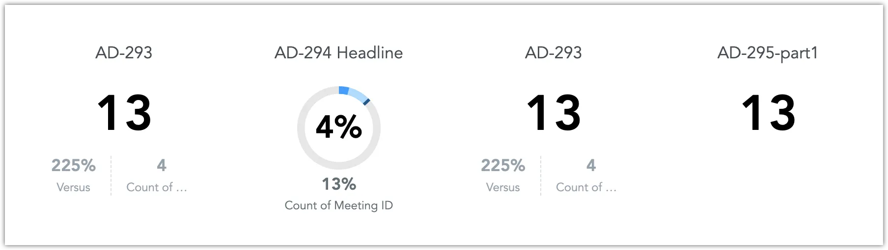
A headline version of the Gauge Chart, this plugin displays progress in a donut format with secondary and main metrics on a dashboard, and an optional third metric. It visually represents goal achievement using radial scales and target metrics.
Headline Bar Chart
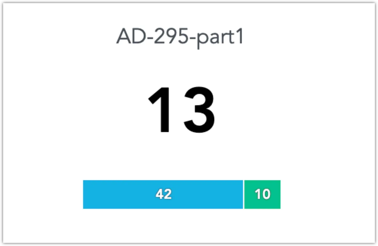
Combines a key driver headline metric with a corresponding bar chart below, offering a dual visualization of numerical and graphical data for a quick, clear overview of important metrics.
SVG Image Chart
Transforms table data into customizable SVG images, supporting filters, tooltips, and multiple insights. Ideal for custom maps and detailed visualizations, it requires at least one metric and attribute, and area IDs for data-specific SVG mapping.
Room Utilization
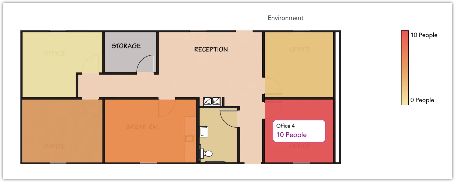
Converts table charts into visual displays of space usage in environments like meeting rooms and offices, offering a layout view beyond mere usage statistics for a more intuitive understanding of space utilization.
Dynamic Metrics with a Chart Switch
Allows users to seamlessly switch between line and bar charts. With dynamic dimensions and metrics, users can easily adjust chart parameters on-the-fly. It also offers flexible time comparison options and pre-defined dimensions/metrics for quick analysis
Gantt chart
Visualizes tasks and resources over time, essential for project management, production scheduling, and employee rostering. It offers a clear overview of project timelines, progress, and assignments.
Bi-directional Bar Chart
Offers advanced data comparison capabilities. Users can effortlessly compare two sets of data either vertically or horizontally, gaining valuable insights into data variations over time or across different items.
Dynamic Heatmap or Flexible Heatmap
A heatmap, a visual tool representing data through color gradients, commonly used in analytics to illustrate user behavior on webpages, can be elevated within GoodData by adopting radial or semi-radial views. These advanced perspectives empower users to discern recurring patterns and trends in time series data and cyclic variables with greater precision and depth.
The default heatmap displays data as a matrix where individual values, or the magnitude or density of data are represented using color gradients — just in flattened view.
Infographics Chart
Presents column or bar charts using intuitive icons to represent KPIs. This visualization simplifies data interpretation by leveraging visually distinct icons that effectively convey the measured concept. For instance, it could illustrate the comparison of health problems across genders with ease.
Range Bar Chart
Converts native multi-line charts into range bar charts, displaying data within specified min-max ranges with values plotted at the midpoint. Ideal for tracking data over time, it presents ranges between two Y-values per data point vertically, enabling easy visualization of multiple series grouped by categories.
User Interface
This section features a collection of plugins designed to enhance the usability and efficiency of dashboard interactions. These tools focus on improving navigation, customization, and data accessibility, ensuring a more streamlined and user-friendly experience.
Collapsible Sidebar
This plugin introduces a button for collapsing the navigation sidebar, optimizing screen space for dashboard visualizations. It automatically adjusts the button’s direction and resizes visualizations when toggled between expanded and collapsed states.
Theme Editor
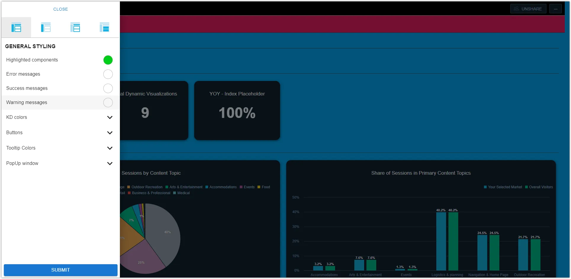
Offers a sidebar-based interface for easy theme configuration, including a range of styling options like message displays, color adjustments, and button modifications. Enables direct, highlighted layout customization of analytics platform sections.
Whitelabelling Bar
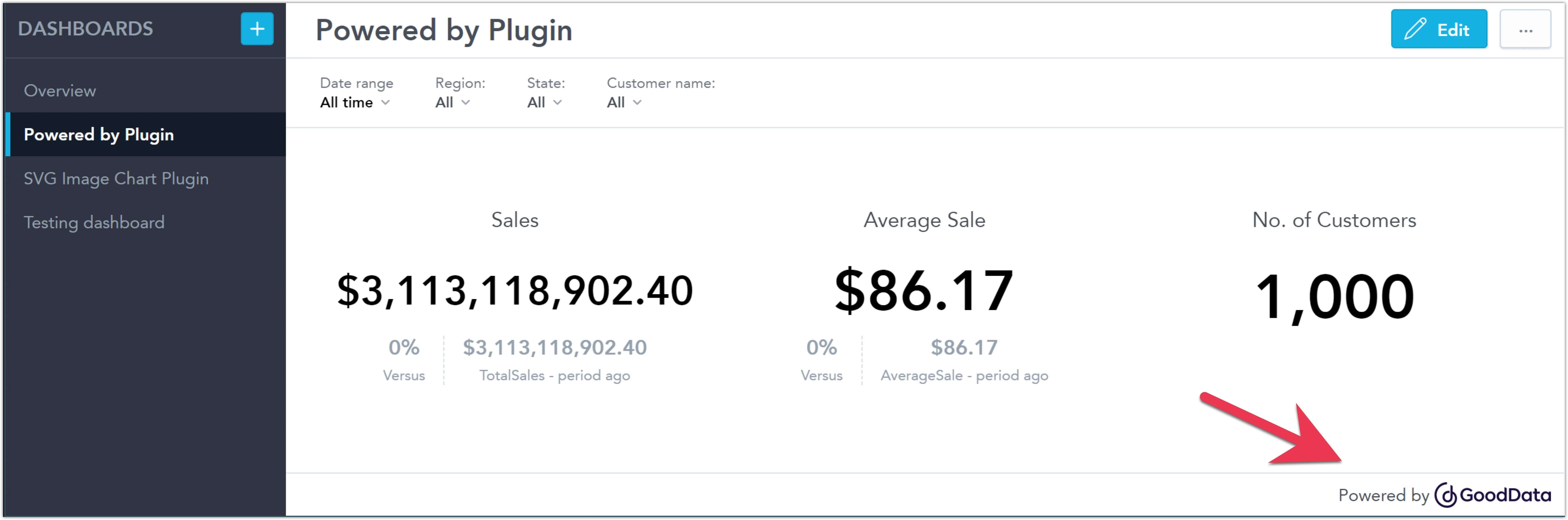
Adds a customizable, fixed bar at the dashboard’s bottom for displaying branding elements like text and images, ensuring continuous visibility, even in iframe embedded scenarios.
Dashboard Description
Enables the addition of markdown-formatted textual descriptions to dashboards, sourced from an external JSON file for versatility. Supports live metric injection with global filter responsiveness, customizable through JSON configuration.
Visualization Groups
Improves dashboard navigation by allowing users to select visualizations from a group through a dropdown in the visualization header, ideal for enhancing user interaction in complex or extensive dashboards.
Search Filter
Streamlines dashboard filtering by allowing direct input of specific values into a search field, offering a faster and more efficient alternative to navigating extensive attribute filter options.
Ranking Filter in Visualization
Introduces a specialized ranking functionality to dashboards, similar to that in the Analytical Designer, but optimized for direct integration with visualizations. It offers users enhanced control and customization for dynamically presenting ranked data within their dashboards, allowing for more targeted data analysis and insight extraction.
Time Granularity Switch
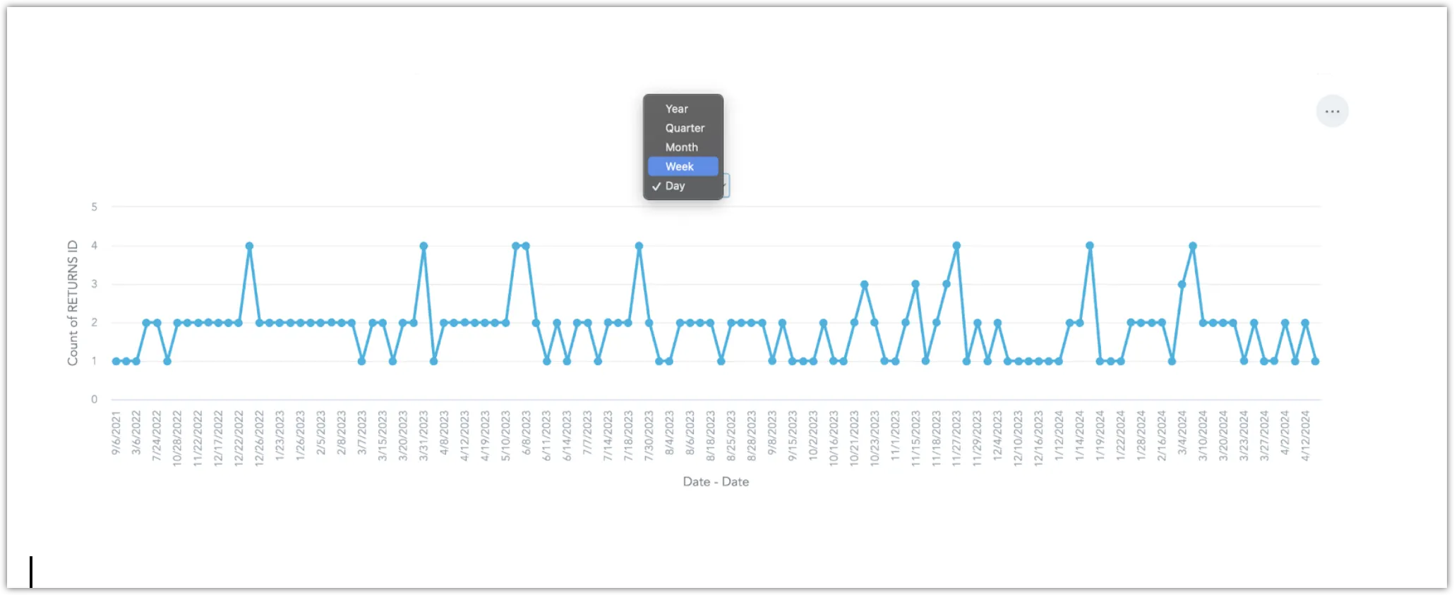
This plugin adds a time granularity switch feature to GoodData dashboards, tightly integrated with visualizations. It includes a dropdown menu for selecting time granularities, automatically recalculating and updating the visualization based on the selected value for real-time data analysis. This functionality is essential for users needing to adjust time perspectives quickly to analyze data trends effectively.
Widgets Tabber
Enables users to toggle between widget views, either individually or in groups, using a tabber that includes additional Key Performance Indicators (KPIs) for each respective segment.
Comments
Lets users add comments to dashboards or visualizations, promoting collaboration and enhancing data understanding.
Intelligent Analytics
The tools in this section are focused on delivering deeper insights through predictive modeling and interactive alerts, enhancing decision-making and user engagement within dashboards.
DeepAR Forecasting
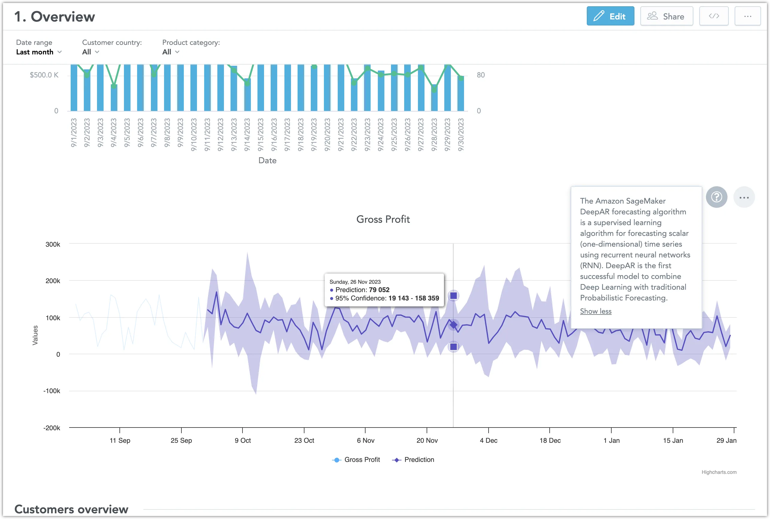
Integrates AWS SageMaker’s machine learning with GoodData’s React SDK to enhance line charts with predictive data, combining historical insights with advanced DeepAR forecasting for enriched analysis.
Headline Alerts
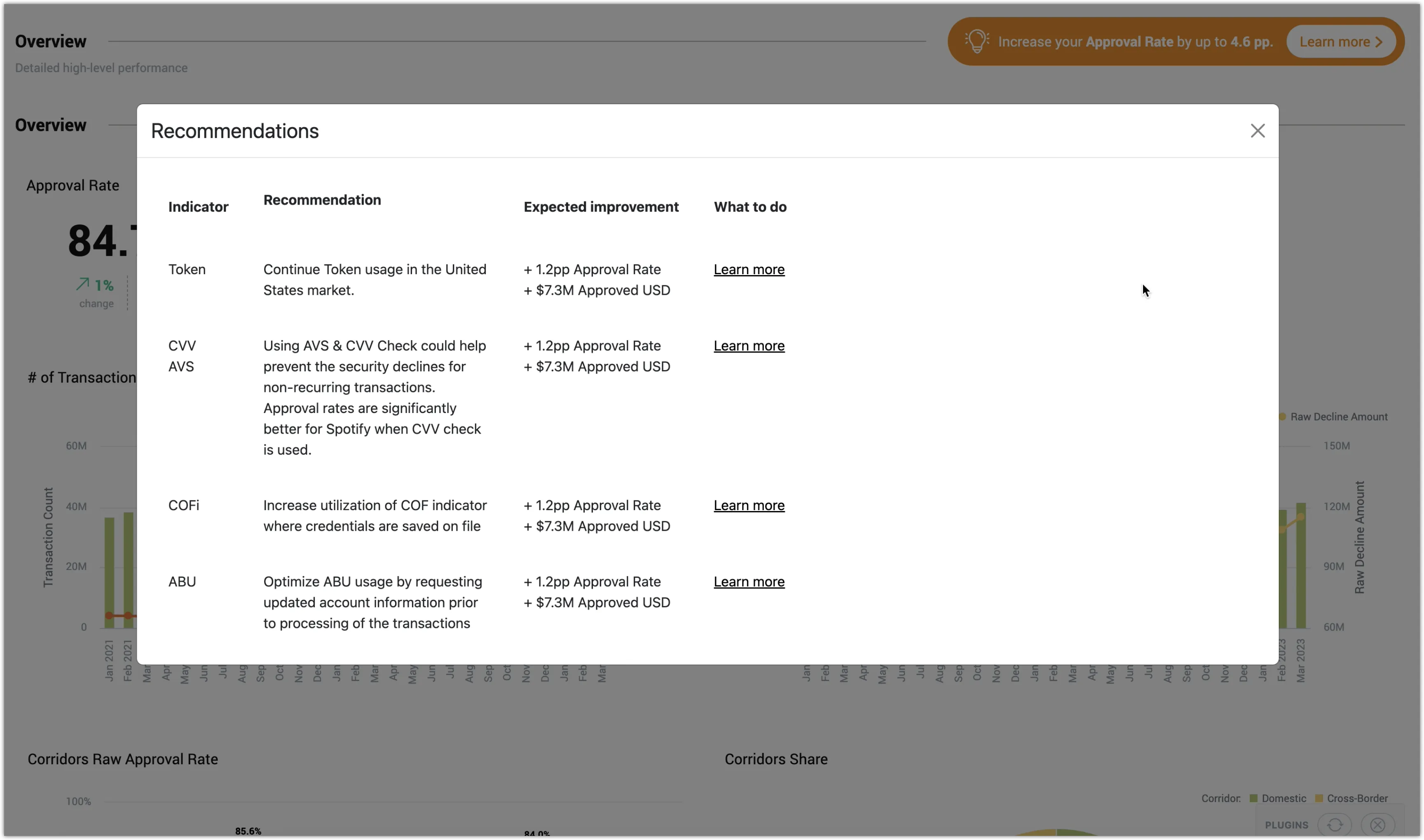
Provides interactive alert boxes within dashboards, which open modal windows with recommendations and guidance upon clicking, offering a streamlined way to deliver essential messages and insights in context.
Period Comparison
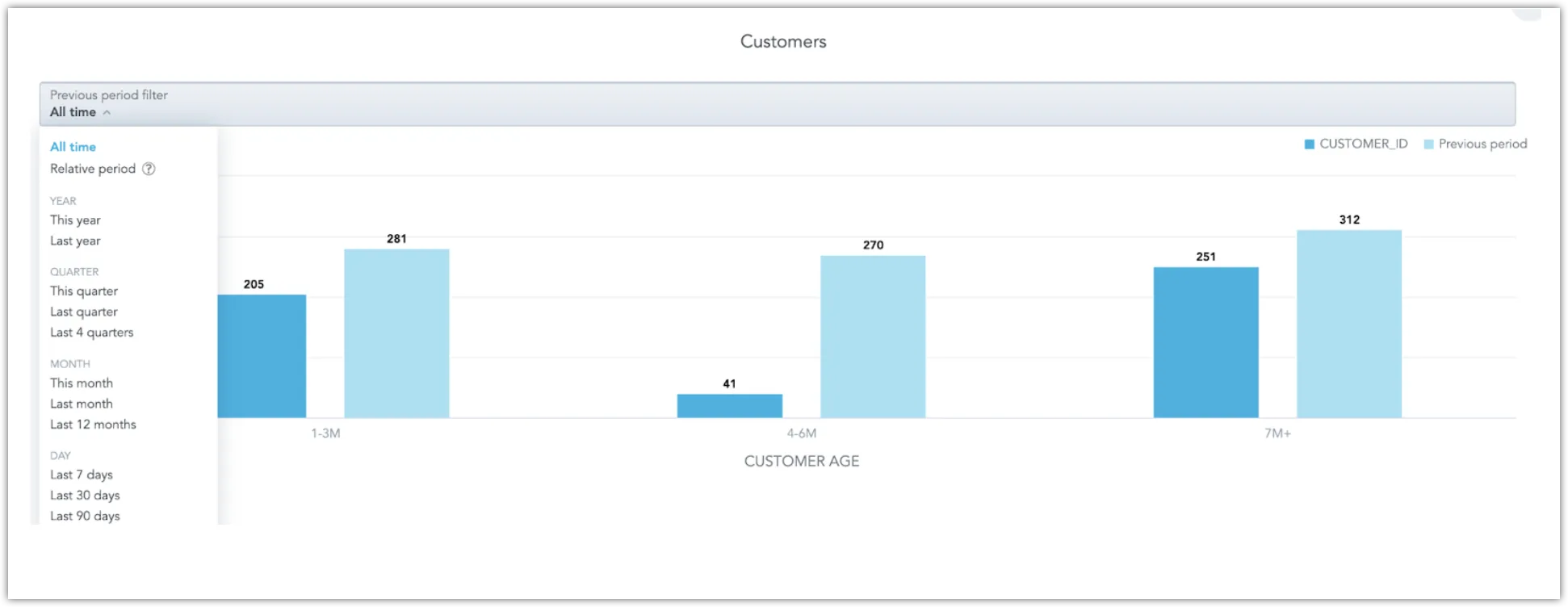
This plugin introduces previous period comparison functionality to GoodData dashboards, seamlessly integrated with visualization components. It enables users to compare current data with data from a previous period directly within their dashboard, enhancing analytical depth and visual data interpretation. This feature is ideal for tracking performance, identifying trends, and making data-driven decisions based on historical comparisons.
Exporting
This section offers plugins for streamlined data exporting, providing customizable and efficient solutions for converting dashboard content into shareable formats.
PDF Export
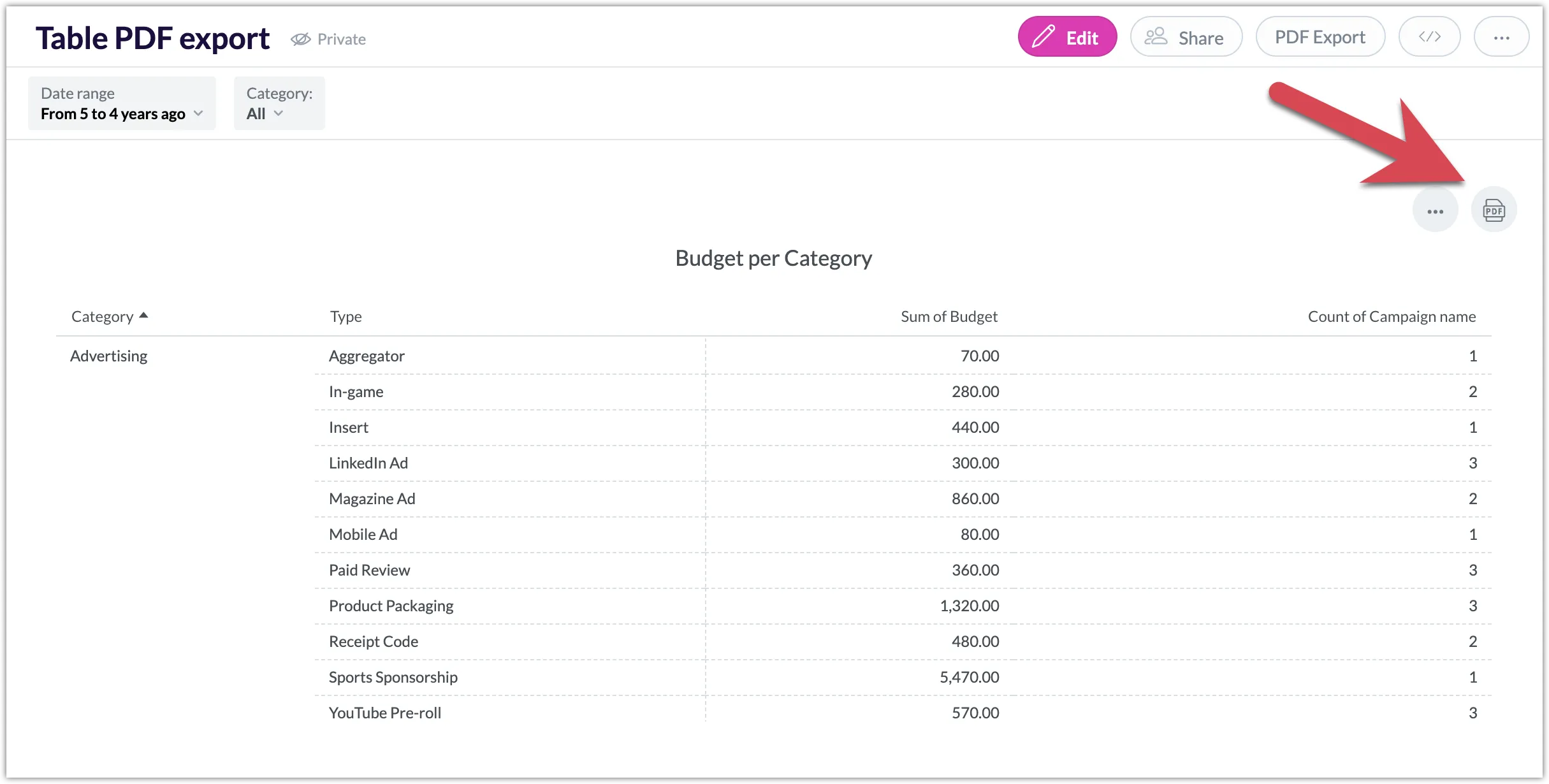
Adds a PDF export icon to table widgets, allowing users to conveniently save and share table data in PDF format. Supports basic export scenarios with customizable PDF styling options like color, font size, background, and alignment.
Enhanced PDF Table Export
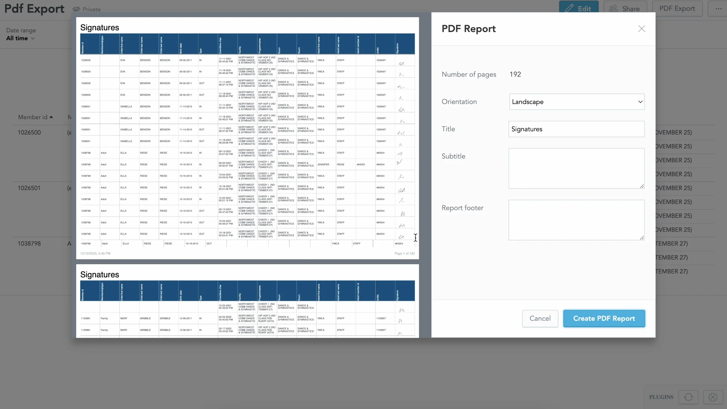
Enhances the PDF Export plugin by allowing customization of cell size, including for multi-line content and images, ideal for exporting detailed reports like user lists with additional information, ensuring efficient handling of extensive tables.
Print Button
Enhances user functionality by integrating a print option directly into a widget’s menu, allowing for seamless printing of visualizations.
Export to Presentations
Enables users to export dashboards into presentation formats, converting dynamic visualizations into static images for easy integration into presentations.