Drill into Visualization
On dashboards, you can add drill interactions to your visualizations which link the original visualization to any other existing visualization. By clicking the data in the visualization, the target visualization then opens.
A visualization displaying multiple metrics, attributes, or both can have an independent drill interaction for each.
Create a Drill into Visualization
In this example, you will add a drill interaction to a metric. The same procedure can be used to add a drill interaction to an attribute.
Steps:
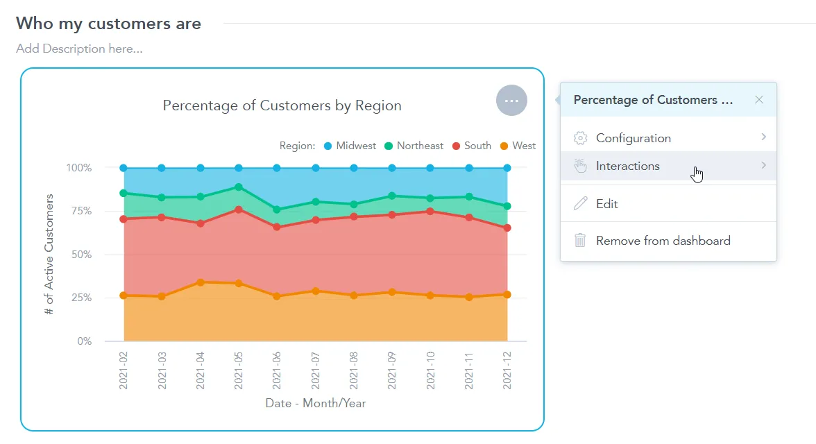
Edit your dashboard and click on the visualization that you want to set up a drill path for.
The options menu opens.
Select Interactions.
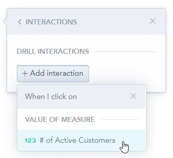
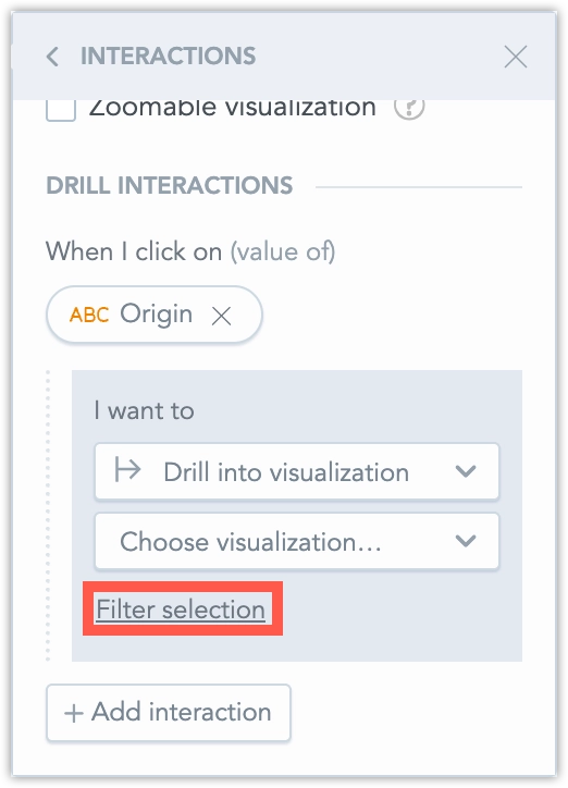
Click + Add interaction and select the metric you would like to drill in on.
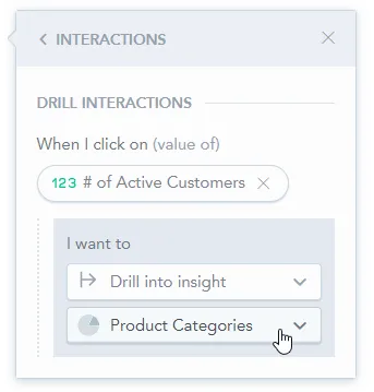
In the first dropdown menu, select Drill into visualization.
After you select the target visualization, you can configure which filters are passed to the drill destination using Using {n} filters.
Save & Publish your changes.
Notice that if you hover over the visualization now, you are able to click on a metric to drill in on it.
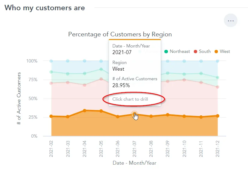
For example if you click on the
2021-07data point for theWestregion as shown on the previous image, you open theProduct Categoriesvisualization and in it you see the breakdown by category of sold items in the West region within the July period.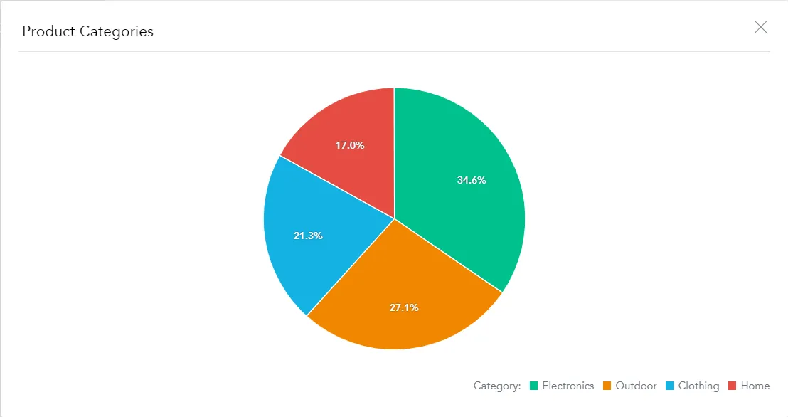
Filters in Visualization Drilling
When you drill into a visualization, the drill destination can receive filters from multiple sources. Editors can explicitly choose which filters are passed to the drill destination.
Configure Passed Filters
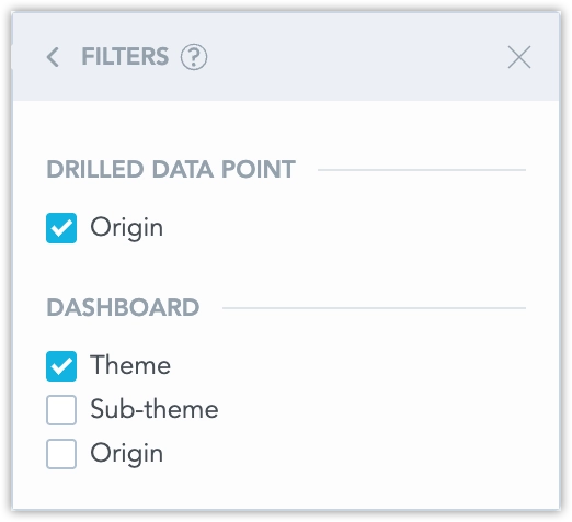
When you set up Drill into visualization and select a target visualization, the configuration shows Filter selection. This replaces the previous Pass as filter behavior. Click Filter selection to review and adjust which filters are passed to the drill destination.
Filter Sources
The filter list is grouped by source. A group is shown only if it contains at least one filter.
Drilled data point
Filters created from the value you click (for example, an attribute value from a table row or a data point in a chart).
Dashboard
Dashboard date and attribute filters that are applied to the source visualization (as configured in the widget settings).
Visualization
Filters defined on the source visualization in Analytical Designer. This can include date, attribute, metric, and ranking filters.
Metric
Filters applied on the specific metric you drill from. This group is available only when the drill is configured on a metric (When I click on metric). Only filters for the drilled metric are listed.
Note
Ranking (top/bottom) filters are shown as disabled, because they can’t be passed to the drill destination.
Staying in Sync with Analytical Designer
The list of available filters stays in sync with changes in Analytical Designer:
- If you add a new visualization or metric filter and save the visualization, the new filter appears in the drill filter list and is unchecked by default.
- If you remove a visualization or metric filter and save the visualization, the filter is removed from the drill filter list. After you save the dashboard, the removed filter is also removed from the dashboard configuration.
If you edit the visualization in a separate window (not in an overlay), the dashboard editor may show a warning that the drill configuration changed. Saving the dashboard updates the stored drill filter selection accordingly.
Drill to URL in Drill Into Visualization
You can make attribute values clickable links by using Drill to URL. You can define the default Drill to URL on the attribute level in your data model. When Drill to URL is enabled, links are applied automatically wherever the attribute is used in table visualizations, including tables opened in drill modals.
Drill to URL can be controlled at these levels:
- Organization, workspace, or user (default behavior)
- Visualization (configured in Analytical Designer)
- Dashboard widget (configured in dashboard interaction settings)
- YAML (Analytics as Code)
How It Works
- If Drill to URL is enabled at the organization, workspace, or user level, GoodData automatically adds a Drill to URL action for attributes that have a hyperlink label in the data model.
- If other interactions exist for the same attribute (for example, cross-filtering or Drill into visualization), Drill to URL appears as an additional item in the interaction menu (for example, More details).
- If Drill to URL is the only available action, clicking the attribute value opens the URL directly.
Manual Drill to URL rules you add on a visualization or widget are not overwritten by the automatic setting. Automatic links are added only when no manual rule exists.
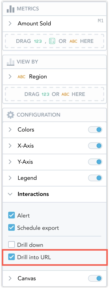
Configure Drill To URL
You can configure Drill to URL for a visualization in Analytical Designer:
- Open the visualization in Analytical Designer.
- Open Interactions.
- Toggle Drill to URL.
You can also override Drill to URL for a widget in dashboard Interactions. For example, you can remove URL drilling from a specific widget even if it is enabled globally.
If you use YAML (Analytics as Code), Drill to URL can be exported and imported. The YAML includes the Drill to URL setting only when you override the current default behavior for that visualization.
Deterministic Label Selection And Warnings
Only one hyperlink label is used for each attribute. If an attribute has multiple hyperlink labels, GoodData uses the first label in metadata order. In this case, the platform shows a model warning that multiple hyperlink labels are not supported for Drill to URL, and recommends keeping only one hyperlink label per attribute.
Limitations
- Drill to URL is not executed in exports (PDF/XLS), alerts, or scheduled emails.
- Only one hyperlink label per attribute is supported.