Design Accessible Dashboards
Designing dashboards with accessibility in mind ensures that everyone can understand, navigate, and act on data, regardless of ability, environment, or device. Accessibility is not just about meeting compliance standards. It is about creating dashboards that are clearer, easier to use, and more enjoyable for everyone.
GoodData provides strong out-of-the-box accessibility support. Full accessibility, however, depends on how dashboards are designed. Accessibility is therefore a shared responsibility between the platform and dashboard creators.
Accessibility Mode
GoodData provides an optional workspace setting, ENABLE_ACCESSIBILITY_MODE, designed to improve accessibility support for dashboards. When this mode is enabled, specific behaviors and limitations are applied to make dashboards more accessible to screen readers and assistive technologies.
Behavior Changes
When ENABLE_ACCESSIBILITY_MODE is enabled, the following changes occur automatically:
Geochart visualization is not available
The Geochart (Pushpin) visualization type is disabled because it cannot provide meaningful information for users relying on screen readers.Tabular PDF export is not available
Tabular exports in PDF format are disabled in this mode.Visual Slide Deck PDF export enhancements
Visual Slide Deck PDF exports include hidden raw data tables for each visualization. These embedded tables ensure the exported content can be interpreted by screen readers.Note
This may significantly increase the resulting file size. Therefore, this feature is available only when Accessibility Mode is enabled.Snapshot export (PDF) is not available
Accessibility Mode Helps, but Design Still Matters
Accessibility Mode makes dashboards more accessible, but it does not fix everything automatically. You still need to design dashboards in a clear and accessible way. GoodData gives you tools, but the final result depends on how you use them.
The following guidelines help you create dashboards that are easier to read and understand:
Principles of Accessible Dashboard Design
Clarity Over Complexity
The most accessible dashboards are the simplest ones. Avoid unnecessary clutter, color overload, and excessive text. Present a clear hierarchy of information: key insights first, supporting context next.
Universal Usability
Accessibility benefits all users. Features that help people with disabilities, such as high contrast, structured layout, and keyboard navigation, also make dashboards faster and more intuitive for everyone.
Predictability and Consistency
Consistent layouts, color schemes, and navigation patterns make dashboards easier to scan and operate, especially for users relying on assistive technologies.
Inclusivity by Design
Designing for accessibility is not an add-on. It’s an approach that anticipates different ways people consume data: With screen readers, with limited color vision, or on small screens, and ensures that insights remain equally accessible in every context.
Plan for Your Audience
The foundation of accessible design begins with understanding your users: Their goals, context, and challenges.
Ask yourself:
- Who will use this dashboard and what decisions will they make with it?
- How familiar are they with the data or subject matter?
- Will they access it on mobile, via screen reader, or with magnification tools?
Use clear, direct language and avoid jargon or unexplained acronyms. Readable text and plain communication benefit every user, from first-time viewers to expert analysts.
Structure and Layout
A clear, organized layout improves comprehension and navigation for all users.
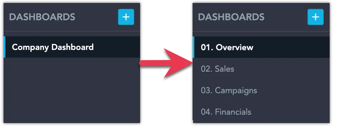
Simplify Layouts
- Use a flat structure rather than nested containers to maintain logical reading and keyboard navigation order.
- Split large dashboards into smaller, topic-focused ones (e.g., Overview, Sales, Campaigns, Financials).
- Place the most important visualizations where they are seen first.
Predictable, well-spaced layouts make dashboards easier to navigate and understand. Learn more in our Why Dashboard Layout Constraints Are a Feature, Not a Bug and Six Principles of Dashboard Information Architecture blog articles.
Use Descriptive Elements
Make sure every component communicates its purpose:
- Dashboard titles and section headers
- Visualization names and descriptions (can differ from default titles)
- Axis labels, data labels, legends, and data points
- Rich Text widgets for context and instructions
Consider which elements must be immediately visible and which can be presented in secondary ways (e.g., visualization description tooltips):
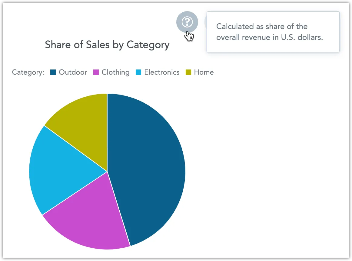
Descriptive content improves accessibility and makes dashboards self-explanatory.
Visual Accessibility
GoodData visualizations include features that help you design dashboards accessible to users with diverse vision needs, while also making them more readable for everyone.
Color, Contrast, and Patterns
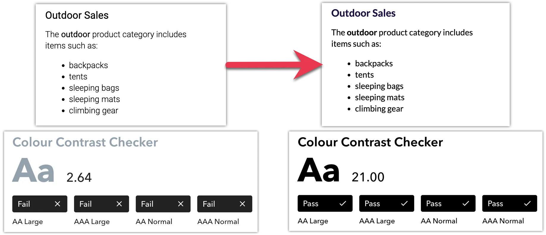
- Choose high-contrast color combinations for text and visuals to meet WCAG 2.1 AA standards. Color choices play a crucial role in dashboard accessibility. Certain color combinations, such as red + green or blue + purple, can be problematic for users with color-vision deficiencies. See the Create Custom Themes article for more information about creating custom color themes.
- Avoid relying on color alone to differentiate categories. Use pattern fills, outline styles, or labels to help users distinguish data series without depending on color.
- Apply backplates (backgrounds behind data labels) to ensure text readability against varied chart backgrounds.
- Use distinct data point shapes (circle, square, triangle, etc.) in line, combo, and stacked area charts for extra distinction.
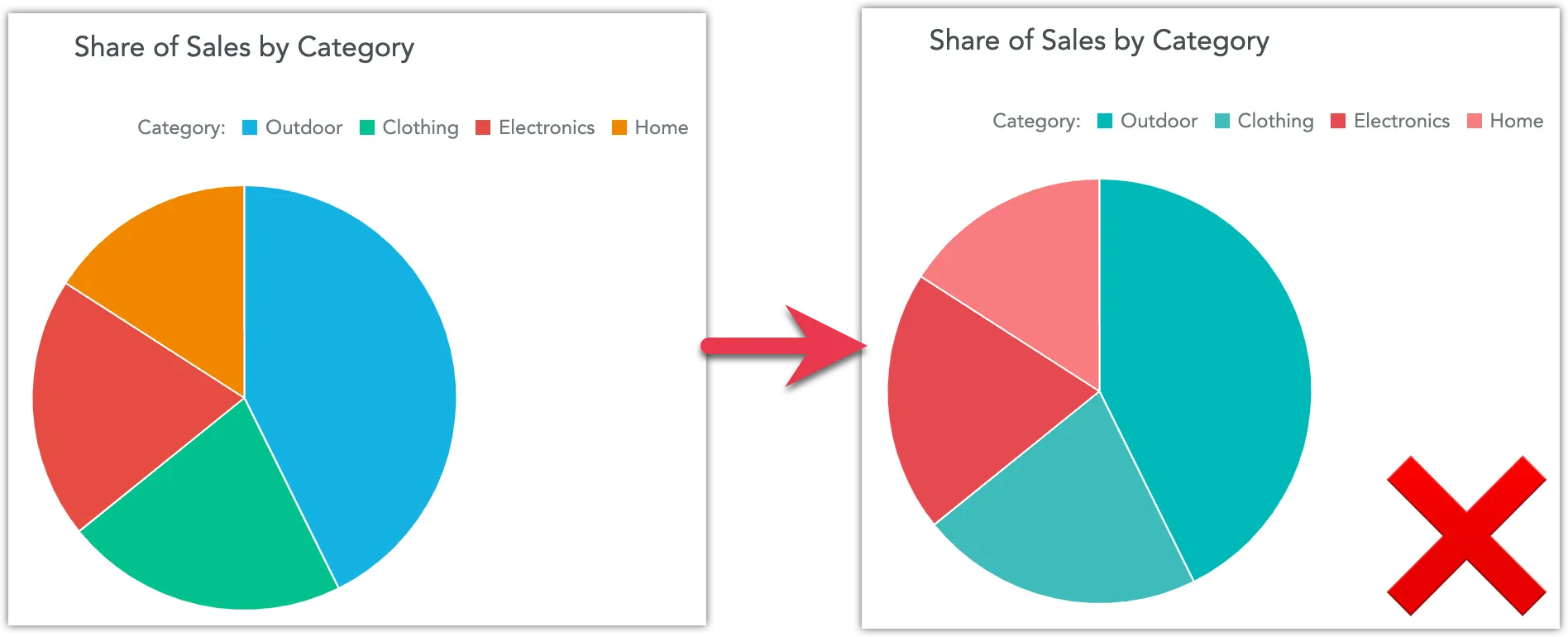
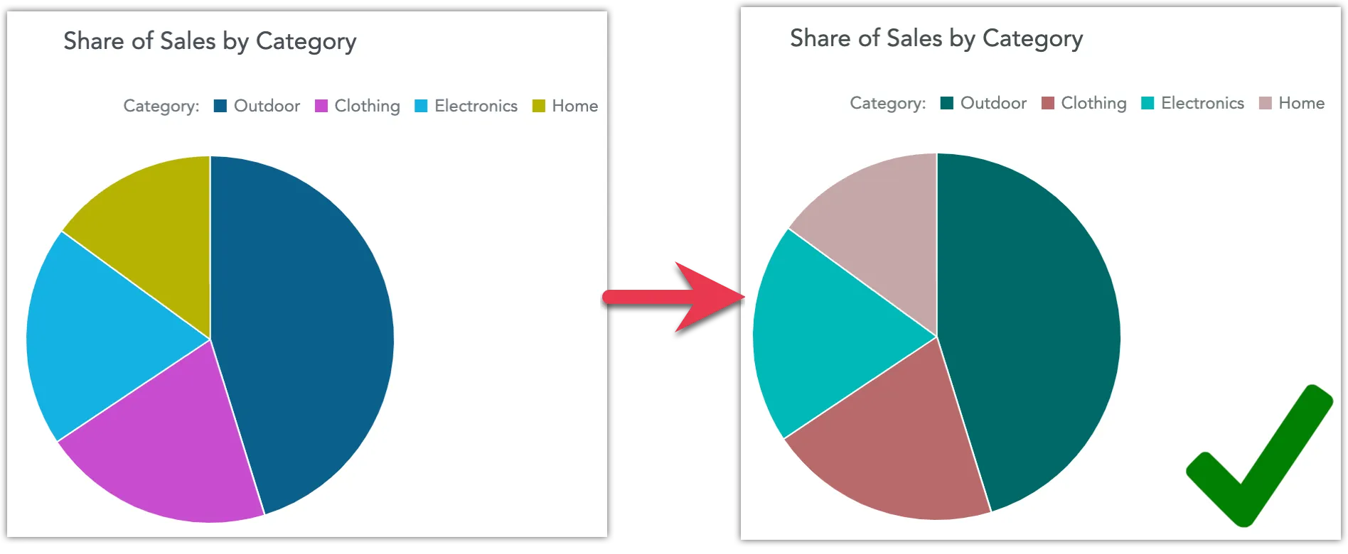
For example, this is how a pie chart can become unintelligible for someone with tritanopia (inability to perceive blue):
If you find your color combinations unsatisfactory, try tools like ColorBrewer2, Leonardo, or the Venngage accessible color palette generator to produce palettes that remain intelligible for a wide range of color-vision deficiencies.
This is how the same chart can become intelligible by using a contrasting, WCAG-aware palette:
Simulating Colorblindness
Certain browsers let you simulate color blindness in Developer Tools, or you can use third-party tools such as the Colorblindly Chrome extension.
Learn how to configure these properties in Visualization Properties. For systematic changes, customize workspace themes and color palettes.
Accessibility Features by Visualization Type
Different visualization types support different accessibility-enhancing options. Use the table below to check which visualizations support pattern or outline fills, backplates, or distinct data point shapes:
| Visualization Type | Pattern / Outline Fills | Backplates for Labels | Distinct Data Point Shapes |
|---|---|---|---|
| Bar chart | ✅ | ✅ | — |
| Column chart | ✅ | ✅ | — |
| Waterfall chart | ✅ | ✅ | — |
| Combo chart | ✅ | ✅ | ✅ |
| Line chart | — | ✅ | ✅ |
| Stacked area chart | ✅ | ✅ | ✅ |
| Pie chart | ✅ | ✅ | — |
| Sankey chart | — | ✅ | — |
Interaction and Navigation
GoodData dashboards are designed to support inclusive interaction. All core accessibility features, such as keyboard navigation, screen reader compatibility, and accessible exports, are described in the Accessibility article.
When designing dashboards, you can improve interaction and usability by following these best practices:
- If you are using Dashboard Tabs, maintain a logical tab order so users can move predictably through content using the keyboard.
- Provide tooltips, descriptions, and alternative text.
Focus on What’s Important
The goal is to present data in a way that is easy to understand and does not overwhelm the user. Select appropriate visualizations, use aggregation to simplify data, and apply filters judiciously to keep the initial view focused.
Features like Drill into visualization, Explore from here, and Zoom visualization let users delve deeper without cluttering the primary dashboard.
Exports and Raw Data Access
Offer data exports that maintain accessibility:
- CSV or Excel exports let users work with data in assistive-technology-friendly formats.
- Accessible Slide Deck PDF exports include structured tables for screen readers (and, when applicable, accessible labeling of visual content).
Raw data presented on your dashboard can be exported into formats like CSV or Excel, providing alternatives for users who prefer or require analysis outside the dashboard.
Accessible exports ensure that insights remain usable outside the dashboard environment and support compliance with WCAG and Section 508 standards.
Display Chart as Table
You can display charts on your dashboards as tables using the Show as table button. This lets you view the widget’s data in a more universally accessible format. The table retains the chart’s drill-down functionality: you can click values to drill into the data, and any drilled-down visualizations automatically open in table view.
See the Display Chart as Table section for more information.
Limitations
To make sure dashboards stay accessible, creators must follow these guidelines. These rules are not enforced by the platform, so it is the dashboard creator’s responsibility to apply them correctly.
Custom plugins
Custom plugins are not supported.Rich text
You can use images, but you must provide alt text.
You can use headings, but only from level H3 and lower. Higher levels (H1 and H2) are reserved for the dashboard title and dashboard section titles.
Separators are not accessible and should not be used in dashboards or exports.Repeater widget
Images are not supported in the repeater widget. Charts rendered inside repeater rows are also not accessible and should not be used.Chart zoom
Presentation export
Avoid Common Pitfalls
Poor visualization practices can harm accessibility and comprehension. Avoid:
- Overuse of color or decorative gradients with no data meaning.
- Inconsistent scales or truncated axes that misrepresent data.
- Dense dashboards without clear focus.
- Small or rotated text labels that hinder readability.
See examples in Bad Data Visualization Examples That You Can Learn From and aim to balance aesthetics with function (see Best Dashboards).