Scatter Plot
Scatter plots show data as points using Cartesian coordinates.
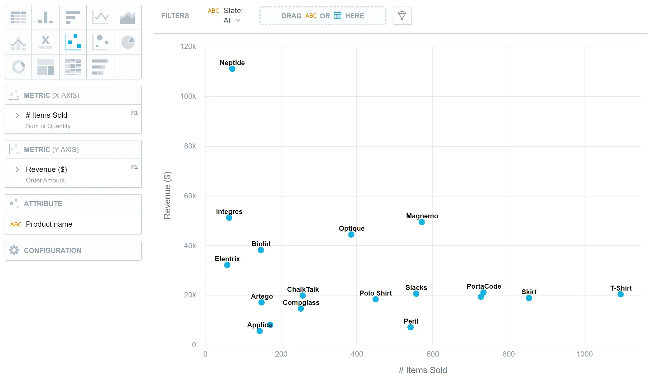
Scatter plots can have two metrics, one for the x-axis and the other for the y-axis, and one attribute, which determines the meaning of each data point. They help identify correlations, patterns, or clusters in data, analyze trends between two metrics, or to track the magnitude of two metrics from the same chart, which makes them especially useful in fields such as statistics, data analysis, and scientific research. For example, a scatter plot can be used to analyze the relationship between a person’s age and their income level.
You can also use segmentation to slice your data using an additional attribute or date, and color-code points that belong to the same segment. You can also make use of the automatic clustering smart function to identify groups of points with statistical similarities.
Scatter plots have the following sections:
- Metric (X-axis)
- Metric (Y-axis)
- Attribute
- Segment by
- Configuration
In scatter plots, you can also:
- In Configuration > Canvas > Labels style, you can choose Backplate to add a background behind chart labels. This makes labels easier to read because the backplate (white by default) creates higher contrast with the chart colors.
For information about common characteristics and settings of all visualizations, see the Visualization Types section.
Limits
| Bucket | Limit |
|---|---|
| Metric (x-axis) | 1 metric |
| Metric (y-axis) | 1 metric |
| Attribute | 1 attribute |
| Segment by | 1 attribute or date |