Geo Charts (Pushpins)
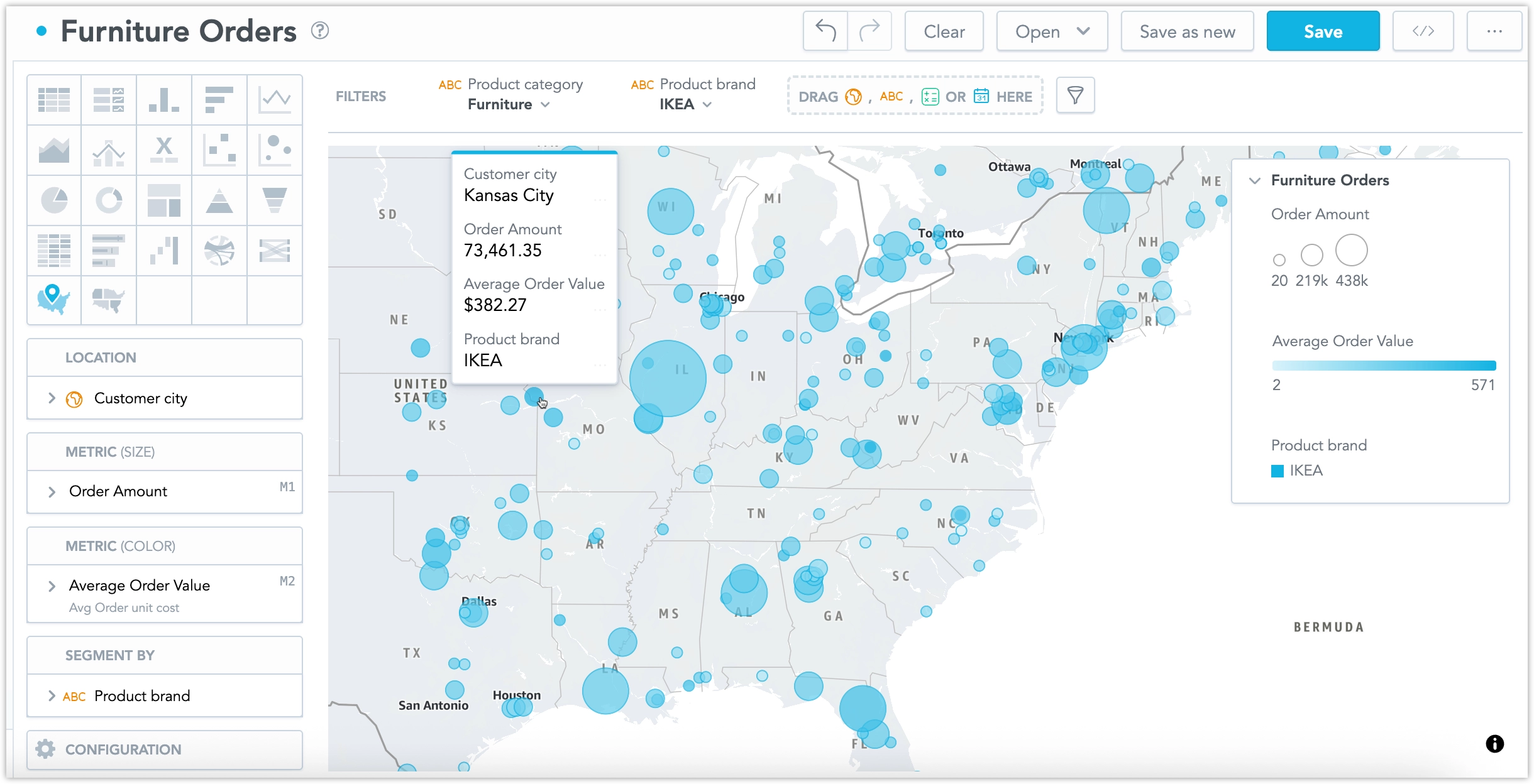
Geo charts (pushpins) show data broken down geographically. Geo charts show data points as bubbles using the coordinates from the location attribute. In addition, geo charts can display the size of the bubbles in proportions using another metric. If you add an attribute to the Segment by section, the bubbles get different colors for each value.
Geo charts (pushpins) have the following sections:
- Location
- Metric (Size)
- Metric (Color)
- Segment by
- Configuration
For information about common characteristics and settings of all visualizations, see the Visualization Types section.
Geo charts support interactive features such as drilling, cross-filtering, and attribute-based interactions.
Drill definitions can be applied to both metrics and attributes and are shared across all layers of a geo chart.
To set a specific part of the map to be seen when you open the visualization, go to Configuration > Map > Default viewport and select a part of the map.
For the configuration options common for all visualizations, see the Configure Visualization Properties section.
Access Tokens
GoodData Cloud uses AWS Location Service as the default map provider for geo charts. If you want to use Mapbox, you must provide your own Mapbox access token. See the Upload Access Tokens for Geo Charts section for details.
Configure Data
For information about the preparation of data for geo charts (pushpins), see the Configure Data for Geo Charts section.
Examples
Location Display
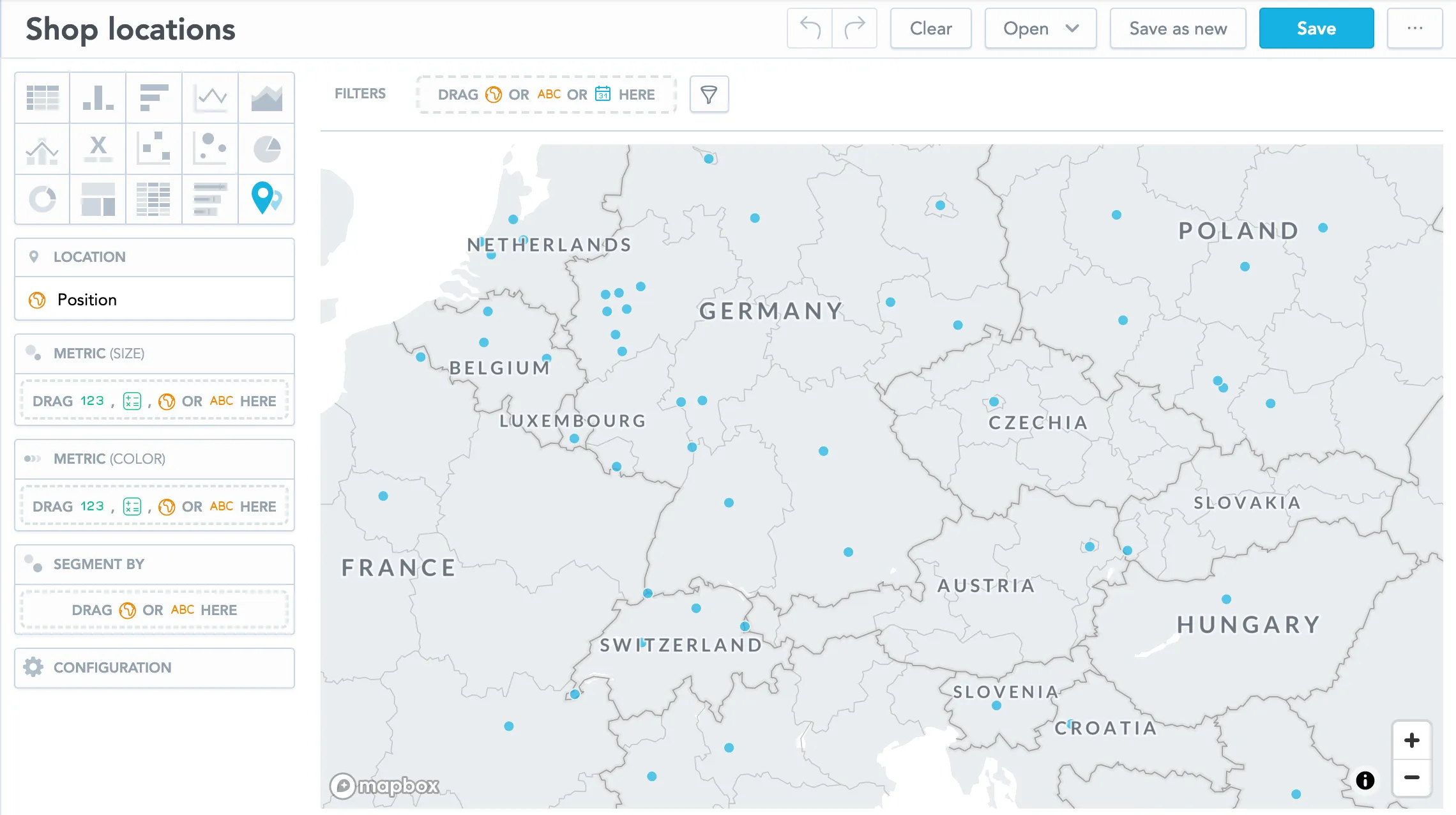
This example shows the distribution of shops of a fictional company.
Put the Position attribute in the Location section. Each dot represents the location where a shop is present. All dots have the same size.
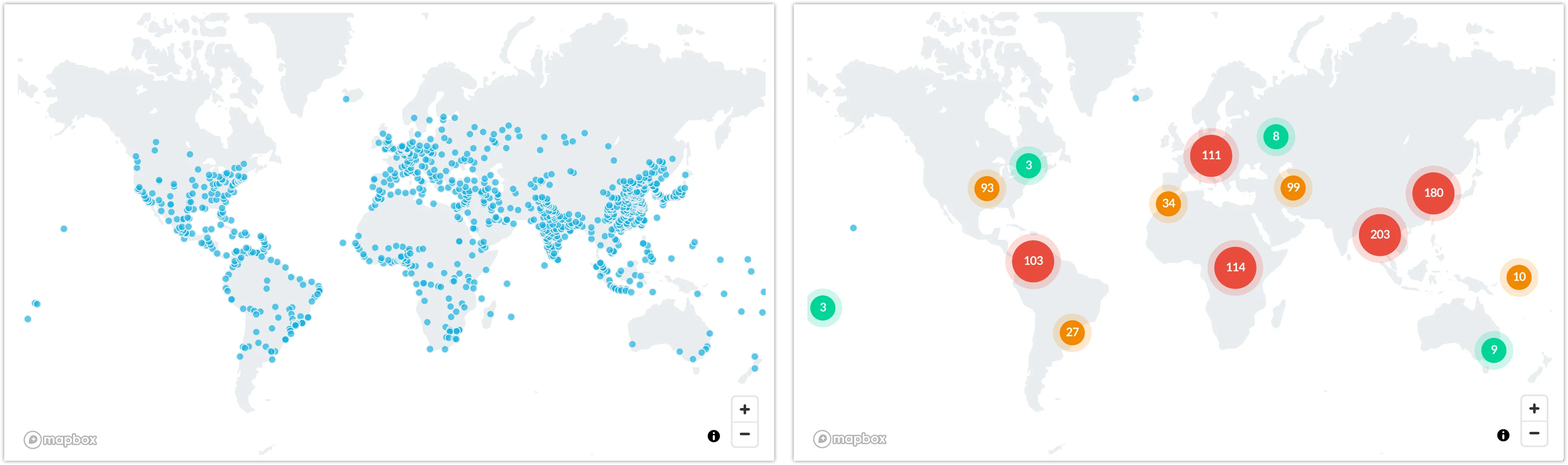
For large maps, you can group nearby points so that the displayed map is not overcrowded. In the Configuration section, go to Points and select Group nearby points.
The following images show identical data - ungrouped and grouped.
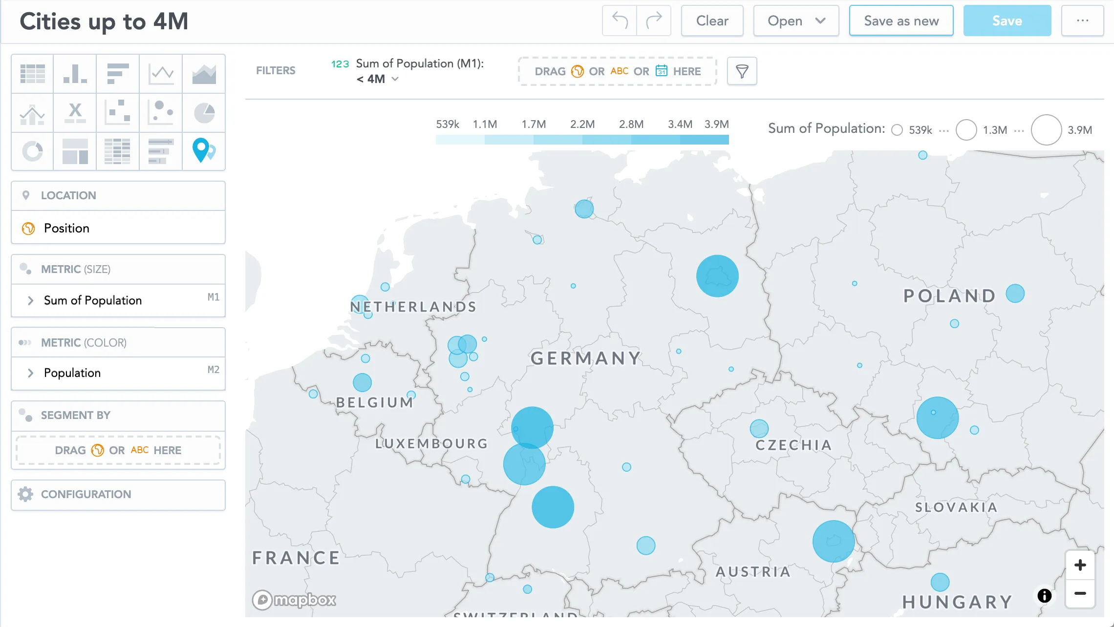
Dot Size Based on Value
If you want to see a different size of the dots based on the metric value, add a metric to the Metric (size) section.
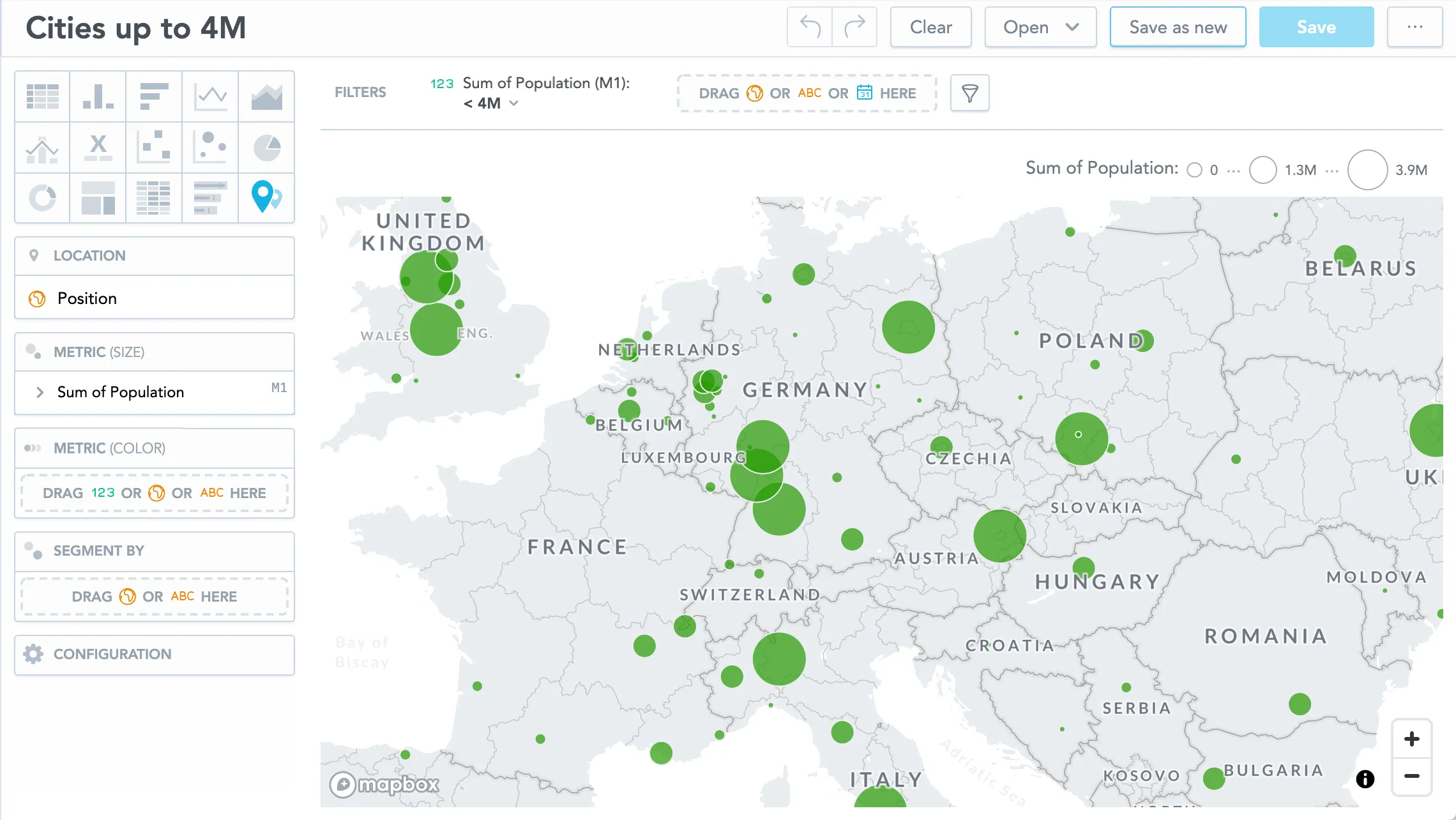
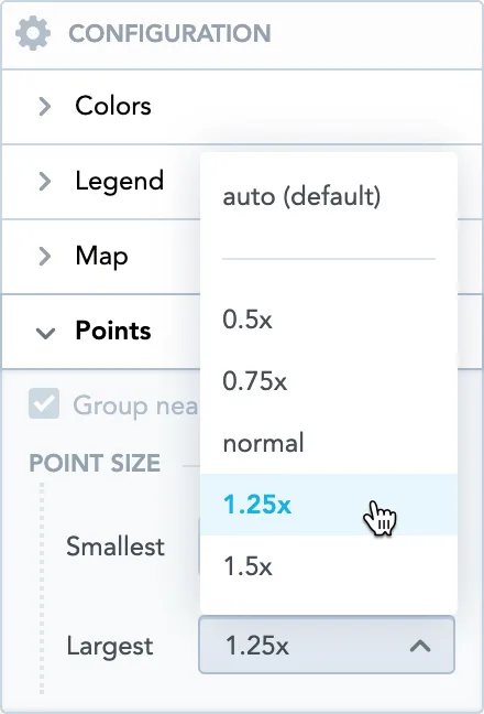
To adjust the size of the smallest and largest dots, go to Configuration > Map > Points and select the value in the dropdown menus.
Dot Color Shade Based on Metric Value
If you put an item to the Metric (color) section, the data displays different shades of the color based on the metric value.
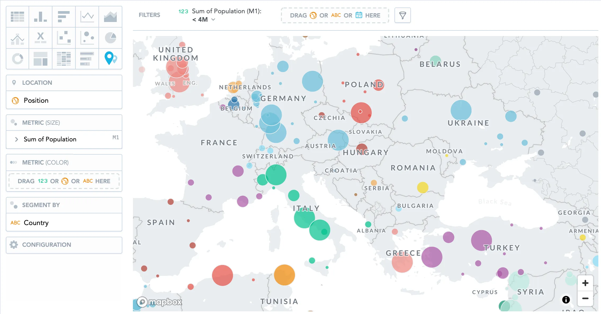
Dot Color Based on Attribute Value
If you put an attribute to the Segment by section, the data displays a different color for each attribute value.
The following image shows the population in cities segmented by country:
Viewport and Navigation
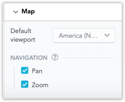
Geo charts allow you to control how users interact with the map viewport. In the Map section of the visualization’s configuration panel, you can set a default viewport and control whether users can move or zoom the map:
- Default viewport – Sets the initial region displayed when the visualization loads. This helps focus the chart on a specific geographic area.
- Pan – Allows users to move the map horizontally or vertically.
- Zoom – Allows users to zoom in and out of the map.
By disabling pan and zoom, you can effectively lock the map to the selected viewport so users cannot navigate outside the defined region. This is useful when the visualization should remain focused on a specific geographic scope.
Limits
Geo charts support displaying up to 50,000 data points.
Modern browsers limit the number of WebGL contexts that can be created on a single page. For example, Chrome allows up to 16 WebGL contexts, which means that you can display up to 16 geo charts per dashboard.