Bullet Chart
Bullet charts are used to display a single quantitative measure along with a target or comparison value. They provide a concise and clear representation of performance, progress, or achievement towards a goal. Common uses of bullet charts include tracking key performance indicators (KPIs), comparing actual results with targets, or visualizing project milestones.
For example, a bullet chart can represent sales performance by displaying the actual sales value, the target sales value, and additional indicators such as poor, satisfactory, or excellent ranges. Bullet charts offer a compact and informative way to assess and communicate performance levels. They are a good choice if you want to compare your data to the previous period or the same period of the previous year. For details, see the Time over Time Comparison section.
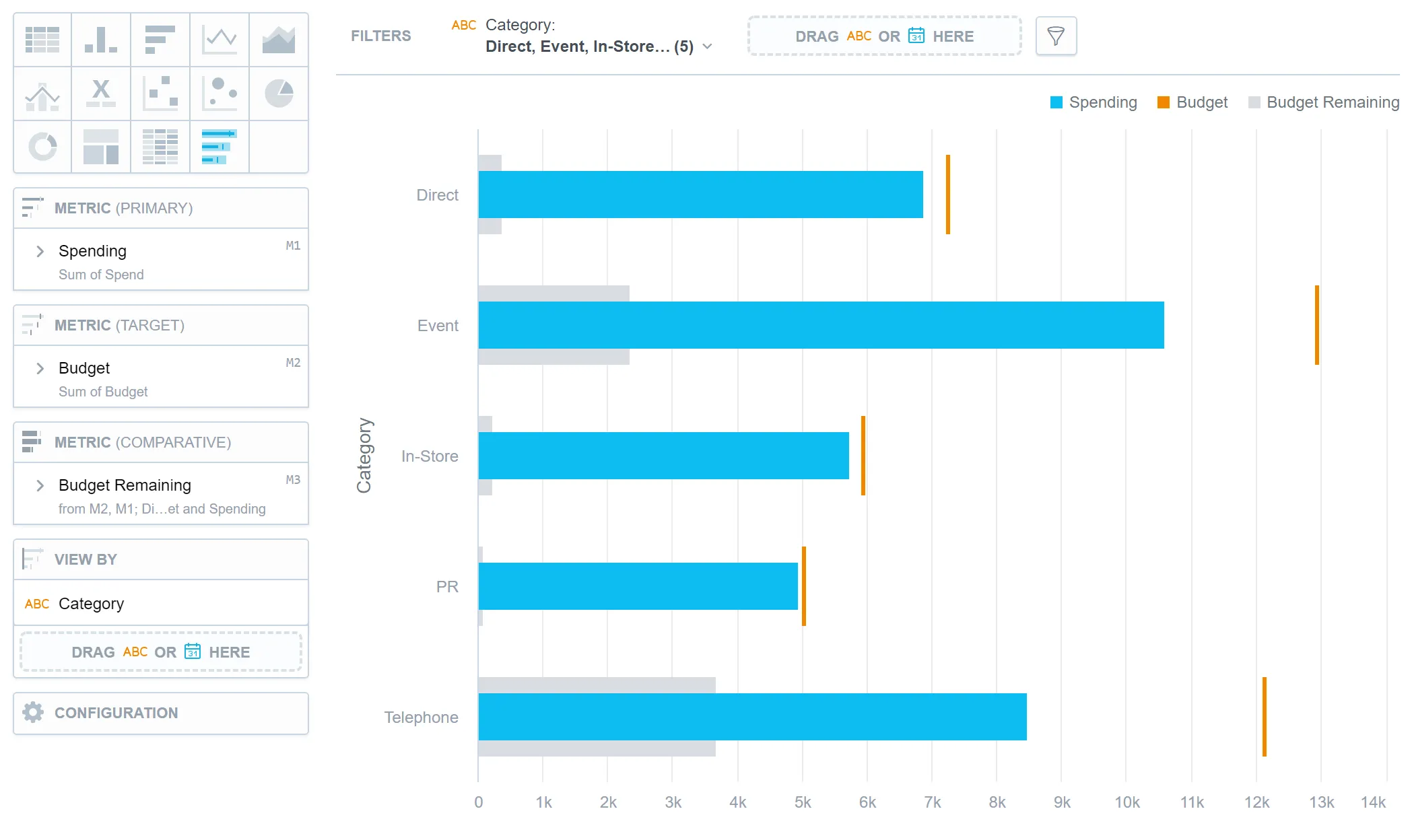
Bullet charts have the following sections:
- Metric (Primary)
- Metric (Target)
- Metric (Comparative)
- View by
- Configuration
In bullet charts, you can also:
In Configuration > Colors and Fills > Fill, you can choose how chart segments are displayed:
- Pattern fill: Replaces solid colors with patterns (like crosshatching). This makes values easier to tell apart because they differ by both color and texture.
- Outline fill: Tones down solid colors and shows emphasized outlines. This style is useful when you want to overlap another chart (for example, a line chart on top of a column chart) because it improves contrast and separation.
See the Change Chart Fills section for further details.

Limits
| Bucket | Limit |
|---|---|
| Metrics | 20 metrics (to add more than one metric, Stack by bucket must be empty) |
| View by | 1 attribute (this bucket is available only if there is exactly one metric) |
| Feature | Limit | Comment |
|---|---|---|
| Maximum data points in one chart | 3,000 | This is a display (visualization) limit. If you exceed this limit and want to see all data, change the visualization type to Table. |