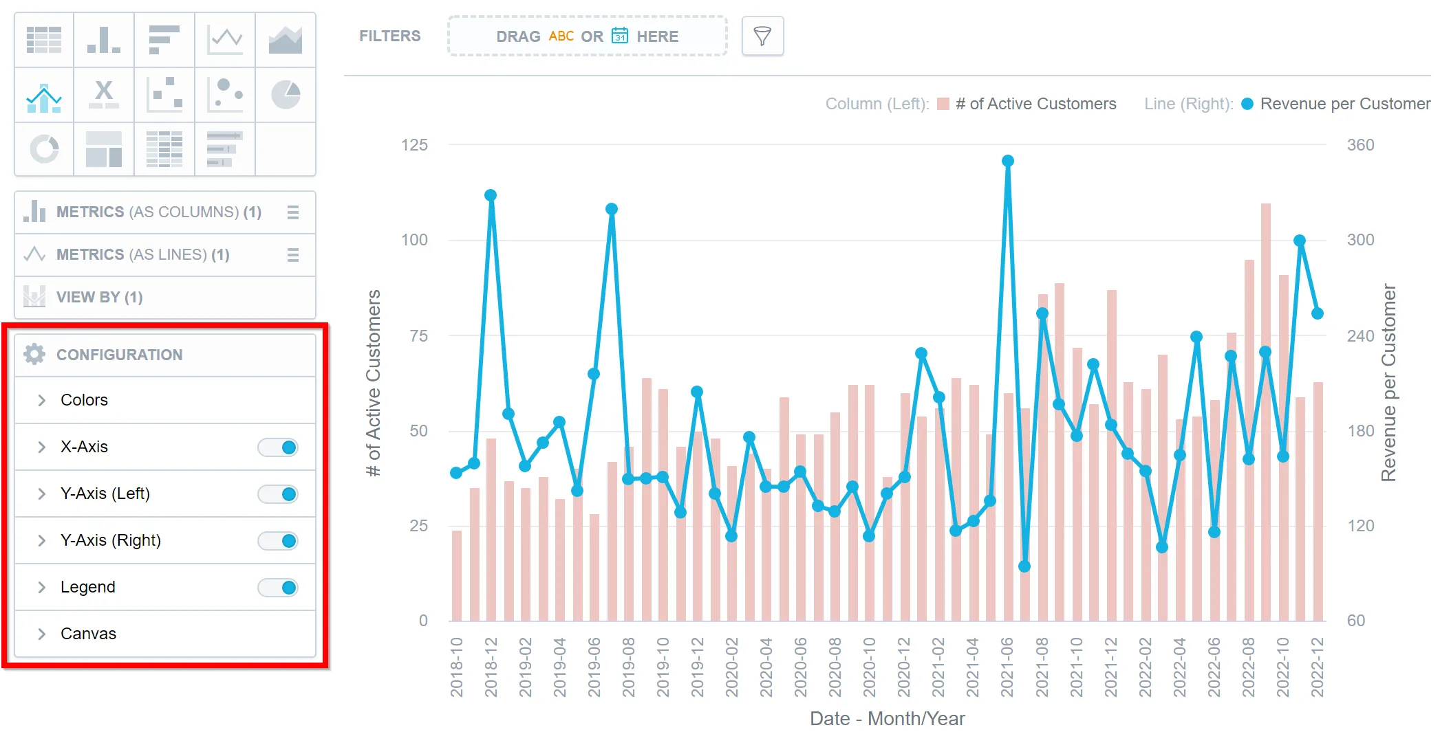
Configure Visualization Properties
Analytical Designer allows you to change the default properties of your visualizations. You can show or hide axes, disable gridlines, rotate labels, change colors, and so on.
You can change the properties in the Configuration section when creating a visualization.
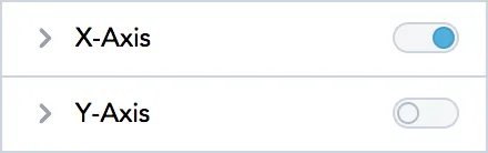
Axes
- To hide or display axes, toggle the switch for the x-axes and y-axes.
If you enable a secondary axis for bar charts, column charts, or line charts, you can configure the secondary axis here as well. For details about the secondary axes, see the Bar Charts, Column Charts, and Line Charts sections.
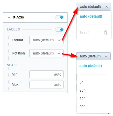
- To change the display angle of the axis values, select the angle in the Rotation dropdown list.
- To change the format of label values, select inherit from the Format dropdown list. The label inherits the format from the first measure in the visualization. For details about formatting, see the Format Numbers section.
- To hide or display the axis name, toggle the switch for Name.
- To change the position of the axis name, select the option in the Position dropdown list.
- To set the minimum and maximum values for an axis, type the values in the Min and Max fields.
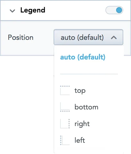
Legend
- To hide or display the legend, toggle the switch in the Legend section.
- To change the position of the legend, select the position in the dropdown list.
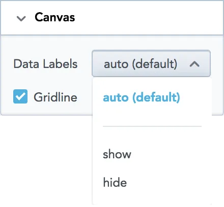
Canvas
- To show or hide the data labels, select the option in the Data Labels dropdown list.
- To show or hide the gridline, select or unselect the Gridline option.
Change Metric and Attribute Colors
Analytical Designer assigns colors for metrics and attributes in a fixed order. The first metric/attribute in the Metric(s) section is assigned the first color from the palette (the default one or your custom palette).
For each metric/attribute in your visualization, you can change the color in which the visualization displays it. For example, you want to display Opportunities won in green and Opportunities lost in blue.
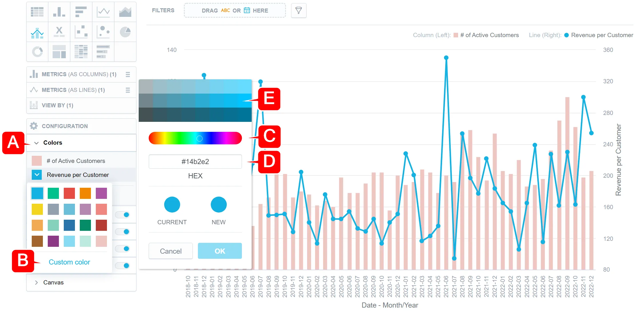
Steps:
In the Configuration section, click Colors (
Ain the image above).Click the metric/attribute that you want to change.
Select a new color, or click Custom color (
B) to adjust the current color.You can select another color form the picker (
C), enter a hexadecimal code for a new color (D), or select a different shade of your color (E).
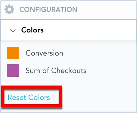
To revert to the original colors, go to Configuration → Colors and click Reset colors.
Change Chart Fills
You can change how chart segments are filled to improve contrast and readability. For example, instead of using only solid colors, you can apply pattern fills. With patterns, each column in a column chart is distinguished not only by color but also by texture (such as lines, grids, or dots).
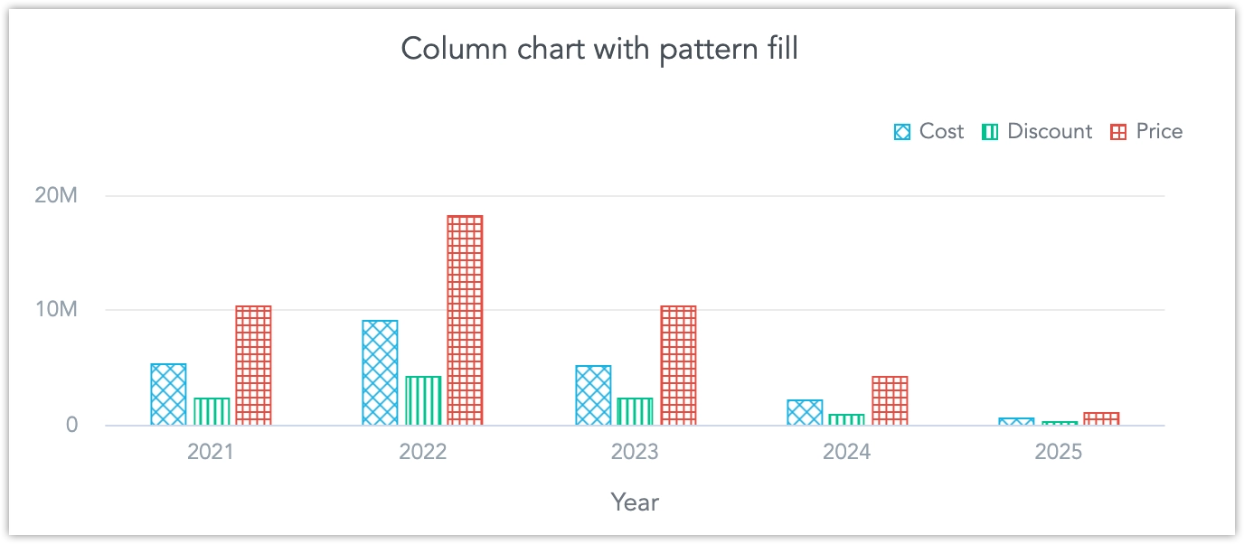
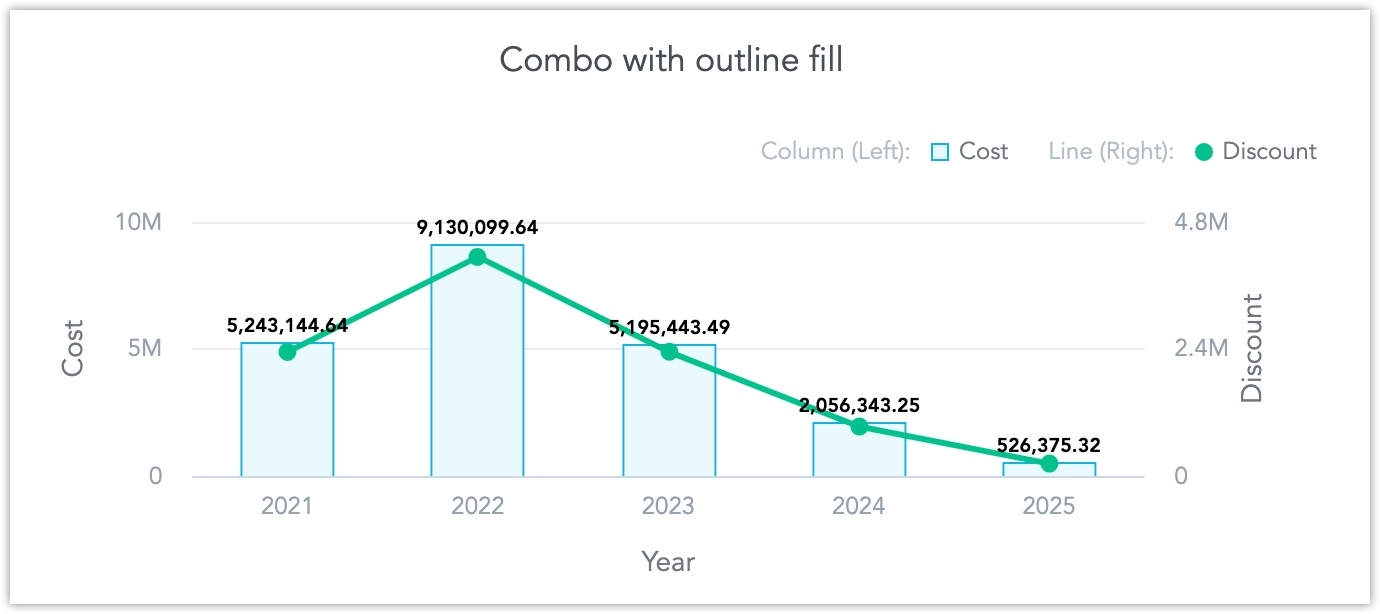
The chartFill property controls how chart segments are displayed.
chartFill?: {
  type: "solid" | "pattern" | "outline";
  measureToPatternName?: Record<string, PatternFillName>
}
Supported Patterns
type PatternFillName =
  | "diagonal_grid_small"
  | "vertical_lines_small"
  | "grid_small"
  | "horizontal_lines_small"
  | "circle_small"
  | "flag_small"
  | "waffle_small"
  | "dot_small"
  | "pyramid_small"
  | "needle_small"
  | "diamond_small"
  | "pizza_small"
  | "diagonal_grid_medium"
  | "vertical_lines_medium"
  | "grid_large"
  | "horizontal_lines_medium"
  | "circle_medium"
  | "flag_medium"
  | "waffle_medium"
  | "dot_medium"
  | "pyramid_medium"
  | "needle_medium"
  | "diamond_medium"
  | "pizza_medium";
How it Works
The
typecan also be changed in the UI (solid,pattern, oroutline).The
measureToPatternNamepart (assigning patterns to specific measures) can only be set via API (see below).A pattern per measure is applied only if
typeis set to"pattern".

Modify via API
PUT {hostname}/api/v1/entities/workspaces/{workspaceId}/visualizationObjects/{insightId}Example:
{
"data": {
"id": "xxxxxxxx-xxxx-xxxx-xxxx-xxxxxxxxxxxx",
"type": "visualizationObject",
"attributes": {
"description": "",
"content": {
"buckets": [
{
"items": [
{
"measure": {
"localIdentifier": "measure_1",
"definition": {
"measureDefinition": {
"item": { "identifier": { "id": "fact_id", "type": "fact" } },
"aggregation": "sum",
"filters": []
}
},
"title": "Sum of Fact",
"format": "#,##0.00"
}
}
],
"localIdentifier": "measures"
},
{
"items": [
{
"attribute": {
"localIdentifier": "attribute_1",
"displayForm": {
"identifier": { "id": "dimension.category", "type": "label" }
}
}
}
],
"localIdentifier": "view"
}
],
"filters": [
{
"negativeAttributeFilter": {
"localIdentifier": "filter_1",
"displayForm": {
"identifier": { "id": "dimension.category", "type": "label" }
},
"notIn": { "uris": [] }
}
},
{
"positiveAttributeFilter": {
"localIdentifier": "filter_2",
"displayForm": {
"identifier": { "id": "dimension.name", "type": "label" }
},
"in": {
"values": ["Example A", "Example B", "Example C"]
}
}
}
],
"sorts": [],
"properties": {
"controls": {
"chartFill": {
"measureToPatternName": {
"measure_1": "diamond_medium"
},
"type": "pattern"
}
}
},
"visualizationUrl": "local:treemap",
"version": "2"
},
"title": "Pattern Fill Example",
"tags": []
}
}
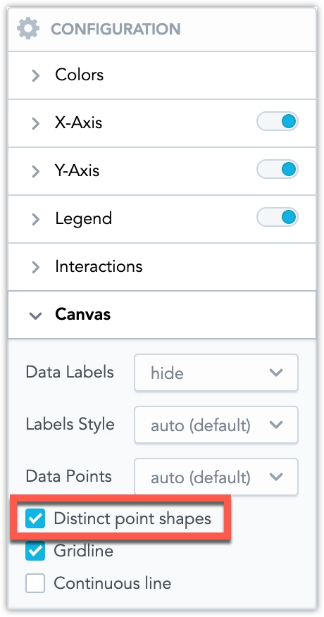
}Change Data Point Shapes
Distinct point shapes make data points easier to tell apart. When enabled, charts use different shapes instead of the same symbol for all data points.
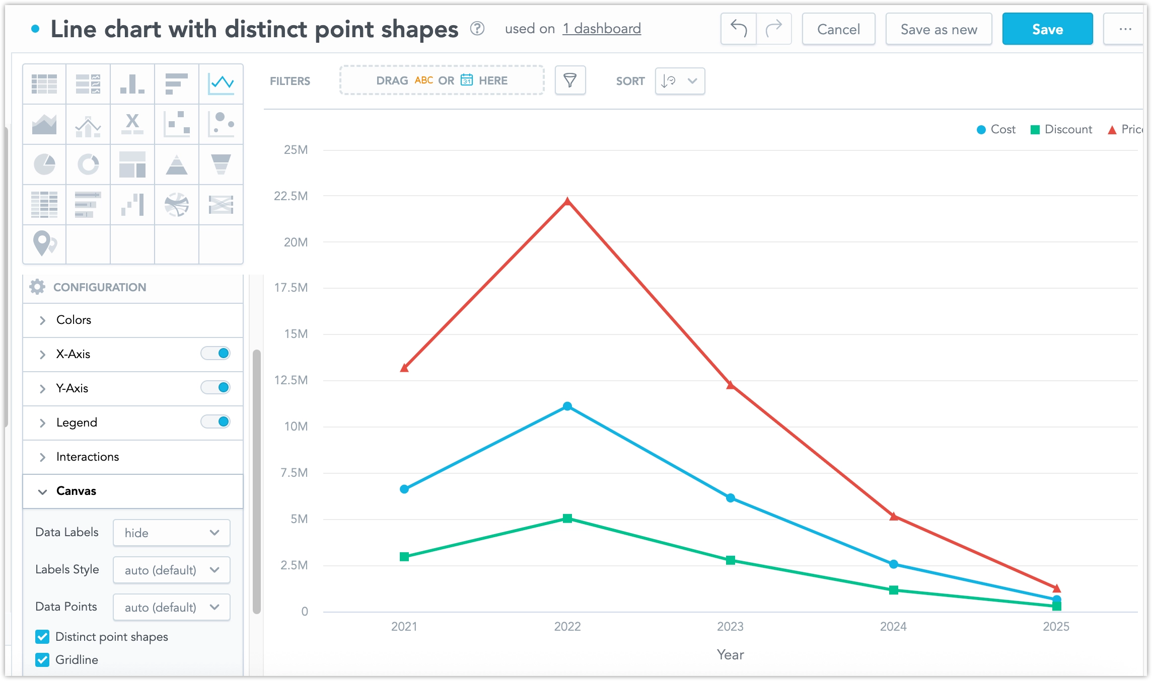
The distinctPointShapes property controls how chart segments are displayed.
distinctPointShapes?: {
  enabled: boolean,
  pointShapeMapping?: Record<string, PointShapeSymbolType>;
}

type PointShapeSymbolType =
  | "circle"
  | "square"
  | "diamond"
  | "triangle"
  | "triangle-up"
  | "triangle-down"
  | "triangle-left"
  | "triangle-right"
  | "arrow"
  | "plus"
  | "cross"
  | "star"
  | "hexagon"
  | "octagon"
| "pentagon";enabled: Can also be controlled in the UI.
pointShapeMapping: Defines which shape is used for each measure. This can be set only via API.
Mapping is applied only if
enabledis set totrue.
Modify via API
PUT {hostname}/api/v1/entities/workspaces/{workspaceId}/visualizationObjects/{insightId}Example:
{
  "data": {
    "id": "insight_id_placeholder",
    "type": "visualizationObject",
    "attributes": {
      "title": "Distinct Point Shapes Example",
      "content": {
        "properties": {
          "controls": {
            "distinctPointShapes": {
              "enabled": true,
              "pointShapeMapping": {
                "measure_1": "triangle-down",
                "measure_2": "square"
              }
            }
          }
        }
      }
    }
  }
}
Data Sampling
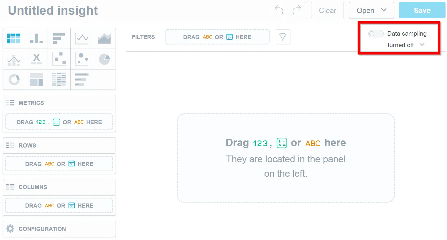
Use data sampling to quickly determine the viability of a particular visualization by processing only a percentage of the total available rows in the associated datasets instead of processing all of the data. Data sampling can be enabled at any point during the analysis, but enabling the option before you build the visualization will provide the most benefit as visualizations are built dynamically according to input.
Data sampling creates a smaller set of data from a much larger set of data. Because the rows are chosen randomly, the results are unstable and therefore unsuitable for persistent objects like visualizations and dashboards.
Visualizations cannot be saved with the results from data sampling. The option must be re-enabled whenever you leave the analytical designer.
Notes
- Data sampling is available only for workspaces that use Vertica Data Sources.
- Data sampling is available for use only within Analytical Designer and through the API.
- If the database associated with the logical data model contains a view, data sampling is unavailable.
Steps:
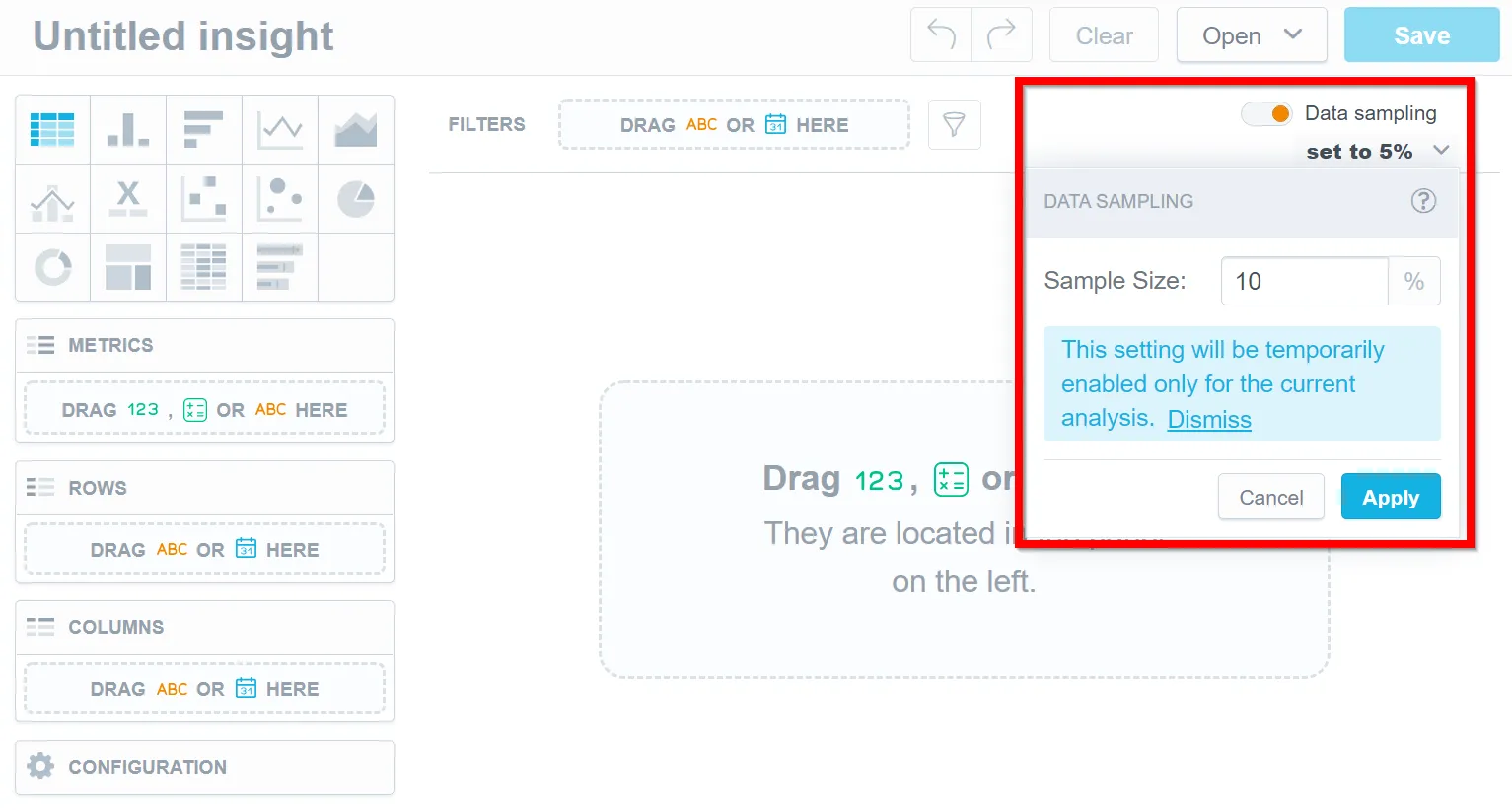
- Enable the data sampling option.
Note
Because only a percentage of the total rows are used in the computation and the decision of which rows to use is random, setting a low sample size with a small set of data can result in 0 rows being used during computation. Adjust the values until you receive usable results.
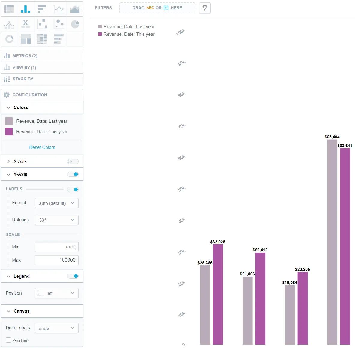
Example of a Column Chart
The image below shows a column chart that has:
The color of the metric changed
The x-axis switched off
The labels on the y-axis (left) rotated by 30°
The scale of the y-axis (left) set between 0 and 100000
Dual x-axes are available for line charts. Dual y-axes are available for bar charts and column charts.
For details, see Bar Charts, Column Charts, and Line Charts.
The legend placed to the left of the visualization
The data labels displayed
The gridline hidden