Theme Properties
Themes use special JSON structures with CSS properties. This article describes individual properties and gives examples.
Complete JSON Structure
This is an example set of the properties that you can customize: NEW JSON from PEK
{
    "palette": {
        "primary": {
            "base": "#3049D1"
        },
        "error": {
            "base": "#e54d42"
        },
        "success": {
            "base": "#00c18d"
        },
        "warning": {
            "base": "#f4d521"
        }
    },
    "typography": {
        "font": "url(https://cdn.jsdelivr.net/npm/roboto-font@0.1.0/fonts/Roboto/roboto-regular-webfont.ttf)",
        "fontBold": "url(https://cdn.jsdelivr.net/npm/roboto-font@0.1.0/fonts/Roboto/roboto-bold-webfont.ttf)"
    },
    "button": {
        "borderRadius": "2",
        "dropShadow": true
    },
    "modal": {
        "title": {
            "color": "#6D7680",
            "lineColor": "#DAE2EA"
        },
        "borderColor": "#ffffff",
        "borderRadius": "6",
        "borderWidth": "2",
        "dropShadow": true,
        "outsideBackgroundColor": "#DAE2EA"
    },
    "tooltip": {
        "color": "#C8D0FF",
        "backgroundColor": "#07124E"
    },
    "analyticalDesigner": {
        "title": {
            "color": "#6D7680"
        }
    },
    "dashboards": {
        "title": {
            "color": "#6D7680",
            "backgroundColor": "#F4F5FB",
            "borderColor": "#1b4096"
        },
        "navigation": {
            "title": {
                "color": "#6d7680"
            },
            "borderColor": "#DAE2EA",
            "item": {
                "color": "#6d7680",
                "hoverColor": "#000",
                "selectedColor": "#000",
                "selectedBackgroundColor": "#F4F5FB"
            },
            "backgroundColor": "#ffffff"
        },
        "filterBar": {
            "filterButton": {
                "backgroundColor": "#F4F5FB"
            },
            "backgroundColor": "#F4F5FB",
            "borderColor": "#1b4096"
        },
        "section": {
            "title": {
                "color": "#6D7680",
                "lineColor": "#dde4eb"
            },
            "description": {
                "color": "#999EA5"
            }
        },
        "content": {
            "kpiWidget": {
                "title": {
                    "color": "#8292E3",
                    "textAlign": "center"
                },
                "kpi": {
                    "primaryMeasureColor": "#E8EAF7",
                    "secondaryInfoColor": "#8292E3"
                },
                "borderColor": "#3049D1",
                "borderRadius": "6",
                "borderWidth": "1",
                "backgroundColor": "#1b4096",
                "dropShadow": true
            },
            "widget": {
                "title": {
                    "color": "#101010",
                    "textAlign": "center"
                },
                "borderColor": "#ffffff",
                "borderRadius": "6",
                "borderWidth": "2",
                "dropShadow": true,
                "backgroundColor": "#ffffff"
            },
            "backgroundColor": "#F4F5FB"
        }
    }
}
General rules
To customize Dashboards, update the properties in the dashboards section.
To customize Analytical Designer, update the properties in the analyticalDesigner section.
When creating your themes, follow these general rules:
| Colors | Use the following color coding formats:
|
| Borders | Border radius and weight use pixels.
To use a different unit, include it in the string. Example: "border-radius" : "2em" |
| Widget borders | The recommended maximum for the widget border radius is 30px.
The recommended maximum width of widget borders is 4px.
To hide the border of widgets, use a transparent color instead of borderwidth=0.
Example: "borderColor": "78787800" or "borderColor": "rgb(120,120,120,0)" |
Properties
The following sections contain information about individual properties, examples, and exemplary codes.
Tip
The provided code examples of the properties are always used in the custom example images.
Colors
The basic colors for your Dashboards and Analytical Designer are defined in the palette section.
Primary color
Color for primary buttons, links, and accented visual elements.
"primary" : {
   "base" : "#3049D1"
}
| Default | Custom |
|---|---|
Error color
Color for error messages and error states.
"error" : {
  "base" : "#7d07f2"
}
| Default | Custom |
|---|---|
Success color
Color for success messages and success states.
"success" : {
   "base" : "#00c18d"
}
| Default | Custom |
|---|---|
Warning color
Color for warning messages and warning states.
"warning" : {
   "base" : "#e60000"
}
| Default | Custom |
|---|---|
Complementary color
For Dashboards only.
Colors for various visual elements, such as borders, lines, shadows, buttons, and so on.
"complementary" : {
        "c0" : "#282a36",
        "c1" : "#4d4466",
        "c2" : "#725e97",
        "c3" : "#9778c8",
        "c4" : "#bd93f9",
        "c5" : "#c8a7f7",
        "c6" : "#d4bbf6",
        "c7" : "#e0cff4",
        "c8" : "#ece3f3",
        "c9" : "#f8f8f2"
    }
The complementary palette consists of 10 colors of your choice (c0 to c9). You can define:
- All 10 colors.
- The first (
c0) and the last color (c9). - These two colors are mandatory. The rest will be calculated automatically using these colors.
- The first color (
c0), the last color (c9), and any number of colors in between. - The rest will be calculated automatically using these colors.
The individual colors are used for:
c0- Background color of dashboard, widgets, dialogs, etc.c1- Contrast background colorc2- More contrast background colorc3- Border light colorc4- Border medium colorc5- Text light color, border dark colorc6- Text colorc7- Text colorc8- Text colorc9- Text dark color, foreground color
Info
- Do not rename the colors.
- If the background color (
c0) is darker than the last color (c9), you can create a “dark” mode. - The complementary palette also applies to all elements that are not specifically defined in your theme.
Fonts
Fonts are defined in the typography section of the JSON.
Specify both variants of the font (regular and bold). Both variants must be from the same font family.
Currently, only https://fonts.gstatic.com/ is enabled as external URL.
If you need fonts from another URL, contact our support.
For external fonts, use the following formats:
- Absolute URL -
"font": "url(https://somewebsite.com/path/to/font.woff)" - Explicit format -
"font": "url(https://somewebsite.com/path/to/font.woff) format('woff')"
For local fonts, use the following formats:
"font": "local(Arial)""font": "local(Time New Roman)""font": "local('Times New Roman')"
To specify a regular font, use the following code:
"font" : "url(https://cdn.jsdelivr.net/npm/roboto-font@0.1.0/fonts/Roboto/roboto-regular-webfont.ttf)"
To specify a bold font, use the following code:
"font": "local(font), url(path/to/font.svg) format('svg'),
         url(path/to/font.woff) format('woff'),
         url(path/to/font.otf) format('opentype')"
Recommended fonts
Here are some recommended free fonts that you can use in your themes.
| Sans Serif Fonts | Serf Fonts |
|---|---|
| Lato | Crimsonn Text |
| Assistant | Old Standard TT |
| Nono Sans | Kameron |
| Source Sans Pro | Copse |
| Libre Franklin | |
| Open Sans | |
| Roboto | |
| Titilium Web | |
| Varela Round |
Visual elements
Customize visual elements, such as buttons, overlay windows, and tooltips.
Buttons
Customize the look of buttons in Dashboards and Analytical Designer.
"button" : {
  "borderRadius" : "0",
  "dropShadow" : false
}
| Default | Custom |
|---|---|


Overlay windows
Customize overlay windows.
"modal" : {
  "title" : {
     "color" : "#6D7680",
     "lineColor" : "#DAE2EA"
  },
  "borderColor" : "#ffffff",
  "borderRadius" : "6",
  "borderWidth" : "2",
  "dropShadow" : true,
  "outsideBackgroundColor" : "#DAE2EA"
}
Tooltips
Customize tooltips.
"tooltip" : {
  "color" : "#C8D0FF",
  "backgroundColor" : "#07124E"
}
| Default | Custom |
|---|---|
Analytical Designer
Customize the color of the visualization names.
Visualization title color
Color of the visualization name.
"analyticalDesigner" : {
  "title" : {
     "color" : "#d6044e"
  }
}
| Default | Custom |
|---|---|
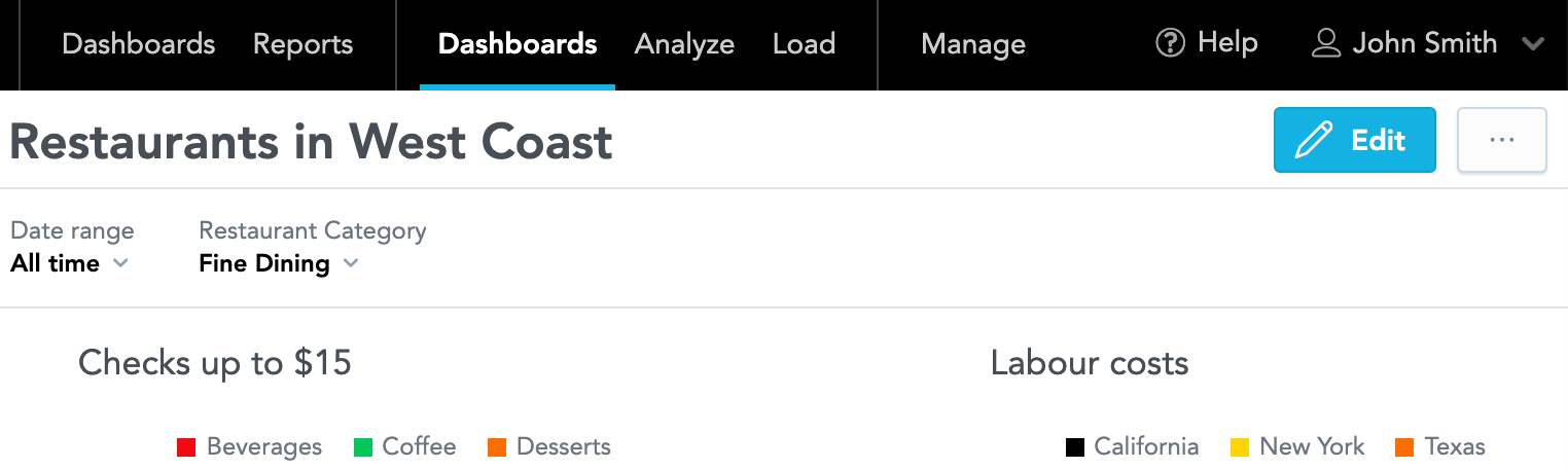
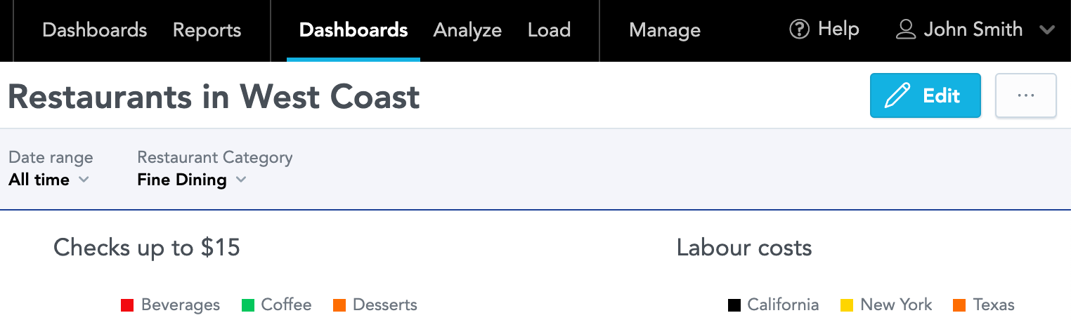
Dashboards
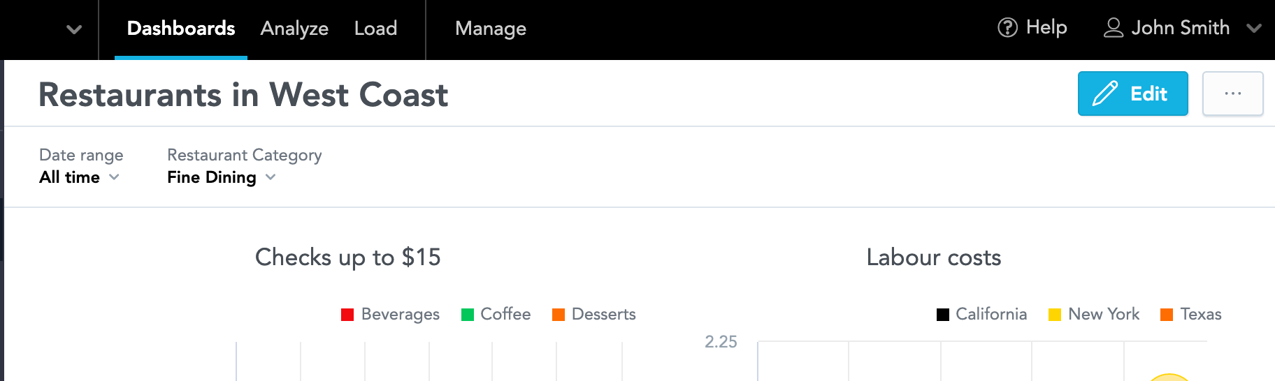
Customize various elements in Dashboards, such as titles, filters, navigation, and widgets. In the Dashboards section.
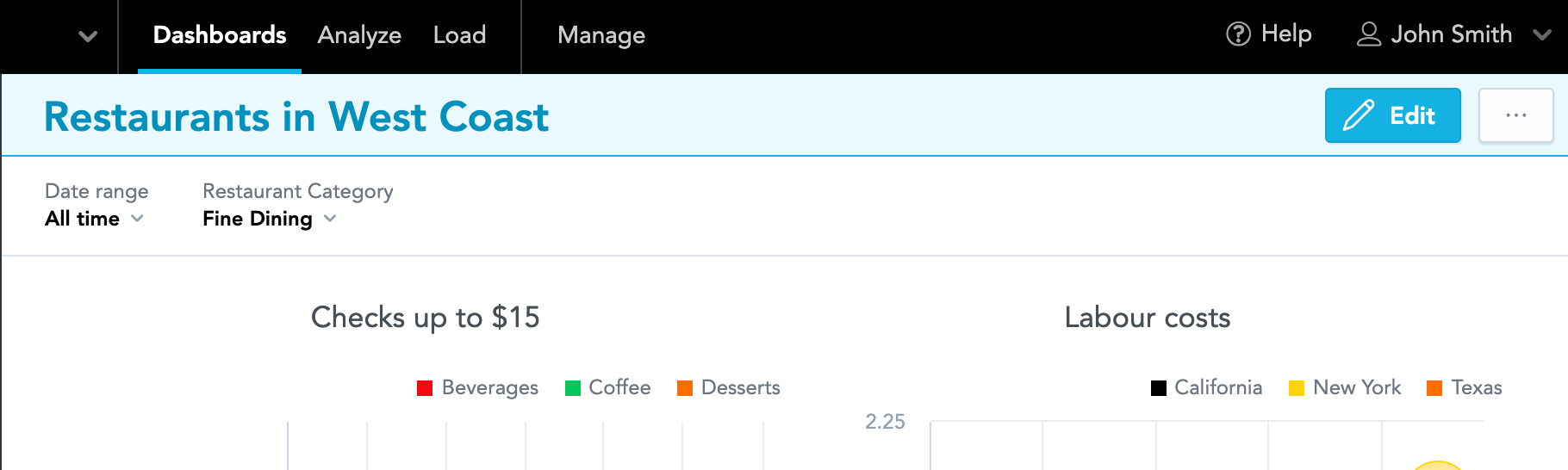
Dashboard title
Customize the title of your dashboards.
"title" : {
               "color" : "#0392bd",
               "backgroundColor" : "#eafafd",
               "borderColor" : "#1b4096"
            }
| Default | Custom |
|---|---|
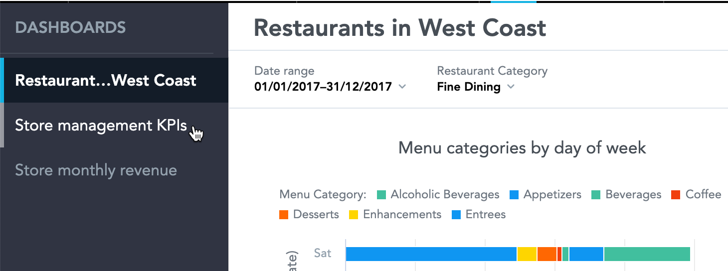
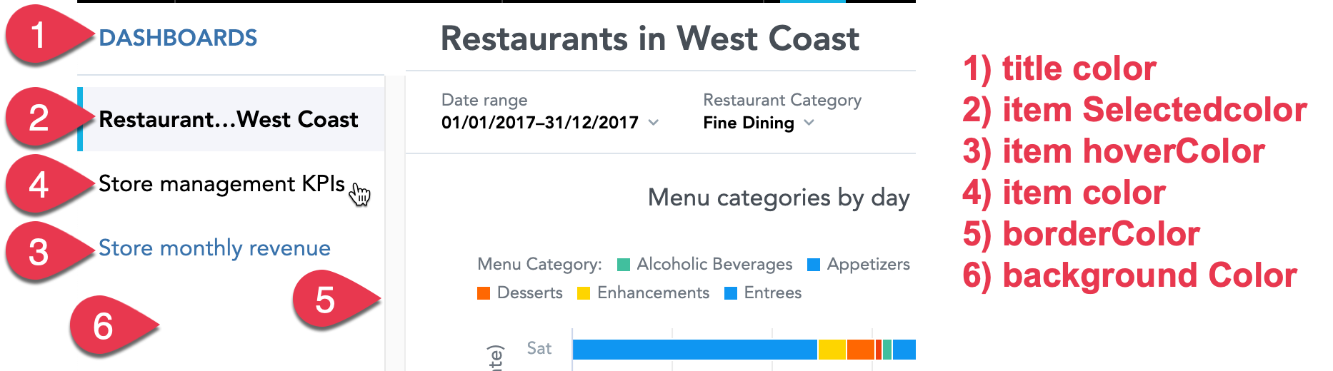
Navigation
Customize the left navigation of the Dashboards.
"navigation" : {
               "title" : {
                  "color" : "#3973ac"
               },
               "borderColor" : "#DAE2EA",
               "item" : {
                  "color" : "#3973ac",
                  "hoverColor" : "#000",
                  "selectedColor" : "#000",
                  "selectedBackgroundColor" : "#F4F5FB"
               },
               "backgroundColor" : "#ffffff"
            }
| Default | Custom |
|---|---|
Filter bar
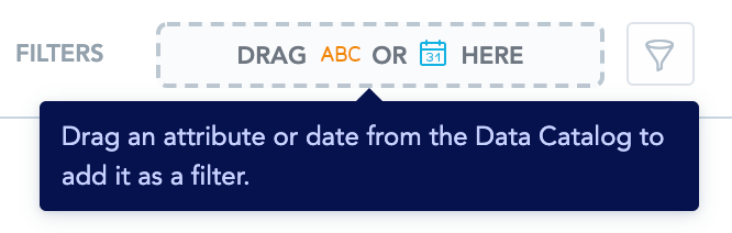
Customize the look of the filter bar of your dashboards.
"filterBar" : {
               "filterButton" : {
                  "backgroundColor" : "#F4F5FB"
               },
               "backgroundColor" : "#F4F5FB",
               "borderColor" : "#1b4096"
            }
| Default | Custom |
|---|---|
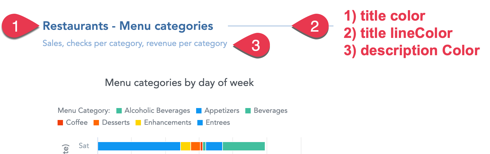
Dashboard sections
Customize the title and description of the sections on your dashboards.
"section" : {
               "title" : {
                  "color" : "#3b6ba1",
                  "lineColor" : "#85abd6"
               },
               "description" : {
                  "color" : "#85abd6"
               }
            }
| Default | Custom |
|---|---|
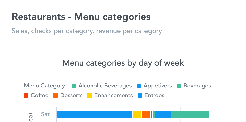
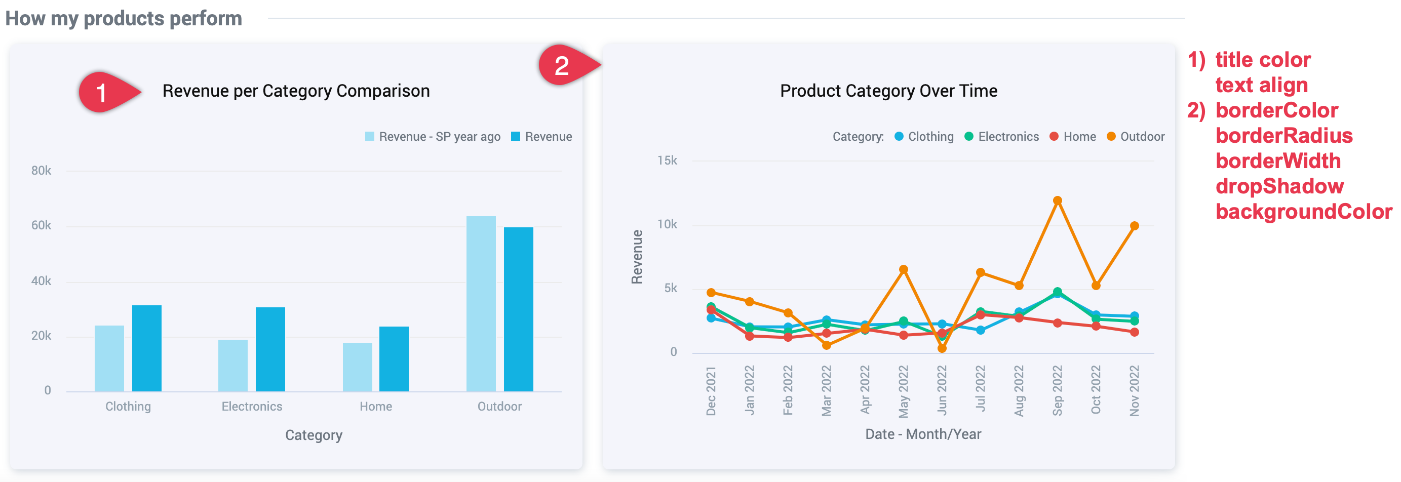
Content section
Visualizations on dashboards
Customize the visualizations added to dashboards.
Info
If you have headline visualizations on your dashboard, keep the border radius at 4px or below to prevent display problems in exported PDF files.
"widget": {
    "title": {
        "color": "#101010",
        "textAlign": "center"
    },
    "borderColor": "#F4F5FB",
    "borderRadius": "6",
    "borderWidth": "2",
    "dropShadow": true,
    "backgroundColor": "#F4F5FB"
}
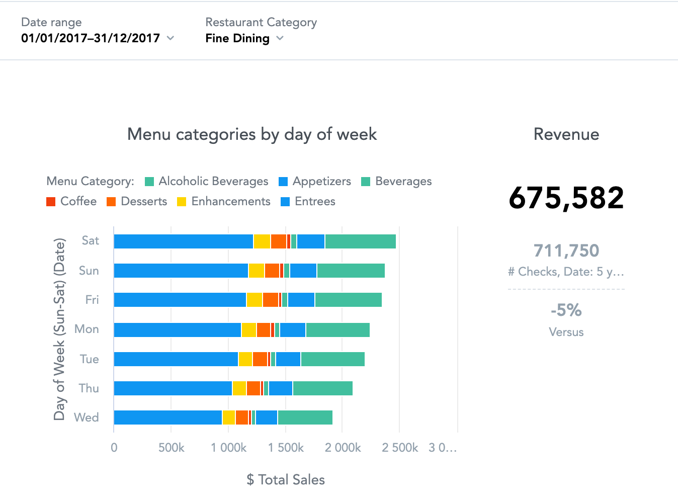
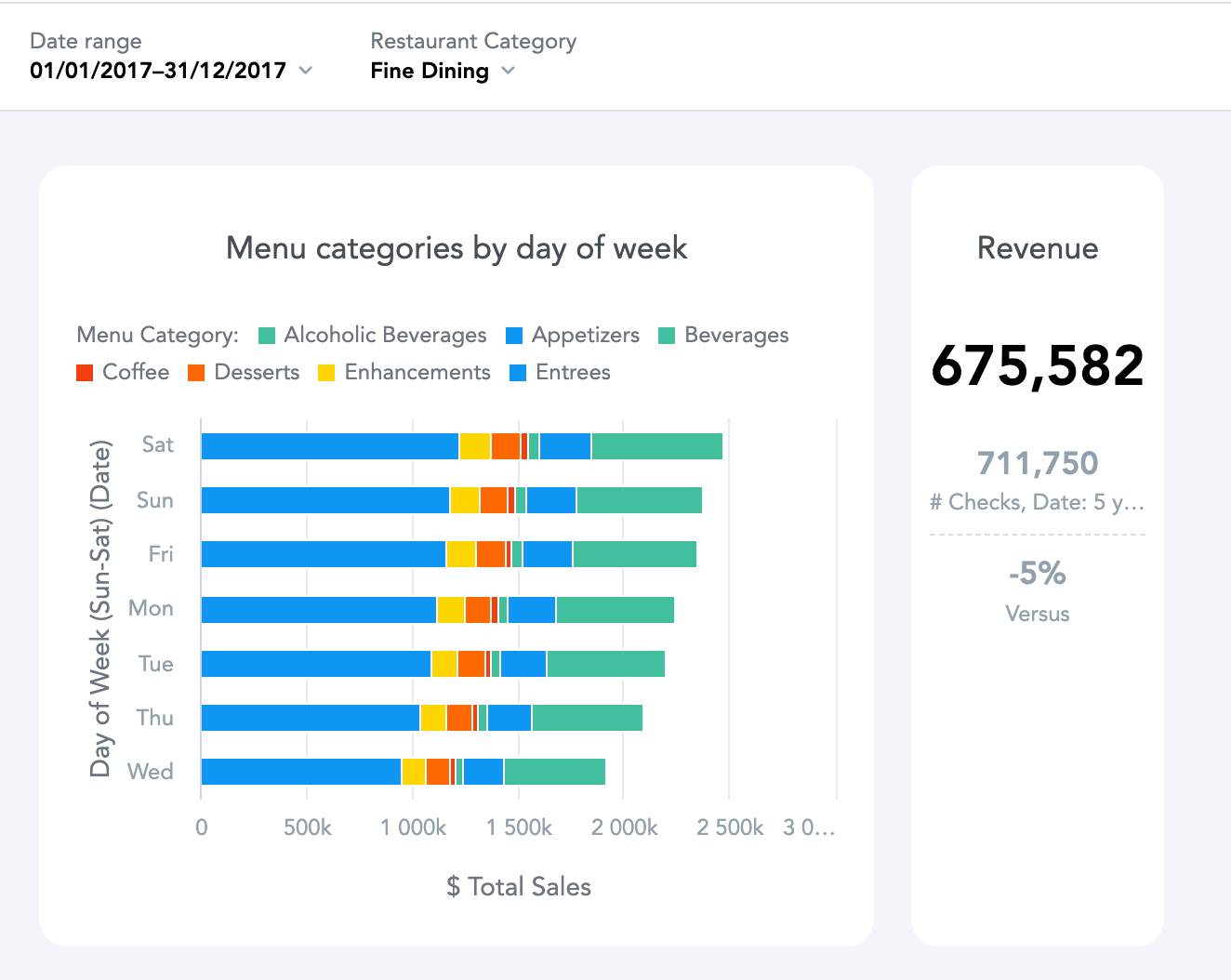
| Default | Custom |
|---|---|
Background color
Color of the dashboard background.
"backgroundColor" : "#F4F5FB"
| Default | Custom |
|---|---|