Filter Metrics in a Visualization by Date
If you want to compare metrics at different times or by different dimensions, use the Filter by date parameter in the metric settings.
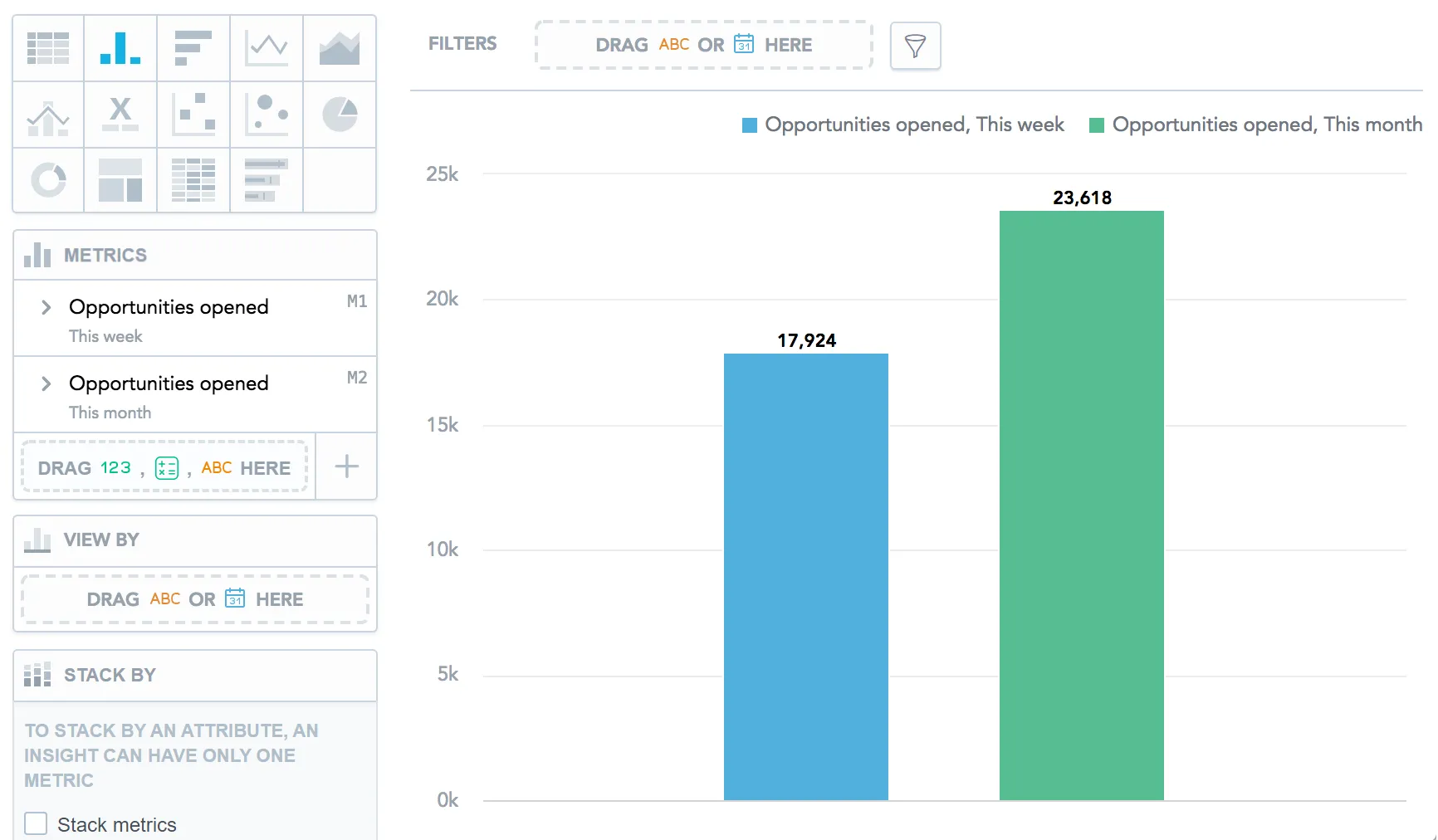
For example, if you want to compare the number of opened opportunities in the current week and month, add the same metric twice and select a different date filter for each instance.
Steps:
Add a metric to the visualization.
In the metric section, click Filter by date.
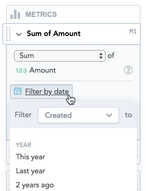
In the drop-down menu, select the dimension.
For details, see the Filter Metrics by Date with Different Date Dimensions.
Select the period by which you want to filter the metric.
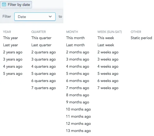
You can select the current and previous years, quarters, months, and weeks, or a static period (a date range).
The visualization displays the metric in the selected period.
If you use the comparison option for a metric, the Filter by date option is not available for this metric. For more information, see Use Time-over-Time Comparison in Visualizations.
Filter Metrics by Date with Different Date Dimensions
If your visualization contains multiple metrics, and you want to use different date dimensions for each of them, specify a different dimension in the date filter of the metrics.
The visualization then displays the data filtered by the date dimensions that you specified.
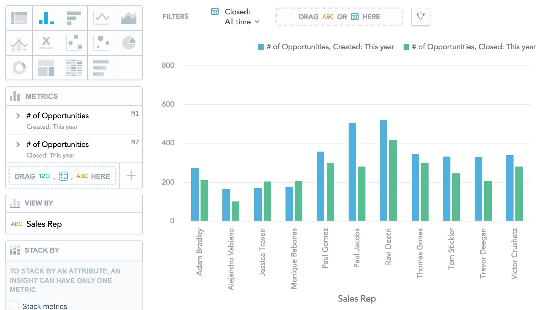
In the following image, the visualization shows a column chart with the number of opportunities that each sales representative created and closed in the current year.
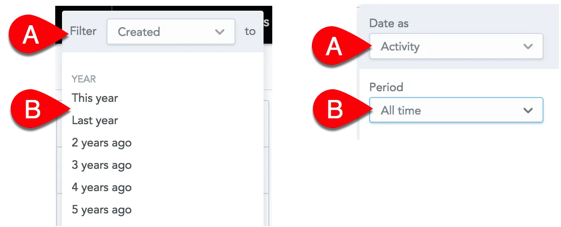
How Date Filters Interact within the Same Visualization
You can set a date filter:
- For individual metrics (Filter by date)
- For a whole visualization (in the top bar)
Both date filters include:
- The period itself (
Bin the following image), such asLast month,3 years ago, orStatic period. - Date dimension (
Ain the following image), such asCreated,Assigned, orClosed.
For example, you have a visualization that shows the trend of how the opportunities that were created last year were gradually closed month by month:
- The metric filter is set to display the opportunities that were created from January 1 to December 31, 2017 (
Ain the image below). - The visualization filter is set to display the opportunities that were closed from January 1 to August 31, 2017 (
Bin the image below).
The resulting visualization applies both filters and shows the number of opportunities that were created and then also closed in the interval of January 1 to August 31, 2017.
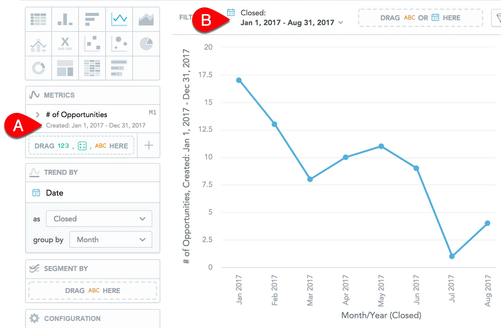
The following opportunities are not included in the displayed data:
The opportunity that was created on December 2016 and closed on February 2017 - because this opportunity does not fit the metric filter (created on January 1 - December 31, 2017)
The opportunity that was created on July 2017 and closed on October 2017 - because this opportunity does not fit the visualization filter (closed on January 1 - August 31, 2017)