Stacked Area Chart
Stacked area charts show data as an area under a line that connects data points. They are similar to line charts and express changes across time. They are commonly used to show the contribution of different components to a whole while displaying the overall pattern. For example, a stacked area chart can represent the market share of different companies in an industry over a period, with each layer representing a company’s share. Stacked area charts allow for easy comparison of both individual and collective trends, making them useful for analyzing data with multiple components and temporal dimensions.
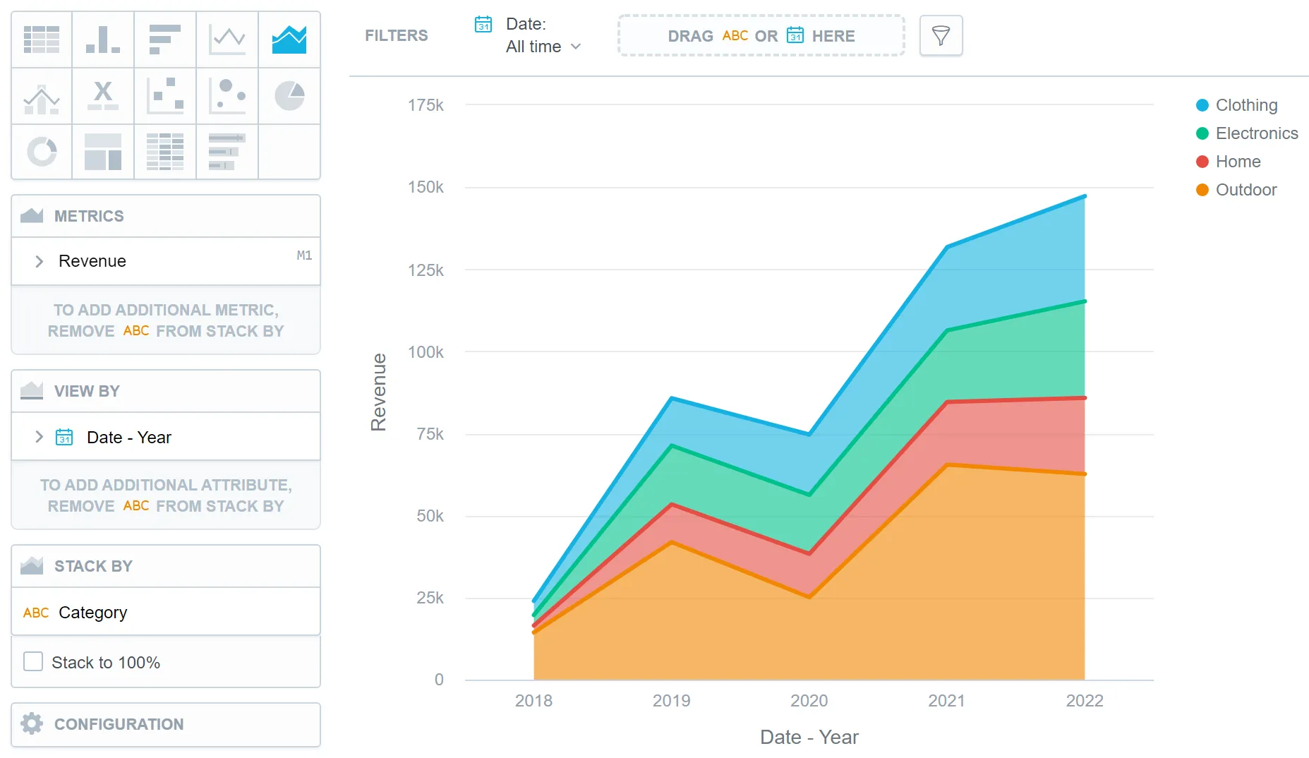
Stacked area charts have the following sections:
- Metrics
- View by
- Stack by
- Configuration
In stacked area charts, you can also:
Display the values as a percentage.
To do so, add a date or an attribute to the View by section.
Display the chart as a continuous line even if your data contain empty values.
To do so, check the Continuous line checkbox in the Configuration | Canvas section. By default, the line is interrupted if it is supposed to display an empty value.
In Configuration > Colors and Fills > Fill, you can choose how chart segments are displayed:
- Pattern fill: Replaces solid colors with patterns (like crosshatching). This makes values easier to tell apart because they differ by both color and texture.
- Outline fill: Tones down solid colors and shows emphasized outlines. This style is useful when you want to overlap another chart (for example, a line chart on top of a column chart) because it improves contrast and separation.
See the Change Chart Fills section for further details.
In Configuration > Canvas > Labels style, you can choose Backplate to add a background behind chart labels. This makes labels easier to read because the backplate (white by default) creates higher contrast with the chart colors.
In Configuration > Canvas, you can enable Distinct point shapes to make data points easier to tell apart. When enabled, charts use different shapes (such as squares, diamonds, or triangles) instead of a single uniform shape for all data points. See the Change Data Point Shapes section for further details.
Stack the chart by attributes.
To add attributes to the Stack by section, you must have only one item in the Metrics section.
For details on how to stack multiple metrics, see the Stack metrics section.

You can add a single metric or multiple metrics to create different types of area charts. See the table for details:
Table Key: ✅ = Add attributes. ❌ = Do not add attributes. N/A = Attributes not supported.
| Metrics | View by Attributes | Stack by Attributes | Result |
|---|---|---|---|
| Single | ✅ | ❌ | Area chart |
| Single | ✅ | ✅ | Stacked area chart |
| Multiple | ✅ | N/A | Stacked area chart |
For information about common characteristics and settings of all visualizations, see the Visualization Types section.
Limits
| Bucket | Limit |
|---|---|
| Metrics | 20 metrics (to add more than one metric, Stack by bucket must be empty) |
| View by | If more than one metric: 1 attribute; If one metric and stack by attribute: 1 attribute; If one metric and no stack by attribute: 2 attributes |
| Stack by | 1 attribute (this bucket is available only if there is exactly one metric and no more than one View by attribute) |
| Feature | Limit | Comment |
|---|---|---|
| Maximum data points in one chart | 3,000 | This is a display (visualization) limit. If you exceed this limit and want to see all data, change the visualization type to Table. |